When you think of YouTube, what comes to mind? Chances are, the iconic logo plays a significant role in that recognition. Over the years, YouTube's logo has seen several transformations, each reflecting the platform's evolution and the changing digital landscape. This blog post aims to take you on a visual journey through the various incarnations of
The Original YouTube Logo

The very first YouTube logo made its debut in 2005 when the platform was launched. This logo was simple yet effective, encapsulating the spirit of the then-nascent video-sharing platform. Here are some key features of the original logo:
- Font Style: The font used was primarily a bold, sans-serif typeface that conveyed simplicity and modernity, making it accessible at a glance.
- Color Scheme: The original logo featured red and white as its primary colors. The red represented passion and excitement, while the white added a contrasting element that highlighted the text.
- Play Button: One of the most distinctive elements of the logo was the red play button, which was cleverly integrated into the logo's design, symbolizing the platform's video-centric focus.
This original logo set the tone for YouTube's identity and was instrumental in creating brand recognition. Over the years, the logo would evolve, but it always retained some elements that paid homage to that original design. It's fascinating how such a simple graphic could encapsulate the essence of a platform that has transformed how we consume and share content worldwide!
Changes Through the Years

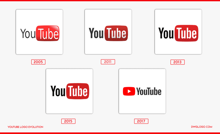
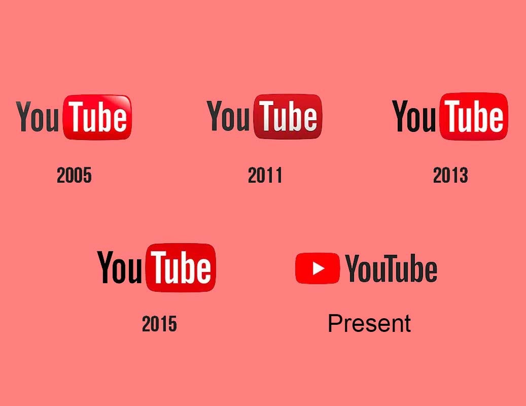
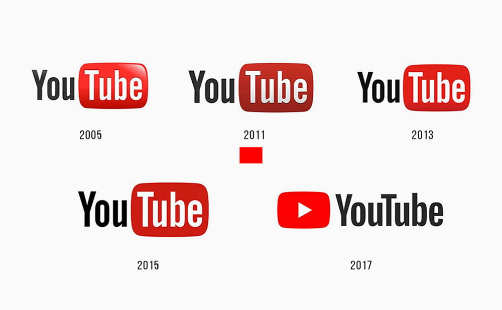
The YouTube logo has undergone several transformations since the platform's inception in 2005. Each iteration reflects not just aesthetic preferences but also the evolving identity of one of the world’s largest video-sharing platforms. Let’s take a closer look at these changes:
- 2005 – The Birth of YouTube: The original logo featured a simple wordmark with "You" in black and "Tube" in red, accompanied by the iconic red play button. This initial design was straightforward, emphasizing the platform's focus on user-generated content.
- 2011 – A Modern Touch: In 2011, YouTube refined its logo by altering the font to a more modern sans-serif style, making it look cleaner. The play button was also given a sleeker appearance by being integrated more seamlessly into the text.
- 2015 – The Bold Move: This redesign saw a significant branding evolution. The logo adopted a more vibrant red color, with a bold font that lent strength and confidence. The updated play button became more pronounced, symbolizing YouTube's core identity as a video platform.
- 2017 – Simplification: Reflecting a trend towards minimalism in design, YouTube opted for a flatter design aesthetic without gradients. The play button stayed, but its integration into the design was cleaner, improving its versatility across various platforms.
Through these transformations, the YouTube logo encapsulates the platform's growth from a small video-sharing site to a cultural phenomenon, adapting with the times while always keeping its core identity intact.
Significance of the Logo Design

The YouTube logo is more than just a visual element; it encapsulates the brand's mission, identity, and evolution over the years. Let's explore the significance behind its design:
- Brand Identity: The logo serves as a quick reference point for users. Its distinct colors—especially the bold red—are easily recognizable and evoke feelings of excitement and energy, which resonates well with the platform's vibrant content.
- Visual Communication: The play button symbolizes video content, acting as an immediate indicator of what users can expect. It’s not just a logo; it's an invitation to engage, showcasing YouTube's core purpose as a video-sharing platform.
- Adaptability: With the rise of mobile usage, having a simple yet impactful logo has been crucial. The YouTube logo is versatile enough to display clearly on various devices, from desktops to smartphones, ensuring brand consistency across screens.
- Emotional Connection: Over the years, YouTube has fostered a community of creators and viewers. The logo represents a platform where diverse voices and content coalesce, cultivating a sense of belonging among its users.
In conclusion, the significance of the YouTube logo design lies in its ability to capture the essence of what YouTube has become—an accessible, engaging, and diverse space for creativity and expression.
Fan Reactions and Cultural Impact
The evolution of the YouTube logo is not just a tale of design changes; it's also a story of how the platform has woven itself into the fabric of internet culture. Over the years, fans and users have reacted to the logo's modifications with various feelings—some nostalgic, others excited. Each logo iteration has stirred conversations across forums, social media, and YouTube's comment sections, showcasing how much the platform means to its user base.
For instance, when YouTube announced its redesign in 2017, fans expressed a mix of appreciation and skepticism. Some loved the cleaner and more modern look, appreciating its adaptability across different platforms—think mobile, desktop, and even smart TVs. Others reminisced about the simpler, more recognizable logos of the past, arguing that the older versions embodied the 'YouTube spirit' more closely. Here’s a brief summary of fan reactions:
- Positive: Many fans enjoyed the minimalistic design, praising it for being streamlined and versatile.
- Nostalgic: Long-time users shared fond memories of the early days of YouTube, often posting throwback images of past logos.
- Critical: Some skeptics felt the newer logos lacked creativity, calling for more playful designs that represented the fun nature of the platform.
In terms of cultural impact, the YouTube logo has transcended mere branding to become a symbol of creativity, freedom, and voice. It's the gateway through which countless creators have expressed themselves, making YouTube not just a video-sharing platform, but a global phenomenon that has spawned new genres, trends, and even social movements.
Conclusion: The YouTube Logo Today
Today, the YouTube logo stands as a modern icon in the digital world. It’s familiar yet fresh, a representation of an evolving platform that has consistently adapted to the needs and expectations of its vast user base. The current logo incorporates a clean, bold font paired with the distinctive red play button, embodying the essence of video content delivery while remaining visually appealing.
Significantly, the YouTube logo now reflects not just the platform itself but also the broader creator culture it fosters. Here’s what makes the logo relevant:
| Element | Significance |
|---|---|
| Red Play Button | Instantly recognizable, symbolizing video content. |
| Bold Font | Conveys clarity and modernity. |
| Minimalistic Design | Adapts well across various media and devices. |
As we continue to witness changes in the digital landscape, the YouTube logo remains a touchstone of creativity, collaboration, and the ever-present need for self-expression. It's a logo that has evolved with its audience—one that not only represents the platform but also the millions of voices who have found a home there. In the end, the YouTube logo is much more than a symbol; it's a beacon of community in the vast ocean of the internet.
 admin
admin


