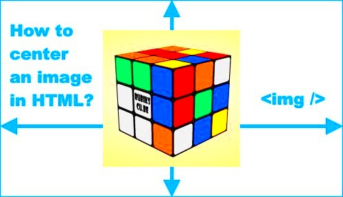
When designing a website, one of the most important elements to get right is the alignment of your images. Whether you're using a photo, graphic, or logo, the way it is positioned on the page can significantly impact the overall design and user experience. Center aligning an image is one of the simplest and most effective ways to make sure it looks balanced and draws attention the right way. In this guide, we'll walk you through the basics of center aligning images, why it matters, and how to achieve it using different techniques.
Why Center Aligning an Image is Important for Your Website
Center aligning an image may seem like a small detail, but it plays a big role in making your website look clean, professional, and well-organized. Here are a few reasons why it's crucial:
- Visual Balance: Centering an image helps create symmetry, making your page appear more organized and polished.
- Enhanced Aesthetics: Images that are centered naturally attract more attention, making your page visually appealing.
- Improved User Experience: A well-aligned image ensures users aren't distracted by awkward spacing or off-centered visuals, allowing them to focus on the content.
- Better Mobile Responsiveness: Centered images are easier to adapt to different screen sizes, ensuring your design looks great on both desktops and mobile devices.
Ultimately, center aligning an image helps achieve a professional look that not only enhances the design but also improves the overall usability of your website.
Also Read This: Designing a Professional Watermark for Your YouTube Channel
How to Use CSS for Center Aligning an Image
CSS (Cascading Style Sheets) provides a simple and effective way to center images on a website. There are multiple techniques available, depending on the specific needs of your design. Here are some of the most common methods:
1. Using `text-align` Property
This method is best for inline or block-level images. The `text-align` property can be applied to the parent container to center the image horizontally.
.container {
  text-align: center;
}
Just wrap your image in a container (e.g., a `
2. Using `margin: auto` and `display: block`
For block-level images, you can use a combination of `margin: auto;` and `display: block;` to center the image horizontally.
img {
  display: block;
  margin: 0 auto;
}
This method ensures the image takes up the available space and aligns it in the center of the page or container.
3. Using Flexbox
Flexbox is a powerful tool for aligning elements in a container. To center an image both horizontally and vertically using Flexbox, follow this example:
.container {
  display: flex;
  justify-content: center;
  align-items: center;
}
This will align the image perfectly in the center of the container, both vertically and horizontally.
4. Using Grid Layout
If you're working with CSS Grid, centering an image is straightforward. Here's how:
.container {
  display: grid;
  place-items: center;
}
The `place-items: center;` rule centers the image within the grid container, making it an efficient and modern solution.
Using these CSS techniques, you can ensure that your images are aligned perfectly and enhance the overall design of your website.
Also Read This: How 123RF Enhances Creative Workflows
Center Aligning Images with HTML Code
While CSS is often the go-to method for aligning images, HTML itself offers a few basic ways to center-align an image. These methods are simple but can be effective for basic layouts. Let’s look at how you can use HTML to center your images manually.
1. Using the `` Tag
The `
` tag was widely used in older HTML versions, but it is now considered obsolete in HTML5. However, if you're working on older projects or need a quick solution, it's still a possible choice. Here's how to use it:

Simply wrap the image tag in the `
` tag to center the image on the page. Keep in mind, though, that this method is outdated, and it’s recommended to use CSS for modern web development.2. Using the `align` Attribute
The `align` attribute on the `` tag was once used to center images. Here's how it works:

However, similar to the `
` tag, the `align` attribute is no longer supported in HTML5 and should be avoided. It's much better to use CSS to align your images for cleaner, more maintainable code.For modern websites, it's highly recommended to use CSS instead of these outdated HTML methods to ensure your website is built on a solid foundation of standards-compliant code.
Also Read This: Uploading 2K Images: How Long It Takes
Responsive Design: Ensuring Image Alignment Works on All Devices
When building websites today, it’s essential that your images look great on all screen sizes. This is where responsive design comes into play. Responsive design ensures that your content, including images, adjusts and aligns properly whether the website is viewed on a mobile phone, tablet, or desktop computer. Let’s look at how you can ensure your images are center-aligned on all devices.
1. Using `max-width: 100%`
One of the best ways to ensure images are responsive is by setting the `max-width` to `100%`. This makes sure the image doesn't exceed the width of its container, allowing it to resize automatically based on the screen size:
img {
  max-width: 100%;
  height: auto;
}
This rule ensures that your image will scale down proportionally, making it look good on mobile and tablet screens, while still maintaining its alignment and aspect ratio.
2. Flexbox and Grid Layout for Responsiveness
As mentioned earlier, both Flexbox and CSS Grid are great tools for centering content. To ensure images are properly aligned on all devices, you can use Flexbox or Grid with media queries:
@media (max-width: 768px) {
  .container {
    display: flex;
    justify-content: center;
    align-items: center;
  }
}
This ensures that on smaller screens (such as smartphones), the image remains centered, regardless of the container's size.
3. Media Queries for Custom Image Adjustments
Another way to ensure that images are properly aligned across different devices is by using media queries to adjust their size and position based on screen width:
@media (max-width: 480px) {
  img {
    width: 90%;
    margin: 0 auto;
  }
}
In this case, the image width is adjusted for smaller screens to ensure it's properly centered and doesn't overflow its container.
Using these techniques will help you maintain a responsive, center-aligned image layout across all screen sizes, ensuring your website looks polished and user-friendly.
Also Read This: Mobile Photos and 123RF: Submission Guidelines and Quality Considerations
Common Mistakes to Avoid When Centering Images
Centering images seems like a simple task, but it's easy to make mistakes that can ruin the layout of your website. Here are some common errors to avoid when centering images on your site:
1. Not Using the Right Container
One of the most common mistakes is not using the right container to wrap your image. If you don't use a container (like a `
2. Forgetting to Set Image Dimensions
Sometimes, images may not center properly if their dimensions aren't specified. If you don't define the width and height of your image, it could affect how it behaves within its container. Setting these properties ensures your image displays consistently and aligns correctly.
img {
  width: 100%;
  height: auto;
}
With this, the image will scale properly, keeping the aspect ratio intact and aligning neatly in its container.
3. Overusing `float` Property
While the `float` property was once used to position images on the left or right, it's not ideal for centering images. It can cause images to float out of place, causing layout issues. It's better to use CSS properties like `margin: auto` or Flexbox to center images without causing float-related problems.
4. Ignoring Mobile Devices
One of the biggest mistakes is designing only for desktop view and forgetting mobile users. As mobile traffic increases, ensuring that images are properly aligned and responsive on smaller screens is crucial. Always test your images on multiple devices and use media queries to adjust image sizes and alignment for different screen widths.
5. Not Testing Across Different Browsers
Different browsers can render images differently, leading to alignment issues. Always check how your images look in multiple browsers (like Chrome, Firefox, Safari, etc.) to ensure they’re centered correctly everywhere. Browser developer tools can help you fine-tune alignment and test changes in real-time.
By avoiding these common mistakes, you’ll ensure that your images are always properly centered and displayed correctly across all devices and browsers, making your website look polished and professional.
Also Read This: Building a Successful Portfolio on Adobe Stock: Tips for Capturing Market Demand
Tools and Resources for Easy Image Centering
Centering images manually can be a tedious task, especially when you're working on large projects. Fortunately, there are various tools and resources that can help streamline the process. These tools make it easier to align images correctly without having to write complex code or guess at the right values. Let’s explore some popular tools and resources for quick and easy image centering.
1. Online CSS Generators
Online CSS generators can save you time by providing ready-made code that you can directly apply to your website. Some of these tools allow you to input the details of your image, and they’ll generate the necessary CSS for centering. Examples include:
- CSS3 Generator - Helps generate various CSS rules, including centering for images.
- Simple CSS - A quick tool for generating basic CSS, including image centering properties.
2. Image Alignment Tools in Website Builders
If you're using a website builder like WordPress, Wix, or Squarespace, these platforms often have built-in tools for image centering. These tools allow you to visually align images without needing to touch code. You can use drag-and-drop features or adjust settings in the image properties panel to center your images quickly.
3. Browser Developer Tools
Most modern browsers like Chrome, Firefox, and Safari come with developer tools that let you inspect and modify the CSS and HTML of a page in real-time. You can experiment with different centering methods and instantly see the results. To access these tools, right-click on an image on a webpage, choose "Inspect," and modify the CSS directly.
4. Image Editing Software for Optimized Alignment
Before you even add an image to your website, image editing software can help you create optimized images with built-in alignment grids. Tools like Adobe Photoshop or GIMP allow you to crop and position images to fit a specific size and alignment, which can save you time when uploading them to your site.
With these tools and resources, aligning your images becomes much easier and more efficient, allowing you to focus on other important aspects of your website design.
Also Read This: How to Place Adobe Stock Photos in Illustrator
Best Practices for Optimizing Center-Aligned Images
Center-aligning images is just one part of the equation. To ensure that your images not only look great but also perform well on your site, it’s important to optimize them. Here are some best practices for optimizing your center-aligned images.
1. Use the Right Image Format
Choosing the right image format can make a significant difference in your website’s performance. Consider the following:
- JPEG: Best for photographs or images with many colors and gradients.
- PNG: Ideal for images with transparency or simple graphics.
- SVG: Great for logos and icons, as it is a scalable vector format.
Using the correct format ensures faster loading times and a better visual experience for your users.
2. Compress Your Images
Large image files can slow down your website, leading to a poor user experience. Use image compression tools to reduce the file size without sacrificing quality. Tools like TinyPNG and ImageOptim are popular choices for compressing images before uploading them to your website.
3. Use Lazy Loading
Lazy loading is a technique where images only load when they are about to enter the viewport (i.e., when they are about to be seen by the user). This can significantly improve your website’s load times and reduce initial page weight. You can enable lazy loading through simple JavaScript libraries or HTML attributes.
4. Optimize for Mobile
With mobile traffic increasing every year, it’s essential to optimize your center-aligned images for mobile devices. Make sure your images are responsive by using relative units (like percentages) for image width and applying media queries to adjust their size on different screen sizes.
5. Test Your Images Across Different Browsers
Sometimes, an image might look great on one browser but not on another. Always test your images across different browsers to ensure they render properly and remain center-aligned. Browser testing tools like BrowserStack allow you to see how your images look on various devices and browsers.
By following these best practices, you ensure that your center-aligned images look professional, load quickly, and offer a smooth user experience on all devices.
Also Read This: Easy Steps to Cancel Your iStock Subscription
FAQ about Center Aligning Images on Websites
If you're new to center-aligning images or just want some quick answers to common questions, here are some frequently asked questions (FAQs) about the process:
1. Can I center an image using HTML only?
Yes, it’s possible to center an image using HTML by using the `
` tag or the `align` attribute. However, these methods are outdated and not recommended for modern web design. CSS is the preferred method for centering images today.2. How do I ensure my center-aligned images look good on mobile devices?
To ensure your images look good on mobile devices, use responsive design techniques. This includes setting the `max-width` property to `100%` in CSS, using flexible layout systems like Flexbox or CSS Grid, and applying media queries to adjust image sizes for different screen sizes.
3. Why is my centered image not aligning properly?
If your image isn't centering correctly, check the following:
- Ensure your container element is wide enough.
- Make sure you’ve applied the correct CSS properties (`margin: auto;`, `display: block;`, etc.).
- Ensure there are no conflicting styles, such as floats or padding, that may affect alignment.
4. Can I center an image both horizontally and vertically?
Yes! You can use Flexbox or Grid layout to center an image both horizontally and vertically. For example, using Flexbox with the properties `justify-content: center;` and `align-items: center;` will center the image in both directions.
5. Is it better to center images manually or use tools for image alignment?
While you can manually center images using CSS or HTML, using tools like CSS generators, website builders, and browser developer tools can make the process quicker and more efficient. These resources are especially helpful for beginners or large-scale projects.
These FAQs should help clear up any confusion you have when centering images on your website and guide you in the right direction for maintaining a consistent, polished design.
Conclusion: Mastering Image Centering for a Professional Website Design
Mastering image centering is a crucial skill for creating a professional and visually appealing website. Whether you're using simple HTML, CSS, or modern techniques like Flexbox and Grid, aligning your images properly ensures a seamless user experience and enhances the overall design of your site. By following best practices like optimizing image size, ensuring responsiveness, and using the right tools, you can achieve a polished, balanced look for your website.
Remember to test your layout across different devices and browsers to ensure your images are aligned correctly everywhere. Avoid common mistakes, such as neglecting mobile optimization or overusing outdated HTML methods, and focus on clean, modern approaches that are easy to maintain.
By focusing on image centering and following the tips and techniques provided in this guide, you’ll elevate your website design, making it not only visually appealing but also user-friendly and efficient. Whether you're a beginner or an experienced web designer, mastering these skills will help you create a website that stands out for all the right reasons.
