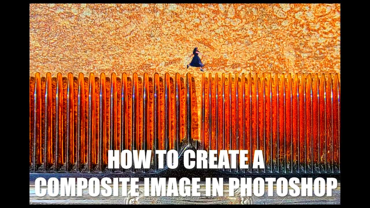
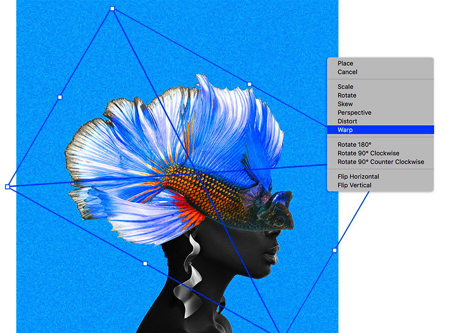
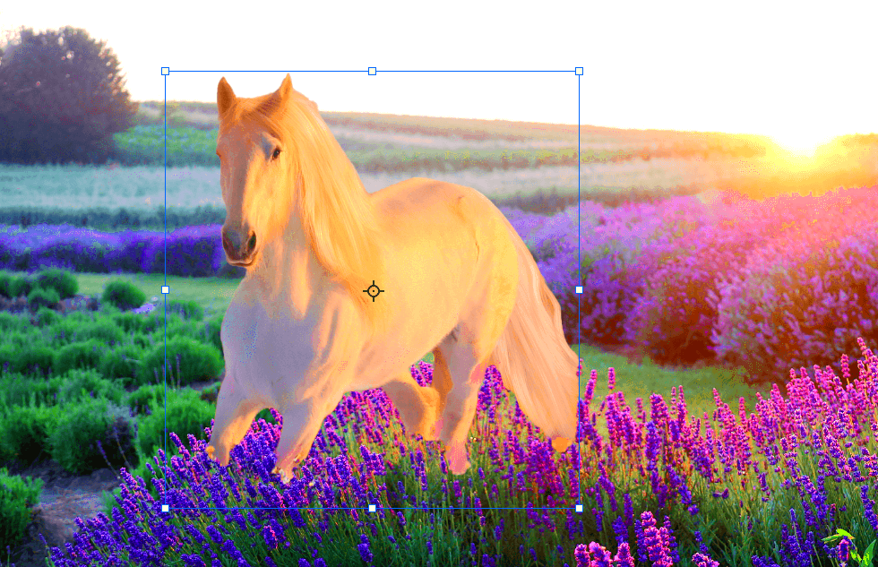
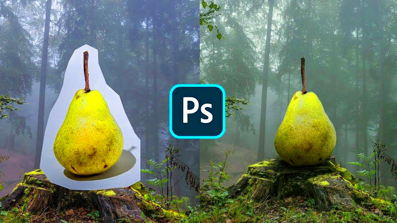
Composite images are a popular technique used in digital photography and graphic design. They involve combining multiple images or elements into one cohesive piece. This technique allows artists and designers to create visuals that might not be possible to capture in a single photograph. Whether you're looking to create surreal art, enhance product photography, or just blend different textures for a unique effect, composite images can bring your creative vision to life.
Some common uses of composite images include:
- Advertising: Brands often use composite images to showcase their products in imaginative ways.
- Film and video production: Special effects in movies are frequently created using composite images.
- Artistic projects: Artists use this technique to produce surreal or fantasy scenes.
- Architecture: Designers create realistic renderings of buildings by combining photographs and 3D models.
In essence, composite images provide endless creative possibilities. If you're just starting out, you’ll find that combining elements in Photoshop or GIMP can be both fun and rewarding.
Getting Started with Photoshop or GIMP

Before you begin creating composite images, it’s essential to familiarize yourself with the tools you'll be using. Photoshop and GIMP are two of the most popular photo-editing software programs for this task. While both programs offer similar features, there are differences in their user interfaces and functionalities.
Here’s a quick comparison of the two tools:
| Feature | Photoshop | GIMP |
|---|---|---|
| Price | Paid subscription | Free |
| User Interface | More polished and user-friendly | More basic and less intuitive |
| Tools | Advanced tools for professional use | Wide range of tools, but with fewer options for advanced users |
Regardless of which program you choose, the basic principles of creating composite images remain the same. The key steps include selecting your images, layering them, masking, blending, and making final adjustments to achieve a seamless result. If you're new to these tools, there are plenty of online tutorials to help you get up to speed quickly.
Also Read This: What to Wear for a LinkedIn Photo for Professional Success
Selecting the Right Images for Your Composite

The success of a composite image largely depends on the quality and compatibility of the images you choose to work with. Selecting the right images is the first step in creating a seamless and visually appealing composite.
Here are some key factors to consider when choosing images:
- Resolution: High-resolution images will ensure that your composite looks sharp and detailed. Low-resolution images may appear pixelated when resized or adjusted.
- Lighting: Choose images with similar lighting and shadows. If the light sources in your images don’t match, it can make the composite look artificial.
- Perspective: The angle at which the images are taken should align. Otherwise, the objects may appear out of place when combined.
- Color Scheme: Images with complementary colors or similar tones will blend more naturally. Avoid using images with clashing color schemes unless that’s the effect you want to achieve.
- Textures: Combining images with similar textures can make the final result look more cohesive.
Here’s an example of how different images can affect the final outcome:
- If you combine a bright, sunlit beach scene with a dark, rainy cityscape, it might look jarring.
- However, combining a foggy forest with a soft-lighted portrait can create a magical, dreamlike atmosphere.
By keeping these factors in mind, you'll be able to choose the best images for your composite project, making the blending process much smoother and more effective.
Also Read This: Print Alamy Downloads for High-Quality Results
Preparing Your Images for Composition

Before diving into the creative part of creating composite images, it's important to prepare your images properly. This step ensures that everything will blend smoothly when combined. Proper preparation helps avoid issues later on, such as mismatched proportions, awkward angles, or rough edges. You want your images to fit together as seamlessly as possible, and getting them ready beforehand can make all the difference.
Here are some key steps to follow when preparing your images:
- Crop and Resize: Ensure each image is cropped to the essential elements, removing any unnecessary background. Resize them to a consistent scale to avoid awkward proportions when layering.
- Remove Backgrounds: If you’re using images with a background that doesn’t fit, consider removing it using selection tools or the magic wand tool in Photoshop or GIMP. This will help isolate the subject and make blending easier.
- Align Images: Make sure your images are positioned according to their perspective. For example, if one image has a subject standing, while another has a subject sitting, it may not align well without adjusting their positioning.
- Sharpen and Adjust Focus: If an image is too soft, sharpen it to match the clarity of your other images. If an image is too sharp, consider softening it to blend better.
Once all images are prepared, it’s time to move on to layering them. The goal is to make each element fit perfectly within the overall composition. Taking your time at this stage will lead to smoother blending and a more polished final image.
Also Read This: The Best Editing Techniques for Portrait Photography
Layering and Masking Techniques
Now that your images are ready, it’s time to start layering and masking them. Layering is the process of stacking your images on top of each other, allowing you to control which parts are visible and which parts are hidden. Masking, on the other hand, is a technique that lets you hide or reveal specific portions of an image without permanently deleting anything. This is where the magic of composites truly happens!
Here are some tips for effective layering and masking:
- Work with Layers: In Photoshop or GIMP, each image you import will be placed on a separate layer. The layers stack on top of each other, and you can control their order by dragging them up or down. Make sure the important elements are on top.
- Use Layer Masks: Instead of erasing parts of your images, use a layer mask. This allows you to hide parts of an image by painting over them with black, while revealing areas with white. This gives you flexibility to adjust later on without losing any data.
- Refine Edges: When masking, ensure that the edges of your subject are smooth. If the edges look harsh or rough, use a soft brush tool to refine the mask, creating a more natural transition between images.
- Feathering: Feathering softens the edges of a selection or mask, making transitions between images appear less sharp and more organic. It’s especially useful when combining images with different lighting conditions.
By mastering layering and masking techniques, you'll be able to craft images that appear as if they were naturally photographed together, even if they were shot at different times or locations.
Also Read This: Do You Get to Keep Storyblocks Stock Footage After Downloading It
Color Correction and Blending Your Images
Color correction and blending are crucial steps in ensuring that all the images in your composite look like they belong together. Without proper color matching, your composite might feel disconnected or unnatural. Whether you’re working with Photoshop or GIMP, both programs offer powerful tools to adjust colors, match lighting, and blend images seamlessly.
Here’s how you can perfect the color and blending of your images:
- Adjust Brightness and Contrast: Start by adjusting the brightness and contrast of your images to create uniform lighting. If one image is too dark or too bright compared to the others, it will stand out awkwardly.
- Match Color Temperature: Pay attention to the warmth or coolness of your images. If one image has a yellowish hue and another has a blue tint, use the color balance or temperature adjustment tools to make them match. This creates a more cohesive overall look.
- Use Hue/Saturation Adjustments: Sometimes images might have slightly different color tones that need to be corrected. By adjusting the hue and saturation, you can make the colors in each image blend together more smoothly.
- Blend with Layer Modes: Experiment with different layer blending modes like “Multiply,” “Overlay,” or “Soft Light” to combine the images more naturally. These modes control how the layers interact with each other, giving you more flexibility when blending elements.
- Apply Gradient Maps: A gradient map can help create a uniform color tone across the entire image. It’s especially helpful when you want to make the images feel like they were taken in the same lighting conditions or environment.
By applying these color correction techniques, you’ll ensure that your images don’t look like they’ve been pieced together from various sources, but rather like they belong in the same scene. The final composite will have a much more professional and cohesive look.
Also Read This: Is VectorStock a Reliable Resource for Designers and Creatives
Final Touches and Enhancements
Once your composite image is almost complete, it's time to add the final touches that will make it truly stand out. This stage involves adding small details, adjusting subtle elements, and applying effects that enhance the overall look without overpowering the main elements. These enhancements can take your image from good to great, ensuring it looks polished and professional.
Here are some key final touches and enhancements you can apply to your composite:
- Shadows and Highlights: Adding subtle shadows and highlights can help integrate your images into one cohesive scene. Ensure that the lighting matches across all elements, and use soft brushes to add realistic shadows under objects or people.
- Vignetting: A vignette effect can help focus the viewer’s attention on the central subject by darkening the edges of the image. This is especially effective in portrait photography or dramatic composites.
- Noise and Texture: If your images have a smooth finish, you can add a slight noise or texture to make them look more cohesive. A little bit of grain can make the different elements feel like they belong together in the same setting.
- Sharpening: Apply a final sharpening pass to the image to enhance details. Be careful not to overdo it, as it could make the image look unnatural.
- Filters: Applying a filter can give your composite a unified look. Whether it’s a sepia tone, black and white, or a custom filter, this can help blend all the elements in the image together.
Final touches and enhancements help ensure that your composite image looks complete and professionally crafted. Take your time with these steps to achieve the best results.
Also Read This: How to Download a Specific Portion of a Dailymotion Video
Exporting Your Composite Image
After spending time creating and enhancing your composite, it's time to save and export your image. This is an important step, as the export settings can affect the quality of your final image, especially if you’re planning to use it for web or print purposes. Understanding the right format and settings for your specific use case will help preserve the quality of your work.
Here’s what you should consider when exporting your composite image:
- Choosing the Right File Format:
- JPEG: Ideal for web use or sharing on social media. It offers a good balance between quality and file size.
- PNG: Best for images that need transparency or higher quality with no loss of data.
- TIFF: Excellent for print quality, especially if you want to retain high-quality details with no compression.
- Resolution: For web images, a resolution of 72 DPI is typically sufficient, while for print, a resolution of 300 DPI is preferred. Adjust the resolution based on the intended use of your composite.
- Compression: If you're working with a large image, consider using a compression tool to reduce the file size without losing too much quality. This is especially important for web images to ensure faster loading times.
- Color Profile: If you plan to print your image, ensure you're using the right color profile (usually CMYK for print) to ensure the colors are accurate on paper.
Once you’ve set your export parameters, save the file, and you’re ready to share your composite image with the world!
Also Read This: How to Sell Your Pictures to Getty Images
FAQ
Creating composite images can be a complex process, so it's common to have questions along the way. Here are some frequently asked questions to help guide you through the process:
- What’s the difference between a layer mask and a regular mask?
A regular mask involves erasing parts of an image, while a layer mask allows you to hide parts of an image without permanently deleting them. You can always adjust or remove a layer mask, which gives you more flexibility when editing.
- Do I need a graphics tablet to make composites?
While a graphics tablet can make detailed work easier, it’s not necessary. A mouse or trackpad can work just fine for most tasks, especially when you’re starting out.
- Can I use low-resolution images for composites?
While it’s possible, using low-resolution images for composites can result in a blurry or pixelated final image. It's always best to work with high-resolution images, especially if you plan to print your work.
- How do I make sure the lighting in my composite matches?
Pay close attention to the light sources in each image. Adjust the exposure, contrast, and shadows to match the lighting conditions. You can also use adjustment layers in Photoshop or GIMP to fine-tune lighting in different areas of your composite.
- Can I use stock images in my composites?
Yes, you can use stock images in your composites, but always ensure you have the proper licensing to use them. Many stock websites offer images for commercial use, but check the licensing details to be sure.
If you have more questions, feel free to explore tutorials or join online communities where others share their composite image tips and experiences!
Conclusion
Creating composite images is an exciting and rewarding process that allows you to express your creativity and produce visually stunning artwork. From selecting the right images and preparing them for composition to mastering techniques like layering, masking, and color correction, each step plays a crucial role in achieving a seamless and professional result. By paying attention to the details, refining your images, and adding those final enhancements, you can take your composite work to the next level. Whether you’re working with Photoshop or GIMP, the skills you’ve learned here will serve as a solid foundation for future projects. Don’t be afraid to experiment, as practice is the key to mastering composite image creation. With these tools and techniques, you’re ready to start creating incredible composites that stand out and tell your unique visual story!


