Image wrapping is an essential design skill that helps to create visually engaging and well-organized layouts. In CSS, image wrapping allows you to position text around images in various ways, giving your content a professional and polished look. Wrapping text around images can also improve readability by creating a balanced visual flow. Whether you want to align text next to a portrait or create a magazine-style layout, CSS offers multiple ways to achieve this effect.
In this guide, we’ll explore popular CSS methods, including float, Flexbox, and Grid, that make image wrapping easier and more effective.
How to Use CSS Float for Image Wrapping
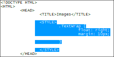
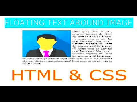
Using the float property is one of the simplest ways to wrap text around images in CSS. It positions elements to the left or right, allowing the content to flow around the image. Although float has been widely replaced by Flexbox and Grid for complex layouts, it remains useful for straightforward image wrapping.
Here’s how to use float for image wrapping:
- Apply float: left or float: right to the image to position it on the desired side.
- Use margin to add space between the text and the image, ensuring they don’t overlap.
- Clear the float after the content using the clear property to avoid layout issues.
Example:
img {
    float: left;
    margin: 10px;
}
This example will place the image on the left, allowing text to wrap on the right. Float is especially useful for smaller images that need a simple text wrap.
Exploring CSS Flexbox for Text and Image Alignment
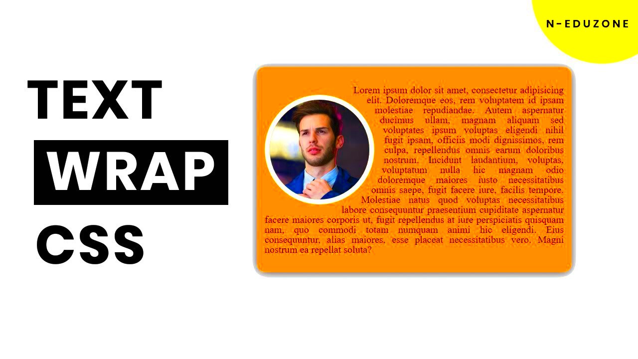
CSS Flexbox offers a powerful and flexible way to align text and images side by side. Unlike float, Flexbox provides more control over alignment and spacing, making it easier to create responsive designs that adapt to different screen sizes.
To use Flexbox for image wrapping:
- Wrap your image and text in a flex container by applying display: flex to the parent element.
- Use flex-direction: row to place them side by side.
- Adjust spacing with properties like gap or margin.
Example:
.container {
    display: flex;
    gap: 15px;
}
Flexbox not only allows images to wrap with text but also makes it easier to control the layout on various devices, ensuring consistency and ease of adjustment.
Using CSS Grid for Creative Layouts
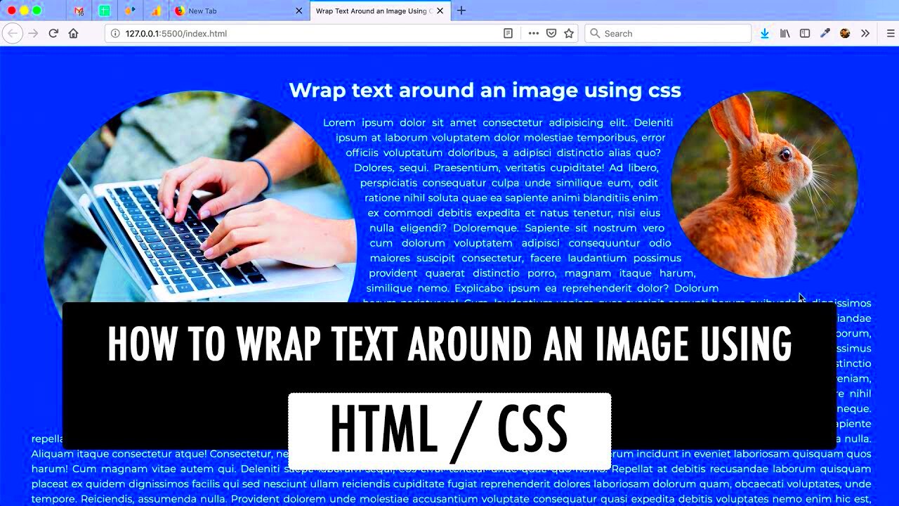
CSS Grid offers a more advanced way to create layouts, giving you control over both rows and columns. This makes it perfect for complex image and text layouts where you want precise placement. With Grid, you can position images and text exactly where you want, even overlapping elements or creating unique designs. It’s ideal for magazine-style layouts, photo galleries, and detailed website sections.
To set up a grid layout:
- Apply display: grid to the container element.
- Define columns and rows with grid-template-columns and grid-template-rows.
- Use grid-column and grid-row to position specific elements.
Example:
.container {
    display: grid;
    grid-template-columns: 1fr 2fr;
    grid-template-rows: auto;
    gap: 10px;
}
This example creates a two-column grid layout, where you could place an image in one column and wrap text in the other. With CSS Grid, you can mix images and text creatively, building layouts that are visually engaging and functional.
Advanced Techniques for Image and Text Wrapping
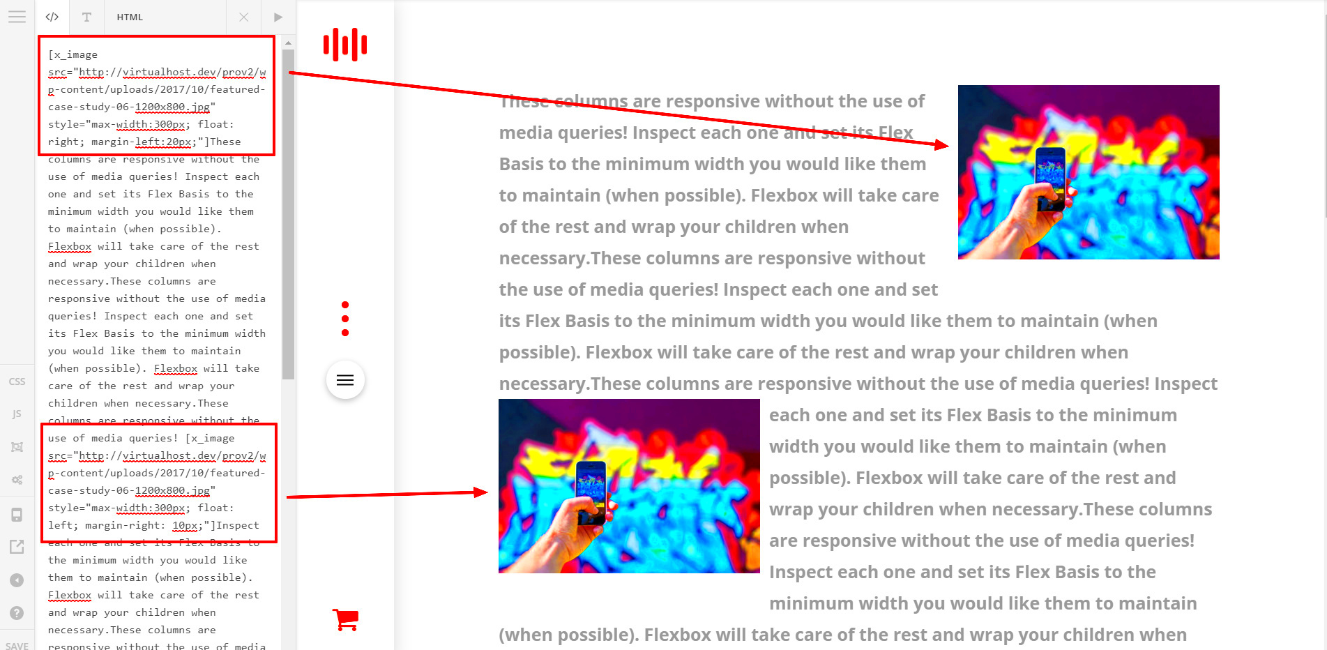
For more refined control over image and text placement, CSS offers additional properties beyond float, Flexbox, and Grid. These advanced techniques help in creating dynamic, unique designs that go beyond simple text wrapping.
- Shape-Outside: Allows text to wrap around images in custom shapes. You can use shapes like circles, ellipses, and polygons, offering a unique visual appeal.
- Clip-Path: Lets you create complex shapes and allows images to blend creatively with text by clipping parts of an image.
- Z-Index: Controls the stacking order, allowing you to layer images and text effectively.
Example: Wrap text around a circular image:
img {
    float: left;
    shape-outside: circle(50%);
    margin: 10px;
}
These advanced techniques add a touch of creativity, enabling you to design layouts that stand out and capture attention.
Best Practices for Responsive Image Wrapping
Ensuring your image and text layouts look good on all devices is crucial. Responsive image wrapping allows your design to adapt across screen sizes, from large desktops to mobile phones. Following these best practices can help maintain consistency and readability.
- Use % or vw for Widths: Set image widths in percentages or viewport units instead of fixed pixels for flexible resizing.
- Apply Media Queries: Adjust layout for different screen sizes. For example, stack images and text vertically on smaller screens.
- Avoid Fixed Heights: Let content adjust naturally to avoid overflow or clipping issues.
- Test on Multiple Devices: Check layouts on various screen sizes to ensure everything looks balanced.
Responsive design is about making sure that your layouts remain user-friendly and visually appealing, regardless of the device.
Common Issues and How to Fix Image Wrapping
While image wrapping is a great way to enhance layout design, it can sometimes lead to challenges. Issues such as text overlapping, inconsistent spacing, or responsive design problems are common. Understanding these problems and knowing how to fix them can make a big difference in your layout.
Here are some typical issues and solutions:
- Text Overlapping Images: This often happens when there isn’t enough spacing between the image and text. To fix it, add margin around the image to create breathing room.
- Images Not Aligning Properly: If images are misaligned, check the float and text-align properties. Using Flexbox or Grid can also offer better control over alignment.
- Responsiveness Issues: If the layout looks off on different screen sizes, use media queries to adjust the layout for smaller devices. Setting widths in percentages rather than pixels can also improve flexibility.
- Floating Elements Breaking Layout: Unclosed floats can cause layout shifts. Use clear: both on elements following a float to stabilize the layout.
By addressing these issues, you can ensure a more polished and reliable design that looks great on any device.
FAQs for Image Wrapping in CSS
Here are some frequently asked questions about image wrapping in CSS:
- What is the best way to wrap text around images?
The float property is simple for basic wrapping, but Flexbox and Grid provide more control and flexibility for complex layouts.
- How do I prevent text from touching the image?
Add margin around the image to create space between the text and image.
- How can I make image wrapping responsive?
Use media queries to adjust the layout for various screen sizes and use relative units like percentages for image widths.
- Can I wrap text in a custom shape?
Yes, with shape-outside, you can create custom text wrapping shapes like circles or polygons around images.
Conclusion on Creating Stylish Layouts
Wrapping text around images with CSS can add a professional touch to any website, making layouts visually appealing and easier to navigate. By mastering CSS properties like float, Flexbox, and Grid, you can create flexible, responsive designs that look great on any device. For advanced layouts, properties like shape-outside and clip-path allow for creative, unique designs.
Whether you’re designing a blog post or a portfolio, using CSS effectively can help you craft stylish, engaging layouts that draw in readers. By addressing common issues and following best practices, you’ll be well-equipped to create designs that stand out.
 admin
admin