Have you ever wondered what makes YouTube not just a platform for videos, but a recognizable brand? One huge factor in its identity is the font it uses. Fonts aren't just random styles; they communicate feelings and reliability. In this blog post, we're going to dive into the font that YouTube uses in its design and how it integrates into the overall aesthetic and functionality of the platform. Let's explore what font
Overview of YouTube's Design Philosophy
YouTube's design philosophy is built around simplicity, accessibility, and user engagement. The platform aims to provide an inviting and straightforward interface for users of all ages and backgrounds. Typography plays a critical role in this design philosophy, working hand-in-hand with elements like color, layout, and imagery. Let’s break down some key aspects:
- Simplicity: YouTube embraces a clean and uncluttered design, ensuring users can focus on content. The font choices complement this by maintaining legibility and clarity, making it easy for viewers to read titles, descriptions, and comments.
- Consistency: Uniformity in design creates a seamless experience for users. YouTube’s font is consistently applied across the platform, helping to build brand recognition. This consistency extends to the mobile app, desktop site, and even promotional materials.
- Accessibility: A primary goal of YouTube’s design is to cater to a global audience. The font used is easily readable, accommodating various languages and scripts. This focus on inclusivity ensures that everyone, regardless of their native language, can engage with the content.
- User Engagement: The choice of font also impacts how engaging a platform feels. A welcoming, modern font encourages users to explore more content and spend time on the site, enhancing their overall experience.
In essence, YouTube’s design philosophy emphasizes a user-first approach that seeks to provide an enjoyable and accessible environment. The way typography is utilized reflects these core principles, making the platform both functional and approachable.
The Main Font Used by YouTube
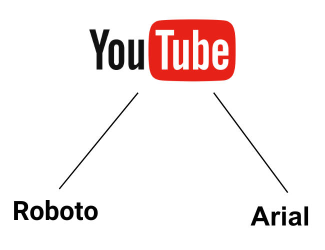
YouTube’s main font is called "Roboto." This versatile typeface was designed by Google and has become a staple across many of its platforms. Roboto is known for its clean and modern look, making it perfect for a platform that is all about sleek, user-friendly design.
What makes Roboto particularly appealing is its wide range of weights and styles. It offers everything from light and thin to bold and black options. This versatility allows YouTube to maintain a consistent aesthetic while also providing enough variety to emphasize different content. For example:
- Titles: Usually set in a bolder weight to grab attention.
- Descriptions: Typically in a lighter weight for easy readability.
- Subtitles: Often use regular weight to ensure clarity during viewing.
The choice of Roboto aligns well with YouTube’s overall design philosophy: functionality meets aesthetics. By using a font that is both readable and stylish, YouTube enhances user experience and keeps viewers engaged. Plus, Roboto functions well across various screen sizes, making it perfect for mobile and desktop use alike. This attention to detail ensures that no matter where you’re watching, the text remains clear and accessible.
History of YouTube's Typography Choices
The journey of YouTube's typography choices reflects the platform’s evolution over the years. When YouTube first launched in 2005, it used the "Arial" font. This was a straightforward choice, as Arial was widely available and easily readable. However, as the platform grew, so did its need for a more distinctive identity.
In 2011, YouTube introduced a redesign that incorporated "Proxima Nova," a modern sans-serif typeface. This move was part of a broader effort to create a more user-friendly interface as video consumption skyrocketed. Proxima Nova offered a fresher, more contemporary look:
- Enhanced Readability: It provided clearer distinctions between different text elements.
- Visual Appeal: Offered a more stylish appearance matching the evolving video content.
In 2015, YouTube made another significant change, adopting the "Roboto" font that we see today. This was in alignment with Google’s broader branding strategy. Roboto embodies the idea that good design should be both beautiful and functional, making it a perfect fit for YouTube as it continues to grow and adapt to new challenges and audiences.
Impact of Font on User Experience
When we think about user experience, we often focus on navigation, layout, and content. However, the *font used in a platform can profoundly impact how users interact with it. On YouTube, the font choice contributes to the overall feel of the site, affecting readability, brand identity, and even emotional connection.
Fonts are more than just a pretty typeface; they can significantly influence how content is perceived. For instance, YouTube employs a typography that is clear and easily readable across various devices. Here’s how font impacts user experience:
- Readability: A clean font enhances readability, especially for mobile users who often navigate quickly. YouTube’s choice keeps viewers engaged without straining their eyes.
- Brand Recognition: The unique font style also aids in reinforcing YouTube's brand identity. When users see the distinct typeface, they instantly associate it with the platform.
- Emotional Response: Fonts can evoke feelings. A sleek, modern font can create a sense of trust and innovation, encouraging users to explore content and create videos.
- User Engagement: Well-chosen fonts can guide users through content seamlessly, making it easier for them to find what they want to watch, which directly impacts engagement rates.
In summary, the font on YouTube isn’t just an aesthetic choice; it plays a pivotal role in crafting a satisfying user experience that keeps viewers returning for more.
Comparing YouTube's Font to Other Major Platforms
YouTube’s choice in typography sets it apart from other major platforms. While many sites share similar stylistic choices, YouTube’s font has unique characteristics that tailor to its audience and content style. Let’s dive deeper into how it compares with platforms like Facebook, Twitter, and Instagram.
| Platform | Font Used | Characteristics |
|---|---|---|
| YouTube | Roboto & Arial | Modern, clean, and easy to read. |
| Helvetica | Slightly more formal, focuses on clarity. | |
| Helvetica Neue | Simple, streamlined, designed for brevity. | |
| Billabong & Helvetica | Stylish, playful, focusing on elegance. |
As you can see, while there's some overlap among these platforms, YouTube distinctly targets a diverse audience with a mix of user-generated content. The Robusto and Arial fonts are modern and emphasize readability across varied backgrounds, a crucial factor in a world filled with multimedia content. In contrast, you’ll find Facebook and Twitter lean towards more formal, clean, and concise fonts, while Instagram opts for a stylistic approach. Each font is crafted with its platform's purpose and audience in mind, making the choice of typography integral to the user experience.
What Font Does YouTube Use for Its Design
YouTube is one of the most popular video-sharing platforms globally, and its design plays a significant role in user experience. One key element of its design is the typography it employs. Understanding the fonts used on YouTube can enhance your own design projects or brand strategies. Below, we explore the main fonts used by YouTube and their characteristics.
The primary font used by YouTube is Roboto, a modern sans-serif typeface developed by Google. Roboto was designed to be versatile and approachable, making it an ideal choice for a user-friendly platform like YouTube.
Font Characteristics:
- Style: Sans-serif
- Weight: Available in multiple weights (Thin, Light, Regular, Medium, Bold, Black)
- Readability: Highly readable across various screen sizes
- Usage: Primarily used for body text, buttons, and notifications
In addition to Roboto, YouTube utilizes a custom font for its logo called YouTube Sans*. This font is characterized by its bold, modern letterforms and is designed to create a strong brand presence.
Comparison Table:
| Font Name | Type | Usage |
|---|---|---|
| Roboto | Sans-serif | Body text, interface elements |
| YouTube Sans | Custom Typeface | Logo and branding |
In summary, YouTube’s choice of typography—primarily Roboto for readability and YouTube Sans for branding—plays a crucial role in both functionality and visual identity, making it a quintessential part of its overall design strategy.
 admin
admin