Cost of health care can never be fully managed without health insurance as it plays an important role in this process. This type of payment plan covers all medical expenses so that patients don’t have to pay exorbitant fees for the services they receive. It is important to learn some basic information about health insurance so that one is able to choose wisely when selecting their package.
The fundamental concept behind health insurance is risk sharing. Here is a straightforward explanation of its operation:
- Premiums: This is the amount you pay regularly to keep your insurance active.
- Deductibles: The money you pay out of pocket before your insurance starts to cover expenses.
- Copayments: A fixed amount you pay for specific services, like doctor visits or prescriptions.
- Out-of-pocket maximum: The highest amount you would pay in a year before insurance covers 100% of costs.
Importance of Visualizing Health Insurance

Understanding complex data is made easier for individuals through the visualization of health insurance ideas. Pictures, charts and infographics can simplify difficult concepts making them more understandable. Here is why visualization really matters:
- Enhances Understanding: Visuals simplify complex information.
- Engages Audiences: Eye-catching images attract attention and maintain interest.
- Supports Memory: People often remember visual information better than text.
Employers can enhance understanding and build stronger bonds with customers by harnessing the potency of visuals.
Key Components of Health Insurance Policies

Health insurance can be complicated, containing numerous components that dictate both coverage and costs. Knowing these main factors can help in choosing a plan that meets an individual’s needs:
| Component |
Description |
| Coverage: |
Refers to the medical services and treatments included in the policy. |
| Network: |
Providers and hospitals that have agreements with the insurance company. |
| Exclusions: |
Specific services or conditions that are not covered by the plan. |
| Lifetime Limit: |
The maximum amount the insurer will pay for covered services during your lifetime. |
The ability of consumers to assess policies properly and select the most appropriate coverage for their health care requirements is facilitated by knowledge in these constituents.
Challenges in Health Insurance Visualization
The following are common difficulties encountered in health insurance visualization:
- Complex Terminology: Health insurance involves a lot of jargon that may confuse consumers. Terms like "deductible," "coinsurance," and "network" can make visuals harder to comprehend.
- Diverse Audiences: Different people have varying levels of understanding about health insurance. A one-size-fits-all approach may not work, as some may need simpler visuals while others may prefer more detailed information.
- Data Overload: Presenting too much information in one visual can overwhelm the audience. Finding the right balance between clarity and comprehensiveness is key.
- Misleading Representations: If visuals are not accurate or clear, they can lead to misunderstandings about what is covered or how much something will cost.
To solve these issues, health insurance visualization should be improved so that people can make informed choices.
Effective Images for Communicating Health Insurance
Dad’s body or his being in a state of death has become an empty shell without a soul. Thus, similar to death, the absence of life is also understood as a mark of a man’s decline and gets related with poverty and difficulty. The suggestion is that if there had been any life left in him at all, it was in his heart while he was still in debt.
In fact even while paying off a loan within one’s means to live the person continues to lose weight and wastes away to nothing much more than skin-and-bones; more so when unpaid bills begin crushing someone down through financial emaciation into oblivion like those who suffer shipwrecks and drown in deep waters after being thrown overboard by pirates or robbers.
In communicating health insurance, every little detail counts, including the visuals used. Visuals need to be able to break down complex ideas and increase comprehension rates among the stakeholders involved within a certain program on how to relate with health services offered today. When making use of such
images, these are some things you should keep in mind:
- Infographics: These combine visuals and text to present data clearly. They can explain processes like claims or how to choose a plan.
- Charts and Graphs: Use these to show comparisons, such as costs or coverage levels across different plans.
- Icons and Symbols: Simple icons can represent services, making it easier to identify coverage options quickly.
- Illustrations: Use relatable images to depict scenarios like visiting a doctor or filling a prescription, helping to humanize the information.
Thus, companies can greatly enhance their communication approaches and enable customers to comprehend their choices more efficiently utilizing these potent classifications of
images.
Case Studies of Successful Visualization
Learning from successful examples can provide valuable insights into how to effectively visualize health insurance. Here are a few case studies that highlight the impact of good visualization:
- Blue Cross Blue Shield: They developed an interactive infographic that breaks down insurance terms and processes. Users can hover over elements to learn more, making complex information accessible.
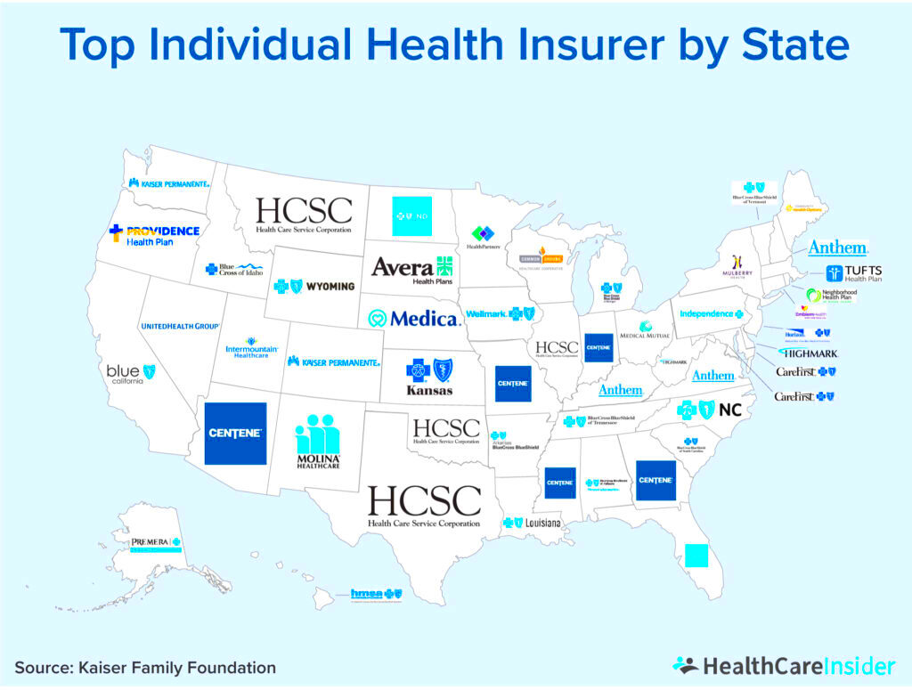
- Kaiser Permanente: Their health education materials use colorful charts to illustrate the cost-sharing structure of their plans. This helps members understand their out-of-pocket expenses clearly.
- Medicare: The Medicare website features a user-friendly tool that allows users to compare different plans visually. It uses side-by-side comparisons to highlight coverage differences, making it easier to choose the right plan.
Such instances exemplify that visualising via thoughts will lead to more informed health insurance decisions by facilitating comprehension and involvement.
Using Giphy for Health Insurance Education
In our era of technology, it is very crucial to have content that is both interesting and informative when it comes to teaching about health insurance. One tool that has become quite popular in this regard is Giphy.
This platform provides an extensive selection of animated GIFs which can effectively explain intricate ideas through humor and simplicity. And so, let’s see how Giphy can improve the process of learning about health insurance.
Here are some useful ways to utilize Giphy wisely:
- Simplifying Concepts: Use GIFs to break down complicated ideas, such as how deductibles work or the benefits of preventive care. Animation can help clarify these concepts in a light-hearted manner.
- Creating Engagement: GIFs can capture attention better than static images. They can be used in social media posts or educational emails to engage audiences and encourage them to learn more.
- Enhancing Presentations: Incorporating GIFs into presentations can keep the audience interested. Instead of lengthy explanations, a quick GIF can illustrate a point effectively.
- Fostering Shareability: GIFs are easily shareable across platforms, making it simple for users to spread knowledge about health insurance topics within their networks.
When using Giphy in educating about health insurance, it makes the learning process interesting and memorable and eventually enables individuals to take informed decisions.
Frequently Asked Questions about Health Insurance Visualization
Nazlin could provide information on a number of different aspects related to health insurance, depending on the perspective of the individual who is in need of such insurance. These are some general questions that most people ask frequently:
| Question |
Answer |
| What is health insurance visualization? |
It involves using images, infographics, and other visual tools to explain health insurance concepts clearly and effectively. |
| Why is visualization important in health insurance? |
It helps people understand complex information, making it easier to make informed decisions about their coverage options. |
| What types of visuals work best? |
Infographics, charts, GIFs, and clear icons are all effective for conveying information simply and engagingly. |
| Can visuals be misleading? |
Yes, if not designed accurately, visuals can lead to misunderstandings about coverage or costs. It's essential to ensure clarity and accuracy. |
Conclusion on Visualizing Health Insurance in the USA
Articulating health insurance is not about mere aesthetics through
images but rather about tasking oneself with understanding and making informed decisions. The increasing intricacy of healthcare settings calls for effective communication strategies. A mixture of visuals such as infographics, and GIFs can be used to deconstruct the barriers thus easing access to health insurance.
Slowly but surely, the significance of visual clarity in health insurance has become a topic for discussion among professionals. They help to clarify what seem to be obscure issues in order for a wider audience base to be involved in them, which will eventually result in improved health standards.
Henceforth, it is essential to use newfangled devices and methods as a means of cultivating an intelligent citizenry that can safely choose their insurance related to health issues.
 admin
admin