YouTube’s design aesthetic plays a crucial role in how users interact with the platform. From the sleek layout to the vibrant thumbnails, every element is strategically chosen to create a visually appealing experience. But what about the fonts? The typography used on YouTube is not just about being readable; it reflects the platform's personality and purpose. In this post, we’ll dive into how these font choices enhance user engagement and contribute to
The Importance of Typography in Digital Platforms
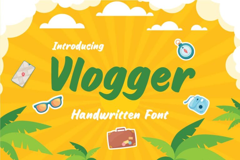
Typography is more than just letters on a screen; it’s the voice of your brand. On platforms like YouTube, where millions of videos are uploaded daily, effective typography helps in:
- Enhancing Readability: Users skim through content quickly. A well-chosen font can make titles and descriptions easy to digest, ensuring that the main message or hook grabs attention.
- Creating Brand Identity: Fonts carry character. YouTube’s choice of sans-serif fonts conveys a modern, approachable feel, aligning with its image as a platform for all creators.
- Improving User Experience: Consistency in typography across the platform helps users navigate smoothly. The fonts used in buttons, titles, and captions all contribute to a cohesive experience.
Furthermore, the emotional impact of typography shouldn’t be underestimated. For instance, using bold fonts in thumbnails can evoke excitement and urgency, prompting users to click. On the other hand, softer fonts can create a sense of calm, suitable for educational content.
To illustrate, let’s consider a few popular YouTube channels and their font choices:
| Channel Name | Font Style | Effect |
|---|---|---|
| Tasty | Bold Sans-Serif | Conveys fun and energy, attracting viewers to cooking videos. |
| Vsauce | Clean Serif | Highlights a scholarly vibe, appealing to audiences interested in science. |
| NikkieTutorials | Stylized Script | Creates a personal touch, suggesting beauty and creativity. |
In summary, typography on digital platforms like YouTube is vital. It not only affects readability and navigation but also shapes brand identity and emotional connections. As YouTube continues to evolve, its font choices will undoubtedly play a key role in how users perceive and interact with content on the site.
Also Read This: Switching YouTube Accounts on Your Browser: Troubleshooting Login Problems
3. Overview of YouTube's Font Selection
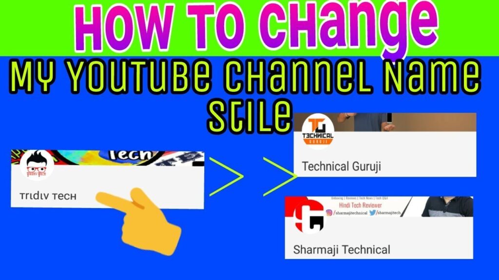
YouTube's font selection is an integral part of its brand identity and overall user experience. When you think about YouTube, what comes to mind? The vibrant videos, the engaging content, and yes, the clean and modern typography that ties everything together! The fonts chosen for the platform play a significant role in making the experience intuitive and visually appealing.
The primary font used across YouTube is Roboto, a sans-serif typeface designed by Google. Why Roboto? Well, it’s all about functionality and aesthetics. Here are a few reasons why Roboto fits so perfectly into YouTube's design:
- Readability: Roboto features a geometric yet friendly style, making it easy to read on various devices, from smartphones to desktops.
- Versatility: The font comes in multiple weights (light, regular, bold), allowing for a hierarchy of information that guides viewers through the content effortlessly.
- Modern Appeal: Its clean lines and contemporary feel resonate well with YouTube’s youthful audience, making it a natural fit for a platform that thrives on innovation and creativity.
In addition to Roboto, YouTube occasionally uses Arial and Helvetica for specific purposes, such as captions and on-screen texts. These fonts maintain the same spirit of clarity and simplicity, ensuring the overall experience is cohesive. YouTube also adapts its font choices based on various user interfaces; for example, the mobile app may use slightly different sizes or weights to optimize viewing on smaller screens.
Overall, YouTube's font selection is a calculated blend of functionality and style, contributing significantly to its user-friendly design. By choosing fonts that enhance readability and align with their brand, YouTube ensures that viewers can focus on what truly matters: the content!
Also Read This: How to Paste a Link in YouTube Comments for Easy Sharing
4. Analysis of YouTube's Custom Fonts
When we dive deeper into YouTube's custom fonts, we discover that they are not just about aesthetics; they serve a purpose in creating a unique identity for the brand. The platform has made some interesting font decisions, especially in the context of branding and marketing campaigns. For instance, during special events or promotions, YouTube often employs custom fonts that deviate from the standard Roboto to create a sense of excitement and urgency.
One notable example is the use of bold and playful typography during YouTube’s annual YouTube Rewind series. For these videos, the platform has utilized custom-designed fonts that are vibrant and colorful, reflecting the creativity of the content creators featured in the series. This not only captures attention but also sets a celebratory tone.
Furthermore, YouTube has embraced a more dynamic approach to font use in their logos and promotional materials. For example, the YouTube Shorts feature has its own distinct font styling that conveys speed and fun, aimed at attracting a younger demographic. This custom font is more whimsical, often incorporating playful elements that resonate with viewers looking for quick entertainment.
Here's a quick breakdown:
| Feature | Standard Use | Custom Use |
|---|---|---|
| Type of Font | Roboto | Dynamic, Playful Fonts |
| Context | General Interface | Special Promotions and Events |
| Target Audience | General Users | Younger Demographic and Creators |
In conclusion, YouTube's custom fonts reflect its commitment to innovation and community engagement. By utilizing diverse font choices, the platform not only reinforces its brand identity but also enhances user experience, making each visitor feel at home while exploring new content. Whether you’re watching a DIY tutorial or a high-energy vlog, the thoughtfulness behind the font choice is just one of the many elements that makes YouTube a platform like no other!
Also Read This: Did Kwite Quit YouTube? Analyzing Kwite’s Absence from YouTube and Future Plans
5. Impact of Font on User Experience
When it comes to design, often the font choice is overlooked, but it plays a crucial role in shaping user experience. Fonts can evoke emotions, influence readability, and even impact how users engage with content. On YouTube, the right font can make the difference between a viewer feeling at home on the platform or feeling disoriented.
The font YouTube employs, Roboto, was selected for its clarity and modern aesthetic. Its clean lines enhance readability, ensuring users can quickly scan titles and descriptions without straining their eyes. In a world where attention spans are dwindling, this is essential. Imagine trying to read a video title that’s in an ornate, hard-to-read font; you’re more likely to click away!
Here are a few ways that font impacts user experience:
- Readability: The simpler and clearer the font, the easier it is for users to absorb information. Roboto is designed for legibility, working well at multiple sizes.
- Brand Identity: Fonts contribute to a platform's overall branding. YouTube's choice reinforces its identity as a user-friendly and accessible platform.
- Emotional Response: The right font can evoke feelings of trust and familiarity. When users see the familiar Roboto typeface, they feel a sense of comfort.
- Consistency: A consistent font style throughout the platform fosters a cohesive experience, making navigation intuitive.
Moreover, YouTube's font choice isn’t just about aesthetics; it's about functionality. In live chats, comment sections, and video descriptions, a good font ensures that communication is clear. This usability directly affects user satisfaction and retention. When users can effortlessly engage with content, they are more likely to return.
Also Read This: How to Fast Forward on YouTube TV and Skip Through Commercials or Long Scenes
6. Comparing YouTube's Fonts to Other Platforms
It’s fascinating to compare YouTube's font choices with those of other major platforms. Each site has unique needs and target audiences, which influences their design choices significantly. Here’s how YouTube’s font, Roboto, stacks up against some popular alternatives:
| Platform | Font Used | Key Attributes |
|---|---|---|
| YouTube | Roboto | Modern, clean, highly readable |
| Helvetica Neue | Versatile, friendly, widely used | |
| Helvetica | Simple, elegant, professional | |
| Billabong & Custom Fonts | Stylish, trendy, artistic |
While Roboto is designed for a digital environment focused on legibility, other platforms prioritize different attributes. For instance, Instagram uses a more stylized font to appeal to a creative audience, while Facebook sticks with a classic option that feels familiar to a wider demographic.
This comparison highlights how YouTube’s font choice is tailored to its unique user experience. By prioritizing readability and a clean aesthetic, YouTube ensures that its vast array of content remains accessible and engaging. Ultimately, the choice of font isn't just a matter of preference; it’s a strategic decision that shapes how users interact with the platform.
Also Read This: Is Temu Legit on YouTube? What You Need to Consider
7. How to Apply YouTube's Font Style in Your Projects
If you’re looking to incorporate YouTube’s distinctive font style into your own projects, you're in luck! It’s not just about aesthetics; it’s about evoking a certain vibe that resonates with audiences. Here’s how you can effectively apply YouTube’s font style:
1. Choose the Right Font: YouTube primarily uses Roboto and Arial for its interface. Roboto is known for its clean, modern look, making it perfect for digital platforms. To get started, you can download Roboto from Google Fonts and integrate it into your design.
2. Color Palette Matters: YouTube’s color palette features a vibrant red (#FF0000) and classic black (#000000). Use these colors strategically to highlight text and create contrast. For example, using red for headings or calls to action can draw attention.
3. Maintain Readability: Typography isn’t just about looking good; it’s also about ensuring that your content is easy to read. Stick to a font size of at least 16px for body text, as smaller sizes can strain the eyes. YouTube’s interface uses size variations effectively, so consider using larger fonts for headings and smaller ones for details.
4. Leverage White Space: YouTube’s design is spacious and uncluttered. Embrace white space to allow your text and elements to breathe. This not only enhances readability but also gives your project a polished, professional feel.
5. Test Across Devices: Remember, YouTube is a platform accessed on multiple devices. Before finalizing your design, test it on mobile, tablet, and desktop to ensure that the font style remains consistent and legible across different screen sizes.
By following these tips, you can capture the essence of YouTube’s font style while adding your unique twist. Whether you’re designing a website, app, or even promotional materials, these approaches will help you connect with your audience in a familiar yet fresh way.
8. Conclusion: The Role of Typography in Brand Identity
Typography is more than just letters on a page; it’s a crucial element of your brand identity. When you think about YouTube, what comes to mind? The iconic red play button, right? But equally powerful is its typography. Let’s explore why typography matters:
1. First Impressions Count: The font you choose creates an immediate impression of your brand. YouTube’s clean and modern typography conveys trustworthiness and accessibility. If your project’s typography fails to resonate, your audience might disengage before they even read a word.
2. Consistency is Key: Just like YouTube maintains its typography across all platforms, consistency in your typography builds familiarity. This helps users feel comfortable with your brand, fostering loyalty over time.
3. Emotional Connection: Fonts can evoke emotions. For example, a bold font may convey strength, while a script font can communicate elegance. YouTube’s choice of sans-serif fonts gives a friendly and approachable vibe, making viewers feel at home. Identify the emotion you want your brand to evoke and choose your typography accordingly.
4. Enhances User Experience: Good typography improves usability. It guides users through your content seamlessly. YouTube’s well-structured typography ensures that viewers can easily navigate their platform, enhancing the overall experience.
In conclusion, typography plays a vital role in shaping brand identity. By thoughtfully applying font styles that resonate with your audience and align with your brand values, you can create a lasting impression. So, whether you’re launching a YouTube channel or developing a website, make sure to give typography the attention it deserves!
 admin
admin