Behance is a powerful platform that allows creatives to showcase their work, connect with other artists, and even land new clients or job opportunities. However, one key element of your Behance portfolio that can make or break your presentation is the cover image you choose. The cover image is the first visual element viewers see, and it sets the stage for how they perceive your entire project. Understanding the right cover size and effective presentation techniques is crucial to making a strong first impression. Let’s dive into what makes
Importance of Optimizing Cover Images
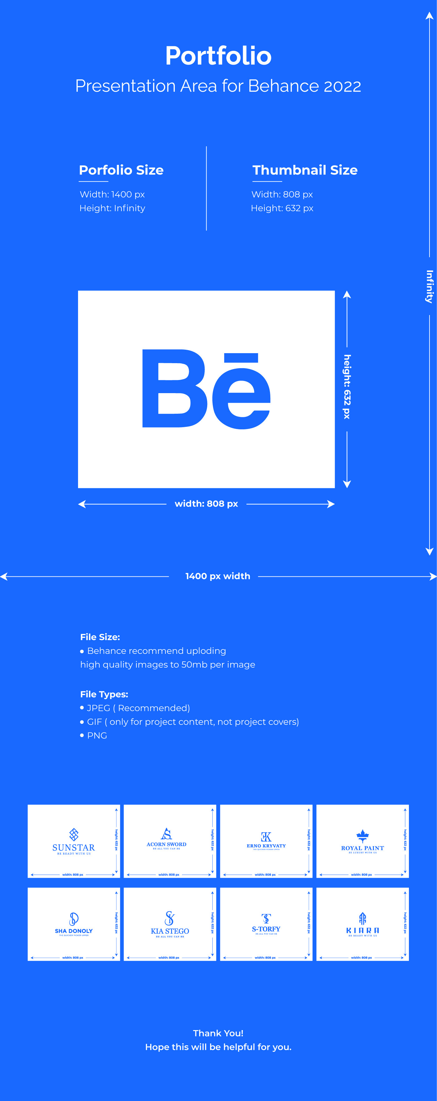
Have you ever heard the saying, "You never get a second chance to make a first impression"? This rings especially true in the digital world, where attention spans are short, and visual appeal is key. Your Behance cover image is like the front door to your portfolio—it needs to be inviting and representative of your style. Here’s why optimizing cover images is a must:
- Visual Impact: A well-designed cover can grab attention in a crowded marketplace, encouraging viewers to click on your project. Using high-quality images that relate to your work can create an emotional connection with your audience.
- Brand Representation: Your cover image is an opportunity to showcase your personal brand. Choose colors, fonts, and graphics that align with your overall aesthetic and message. This visual consistency helps create a recognizable identity.
- Professionalism: A blurry, incorrectly sized cover can scream "amateur hour." Ensuring that your cover is properly sized and high-quality shows that you take your work seriously and care about how it's presented.
- SEO Benefits: Optimized images can also enhance your visibility. Using appropriate ALT tags and descriptions will not only help with accessibility but can also improve your portfolio's search engine ranking.
In summary, optimizing your Behance cover images is more than just a technical requirement; it's an essential part of how you present yourself as a creative professional. Take the time to choose and size your cover image wisely to make the most of every portfolio visitor's experience.
Also Read This: Discover Unique Branding Ideas and Inspiration with VectorStock
Recommended Dimensions for Behance Covers
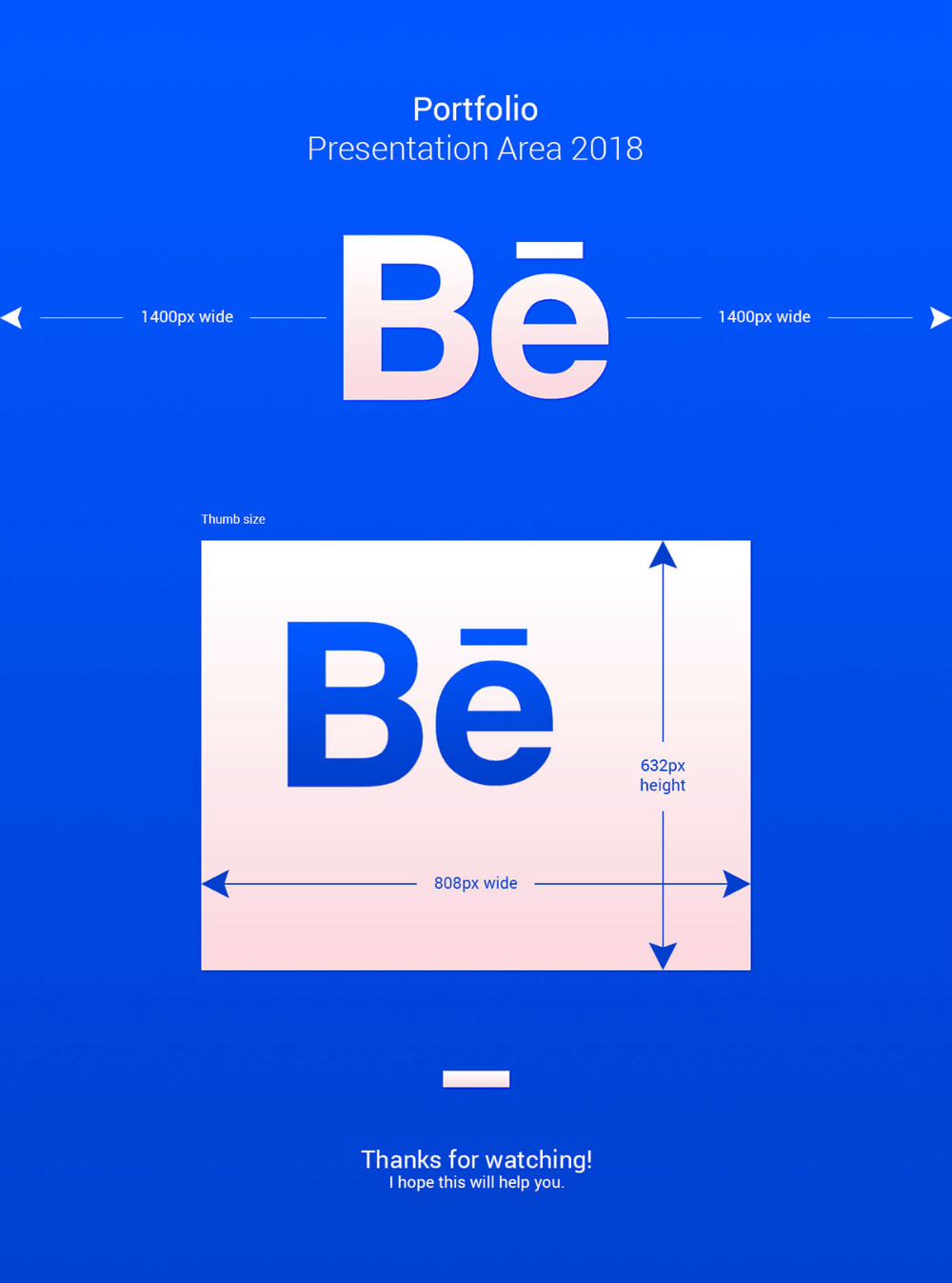
When it comes to making a strong first impression on Behance, the size of your cover image can make all the difference. The recommended dimensions play a crucial role in how your portfolio is displayed, ensuring that your creativity shines through without any awkward cropping or distortion.
The preferred size for your Behance cover image is 4048 pixels wide by 2306 pixels tall. This size is designed to maintain a good balance of resolution and visual impact, helping to showcase your work beautifully.
Here’s a quick overview of the recommended dimensions:
| Cover Image Size | Width (pixels) | Height (pixels) |
|---|---|---|
| Recommended | 4048 | 2306 |
| Minimum | 1400 | 700 |
While you can technically upload images with different dimensions, sticking to these guidelines will ensure your covers look sharp and professional. Keep in mind that Behance is a highly visual platform, and having a well-prepared cover image can attract more viewers to your projects, ultimately showcasing your work in the best light.
Also Read This: Follow This Simple Way to Save Tiktok Video Without Watermark on iPhone
Tips for Creating Eye-Catching Cover Images
Creating an eye-catching cover image for your Behance portfolio is about more than just dimensions; it’s about encapsulating the essence of your work. Here are some effective tips to help you craft compelling cover images that will undoubtedly grab attention:
- Use High-Quality Images: Always start with high-resolution images to ensure your cover doesn't look blurry or pixelated.
- Keep it Simple: Less is often more! A clean and minimalistic design can sometimes be more impactful than a cluttered one.
- Incorporate Your Branding: If you have a personal logo or a distinctive color scheme, include it in your cover to reinforce your brand identity.
- Focus on Composition: Utilize principles of design, such as the rule of thirds, to create a harmonious layout that guides the viewer’s eye.
- Experiment with Text: If adding text, make it concise. Use bold typography that complements your imagery.
- Utilize Color Theory: Vibrant colors can evoke emotions and attract attention. Choose a palette that resonates with your work.
Ultimately, your cover image is your chance to captivate potential clients and collaborators. Don't hesitate to play around with different styles until you find the one that reflects your artistic voice while adhering to the recommended specifications. Happy designing!
Also Read This: Mastering the Export of LinkedIn Sales Navigator Lists for Targeted Marketing
5. Tools and Resources for Designing Cover Images
When you're looking to create the perfect cover image for your Behance portfolio, using the right tools can make all the difference. Luckily, there is a plethora of resources out there, both free and paid, that cater to various skill levels.
Here are some popular tools that can help you craft stunning cover images:
- Adobe Photoshop: A classic choice for graphic designers, Photoshop offers incredible capabilities for image editing and manipulation. With a bit of practice, you can create high-quality cover images that stand out.
- Canva: If you're not a seasoned designer, Canva is an excellent user-friendly tool. With a variety of templates specifically for Behance cover images, you can quickly create a professional look without the steep learning curve.
- Figma: Great for collaborative projects, Figma allows you to design cover images in a shared environment. It’s especially useful if you’re collaborating with teammates or clients.
- GIMP: This free and open-source alternative to Photoshop packs a punch and is perfect for those on a budget. You can utilize its various features to create intricate designs.
- Unsplash: Sometimes, finding the right images can be challenging. Unsplash provides high-quality, royalty-free images that you can use as a base for your cover design.
Additionally, various online tutorials and communities can guide you through the design process. Lists and resources on platforms like YouTube can help you understand design principles and dive deeper into using these tools effectively.
Also Read This: how to remove colors from an image
6. Common Mistakes to Avoid with Cover Images
Creating a visually appealing cover image for your Behance portfolio might seem straightforward, but there are several common pitfalls that can undermine your efforts. Here’s a rundown of mistakes to watch out for:
- Wrong Dimensions: Failing to adhere to the recommended dimensions can lead to a pixelated or awkwardly cropped image. Always check the latest guidelines for optimal sizes.
- Cluttered Design: Less is often more! A busy cover image can distract from your portfolio's main focus. Keep your design clean and straightforward to best showcase your work.
- Poor Color Choices: Colors evoke emotions and can influence perception. Avoid using too many contrasting colors that clash; instead, opt for a cohesive color palette that complements your work.
- Neglecting Branding: A cover image is an opportunity to represent your brand. Make sure that your image aligns with your overall branding strategy, including your style and voice.
- Ignoring Typography: If your cover includes text, be mindful of font choices and placements. Overly complex fonts can be hard to read, so choose something simple and clear.
By keeping these tips in mind, you'll be well on your way to creating a cover image that not only represents your work effectively but also makes a strong impression on viewers. Take your time and test out a few designs before settling on the final version!
Understanding Behance Cover Size for Optimal Portfolio Presentation
In the digital world, first impressions matter greatly, especially in creative fields. Behance, a platform for showcasing and discovering creative work, allows users to present their portfolios to clients and peers. One critical aspect of making a strong first impression is the cover image size. Understanding the optimal cover size for your Behance project can significantly improve the visual appeal and effectiveness of your portfolio presentation.
*Why Cover Size Matters
- The cover image is often the first visual that viewers encounter.
- A properly sized cover image ensures that your work is displayed in high quality.
- Correct dimensions enhance the overall aesthetic of your portfolio.
Optimal Behance Cover Size
The recommended cover image size for a Behance project is:
- Dimensions: 1400 pixels wide by 800 pixels tall
- Aspect Ratio: 16:9
- File Types: JPG, PNG preferred
- File Size: Keep the file size under 10 MB
Tips for Creating a Great Cover Image*
- Use high-resolution images to avoid pixelation.
- Incorporate branding elements, such as your logo or colors.
- Design with the viewer's eye in mind—balance visuals to guide attention.
- Test different images and layouts to see what resonates best with your audience.
By following these guidelines for your Behance cover image, you can enhance your portfolio's professionalism and effectiveness. A well-crafted cover image not only attracts viewers but also serves as a preview of the quality they can expect in your work.
Conclusion and Final Thoughts: Mastering the ideal Behance cover size is crucial for a successful portfolio presentation, allowing you to create a visually appealing and impactful introduction to your creative work.
 admin
admin