Image dimensions are very significant aspects when deciding on the right ones for our project. Knowing these will greatly improve the design and creative process.
Adobe Stock provides various image sizes that every designer should understand.I can still recall how I had to choose photos for my client’s website for them; poor sizing resulted in pixelated images making the site appear unprofessional – lesson learnt! This article explains various image sizes available as well as ways of selecting the best one that meets your requirements.
Different Image Dimensions Available
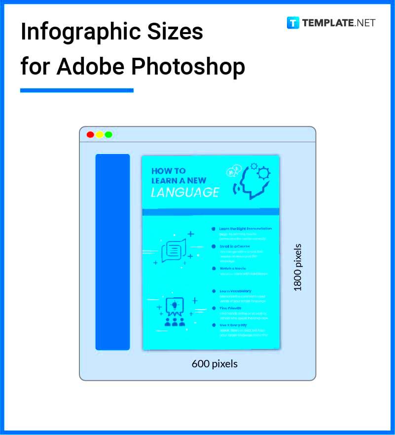
Image dimensions on
Adobe Stock suit a variety of purposes. A brief overview of some standard sizes is provided below:
- Small: Typically 640 x 480 pixels, good for web use.
- Medium: Around 1200 x 800 pixels, suitable for blogs or social media.
- Large: About 3000 x 2000 pixels, ideal for print materials.
- Extra Large: 6000 x 4000 pixels or more, perfect for high-resolution prints.
One does not tire of saying that each size has a different reason; hence if one knows the sizes one is more likely to avoid mistakes which can be very expensive.
Choosing the Right Size for Your Project
Opting for the ideal image dimension involves more than a mere technical choice; it communicates the correct information. A large image, for instance, can lend weight to your flyer for an occasion. Otherwise, in a small size might suffice for an email newsletter. Normally, I look at it ahead of time as regards my work’s completion. Follow these tips:
- Consider the Medium: Digital projects usually require smaller sizes, while print projects need larger images.
- Check Resolution: Higher resolution is better for print, while lower resolution is fine for online use.
- Think About Load Times: Larger images can slow down your website. Balance quality with performance.
It’s finally all about the proper structure. The success of your story relies on how well you put together these visuals.
How Image Size Affects Quality
The relationship between image dimensions and quality is one that many of us ignore, especially when we’re caught up in the creative whirlwind. I recall a project where I hastily downloaded images for a presentation, only to find out later that on the big screen, low-resolution pictures seemed pixelated. So embarrassing! Size of an image has a great importance on its quality; knowing this can save you from making similar mistakes in future.When choosing a smaller image for a larger display, it is possible that you will lose clarity. On the other hand, using high-resolution images on occasions where this is not necessary may slow down your website. Here are some important points to remember:
- Resolution: Measured in pixels per inch (PPI), higher numbers mean more detail.
- Aspect Ratio: Maintaining the right proportions ensures images don’t look stretched or squished.
- Compression: Too much compression can lead to artifacts, making images appear blurry or distorted.
However, objective remains to strike the right common ground of size and quality. The idea is to have professional-looking razor-sharp pictures while considering the main purpose of your project.
Common Uses for Various Sizes
In the large picture of designing and presenting, each dimension of an image has its role. You can deal with various demands when you have a range of images and at times I do use certain sections based on the given assignment.
Here is a list of some normal usages of different image sizes:
| Image Size | Common Uses |
|---|
| Small (640 x 480) | Web thumbnails, social media posts |
| Medium (1200 x 800) | Blog images, email newsletters |
| Large (3000 x 2000) | Print ads, posters |
| Extra Large (6000 x 4000) | Billboards, high-quality prints |
The smoothness of your design process could be achieved by understanding these conventional applications. Every dimension has its function, hence, making it possible for you to customize your images in such a way that they correspond with the particular information you want to convey.
Tips for Downloading the Correct Size
When you download an image that is of the correct size, it can either make your project a success or a failure. Through my own personal experiences, I have discovered that the challenge lies in downloading images that are too big or too small. Here are some helpful suggestions on how to get it right every time:
- Assess Your Needs: Before downloading, think about where the image will be used. Will it be printed, or is it for digital use?
- Check Specifications: Different platforms have different size requirements. Always check before you download.
- Use Previews: Take advantage of image previews to see how they look at different sizes. This helps you gauge the quality.
- Keep a Backup: If unsure, download a larger size. You can always resize, but increasing a small image often leads to loss of quality.
Following these pointers will make it easier for you to process downloads well and make your images appear at their best under all conditions.
FAQ
1. What are the standard image sizes available on Adobe Stock?
Adobe Stock offers various sizes: Small (640 x 480 pixels), Medium (1200 x 800 pixels), Large (3000 x 2000 pixels), and Extra Large (6000 x 4000 pixels).
2. How do I choose the right image size for my project?
Consider the medium (digital or print), check the resolution needed, and think about load times for web use.
3. How does image size affect quality?
Larger images generally have better quality, but using a small image on a large display can result in pixelation. Balance size and quality for the best results.
4. What are common uses for different image sizes?
Small images are used for web thumbnails, Medium for blogs, Large for print ads, and Extra Large for billboards.
5. What tips can help me download the correct image size?
Assess your needs, check platform specifications, use previews to gauge quality, and consider downloading a larger size if unsure.
Conclusion
Understanding image dimensions is crucial for any design project. By recognizing the various sizes available on Adobe Stock and how to select the right one, you can enhance both the aesthetic and functional aspects of your work. Ultimately, choosing the appropriate image size not only elevates your project’s quality but also ensures it communicates the intended message effectively. Delve into these best practices to maximize your creative potential!
 Image dimensions on Adobe Stock suit a variety of purposes. A brief overview of some standard sizes is provided below:
 admin
admin