Canva is a fantastic tool for creating stunning graphics, and one of its powerful features is the ability to outline images. Outlining helps to make images stand out, adding a polished look to your designs. Whether you're working on social media posts, presentations, or marketing materials, understanding how to outline
Understanding the Importance of Image Outlining
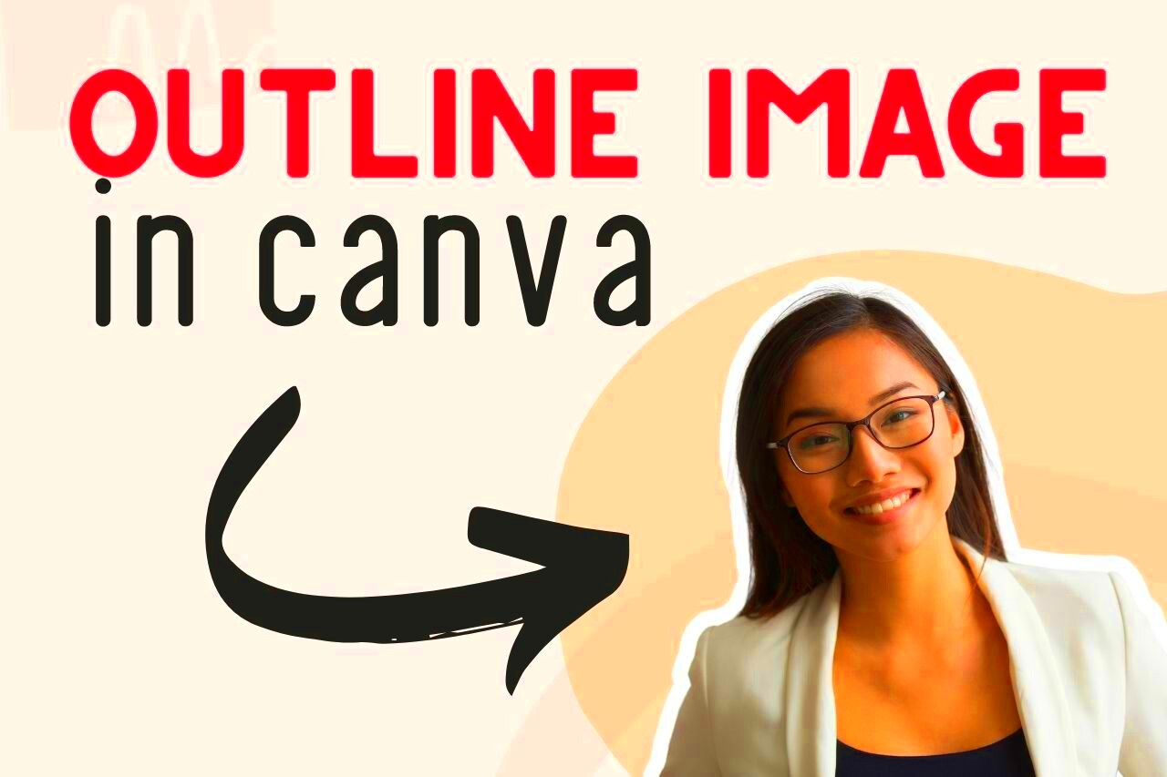
Outlining images serves several important purposes in design. Here are a few reasons why you should consider adding outlines to your images:
- Enhanced Visibility: Outlines help images pop against backgrounds, making them more noticeable.
- Visual Appeal: A well-defined outline can add a stylish touch, giving your designs a professional look.
- Brand Consistency: Using a consistent outline style can reinforce your brand identity across various materials.
- Focus: Outlines can guide the viewer’s eye to the main subject, ensuring that the important elements are highlighted.
Overall, outlining images can significantly improve the aesthetic and functional aspects of your designs, making them more engaging and effective.
Also Read This: Blurring an Image in Google Slides
Step by Step Guide to Outlining Images
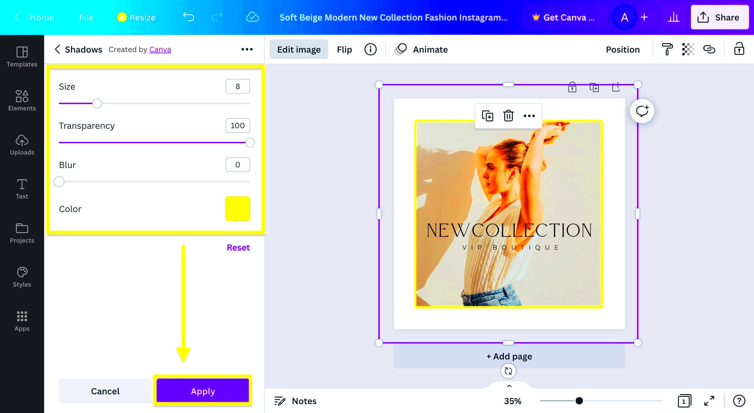
Now, let’s walk through the process of outlining images in Canva. Follow these steps to get started:
- Select Your Image: Open your Canva design and click on the image you want to outline.
- Access Effects: With the image selected, navigate to the top toolbar and click on the "Effects" option.
- Choose Outline: In the effects menu, look for the "Outline" option. Click on it to apply a default outline.
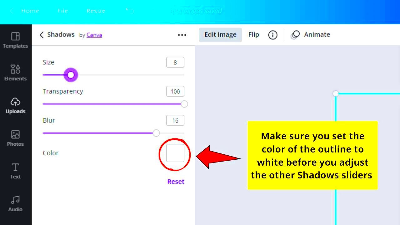
- Customize the Outline: Adjust the outline thickness, color, and style to fit your design. You can experiment with different colors to see what works best.
- Layering: If needed, you can duplicate the image, change the order of layers, or adjust transparency for more depth.
- Final Touches: Once satisfied with your outline, review your overall design. Make sure everything looks cohesive and aligned.
By following these steps, you can effectively outline images in Canva, enhancing your designs and making them visually appealing.
Also Read This: Mirroring an Image on a Mac
Choosing the Right Color for Outlines
When it comes to outlining images in Canva, color choice is crucial. The right color can enhance your design and create a cohesive look. Here are some tips to help you choose the best outline color:
- Contrast is Key: Ensure the outline color contrasts well with both the image and the background. This makes the outline stand out. For instance, if your background is light, opt for darker outline colors and vice versa.
- Brand Colors: If you’re designing for a brand, use its color palette. Sticking to brand colors can enhance recognition and create a unified look across your designs.
- Color Psychology: Consider the emotions associated with colors. For example, blue can convey trust, while red might evoke excitement. Choose colors that align with the message you want to communicate.
- Test Combinations: Don’t hesitate to experiment with different color combinations. Canva allows you to easily change colors, so try out a few until you find the perfect match.
Remember, the right color can make a significant difference in how your designs are perceived. Take your time to explore different options!
Also Read This: Cropping Images in Procreate
Using Different Outline Styles for Impact
Outlines aren't just about color; the style of the outline can also greatly influence the look of your design. Here are some popular outline styles to consider:
- Solid Lines: These are straightforward and classic, perfect for creating a clean look.
- Dotted Lines: Dotted outlines add a playful touch, great for casual or fun designs.
- Dashed Lines: Dashed outlines can create a dynamic feel, suitable for energetic themes.
- Shadowed Outlines: Adding a shadow effect to your outline can create depth and make images pop.
Each style has its own personality, so consider the mood of your design when selecting an outline style. You can even combine styles for unique effects, making your images more engaging.
Also Read This: Here’s Your Ultimate Guide on Stealing Thumbnails from Likee
Tips for Effective Image Outlining
To make the most of outlining images in Canva, consider these helpful tips:
- Keep it Simple: Avoid overly complex outlines that might distract from your image. A simple outline often has a stronger impact.
- Size Matters: Adjust the thickness of your outline to match the scale of your image. Thicker outlines work well for larger images, while thinner outlines are better for smaller ones.
- Use Outlines Sparingly: Not every image needs an outline. Use them strategically to highlight key images while allowing others to stand on their own.
- Stay Consistent: If you’re creating a series of designs, keep your outline styles consistent. This helps create a cohesive look across your work.
- Seek Feedback: Don’t hesitate to ask others for their opinions on your outlines. Fresh eyes can provide valuable insights!
By following these tips, you can create outlines that enhance your designs and resonate with your audience, making your graphics more effective and appealing.
Also Read This: How to Professionally Print Alamy Photos in the US
Common Mistakes to Avoid When Outlining Images
Outlining images can significantly enhance your designs, but there are some common mistakes to watch out for. Avoiding these pitfalls can help you create polished and professional-looking graphics. Here are a few mistakes to keep in mind:
- Neglecting Contrast: One of the biggest mistakes is not ensuring sufficient contrast between the outline and the background. If the outline blends in, it won't have the desired impact.
- Overcomplicating the Design: Adding too many details to an outline can overwhelm the image. Keep it simple to maintain clarity and focus.
- Inconsistent Styles: Using different outline styles in a single project can create visual chaos. Aim for consistency to maintain a cohesive look.
- Ignoring Image Size: A thick outline may look great on a large image but can overwhelm a smaller one. Adjust the thickness based on the image size.
- Forgetting About Alignment: Make sure your outlines are aligned properly with your images. Misaligned outlines can make designs look unprofessional.
Avoiding these mistakes will help you create images that stand out for all the right reasons. Pay attention to these details, and your designs will shine!
Also Read This: How to Embroider Images on Fabric
FAQs
Here are some frequently asked questions about outlining images in Canva that can help clarify common queries:
- Can I change the outline color after applying it? Yes, you can easily change the outline color by selecting the image and accessing the effects menu again.
- Is there a limit to how many outlines I can apply? Generally, you can apply one outline per image, but you can duplicate the image to create layered effects.
- Can I outline text as well? Yes, Canva allows you to outline text, adding depth and emphasis to your typography.
- What if I want to remove an outline? Simply select the image, go to the effects menu, and toggle off the outline option to remove it.
If you have more questions, exploring Canva’s help resources can provide additional insights and tutorials.
Conclusion
Outlining images in Canva is a simple yet powerful technique that can enhance your designs significantly. By choosing the right colors, styles, and avoiding common mistakes, you can create visually appealing graphics that effectively communicate your message. Remember to experiment and have fun with your designs! As you practice outlining, you'll develop a better sense of what works best for your style and audience. Happy designing, and may your images stand out like never before!
 admin
admin


