By employing
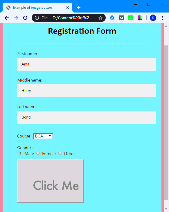
images as buttons instead of conventional texts, the user gets an extraordinary experience. These are often used in websites that have a modern and appealing design. Thanks to the flexibility of HTML and CSS, programmers can easily turn photos into clickable buttons providing intuitive attached with user friendly elements.
Why Use Images as Buttons on Web Pages
Moreover,
images can not only bring fascination but can also perform duties, for example, they can act as clickable buttons. The following are some reasons why image buttons are an ideal option.
- Enhanced Aesthetic Appeal: Image buttons can make a page look more dynamic and engaging, adding an extra layer of creativity to your design.
- Improved User Experience: Images are often easier for users to recognize and understand, which can make navigation more intuitive.
- Stronger Branding: Using custom image buttons allows you to reinforce brand identity by incorporating colors, logos, or other visual elements specific to your brand.
- Better Visual Cues: Image buttons can act as clear, visual cues that guide users towards specific actions, especially on mobile-friendly designs.
Setting Up HTML and CSS for Image Buttons
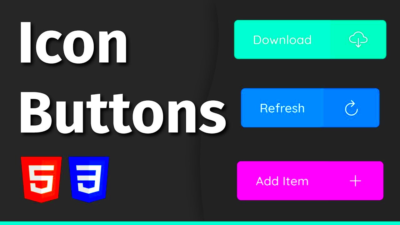
To build an image button, one needs to have a fundamental HTML outline and a few CSS styles. The configuration can be as straightforward or intricate as desired, according to the type of button that is being made. Below is a basic arrangement to begin with:
1. HTML Structure:<button>
<img src="path/to/image.jpg" alt="Button Image">
</button>
2. CSS Styling:By means of CSS it is possible to include designs in order for buttons to have good appearance:
button {
border: none;
padding: 0;
cursor: pointer;
}
button img {
width: 100px; /* Adjust size */
height: auto;
transition: transform 0.2s ease; /* Optional hover effect */
}
button:hover img {
transform: scale(1.1); /* Slight zoom on hover */
}
This arrangement provides you with the essentials for an image button. You may vary dimensions, hues and animations from this point in order to enhance its appeal.
Creating an Image Button with the <button> Tag

The
<button> tag is a convenient option for creating image buttons in HTML. It’s easy to style, responsive, and allows you to add JavaScript for further interaction. With the
<button> tag, you can make an image not only look like a button but behave like one too.
Step 1: Adding the Image Inside the <button> TagTo create an image button, simply place an
<img> tag inside a
<button> tag. Here’s an example:
<button>
    <img src="path/to/image.jpg" alt="Button Image">
</button>
Step 2: Styling the ButtonForget about how buttons looked before. If they want to look smarter, bit fluffier or bling-bling: it is your CSS hand behind it.
button {
    background-color: transparent;
    border: none;
    cursor: pointer;
    padding: 0;
}
button img {
    width: 100px;
    height: auto;
}
Benefits of Using <button> with Images:- Better Control: You can easily style and adjust the button’s appearance.
- JavaScript Compatibility: The
<button> tag works seamlessly with JavaScript, allowing for advanced interactions like modal pop-ups. - Accessible Text: Use the
alt attribute for accessibility, describing the button’s purpose.
Using the <a> Tag for Image Buttons with Links
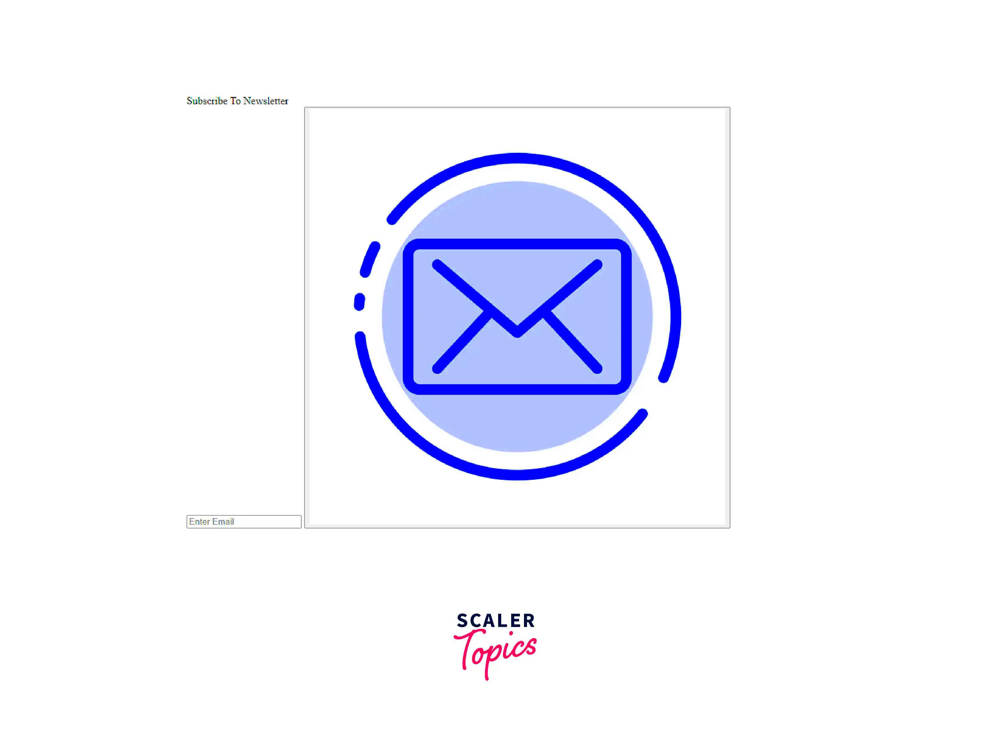
When the primary purpose of the image button is navigation, the
<a> tag is ideal. It allows you to turn any image into a clickable link, perfect for situations where you want the button to redirect users to another page.
Step 1: Wrapping an Image Inside the <a> TagPlace the
<img> tag within an
<a> tag, and specify the link in the
href attribute:
<a href="https://example.com">
    <img src="path/to/image.jpg" alt="Clickable Image">
</a>
Step 2: Styling for Better InteractionIn order to remove the default link style and make the button look better:
a img {
    border: none;
    display: block;
    width: 100px;
    height: auto;
}
Advantages of Using the <a> Tag for Image Buttons:- Simple Navigation: Perfect for directing users to different pages or resources.
- SEO Benefits: Using
<a> tags for links helps with search engine optimization. - Flexibility: Ideal for cases where JavaScript isn’t necessary, keeping the code cleaner and faster.
Adding Hover Effects to Enhance Image Buttons
Hover effects can make your image buttons more interactive and engaging. Attaching simple CSS hover animations to the buttons can make them feel more dynamic thereby encouraging clicks by users.
Basic Hover EffectA simple hover effect is this scale or zoom in which when used with hover would make the button look like it has enlarged slightly.
button img, a img {
    transition: transform 0.3s ease;
}
button:hover img, a:hover img {
    transform: scale(1.1);
}
Color Overlay on HoverFor a more intense impact, you can additionally include a hue mask:
button img, a img {
    position: relative;
    transition: filter 0.3s ease;
}
button:hover img, a:hover img {
    filter: brightness(80%);
}
Common Hover Effects to Try:| Effect | Description |
|---|
| Scale | Enlarges the image slightly to catch the user’s eye. |
| Shadow | Adds a subtle shadow behind the button for depth. |
| Color Overlay | Darkens or lightens the image when hovered. |
Hover effects create an interactive feeling that makes your buttons more appealing to the users.
Best Practices for Accessible Image Buttons
To create websites that can be enjoyed by everyone without any difficulty, accessibility is paramount. When designing image buttons, it is important to give thought to accessibility so that they are easily usable by all users including people with disabilities. The following are best practices for making your image buttons accessible:
1. Use Descriptive alt TextAdding descriptive
alt text to your image buttons allows screen readers to convey their purpose to visually impaired users. The
alt text should briefly describe the button's function. For example:
<img src="path/to/image.jpg" alt="Submit Form Button">
2. Ensure Sufficient Color ContrastFor users with low vision, it’s essential to ensure that the image button’s colors stand out against the background. Check that the contrast ratio meets accessibility standards (at least 4.5:1 for normal text).
3. Make Buttons Keyboard AccessibleNot all users navigate with a mouse. Use HTML elements that are natively keyboard-accessible, such as the
<button> or
<a> tags, instead of
images alone. This approach ensures users can navigate buttons using the
Tab key.
4. Add Focus StylesWhen users use their keyboards to move around, an active element is being emphasized by its current state (for example border or shadow). For your image buttons you need CSS that should certainly show distinct sign of gaining focus:
button:focus, a:focus {
    outline: 2px solid #005bcc;
    outline-offset: 2px;
}
As a result of the following steps, image buttons can be made easily accessible by different users and therefore make your website more inclusive.
Frequently Asked Questions about Image Buttons
Q: Can I use any image format for buttons?A: Yes, you can use formats like JPG, PNG, or SVG. However, SVG is often preferred for its scalability and high quality at any resolution.
Q: How do I make my image button responsive?A: Use percentage-based widths and CSS media queries to ensure the button adapts to different screen sizes. For example, setting
width: 50%; makes the button take half the container’s width, adjusting to smaller screens.
Q: Are image buttons compatible with all browsers?A: Yes, image buttons are widely supported. Using standard HTML and CSS ensures compatibility across modern browsers. It’s always wise to test for any browser-specific issues.
Q: How can I make my image buttons more interactive?A: Adding CSS hover effects like scaling, shadows, or color overlays can make image buttons feel more interactive. CSS animations can also make them more visually engaging.
Q: Is it better to use <button> or <a> for image buttons?A: Use
<button> if you want to trigger actions, like submitting a form, and
<a> if the button directs users to another page. Both are suitable for image buttons but have slightly different use cases.
Conclusion on Making Image Buttons in HTML
Image buttons are a fantastic way to enhance a website's user experience. They’re visually appealing, versatile, and can convey actions quickly. By using HTML tags like
<button> and
<a>, you can create clickable, interactive elements that draw users’ attention. Applying CSS for styling, adding hover effects, and keeping accessibility in mind can make your buttons both functional and appealing.Following best practices, such as adding
alt text for screen readers and ensuring good color contrast, makes your site more inclusive. Ultimately, image buttons allow for creative customization and improve the way users interact with your content. Experiment with these techniques to make your website stand out and keep visitors engaged.
 To build an image button, one needs to have a fundamental HTML outline and a few CSS styles. The configuration can be as straightforward or intricate as desired, according to the type of button that is being made. Below is a basic arrangement to begin with:1. HTML Structure:
 The
The  When the primary purpose of the image button is navigation, the
 admin
admin