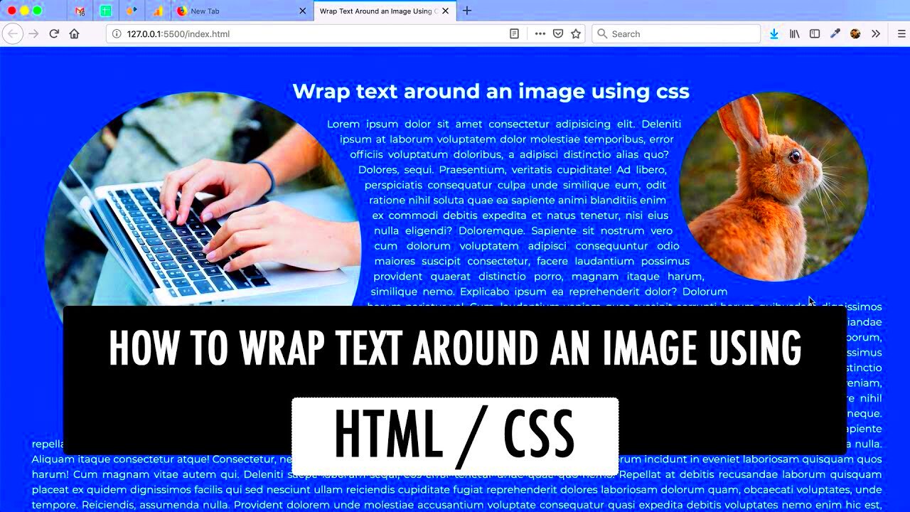
float property in your CSS to make the text wrap around the image. You can float the image to the left or right depending on your layout:img {
float: left;
margin-right: 15px;
When it comes to wrapping text around images in CSS, there are several properties that are essential for creating an effective layout. Understanding these properties can help you control how your text interacts with images, enhancing both functionality and aesthetics on your website. Here are some common CSS properties used for text wrapping:
- Float: This property allows you to position images to the left or right, letting the text flow around them. For instance,
float: left; will move the image to the left side of its container.
- Clear: The
clear property is used to prevent text from wrapping around floated elements. Using clear: both; on an element will make sure that it appears below any floating elements.
- Margin: Margins add space between the image and the text, ensuring that the text doesn’t crowd the image. For example, you might use
margin: 10px; to create even spacing.
- Width: Setting a width on images helps control how much text wraps around them. Using percentages allows for responsive designs, like
width: 100%; for a full-width image on mobile.
- Display: The
display property can also affect text wrapping. For example, using display: block; on an image makes it occupy its own line, preventing text wrapping.
By mastering these properties, you’ll be able to create layouts where text and images work harmoniously together, improving your site's overall design.
Examples of Different Text Wrap Layouts
Text wrapping can be applied in various ways to create unique and engaging layouts. Below are some common examples of how you can wrap text around images effectively:
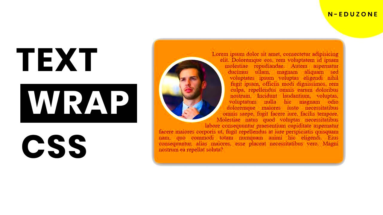
1. Text Wrapped on One Side
This is the most common layout where the text wraps around the left or right side of the image. Here's how it looks:
<img src="image.jpg" alt="Image" style="float: left; margin: 10px;">
Lorem ipsum dolor sit amet, consectetur adipiscing elit...
2. Text Wrapped on Both Sides
In this layout, you can have an image with text wrapping on both sides, creating a more dynamic look. This often works well for larger images:
<img src="image.jpg" alt="Image" style="float: left; margin: 10px;">
Lorem ipsum dolor sit amet, consectetur adipiscing elit...
Lorem ipsum dolor sit amet, consectetur adipiscing elit...
3. Centered Image with Text Below
In some cases, you might want the image to be centered with the text below it, rather than wrapping:
<img src="image.jpg" alt="Image" style="display: block; margin: 0 auto;">
Lorem ipsum dolor sit amet, consectetur adipiscing elit...
4. Full-Width Image with Overlaying Text
This layout allows for a full-width image with text overlaying it, often used for headers or banners:
<div style="position: relative;">
<img src="image.jpg" alt="Image" style="width: 100%;">
<p style="position: absolute; top: 20px; left: 20px; color: white;">Overlay Text</p>
</div>
These examples illustrate the flexibility of text wrapping, enabling you to choose the layout that best fits your content and design goals.
Also Read This: How to Film YouTube Videos with Your iPhone
Best Practices for Responsive Text Wrapping
Responsive design is crucial for providing an optimal viewing experience on various devices. Here are some best practices to ensure your text wrapping looks great on all screen sizes:
- Use relative units: Instead of fixed pixel values, use percentages or em units for margins and widths. This helps your layout adapt to different screen sizes.
- Test on multiple devices: Always preview your layout on various devices and screen sizes. What looks good on a desktop may not translate well to a mobile screen.
- Maintain readability: Ensure that the text remains easy to read, even when wrapped around images. Avoid letting the text crowd the image, which can make it hard to read.
- Consider accessibility: Make sure that images have descriptive alt text, providing context for users who may not see the images.
- Utilize media queries: Use CSS media queries to adjust the styles for different devices. For example, you might want to stack images and text vertically on smaller screens.
By following these best practices, you can create visually appealing and user-friendly layouts that work seamlessly across all devices.
Also Read This: How to Save Images from TikTok
FAQs About Text Wrapping with CSS
When it comes to text wrapping with CSS, many people have questions about how to implement it effectively. Here are some frequently asked questions that can help clarify the process:
1. What is text wrapping?
Text wrapping refers to the way text flows around images or other elements on a webpage. It allows for a more visually appealing layout, making content easier to read and navigate.
2. How do I wrap text around an image?
You can wrap text around an image using the float property in CSS. For example, applying float: left; to an image will allow text to flow on its right side. Remember to add margins for spacing!
3. What if my text overlaps the image?
If your text overlaps the image, you may need to adjust the margins or use the clear property to ensure proper spacing. You can also consider using different layouts based on screen size.
4. How do I ensure my layout is responsive?
To make your layout responsive, use relative units like percentages for widths and margins. Additionally, employ CSS media queries to adjust styles based on the device's screen size.
5. Is it necessary to provide alt text for images?
Yes, providing descriptive alt text for images is essential for accessibility. It ensures that users with visual impairments can understand the content of your images.
6. Can I wrap text around multiple images?
Absolutely! You can wrap text around multiple images by applying the float property to each image. Just be mindful of how the text interacts with the layout.
Conclusion: Enhance Your Design with Effective Text Wrapping
Mastering text wrapping with CSS can significantly enhance your web design, making your content more engaging and user-friendly. By understanding the key properties and best practices, you can create layouts that not only look great but also provide a seamless reading experience for your audience. Implementing effective text wrapping allows you to showcase your images while keeping your text clear and readable, ultimately improving the overall appeal of your website.
 admin
admin