In Google Slides, wrapping text around an image allows you to create a more dynamic and visually appealing presentation. It’s a simple yet effective technique to add style and clarity to your slides. Instead of the image sitting by itself or overlapping with the text, wrapping text ensures everything fits neatly together. Whether you’re working on a report, project presentation, or creative slideshow, learning how to wrap text around images can help make your content more engaging and organized.
Why Wrapping Text Around an Image is Useful
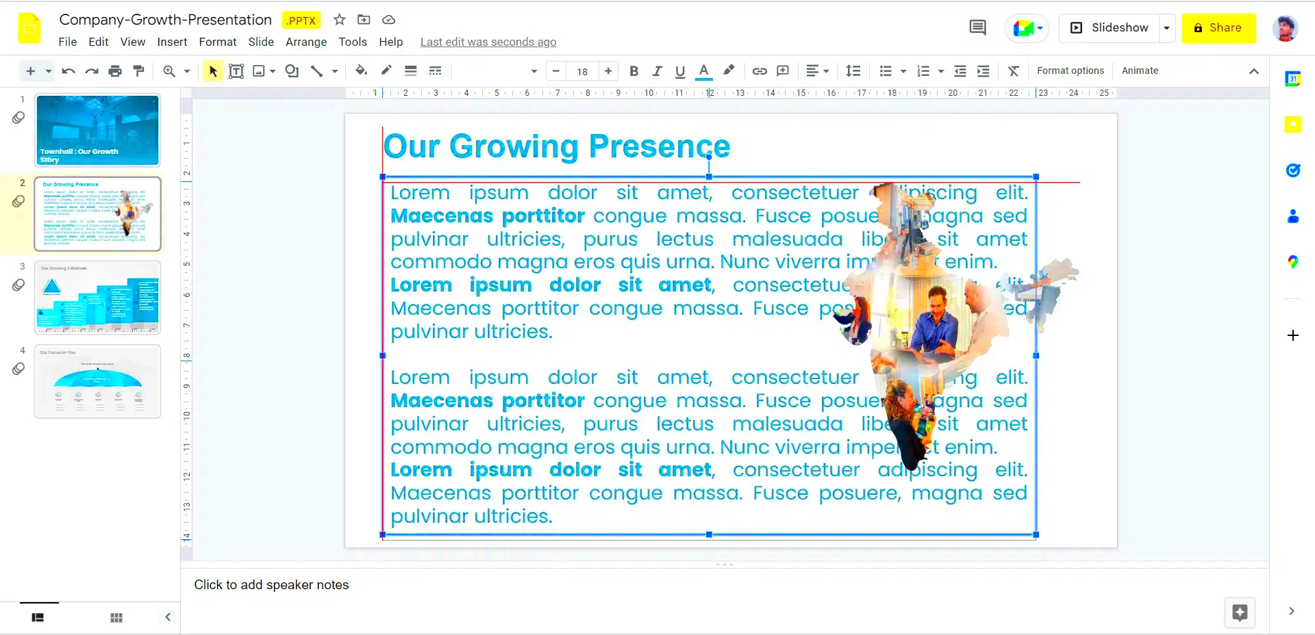
Wrapping text around an image in Google Slides offers several benefits that can improve the overall look and feel of your presentation. Here are a few reasons why it’s worth using:
- Improved Visual Appeal: It makes your slides look polished and professional.
- Better Layout Control: You can control how text interacts with images, avoiding clutter or awkward spacing.
- Enhanced Readability: Wrapping text around an image allows the content to flow naturally, making it easier for your audience to read and follow along.
- Flexibility in Design: It provides more design options, allowing you to position your text and images exactly where you want them.
When done right, wrapped text can elevate the design of your presentation, making it more visually appealing and easier to navigate for your audience.
Also Read This: How to Convert an Image to EPS Format for Printing
Steps to Wrap Text Around an Image in Google Slides
Wrapping text around an image in Google Slides is easy once you know the steps. Here’s how you can do it:
- Insert the Image: First, add your image to the slide. Go to the menu, click on Insert, then choose Image and select your desired image from your device or online sources.
- Position the Image: Once the image is inserted, click and drag it to your preferred position on the slide. The text will wrap around the image based on its placement.
- Enable Text Wrap: Google Slides doesn’t have a direct text wrap option like other programs. To work around this, click on the image, then use the “Text Box” feature to create a text box around the image. Adjust the text box to flow with the image.
- Adjust Text Box Size: Resize the text box to fit the space around the image. This ensures the text wraps neatly around it. You can also move the text box closer to the image or farther away, depending on your design needs.
- Fine-tune the Layout: You can change the alignment of the text box and adjust margins to control how tightly the text wraps around the image.
These steps will help you achieve the perfect layout where the text flows naturally around your image, making your presentation look neat and professional.
Also Read This: Top Seller Tactics: Achieving Top Rated Seller Status on eBay
Customizing Text Wrap Style in Google Slides
While Google Slides doesn’t have an automatic text wrap feature like some other programs, you can still control how text interacts with images by customizing the layout. Customizing the wrap style allows you to make sure the text flows around your image in a way that suits your design. You can adjust the alignment, padding, and margins around the image and text box to get the perfect look. Here’s how you can customize the text wrap in Google Slides:
- Positioning the Image: You can choose whether the text wraps around the image from all sides or just one side. This will depend on where you place the image on your slide and how you want the text to flow.
- Text Box Adjustments: After inserting the image and adding a text box, adjust the size of the text box so the text wraps smoothly. You can make the box larger or smaller, depending on how much space you need around the image.
- Text Alignment: You can adjust text alignment within the text box (left, center, or right). This helps in ensuring that the text aligns well with the image and looks clean.
- Margin and Padding: Adjusting the margins and padding of the text box around the image can help control the amount of space between the image and text. This fine-tuning ensures the layout doesn’t look crowded or unbalanced.
By customizing these elements, you can create a neat, professional layout where the text flows perfectly around the image, adding to the visual appeal of your slides.
Also Read This: How to Train Your Dragon: Iconic Images from the Movie
Adjusting Image Size and Text Alignment
When wrapping text around an image, it’s important to adjust both the size of the image and the alignment of the text. This helps ensure that your slide remains clear, organized, and aesthetically pleasing. Here’s how you can adjust both:
- Resizing the Image: After you insert the image, click on it and drag the corners to resize. If the image is too big, it can cause the text to be crowded. If it’s too small, it may leave too much empty space. Find a balance that fits your slide layout.
- Aligning the Text: Once the image size is set, adjust the text box alignment. You can set the text box to align with the left, right, or center of the image. This helps create a balanced look where the text doesn’t overlap the image unnecessarily.
- Text Box and Image Positioning: Make sure the text box is positioned in a way that complements the image’s size. You can move the text box around to achieve the best wrap effect, ensuring the text flows smoothly around the image without too much space or overlap.
Adjusting these elements makes sure the layout is clean, and the text doesn’t detract from the image. A well-sized image with aligned text will create a visually balanced presentation.
Also Read This: Exploring Alternatives for Video Streaming
Tips for Better Layouts with Wrapped Text and Images
Creating the perfect layout with wrapped text and images takes some practice, but with a few tips, you can make your Google Slides look professional and polished. Here are some helpful tips for improving your layout:
- Use White Space Wisely: Don’t cram text and images too closely together. Leave some space around the image to allow the text to breathe. This will help create a clean, balanced design.
- Choose the Right Image Size: The image should complement the text rather than overpower it. If your image is too large, it may dominate the slide. Try resizing it to maintain balance.
- Try Different Text Alignments: Experiment with left, right, or center alignment to see which one works best with your image’s placement. Sometimes, centering the text works best for a symmetrical look.
- Keep the Text Simple: Avoid overcrowding the slide with too much text. Keep the font size readable, and use bullet points or short sentences to make the content digestible.
- Use Text Box Borders: Adding a subtle border around the text box can help separate the text from the image, making the layout more organized and visually appealing.
These tips will help ensure that your slides are not only functional but also visually engaging. A clean and thoughtful layout with wrapped text and images can make a big difference in your presentation’s impact.
Also Read This: Easy Guide to Uninstalling the YouTube App from Samsung Smart TVs
Common Issues When Wrapping Text Around an Image and How to Fix Them
While wrapping text around images in Google Slides can be an effective design tool, there are a few common issues that may arise. These issues can affect the overall presentation, but the good news is they are usually easy to fix. Let’s take a look at some of these common problems and how to resolve them:
- Text Overlapping the Image: One of the most common issues is text overlapping the image. This happens when the text box is too close to the image. To fix this, try adjusting the margins of the text box or resizing the image so there’s enough space around it.
- Inconsistent Text Alignment: Sometimes, the text might not align properly around the image, causing the layout to look messy. You can fix this by adjusting the text box alignment (left, center, right) and making sure the text flows smoothly around the image.
- Unwanted Blank Space: If there’s too much space between the image and the text, it can look awkward. To correct this, resize the image or adjust the text box margins to bring the text closer to the image, creating a tighter, more cohesive layout.
- Image Getting Cut Off: If the image is too large, parts of it might get cut off or pushed out of view. To fix this, reduce the size of the image or reposition it on the slide to ensure it’s fully visible.
By recognizing these common issues and knowing how to fix them, you can achieve a well-organized slide where the text and image complement each other perfectly.
Also Read This: How to Watch the Royal Rumble Without Cable
Benefits of Using Google Slides for Wrapping Text Around Images
Google Slides is a popular presentation tool, and it offers a number of benefits when it comes to wrapping text around images. Here’s why you should consider using Google Slides for this task:
- Easy to Use: Google Slides offers a simple, user-friendly interface that makes it easy to insert and position images and text. You don’t need advanced design skills to create a professional-looking slide.
- Real-time Collaboration: Google Slides allows multiple users to collaborate in real-time. This is perfect for team projects, where everyone can contribute to the design and layout of the slides.
- Cloud-Based: Since Google Slides is cloud-based, you can access your slides from anywhere. All your work is automatically saved, so you don’t have to worry about losing your progress.
- Free and Accessible: Google Slides is completely free to use, making it accessible to anyone with a Google account. It’s a cost-effective tool for creating high-quality presentations.
- Flexible Image and Text Placement: Google Slides gives you full control over how images and text are arranged. Whether you want text to wrap around the image or simply sit next to it, you can customize the layout as needed.
These benefits make Google Slides a great option for anyone looking to create professional-looking presentations with wrapped text around images. It combines simplicity with powerful features, making it a go-to tool for many users.
Also Read This: Fulfillment Finesse: Sending Alibaba Products to Amazon FBA
Conclusion
Wrapping text around images in Google Slides is a simple yet effective way to enhance the layout and visual appeal of your presentations. By customizing the text wrap style, adjusting image size, and using smart layout techniques, you can create professional-looking slides that captivate your audience. While there may be some common issues when wrapping text, they are usually easy to fix with a little tweaking.
Google Slides makes this process even easier with its easy-to-use interface, real-time collaboration features, and cloud-based storage. Whether you’re creating a business presentation, a creative slideshow, or something else, using Google Slides to wrap text around images can elevate your design and make your content more engaging.
By understanding the process and benefits, you’ll be able to use Google Slides to its full potential, creating beautiful and functional presentations that impress your audience every time.
FAQ
Here are some common questions about wrapping text around images in Google Slides, along with their answers to help you get the most out of your presentations:
- Can I automatically wrap text around an image in Google Slides?
No, Google Slides doesn’t have an automatic text wrapping feature like some other programs. However, you can create a similar effect by adjusting the text box around the image and manually aligning the text to flow around it.
- How can I adjust the space between the text and the image?
You can adjust the space between the text and the image by resizing the image, modifying the size of the text box, and using the text box margins. This will control how tightly the text wraps around the image.
- What should I do if my text is overlapping the image?
If the text is overlapping the image, try increasing the space around the image by resizing the image or adjusting the margins of the text box. This will prevent the text from crowding the image.
- Can I change the alignment of the text around the image?
Yes, you can change the text alignment within the text box. You can align the text to the left, right, or center depending on your preference and how the image is positioned on the slide.
- What if my image gets cut off when wrapping text around it?
If the image is getting cut off, resize it to make sure it fits within the slide space. You can also reposition the image to ensure it’s fully visible and that the text flows correctly around it.
- How do I wrap text around irregularly shaped images?
For irregularly shaped images, like circular or custom-shaped images, you may need to adjust the position of the image and the text box manually to ensure that the text flows around the edges of the image smoothly.
- Can I wrap text around multiple images in Google Slides?
Yes, you can wrap text around multiple images by placing each image where you want it and adjusting the text boxes accordingly. You may need to adjust the text box for each image to make sure the text flows properly.
