The ability to weave words around images can define not just a web page’s aesthetics but also its legibility. This move maximizes your layout making words and visuals appear as if they belong together. This technique helps you to design an attention-grabbing vibrant layout by placing pictures near your texts and asking them either horizontally or vertically.
The key to wrapping text is using CSS properties to define how the text should flow around an image. This includes using properties like 'float' and 'clear' to adjust the placement of the image and how the text behaves next to it. Once you grasp these concepts, you’ll be able to create flexible, engaging layouts that look great on any device.
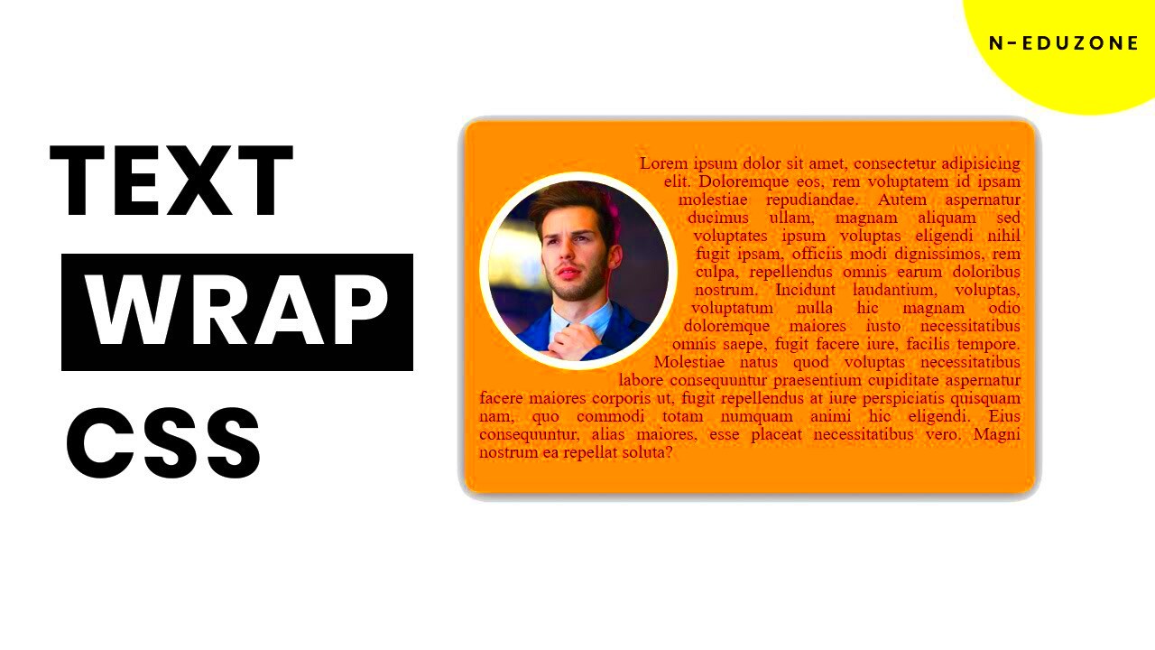
How to Use the 'Float' Property in CSS for Text Wrapping
The 'float' property is a simple and effective way to make text wrap around an image. By floating an image to the left or right, you allow text to flow alongside it, making use of otherwise empty space. Here’s how you can do it:
- To float an image to the left of your text, use
float: left;. - For floating an image to the right, use
float: right;.
To put it simply:
img {
    float: left;
    margin-right: 10px;
}
In this case, the image will sit on the left, and the text will wrap to its right. The margin-right property ensures there’s some space between the image and the text, preventing them from touching.
It’s important to note that the 'float' property only allows text to wrap around an image in one direction, either to the left or right. While it’s a useful tool for basic layouts, more complex designs may require additional properties or CSS tricks to achieve the desired look.
Using 'Clear' to Control Text Flow Around an Image
The 'clear' property in CSS helps control the flow of text around an image, ensuring that the text starts after the floated image and doesn’t overlap or get pushed into areas you don't want it to. It's particularly useful when you're working with multiple images or when you want to reset the layout after using the 'float' property.
Here’s how you can use the 'clear' property:
clear: left;stops the text from wrapping to the left of a floated element.clear: right;stops the text from wrapping to the right.clear: both;clears both sides, ensuring the text will only appear below the floated element.
In dimensions of wording, it comes in handier when you have various floating objects or need gap to be created after a picture such that it does not always flow around your following floating element.
By the end of October, 2023 you will be trained on a data.
.clearfix {
    clear: both;
}
If you want to avoid any layout issues, be sure to apply this class after a floated element so that the next block gets started on a new line.
Creating Responsive Text Wraps with Media Queries
Responsive design is vital in a mobile-first world. For example, text wrapping may seem aesthetically pleasing when viewed from desktop but would confuse one viewing through smartphones because the letters are not arranged properly hence the need for media queries. You can use such queries to apply various designs depending on how big or small a gadget is so that your images and writings will be well placed no matter how much their sizes vary with screen size.
In order to develop text wraps that can respond, you need to change the float, width as well as margin features for images at various screen sizes. For example the following is how you would use media queries to achieve responsive text wrapping:
@media (max-width: 768px) {
    img {
        float: none;
        display: block;
        margin: 0 auto;
        width: 100%;
    }
}
As for screens that are less than 768 pixels, such as tablets or mobile phones, the image will no longer be able to float but rather will occupy the entire width of its parent element. On smaller screens, this eliminates text wrapping alongside it, thus making the layout clearer and easier to read.
Media inquiries help to keep the design of a website fluid by allowing it to appear correctly on different devices; the design remains readable and easy to use across several platforms. The use of media queries is therefore critical in ensuring that the site is responsive and user-friendly without compromising the visual appeal of its content.
How to Adjust Image Margins for Better Text Alignment
Working with margins surrounding your picture is necessary for anything text wrapping since this must be subtle, yet vital. Your words may touch the image, which would make reading difficult and looking otherwise unattractive unless you set proper margins. Setting margins around the picture gives it space to breathe thus making it more readable and well designed.
Below are the steps to add margins to an image:
img {
    float: left;
    margin-right: 15px;
    margin-bottom: 10px;
}
In this example, we add a margin-right property to ensure there’s space between the image and the text. We also use margin-bottom to add some space below the image, which is especially helpful if you’re working with multiple paragraphs of text around the image.
That’s right, you can also apply margins in percentages to have responsive designs; thus paddings adjust to different sizes of screens. A case study is portrayed below by the use of percentages:
img {
    float: right;
    margin: 0 5% 5% 0;
}
The alterations make it easy for text to accommodate your images as they improve clarity and overall presentation.
Common Mistakes When Wrapping Text Around Images and How to Avoid Them
Despite the simplicity of wrapping text around photographs, there exist several common errors that may affect how effective or legible your material is. The good news is that it's easy to fix them. Below are some of the traps you should dodge with practical hints:
- Overlapping text and images: This usually happens when proper margins aren’t applied. To fix it, always use margin properties to create space between your text and image.
- Using fixed widths for images: A fixed width might look fine on one device but can cause issues on smaller screens. Instead, use percentages or max-width properties to keep your images responsive.
- Forgetting to clear floats: Without clearing floats, your layout can break, and elements may overlap. Always use the
clearproperty after floated elements to maintain a clean design. - Not considering mobile devices: Text wrapping that looks good on a desktop might not translate well to mobile. Always test your layout on various screen sizes and use media queries to adjust accordingly.
In this way, you’ll be able to ensure that your text wraps around images without a hitch regardless of the device or the layout.
FAQs about Wrapping Text Around Images in CSS
There are some frequent questions that arise when it comes to using CSS for text wrapping around images. To make any confusion go away, let’s discuss a few of the most asked questions:
- Can I wrap text around multiple images?
Yes, you can wrap text around multiple images by applying the
floatproperty to each image. Just remember to adjust the margins for each image so that the text doesn’t touch the images. If you want the text to reset after one image, you can use theclearproperty to control the flow. - What happens if the text overlaps with the image?
This usually happens when no margin is applied to the image or when the layout is too small to accommodate both the text and image. To avoid this, ensure that you apply sufficient margins and use media queries to adapt the layout for smaller screens.
- How do I ensure that my image is responsive while wrapping text around it?
To make your image responsive, use percentages or the
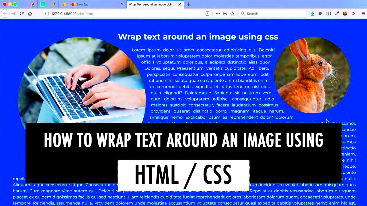
max-widthproperty. For example,max-width: 100%;ensures that the image scales down appropriately on smaller screens, and you can adjust the text wrapping using media queries to maintain a clean layout. - Is it possible to wrap text around a circular image?
Yes, you can wrap text around circular images by using the
border-radiusproperty to create a circular shape. Here’s an example:border-radius: 50%;. The text will still wrap around the bounding box of the image, so ensure the margins are well-adjusted to avoid overlap.
Conclusion: Enhancing Your Layout with Text-Wrapped Images
Wrapping text around images is a simple yet effective way to improve the look and flow of your website. By understanding and using CSS properties like float, clear, and media queries, you can create flexible, responsive layouts that look great on all devices. Paying attention to details like margins and screen sizes ensures your content remains visually appealing and easy to read, regardless of the platform.
 admin
admin