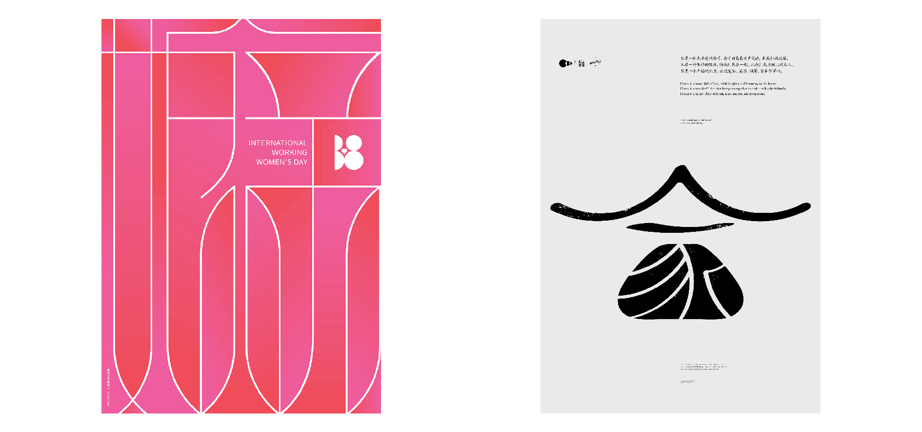
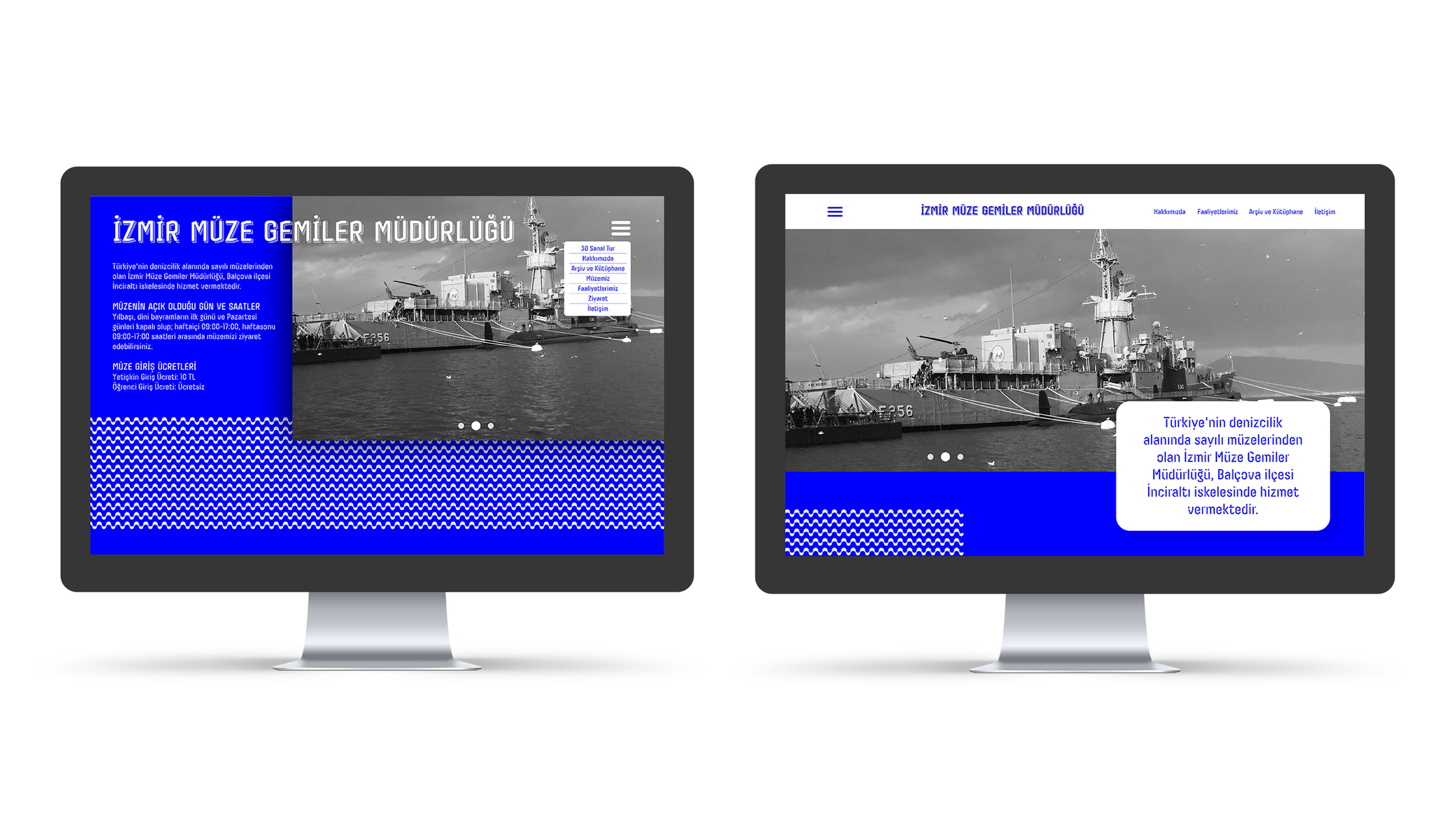
Behance is like a vibrant playground for creative minds! It’s an online platform where artists, designers, and creatives from all over the world showcase their work. Whether you’re into graphic design, photography, or even fashion, Behance has something for you. It's not just about displaying projects; it’s about connecting with a community that shares your passion.
Imagine scrolling through a feed filled with stunning visuals, innovative designs, and inspiring concepts. That’s what you get with Behance. You can follow your favorite artists, leave feedback, and even collaborate on projects. It’s a space that encourages creativity and fosters talent. Plus, it’s a fantastic resource for anyone looking to find unique fonts that can elevate their design projects.
Why Fonts Matter in Design Projects
Fonts are more than just letters on a page; they breathe life into your designs! The right font can convey emotion, set the tone, and even enhance brand identity. Think about it: when you see a clean, modern font, you might associate it with innovation. On the other hand, a handwritten font can evoke warmth and nostalgia. Choosing the right font is essential for effective communication.
Here are some key reasons why fonts matter in your design projects:
- Brand Identity: Fonts play a crucial role in expressing your brand’s personality. For instance, a tech company might opt for sleek and modern fonts to reflect innovation, while a bakery might choose softer, rounded fonts for a friendly feel.
- Readability: The best designs prioritize readability. A beautifully designed font that’s hard to read can defeat the purpose. Always consider your audience and where the text will appear.
- Emotional Impact: Fonts can evoke emotions. Serif fonts often feel more traditional and trustworthy, while sans-serif fonts offer a more contemporary and approachable vibe.
- Hierarchy and Structure: Different fonts can help establish visual hierarchy in your design. For example, using a bold font for headings and a lighter one for body text can guide the viewer’s eye and make information easier to digest.
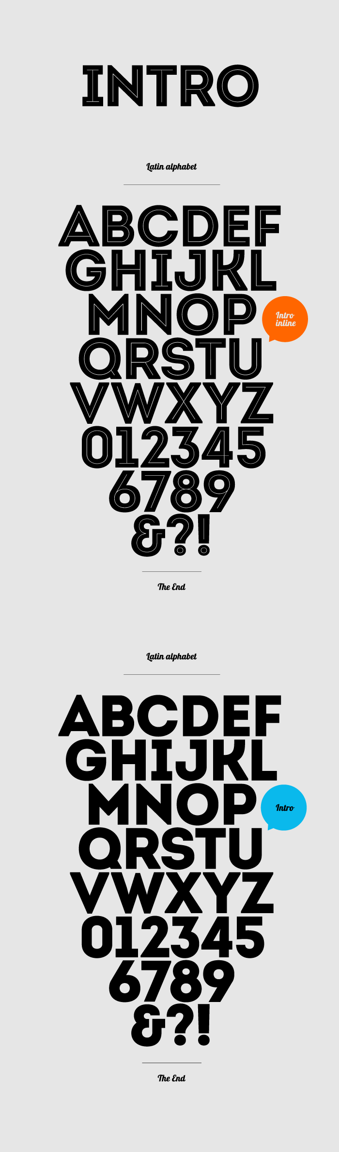
Using Behance to find unique fonts can greatly enhance your projects. The platform features plenty of designers who share their typographic creations, offering a wealth of options to choose from. Explore these fonts, and don’t be afraid to experiment; the right typeface can unlock a new level of creativity in your work!
Also Read This: Free Bilibili Downloader Mp3 Tool That Works Fast
3. Exploring Behance for Unique Font Styles
When it comes to design, choosing the right font can make all the difference. Behance is a treasure trove for creative professionals, offering a plethora of unique fonts that can elevate your projects. But how do you navigate this vast platform to find the perfect typeface? Let’s dive into some tips and tricks!
First off, understanding the search functionality on Behance is key. You can start by typing in keywords that resonate with your project’s theme. For instance, if your design is modern and sleek, try searching for “modern fonts” or “sleek typography.” The search results can lead you to an array of projects that showcase various styles.
Next, don't hesitate to explore popular projects and featured creatives. Often, top designers share their custom typefaces, which are not only visually appealing but also carry a certain uniqueness that can set your work apart. Check out the “Featured” section on the Behance homepage for inspiration.
Another tip is to look for collections that specifically highlight fonts. Behance allows users to curate collections, making it easier for you to discover themed fonts. You might find collections like “Vintage Typography” or “Minimalist Fonts” that can align perfectly with your design aesthetic.
Moreover, engaging with the community can open up more avenues for discovering fonts. Follow designers whose work you admire, leave comments, and even reach out to them for recommendations. This interaction can lead you to exclusive font finds that may not be widely advertised.
Finally, when you find a font you like, take note of the context in which it’s used. Check how designers pair it with other elements and colors. This can give you additional insights into how to implement the font in your own projects. Remember, the right font is not just about looks; it’s about how it complements your overall design vision!
Also Read This: How to Change Language in Behance Adjusting the Platform’s Language Settings
4. Steps to Download Fonts from Behance
Ready to snag some eye-catching fonts from Behance? The downloading process is straightforward, but here’s a step-by-step guide to ensure you get it right!
- Sign Up or Log In: Before you can download any fonts, you’ll need a Behance account. If you don’t have one, it’s quick and easy to sign up. Just visit the Behance homepage, click on the “Sign Up” button, and fill out the required information.
- Search for Fonts: Use the search bar to find the fonts you want. As mentioned earlier, be specific with your keywords! Browse through the projects and collections until you find a font style that catches your eye.
- View Project Details: Click on a project to see more. This will often include images, descriptions, and sometimes even links to download the font. Take your time to explore the entire project to get a full understanding of the font’s capabilities.
- Check the License: Not all fonts are free to use, so it’s crucial to check the licensing information provided by the designer. Some might offer free personal use, while others may require a purchase for commercial projects.
- Download the Font: If the font is available for download, look for a button or link that says “Download.” Click on it, and the font file will typically download as a ZIP file. Make sure to save it in a location on your computer where you can easily find it later.
- Install the Font: Once downloaded, extract the ZIP file to access the font files. For Windows, right-click on the font file and select “Install.” On Mac, double-click the font file and hit “Install Font” in the Font Book application.
- Start Designing: Open your design software, and the new font should be available in your font list! Play around with it, experiment, and see how it enhances your projects!
And there you have it! With these simple steps, you can easily explore and download unique fonts from Behance, ready to take your design projects to the next level.
Also Read This: How to Create Stunning 3D Art with Step by Step Guidance from Dailymotion Videos
5. Integrating Behance Fonts into Your Design Software
So, you’ve browsed through the stunning fonts available on Behance and found a few that speak to your design soul. But how do you actually get those fonts into your favorite design software? Don’t worry; it’s as easy as pie! 🎨
First, let’s clarify that fonts downloaded from Behance are often packaged as .ttf or .otf files. Here’s a quick guide to help you integrate them seamlessly into various design programs:
- Adobe Creative Suite (Photoshop, Illustrator, InDesign):
- Download the font file from Behance.
- Install the font by double-clicking the downloaded file and clicking ‘Install Font’.
- Restart your design software to see the new font in the font list.
- Sketch:
- Similar to Adobe, download and install the font.
- Open Sketch and create a new text layer. The font should be available in the font dropdown.
- Figma:
- Install the font on your system first.
- Open Figma and ensure that the installed font is selected in the text properties panel.
Once you’ve installed your fonts, don’t forget to check for any licensing restrictions. Some fonts might require you to give credit to the designer or restrict commercial use. Always respect the creator's rights!
And voilà! You’re ready to sprinkle some typographic magic into your projects. The fonts you choose can say a lot about your design, so make sure they align with your vision. Happy designing!
6. Best Practices for Using Fonts in Design Projects
Now that you’re equipped with some gorgeous fonts from Behance, let’s talk about how to use them effectively. Good typography can make or break your design, so here are some best practices to keep in mind:
- Limit the Number of Fonts:
Using too many fonts can create chaos. Stick to a maximum of two to three different fonts in a single project. For instance, you might choose one font for headings and another for body text. This will maintain visual harmony.
- Pairing Fonts:
Not all fonts work well together. Look for contrasting fonts that complement each other. For example, pair a sans-serif font for headers with a serif font for body copy. This contrast enhances readability and interest.
- Consider Readability:
No one likes to squint at tiny text! Make sure your font size is legible across different devices, especially for web designs. A good rule of thumb is to use at least 16px for body text.
- Use Hierarchy Wisely:
Establish a clear visual hierarchy using different font sizes, weights, and styles. For example, make your headings bold and larger, while keeping subheadings slightly smaller. This helps guide the viewer’s eye through your design.
- Test on Various Backgrounds:
Always check how your fonts look against different backgrounds. A font that looks great on white might be hard to read on dark colors. Ensure there's enough contrast to maintain readability.
Incorporating these best practices will help you create designs that are not only visually appealing but also functional. Remember, fonts are more than just letters; they convey emotions, set the tone, and enhance your message. Take your time to choose wisely, and let your creativity shine!
cURL error: CONNECT tunnel failed, response 502
: Trying to access array offset on value of type null in C:xampphtdocsgpt4chatgptapi.php on line 213
: Trying to access array offset on value of type null in C:xampphtdocsgpt4chatgptapi.php on line 213
Fatal error: Maximum execution time of 120 seconds exceeded in C:xampphtdocsgpt4chatgptapi.php on line 149
 admin
admin