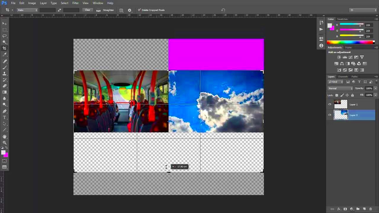
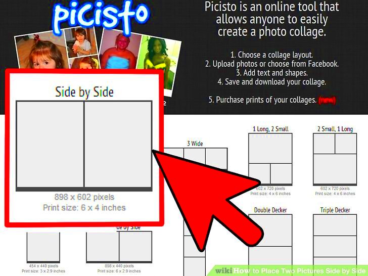
Side-by-side images are an effective way to showcase comparisons, whether it's for product reviews, tutorials, or visual storytelling. They allow viewers to easily spot differences and similarities between two visuals, making the information clearer and more engaging. By displaying images side by side, you can enhance your message and make it more impactful. This technique is particularly useful in:
- Marketing: Highlighting product features or improvements.
- Education: Demonstrating changes or progress over time.
- Photography: Showcasing before-and-after shots or variations of a scene.
In today’s visual world, capturing attention is crucial. Side-by-side images can help achieve that by providing a straightforward way to convey your point. They make content more digestible and visually appealing, inviting your audience to engage further.
Steps to Prepare Your Images for Comparison

Before you can place your images side by side, you need to ensure they are ready for comparison. Follow these simple steps:
- Select Your Images: Choose two images that complement each other. Ensure they relate to the same topic or theme.
- Check the Quality: Make sure both images are of high quality. Blurry or low-resolution images can make your comparison ineffective.
- Consider Image Size: For a better visual impact, try to keep the images the same dimensions. This helps in creating a balanced look.
- Use Consistent Backgrounds: If possible, use similar backgrounds for both images to maintain focus on the subject matter.
Preparing your images thoughtfully sets the stage for an effective comparison, making it easier for viewers to understand your message.
Also Read This: How to Upload Video to Canva from YouTube
Using Canva Downloader for Image Access
Canva Downloader is a fantastic tool that can help you access a wide range of images for your side-by-side comparisons. Here’s how to use it:
- Create a Canva Account: If you don’t have an account, sign up for free. Canva offers numerous resources that can enhance your designs.
- Search for Images: Use the search bar in Canva to find images related to your topic. You can search for specific keywords or browse through categories.
- Download Images: Once you find the images you like, you can easily download them. Click on the image, and select the download option to save it to your device.
- Utilize Filters: Canva allows you to apply filters to your search, making it easier to find images that match your desired aesthetics.
With Canva Downloader, you can access a vast library of images, making it simple to find the perfect visuals for your side-by-side comparisons. This tool streamlines your design process, allowing you to focus on creating engaging content.
Also Read This: How to Create a Waterfall Braid on Yourself for an Easy DIY Hairstyle
How to Create a Side-by-Side Layout in Canva
Creating a side-by-side layout in Canva is a breeze! Whether you are designing a marketing graphic or a simple comparison, Canva provides user-friendly tools to get the job done. Follow these steps to create your layout:
- Open Canva: Log into your Canva account and choose the design type you want, like a social media post or presentation slide.
- Choose a Blank Template: Start with a blank canvas to have full control over your layout. Select the dimensions that suit your project best.
- Upload Your Images: Click on the “Uploads” tab on the left sidebar, then upload the two images you want to compare.
- Drag and Drop Your Images: Place each image on the canvas side by side. You can resize them by clicking and dragging the corners to fit your layout.
- Add a Divider (Optional): If you want to emphasize the comparison, consider adding a line or a shape between the images. This adds a clear separation and enhances focus.
- Customize Further: Use text boxes to add labels or descriptions to each image. This helps your audience understand what they are viewing.
With these simple steps, you can easily create an eye-catching side-by-side layout that effectively communicates your message.
Also Read This: Effective Techniques to Conceal Dark Circles with Foundation
Adjusting Image Sizes for Perfect Alignment
Getting your images aligned perfectly is crucial for a polished look. Misaligned images can distract viewers and lessen the impact of your comparison. Here’s how to adjust image sizes in Canva for perfect alignment:
- Use the Resize Tool: Click on each image and use the corners to resize them. Canva shows guidelines to help you align them properly.
- Check Dimensions: For a uniform look, ensure both images have the same height and width. You can manually input the dimensions in the top menu if needed.
- Align Options: Canva has built-in alignment tools. Select both images, and then use the alignment options in the top toolbar to center them or distribute space evenly.
- Group Images: Once you’re satisfied with the alignment, group the images by selecting them and right-clicking to choose the “Group” option. This helps keep them together during further edits.
By following these steps, you’ll ensure that your images are perfectly aligned, making your side-by-side comparison visually appealing and professional.
Also Read This: Mastering OK.ru for Effective Personal Brand Building and Promotion
Saving and Exporting Your Side-by-Side Images
After you’ve created your stunning side-by-side layout, it’s time to save and export your work. This is an essential step to ensure your images are ready for sharing or posting. Here’s how to do it in Canva:
- Preview Your Design: Be
Also Read This: Sonic Looping: Looping Songs on SoundCloud – A Guide to Seamless Repetition
Common Mistakes to Avoid When Placing Images Side by Side
Creating a side-by-side image layout can be simple, but there are some common pitfalls that can undermine your effort. Avoiding these mistakes can significantly enhance the effectiveness of your comparisons. Here are a few to watch out for:
- Inconsistent Image Sizes: Using images of different dimensions can create a chaotic appearance. Always try to use images that have the same height and width to maintain a clean layout.
- Poor Quality Images: Blurry or pixelated images can distract viewers and make your comparison less effective. Always use high-quality images to present a polished look.
- Cluttered Backgrounds: Busy backgrounds can divert attention from your main subject. Opt for simple, uniform backgrounds to keep the focus on the images you are comparing.
- Neglecting to Add Labels: Forgetting to label your images can confuse your audience. Always include clear labels or captions to guide viewers on what they are looking at.
- Not Considering Color Schemes: Colors that clash can make the layout unpleasant to view. Ensure that your color scheme is harmonious and complements the images you’re using.
Avoiding these mistakes will help ensure that your side-by-side images effectively communicate your message, engaging your audience and enhancing their understanding.
Also Read This: How to Create Stickers at Home with Fun DIY Video on Dailymotion
Tips for Effective Image Comparisons
When creating image comparisons, a few tips can help you get the best results. Here are some useful strategies to consider:
- Keep It Simple: Don’t overload your layout with too many images or excessive text. A clean, straightforward approach is often the most effective.
- Focus on Key Differences: Highlight the main differences you want your audience to notice. Use arrows or text boxes to draw attention to specific areas.
- Utilize Visual Aids: Consider using arrows, shapes, or lines to connect similar areas of the images, making it easier for viewers to follow along.
- Test with Your Audience: If possible, share your comparisons with a few people before going live. Getting feedback can help you refine your layout and messaging.
- Be Consistent: Use a consistent style for all your images, including similar lighting, colors, and angles, to enhance the comparison’s effectiveness.
By incorporating these tips into your image comparisons, you can create visuals that are not only informative but also engaging and easy to understand.
Also Read This: How to Outline an Image in Canva
Frequently Asked Questions
When creating side-by-side images, you might have some questions. Here are answers to some frequently asked questions that can help you:
- What is the best format to save side-by-side images?
- JPEG and PNG are the most common formats. JPEG is suitable for photographs, while PNG is better for images with transparency or text overlays.
- Can I use Canva for commercial projects?
- Yes, you can use Canva for commercial projects, but make sure to check the licensing of specific images to avoid copyright issues.
- How do I ensure my images are high quality?
- Always choose high-resolution images for your comparisons. Avoid images that appear pixelated or blurry, as they can detract from your presentation.
- Can I animate my side-by-side images?
- Yes! Canva offers animation options that can make your side-by-side comparisons more dynamic and engaging.
- How do I share my side-by-side images on social media?
- After saving your images, simply upload them to your preferred social media platform. Make sure to choose a platform that supports the file format you saved your images in.
These FAQs can help you navigate common concerns and make your image comparisons as effective as possible!
Conclusion on Creating Side-by-Side Images
Creating side-by-side images is a powerful way to communicate visual information clearly and effectively. Whether you're comparing products, showcasing before-and-after results, or simply presenting related visuals, this technique enhances understanding and engagement. By following the steps outlined in this guide, from preparing your images to ensuring perfect alignment, you can craft layouts that are both visually appealing and informative.
Remember to avoid common pitfalls such as inconsistent sizing or poor-quality images, and utilize helpful tips like focusing on key differences and keeping your layout simple. With the right tools, such as Canva, and a thoughtful approach, you can create side-by-side images that resonate with your audience. So go ahead, embrace this technique, and elevate your visual storytelling!

 admin
admin


