Images play a crucial role in web design, enhancing visual appeal and conveying information. To make the most of your images, understanding how to position them in HTML is essential. Proper positioning can improve user experience and ensure that your content looks organized and professional. In this section, we'll explore the basics of image positioning, helping you grasp the fundamental concepts that will guide you in creating effective layouts.
Exploring Different Image Positioning Techniques
When it comes to positioning images in HTML, there are several techniques you can use. Here are a few common methods:
- Inline Images: Placing images directly within the text flow. They move with the text and are often used for small visuals.
- Block Images: These images take up the full width available and start on a new line. This method is useful for larger visuals that need emphasis.
- Floating Images: Using the CSS float property, images can be positioned to the left or right of text, allowing text to wrap around them.
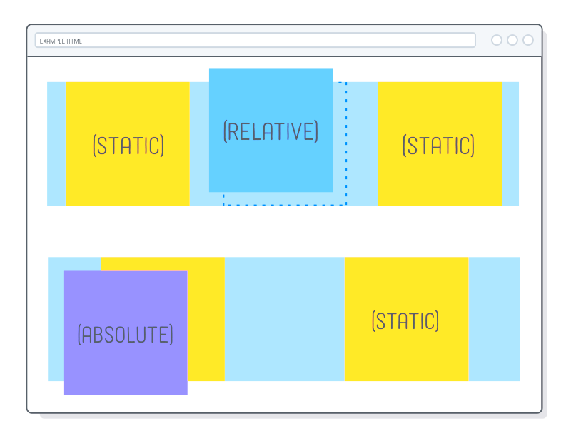
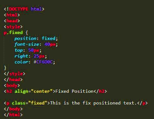
- Absolute Positioning: This technique involves placing an image at a specific location on the page, regardless of other elements. It’s great for overlays or specific design elements.
Choosing the right technique depends on your design goals and the layout of your website.
Also Read This: Annotating Images for Clearer Explanations
Using CSS for Image Alignment
CSS offers powerful options for aligning images, allowing for greater control over how they appear on your webpage. Here are some essential CSS properties you can use:
- text-align: This property is used to align inline images within block-level elements. For example, you can center an image by setting
text-align: center;on its parent element. - margin: You can adjust the space around images using the
marginproperty. For instance, settingmargin: auto;can center an image horizontally if it has a defined width. - float: This property lets you position images to the left or right. Just remember to clear the float afterwards, either by using the
clearproperty on subsequent elements or by adding a clearfix. - object-fit: This CSS property is useful for ensuring that images maintain their aspect ratio when resized. Setting it to
coverorcontaincan help control how the image fits its container.
By leveraging these CSS techniques, you can effectively align and position images to enhance the overall look of your website.
Also Read This: Applying Makeup on Oily Skin for a Long-Lasting Finish
Setting Image Size and Aspect Ratio
When you're working with images on your website, setting the right size and maintaining the correct aspect ratio is crucial. Proper sizing ensures that your images look sharp and fit well within your layout. An aspect ratio, which is the relationship between an image's width and height, is essential for avoiding distortion. Let's dive into how to set these parameters effectively.
Here are a few key points to consider:
- Use HTML Attributes: You can set the width and height of an image directly in the HTML using the
widthandheightattributes. However, it's best to specify these in CSS for better responsiveness. - Maintain Aspect Ratio: To keep the aspect ratio intact while resizing, set only one of the dimensions (either width or height) in CSS, and set the other to
auto. - CSS Properties: Use the
max-widthproperty to prevent images from stretching beyond their original size. This is especially useful for responsive designs.
By understanding how to set image size and maintain aspect ratio, you can create visually appealing and well-structured web pages that enhance the user experience.
Also Read This: Cropping an Image in Cricut
Responsive Image Positioning for Different Devices
In today's world, where people access websites on various devices, ensuring that your images are responsive is vital. Responsive image positioning means that your images will look great on desktops, tablets, and smartphones without losing quality or clarity. Here are some strategies to achieve this:
- Use CSS Media Queries: Media queries allow you to apply different styles depending on the device's screen size. This way, you can adjust image sizes and positions for var
Also Read This: How to Make Fabric Handbags at Home with Dailymotion Tutorials
Tips for Improving Image Placement on Your Website
Images are not just decoration; they can significantly enhance your website's message and user experience. Improving image placement can make your content more engaging and accessible. Here are some practical tips to help you optimize your image placement:
- Use High-Quality Images: Always choose clear, high-resolution images. Blurry or pixelated images can turn visitors away and give an unprofessional impression.
- Consider Visual Hierarchy: Place important images strategically to draw attention. Use larger images for key messages and smaller ones for supplementary content.
- Balance Text and Images: Avoid cluttering your pages with too many images. A balanced layout with ample whitespace can improve readability and focus.
- Utilize Captions: Adding captions to images can provide context and enhance understanding. Captions can also keep viewers engaged by inviting them to read more.
- Test Different Layouts: Experiment with various image placements to see what works best for your audience. A/B testing can provide valuable insights into user preferences.
- Optimize Load Times: Use image compression tools to reduce file sizes without losing quality. Faster loading times improve user experience and SEO rankings.
By applying these tips, you can create a more visually appealing and effective website that resonates with your audience.
Also Read This: Creating Curved Images in Canva
Frequently Asked Questions About Image Positioning
Many web designers and content creators have questions about image positioning. Let’s tackle some frequently asked questions to clarify any uncertainties:
- What is the best way to center an image?
To center an image, set the image's display property toblockand applymargin: auto;in CSS. - How can I ensure images are responsive?
Use CSS to set the image width to100%and height toauto. This way, the image adjusts to the container size. - Should I use fixed sizes for images?
It’s generally better to use relative sizes for flexibility. Fixed sizes can lead to issues on different screen sizes. - What is the purpose of alt text?
Alt text improves accessibility for users with visual impairments and also helps search engines understand the content of your images. - How can I improve image load speed?
Optimize your images by compressing them before uploading. Tools like TinyPNG or ImageOptim can be helpful.
If you have more questions, feel free to explore resources or consult web design communities for further guidance!
Conclusion on Effective Image Positioning in HTML
Effective image positioning in HTML is essential for creating visually appealing and user-friendly websites. By understanding the various techniques for image placement and being mindful of responsive design, you can enhance your site's overall quality. Remember to consider aspects like size, aspect ratio, and alt text, which contribute to both aesthetics and accessibility.
Whether you’re a seasoned designer or just starting, keeping these tips in mind will help you make informed choices about how to position images on your website. A well-placed image can tell a story, evoke emotion, and guide users through your content. So go ahead, put your newfound knowledge into practice and watch your website flourish!
 admin
admin