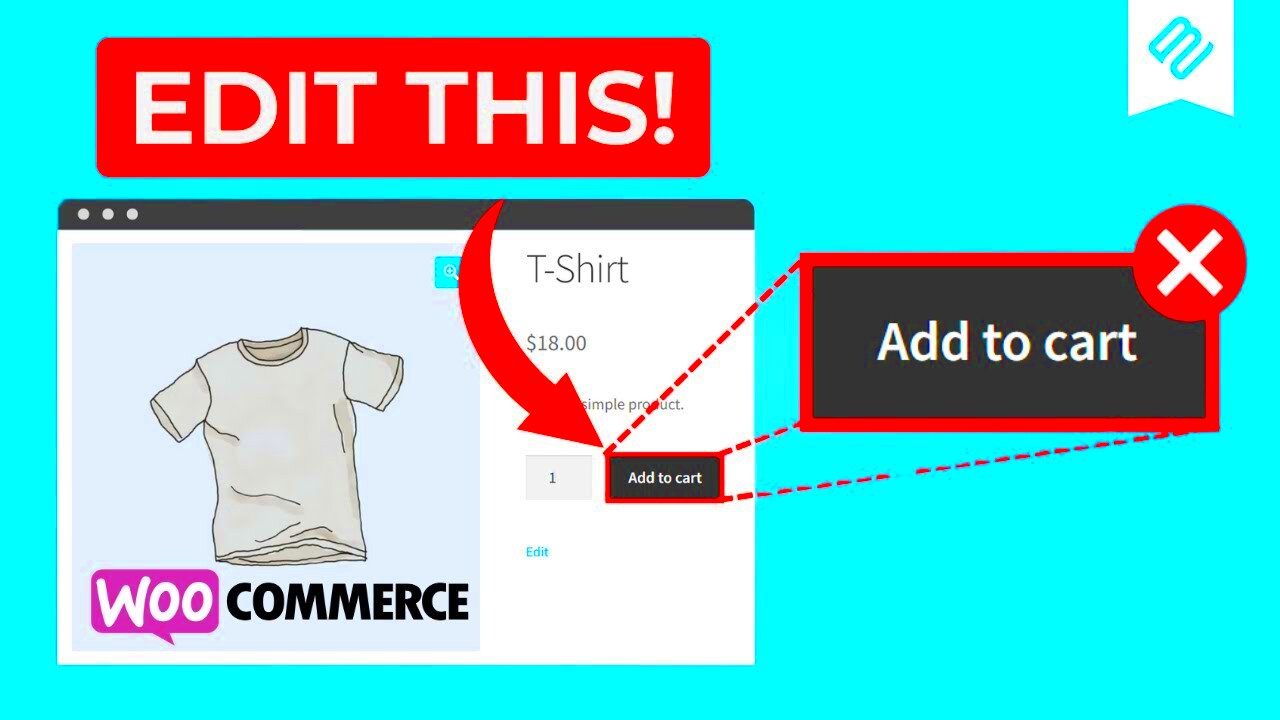
In WooCommerce, the placement of the Add-to-Cart button plays a key role in how customers interact with your store. By default, the button is positioned beneath the product image or description, but you might want to change its position to optimize your store's user experience or to better match your website's design. Moving the Add-to-Cart button underneath the product image can increase visibility and make it easier for customers to make a purchase. In this guide, we'll explore why and how you can adjust the placement of the Add-to-Cart button in WooCommerce.
Why You Might Want to Move the Add-to-Cart Button
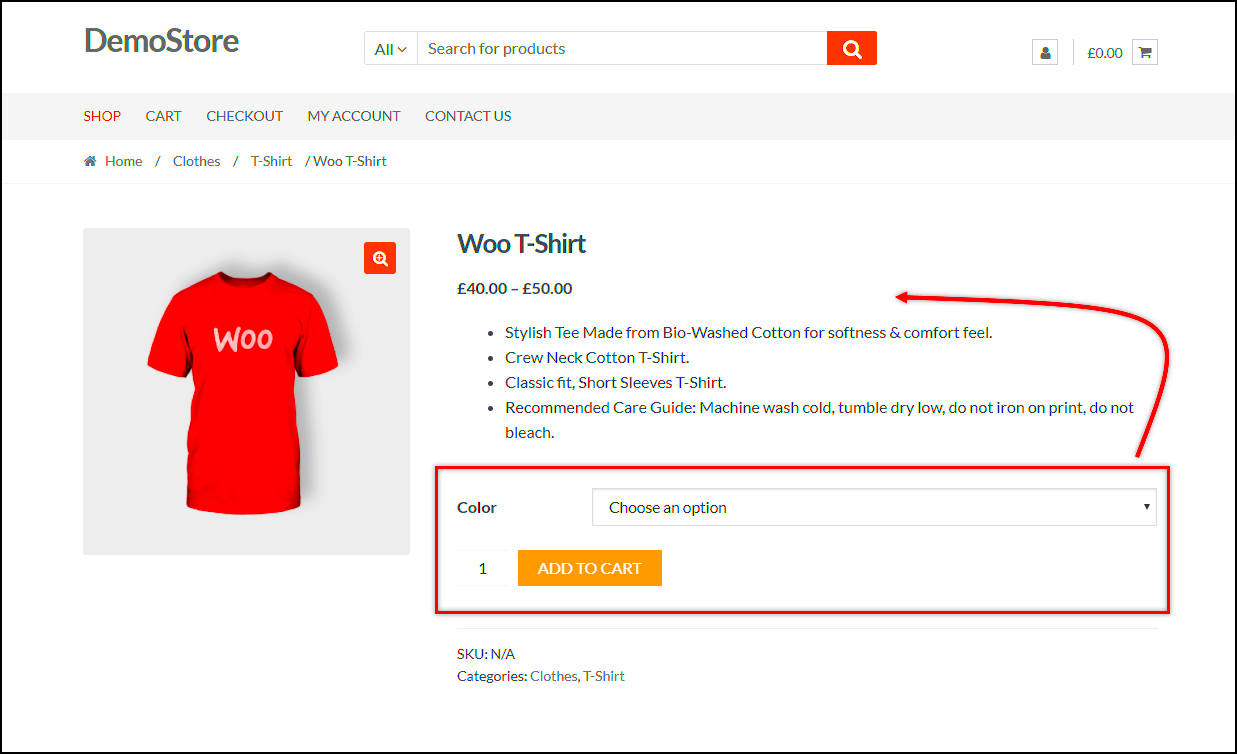
There are several reasons why you might want to change the position of the Add-to-Cart button on your WooCommerce site. Here are some common ones:
- Improved user experience – Placing the button closer to the product image can make it easier for customers to see and interact with, which may improve their shopping experience.
- Better design alignment – If your website has a custom design, moving the button can help align it with the overall aesthetics and flow of the page.
- Faster checkout process – By placing the button where it's more accessible, you can encourage quicker purchasing decisions from your customers.
- Mobile optimization – On mobile devices, positioning the button in a more accessible location can improve mobile user experience and conversion rates.
By understanding why you may want to move the button, you can make more informed decisions about how to optimize your product pages for better sales and customer satisfaction.
Also Read This: Which Streaming Service Delivers Better Sound Quality Spotify or YouTube Music
Step-by-Step Guide to Changing the Button Position
Moving the Add-to-Cart button in WooCommerce can be done in a few different ways, depending on your skill level and how comfortable you are with editing code or using plugins. Here's a simple guide to help you get started:
Option 1: Edit the Theme Files
If you're familiar with coding, this option gives you more control over the button's placement. You'll need to edit your theme's functions.php or single-product.php file. Here's how:
- Go to your WordPress dashboard and navigate to Appearance > Theme Editor.
- Select the
functions.phpfile from the list on the right. - Add a custom function to change the button's position. For example, you can use the
remove_action()andadd_action()functions to change where the button appears. - Save your changes and refresh your website to see the updated button position.
Option 2: Use a Plugin
If you're not comfortable editing code, there are several WooCommerce plugins available that allow you to move the Add-to-Cart button with a few clicks. Popular options include:
- WooCommerce Customizer – This plugin provides a simple interface for customizing WooCommerce elements, including button placement.
- Elementor – A page builder plugin that allows you to visually drag and drop WooCommerce elements, including the Add-to-Cart button.
- WooCommerce Product Page Customizer – A plugin designed specifically to let you modify product page layouts, including button positions.
Option 3: Custom CSS
If you want to make minor adjustments to the button's position, you can use custom CSS. Here’s how:
- Go to Appearance > Customize > Additional CSS.
- Enter custom CSS to move the Add-to-Cart button. For example:
- Save your changes and check your site to see the effect.
        .single-product .product .add-to-cart {
            position: relative;
            top: -20px;
        }
Each of these methods has its pros and cons, but all can help you move the Add-to-Cart button to a more strategic location on your product pages.
Also Read This: List of Top Linkedin Companies of USA in 2023
Customizing Your Theme to Move the Button
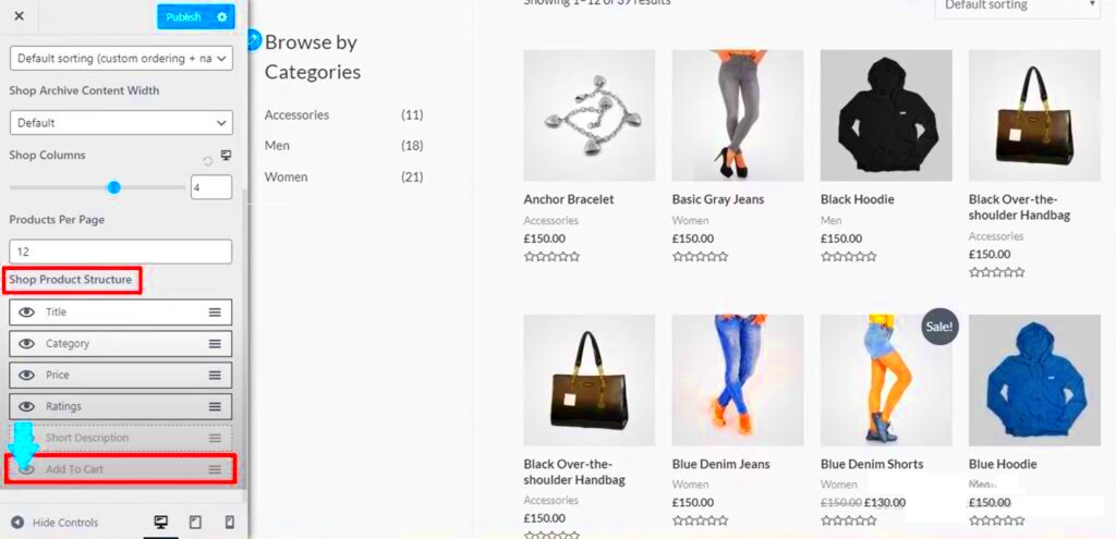
Customizing your theme is a great way to change the position of the Add-to-Cart button in WooCommerce. It gives you full control over where and how the button appears on your product pages. If you're familiar with PHP and CSS, you can directly edit your theme files to modify button placement. Here's how you can do it:
Editing Theme Files
To start, you'll need to access your theme’s files through the WordPress dashboard or via FTP. Here are the key steps:
- Go to Appearance > Theme Editor from your WordPress dashboard.
- Locate the
single-product.phpfile under your theme's template files. - Search for the line of code that handles the Add-to-Cart button (usually
woocommerce_template_single_add_to_cart()). - Move this code to a different location within the HTML structure of the product page. For example, you could position it below the product image.
Using Hooks and Filters
If you're not comfortable editing the HTML directly, you can use WooCommerce hooks to control where the button appears. WooCommerce provides several hooks, such as woocommerce_single_product_summary, that allow you to insert content at specific locations within the product page. You can use the remove_action() and add_action() functions in your theme’s functions.php file to move the button.
Using Custom CSS
Once you've adjusted the button’s location, you can further tweak its appearance using custom CSS. For example, if the button is too close to other elements, you can add padding or margins to create more space:
.single-product .product .add-to-cart {
    margin-top: 20px;
}
By customizing your theme, you gain more flexibility in placing and styling the Add-to-Cart button to fit your design needs.
Also Read This: Watch the Cowboys Game on YouTube TV – A Comprehensive Guide
Using a Plugin to Adjust Button Placement
If you prefer a simpler approach, using a plugin is an easy way to move the Add-to-Cart button without touching any code. Plugins can simplify the process, especially for those who are not comfortable working with PHP or CSS. Here are some popular options to consider:
WooCommerce Customizer
The WooCommerce Customizer plugin offers an intuitive interface for adjusting various aspects of your WooCommerce store, including the placement of the Add-to-Cart button. After installing the plugin, you can use the settings panel to change button position without writing any code.
Elementor
If you use the Elementor page builder, you can easily adjust the placement of your Add-to-Cart button using a drag-and-drop editor. Elementor gives you full control over page elements, including WooCommerce widgets like the Add-to-Cart button. Simply drag the button widget to the desired location on the page.
WooCommerce Product Page Customizer
This plugin is designed specifically for customizing product page layouts. It allows you to move the Add-to-Cart button and other product elements by simply selecting a different position from a dropdown menu. This option is great for beginners who want to avoid dealing with code.
Other Plugins
There are several other plugins available, such as Product Add-ons and WooCommerce Blocks, that allow for greater customization of product pages, including the button's placement.
Using a plugin is a quick and efficient way to adjust your button's placement, especially if you don't want to get into the technical side of things.
Also Read This: Can You Stream Peacock on YouTube TV?
How to Test the Button Position After Moving It
Once you've moved the Add-to-Cart button, it's important to test the changes to ensure everything is working as expected. Testing helps you catch any potential issues with button visibility, functionality, or layout. Here's how you can thoroughly test the button's new position:
1. Check on Different Devices
It's important to test the button on both desktop and mobile devices. Sometimes, changes that look good on a computer screen might not work well on mobile. Use browser tools to test how your page looks on different screen sizes, or simply view the page on your own phone.
2. Test Button Functionality
After moving the button, make sure it still works correctly. Click the button to ensure the item is added to the cart and the cart page loads properly. Check that the button is still responsive, meaning it reacts when clicked or hovered over.
3. Review User Experience
Consider your customers' experience. Does the new button placement make the page easier to navigate? Is the button easy to find? Ask for feedback from a few users or coworkers if possible.
4. Test with Multiple Themes
If you’re using a child theme or have custom elements on your site, test the button across different themes to ensure the changes don't interfere with other parts of your site.
5. Use Browser Tools for Debugging
If the button's new position causes layout issues, use your browser's developer tools to inspect the element and make adjustments. This tool will help you fine-tune margins, padding, and other properties to fix any issues.
After testing, ensure that the new placement provides a seamless and functional shopping experience for your customers. This way, your site will look great, and your customers will have a smooth and easy time completing their purchases.
Also Read This: how to make the image smaller in html
Troubleshooting Common Issues
Even after successfully moving the Add-to-Cart button in WooCommerce, you may run into a few issues that could impact the functionality or appearance of your site. These issues can range from minor layout problems to more significant functionality concerns. Here are some common problems you might encounter and how to troubleshoot them:
1. Button Not Appearing
If the Add-to-Cart button isn’t showing up after you’ve moved it, first check whether the code was added correctly or the plugin was installed properly. You can:
- Review the theme's
single-product.phpfile or plugin settings to ensure the code is placed in the right location. - Clear your site’s cache and browser cache to make sure you're seeing the latest version of your page.
- Inspect the page using browser developer tools to see if the button is hidden due to CSS conflicts.
2. Layout Issues
Sometimes, moving the button can cause layout issues, such as overlapping text, images, or other elements. To fix this:
- Check if any custom CSS or theme styles are conflicting with the button’s position.
- Use
paddingormarginto create more space around the button and ensure it doesn’t overlap with other elements. - Test on multiple devices to ensure the layout is responsive and adapts well to different screen sizes.
3. Button Not Functioning Properly
If the Add-to-Cart button is not functioning after moving it, verify that:
- The WooCommerce core functions are still intact and no essential code was removed or broken.
- Any JavaScript that handles the button’s behavior is still active and has not been affected by the changes.
By following these steps, you can identify and resolve any issues that arise when moving the Add-to-Cart button in WooCommerce.
Also Read This: How to Remove YouTube from Google TV Uninstalling the App from Your Smart Device
Benefits of Moving the Add-to-Cart Button
There are several advantages to customizing the position of the Add-to-Cart button in WooCommerce. While it may seem like a small change, moving the button can have a significant impact on both user experience and conversions. Here’s why it might be worth considering:
1. Improved User Experience
Making the Add-to-Cart button more prominent or accessible can improve how easily customers interact with your product pages. A more intuitive button placement, like positioning it closer to the product image, helps customers take quicker actions, reducing frustration and improving site navigation.
2. Increased Conversions
A well-placed Add-to-Cart button can directly influence conversion rates. By positioning it in a more visible or convenient location, you make it easier for customers to make a purchase. This can lead to higher sales, especially if the button is easy to find and click, especially on mobile devices.
3. Customization to Match Branding
Moving the Add-to-Cart button gives you more flexibility to match your site’s branding and design. Whether you want the button in a specific spot to align with the visual flow of your site or to make it stand out with unique styling, customization ensures it fits seamlessly into your overall theme.
4. Better Mobile Optimization
For mobile users, having the Add-to-Cart button positioned in a more accessible place can improve user experience. Mobile users tend to interact with the site differently than desktop users, and optimizing the button placement ensures that it’s easily clickable and user-friendly.
5. Alignment with Sales Strategy
In some cases, moving the button is part of a broader sales strategy, such as making the Add-to-Cart button more prominent for high-demand products or special offers. Adjusting the button’s position could help emphasize certain products and lead to more purchases.
Overall, moving the Add-to-Cart button is a simple but effective way to enhance your WooCommerce store’s usability and improve customer satisfaction, ultimately contributing to higher conversion rates.
Also Read This: Don’t Worry Darling Watch Online on Dailymotion How to Stream
Conclusion
In conclusion, moving the Add-to-Cart button in WooCommerce can significantly improve the user experience, boost conversions, and better align with your store’s design and branding. Whether you choose to modify your theme files, use a plugin, or rely on custom CSS, there are various methods to customize the button’s position according to your needs. Troubleshooting common issues, such as layout problems or button functionality, ensures that your changes are implemented correctly. By testing the button on multiple devices and optimizing its placement for both desktop and mobile users, you can ensure that your customers have a smooth and efficient shopping experience.
Ultimately, customizing the Add-to-Cart button placement can make your store more intuitive, user-friendly, and appealing, leading to better customer engagement and increased sales.
Frequently Asked Questions
Here are some common questions you might have about moving the Add-to-Cart button in WooCommerce. These FAQs can help clarify any uncertainties and provide additional guidance as you make changes to your product pages.
1. Can I move the Add-to-Cart button without editing code?
Yes, you can move the Add-to-Cart button without editing code by using plugins. There are several WooCommerce plugins, such as WooCommerce Customizer and Elementor, that allow you to change the button's position with a simple drag-and-drop interface. This method is ideal for beginners or those who prefer not to touch the code.
2. Will moving the Add-to-Cart button affect my store’s mobile layout?
If done correctly, moving the Add-to-Cart button should not negatively impact your store’s mobile layout. However, it’s essential to test the button after making any changes to ensure it's still easily accessible on mobile devices. You may need to adjust margins or padding using CSS to ensure it looks great on both desktop and mobile.
3. Can I change the appearance of the Add-to-Cart button as well as its position?
Yes, you can change both the appearance and position of the Add-to-Cart button in WooCommerce. You can use custom CSS to modify the button’s color, size, font, and other styles. Additionally, positioning can be adjusted through your theme files, hooks, or plugins, as discussed in the previous sections.
4. What should I do if the Add-to-Cart button is not showing after moving it?
If the Add-to-Cart button isn't showing after moving it, check for potential issues such as:
- Incorrect code placement or missing code if you edited your theme files.
- Plugin conflicts that may be preventing the button from displaying.
- Browser cache or site cache that may need to be cleared.
Clearing the cache and reviewing the code should help resolve the issue.
5. Will moving the Add-to-Cart button affect the checkout process?
No, moving the Add-to-Cart button will not affect the checkout process as long as the button remains functional. The button’s functionality (adding items to the cart) is controlled by WooCommerce’s core settings, so as long as the button triggers the add-to-cart action, the checkout process should remain unchanged.
6. How do I test the Add-to-Cart button after moving it?
After moving the button, it’s essential to test it for both functionality and visual appeal. Here’s how to do it:
- Test on multiple devices (desktop, tablet, mobile) to ensure the button is positioned correctly and looks good.
- Click the button to ensure it adds the product to the cart and that the cart page loads properly.
- Check for any layout issues, such as overlapping text or images, that might result from the new position.
By addressing these common questions, you should have a clearer understanding of how to move and optimize the Add-to-Cart button in WooCommerce for a better user experience and higher conversions.
