When building a website, image size plays a crucial role in how fast your page loads and how users interact with your site. Larger images can significantly slow down page load times, leading to a poor user experience. This is especially true for mobile users who may have slower internet connections. In this guide, we’ll walk you through different methods of making images smaller in HTML, improving both your website’s performance and SEO ranking.
Understanding the Importance of Image Size

Images are an essential part of any website, but if they’re too large, they can hurt your website’s performance. A large image takes longer to load, which increases page load times. This can frustrate users, cause them to leave your site, and even lower your website’s ranking on search engines like Google.
Here’s why image size matters:
- Faster Load Times: Smaller images load faster, improving the overall speed of your website.
- Improved User Experience: Users expect fast loading times, especially on mobile devices. Smaller images ensure a smoother browsing experience.
- Better SEO: Search engines like Google take page load speed into account when ranking websites. Faster pages rank better.
- Less Data Usage: Smaller images use less bandwidth, which is beneficial for users with limited internet data.
To get the best results, it's essential to optimize your images for the web. Reducing their size doesn’t mean compromising on quality; it’s about striking the right balance between clarity and load speed.
Also Read This: How to Get YouTube on DirecTV in 2023 Latest Updates and Tips
Different Ways to Make an Image Smaller in HTML
There are several methods you can use to make an image smaller in HTML. Depending on your needs, you can choose the method that works best for you. Here are some common techniques:
- HTML Image Attributes: You can resize an image directly in the
<img>tag using thewidthandheightattributes. This is a quick and easy way to scale an image without affecting its file size. - CSS Styles: CSS offers more flexibility for resizing images. You can use CSS to adjust the dimensions of an image or set it to be responsive, adapting to different screen sizes.
- Image Compression: This involves reducing the file size of the image itself without changing its dimensions. Compression tools like TinyPNG or ImageOptim help achieve this.
- Responsive Images: With responsive web design, you can use the
srcsetattribute in HTML to display different image sizes depending on the screen resolution and size.
Each of these methods can be used in combination for the best results. For example, you might resize an image with HTML attributes, then use CSS for responsiveness, and finally compress the image to ensure it’s optimized for faster loading.
Also Read This: Seamless Integration: Connecting Amazon to Your Alibaba Business
Using HTML Attributes to Resize Images
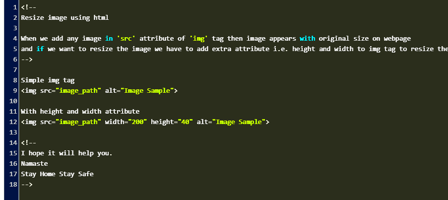
One of the easiest ways to resize an image in HTML is by using the width and height attributes in the <img> tag. This method allows you to set the specific dimensions for an image directly within your HTML code. While it’s a simple approach, it doesn’t change the file size of the image itself, only the display size.
Here’s an example of how to resize an image using HTML attributes:
<img src="image.jpg" width="300" height="200">In this example, the image will be displayed at 300px wide and 200px tall, regardless of its original size. However, keep in mind that this doesn’t compress the image, so it might still take a long time to load if the image file is large.
Benefits of Using HTML Attributes:
- Simple and Quick: It’s easy to implement this method by adding the
widthandheightattributes to the image tag. - No Need for Extra Code: You don’t need to write any CSS or JavaScript to resize the image—just modify the HTML code.
- Control Over Image Dimensions: This method gives you precise control over how the image appears on your page.
However, for more advanced control, especially if you want your images to scale responsively across different devices, using CSS or other methods might be a better choice.
Also Read This: List of Top Linkedin Demanding Skills
Resizing Images with CSS
CSS provides a more flexible and powerful way to resize images. With CSS, you can easily adjust the width and height of an image or make it responsive, meaning it adapts to different screen sizes. This method doesn’t affect the image file size but changes how it’s displayed on the page.
Here are a few ways to resize images using CSS:
- Fixed Size: You can specify a fixed width and height for an image in your CSS file.
img { width: 300px; height: 200px; }img { width: 100%; height: auto; }max-width property.img { max-width: 100%; height: auto; }Advantages of Using CSS:
- More Control: CSS gives you better control over how images look on different screen sizes, making your website more flexible.
- Responsive Design: You can create images that adjust automatically to fit mobile, tablet, or desktop screens.
- Less Code: Using CSS for resizing keeps your HTML cleaner and reduces redundancy.
For responsive designs and more control over image presentation, CSS is a preferred method. You can combine CSS with HTML attributes for even better results.
Also Read This: Exploring the Best Streaming Platforms: a Guide to Finding Your Perfect
Optimizing Images for Faster Load Times
Optimizing images is crucial for improving page load times and overall site performance. While resizing images with HTML and CSS changes their display size, optimization actually reduces the file size of the image itself. This is important because smaller files load faster, which results in a better user experience, especially for visitors on mobile devices or slower internet connections.
Here are some common ways to optimize images:
- Image Compression: Compressing images reduces their file size without sacrificing quality. You can use tools like TinyPNG or ImageOptim to compress your images before uploading them to your website.
- Choosing the Right File Format: Different file formats are better suited for different types of images. For example:
- JPEG: Great for photographs and images with many colors.
- PNG: Ideal for images with transparency or images that require high detail.
- WebP: A modern image format that offers superior compression without loss of quality, supported by most modern browsers.
- Using Lazy Loading: Lazy loading allows images to be loaded only when they are about to be displayed on the user’s screen. This reduces initial page load time and saves bandwidth.
- Responsive Images: Use the
srcsetattribute in HTML to serve different image sizes depending on the user’s screen size and resolution. This helps reduce the file size for mobile users while still providing high-quality images on larger screens.
Why Image Optimization Matters:
- Faster Load Times: Optimized images load quicker, improving your website's speed.
- Better SEO: Google rewards websites with faster load times by ranking them higher in search results.
- Improved User Experience: Faster loading means happier visitors, which can lead to better engagement and higher conversion rates.
Optimizing images doesn’t require much effort, but it can have a significant impact on the performance of your website. It’s one of the most important steps you can take to improve both user experience and SEO.
Also Read This: Capturing Famous Places Across the USA in Photos
Best Practices for Image Resizing in HTML
Resizing images in HTML might seem simple, but there are certain best practices you should follow to ensure your images look great and load efficiently on all devices. Whether you're resizing images manually or using CSS, keeping these guidelines in mind can help you create a better user experience and boost your site's performance.
Here are some best practices to consider:
- Use the Correct Image Format: Choose the right format based on the image content. For photographs, JPEG is usually best. For images with transparency or sharp edges, consider PNG. And for modern browsers, WebP is a great option for superior compression without losing quality.
- Set Width and Height: Always specify the width and height of an image, whether in HTML or CSS. This ensures that the page layout doesn’t shift as images load and prevents content from "jumping" around.
- Maintain Aspect Ratio: When resizing images, make sure the aspect ratio (width to height ratio) is maintained to avoid stretching or distorting the image. You can set this in CSS with the
height: auto;property. - Resize Before Uploading: If possible, resize and compress images before uploading them to your server. This reduces the workload on your site and improves loading speed.
- Use Responsive Images: To ensure your images look good on all devices, use the
srcsetattribute to load different image sizes depending on screen width or resolution.
By following these best practices, you can optimize images for better performance, making sure your site is fast, responsive, and user-friendly.
Also Read This: A Glimpse into the Influential Technology Firms Shaping the Landscape of the USA
Frequently Asked Questions (FAQ)
In this section, we answer some common questions about resizing and optimizing images in HTML. These tips can help clear up any confusion and ensure you're following the best practices.
1. How do I resize an image in HTML?
To resize an image in HTML, you can use the width and height attributes in the <img> tag. For example:
<img src="image.jpg" width="300" height="200">This will display the image at a fixed size of 300px by 200px. For more control, you might prefer resizing using CSS.
2. Can resizing an image affect its quality?
Yes, resizing an image can affect its quality. If you reduce the image size too much, it may become pixelated or blurry. It’s important to maintain a good balance between size and quality. For best results, resize and compress images properly before uploading them to your site.
3. How do I make an image responsive in HTML?
To make an image responsive, you can use CSS. For example, setting width: 100% and height: auto; will allow the image to adjust to the width of its container while maintaining its aspect ratio.
img { width: 100%; height: auto; }This method ensures that the image looks good on both large screens and mobile devices.
4. What is the best file format for web images?
The best format depends on the type of image:
- JPEG: Best for photographs and images with lots of colors.
- PNG: Ideal for images that need transparency or images with sharp lines.
- WebP: A newer format offering great compression without losing quality, but check browser compatibility.
5. Should I always resize images before uploading them?
Yes, it’s a good idea to resize images before uploading them to your website. This helps reduce the load on your server and improves page loading times for users. Tools like Photoshop, GIMP, or online compressors can help with resizing and optimizing images for the web.
Conclusion
In summary, resizing images properly in HTML is an essential practice for web developers. By optimizing your images, you not only improve the speed and performance of your website but also enhance user experience and SEO. Whether you’re using HTML attributes, CSS, or image compression, always aim for the right balance between image quality and file size.
Remember, smaller images that load faster lead to better engagement and improved search engine rankings. Follow the best practices mentioned in this post, and your website will perform better on both desktop and mobile devices.
By adopting the right techniques, like using responsive images and compressing files before uploading, you can ensure that your website is both fast and visually appealing for your visitors.


