Visual content can be presented excellently through image cards which work well for blogs, social media posting or other marketing materials. The combination of text and pictures makes the presentation uniform and eye-catching. Using image cards will enable you to attract readers’ attention very fast while giving them vital information. This part shall explain what
Usually, the image snaps of cards include the following components:
- Image: The main visual element that attracts viewers.
- Title: A catchy phrase that summarizes the content.
- Description: A brief explanation or context for the image.
- Call to Action: Encourages users to take the next step, like visiting a website or learning more.
Choosing the Right Images
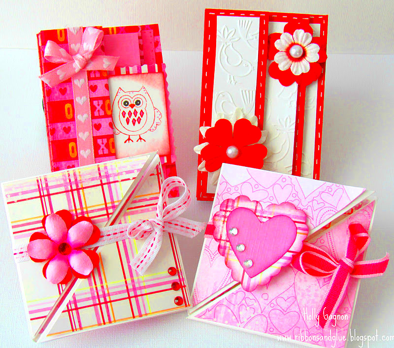
The selection of the right images for your cards is very important. The pictures chosen should harmonize with the target audience of yours and also match with what you want to convey through them. The following are some of the guiding principles in picking out appropriate visuals:
- Know Your Audience: Consider what appeals to them. Younger audiences might prefer vibrant colors, while professional groups might favor muted tones.
- Use High-Quality Images: Clear, sharp images make a better impression. Avoid blurry or pixelated visuals.
- Consider Your Brand: Select images that reflect your brand’s personality and values.
- Use Diverse Images: Represent different cultures and perspectives to appeal to a broader audience.
<p>The Free Range Stock Image Downloader is one of the platforms, which can help you choose a range of images that you might be interested in. Just make sure you adhere to copyright and usage rights.</p>
Also Read This: How to Change Your YouTube Font and Personalize Your Channel
Designing Your Image Cards
Now that you’ve gotten your pictures, you want to go ahead and design the image cards. It is essential to be creative because a well-designed card can make your content noticeable and captivate your audience. Consider these 4 design principles:
- Keep It Simple: Avoid clutter. Use whitespace effectively to let your content breathe.
- Consistent Style: Use a uniform font, color scheme, and layout to create a cohesive look.
- Focus on Readability: Ensure that your text is legible against the background. Choose contrasting colors for text and images.
- Include Branding: Add your logo or brand colors to reinforce your identity.
You may want to try design tools such as Canva or Adobe Spark, which have templates that can be easily customized. Play around with various layouts until you discover one that is consistent with your content and style.
Also Read This: How to Remove Watermarks from Getty Images Using Reddit Insights
Adding Text and Branding
Creating successful image cards depends greatly on the text and branding. Although it is the beautiful images that attract the eye, the provided text conveys meaning and helps to brand. Let us consider how to add text plus branding to image cards efficiently.
POINTERS WHILE ADDING TEXT:
- Be Concise: Use short, impactful phrases. Avoid long paragraphs that can overwhelm viewers.
- Choose the Right Font: Select a font that matches your brand's personality. For example, a fun brand might use playful fonts, while a serious one might opt for classic, professional styles.
- Highlight Key Information: Use bold or larger text for essential points to grab attention.
- Incorporate Your Logo: Include your logo in a corner of the card. It helps in brand recognition.
It’s important not to let the words overpower the images. The picture must be complemented, not confused with unnecessary wordings. Link them up just enough tu get the attention of your target audience.
Also Read This: Posting Shutterstock Images on Instagram: Understanding Copyright and Usage Policies
Using Free Range Stock Image Downloader
The Free Range Stock Image Downloader is a perfect tool for individuals looking for quality, free-of-charge images. You can easily search and download images with it, thus making it an ideal resource for designing image cards. Let us examine how the use of the tool can be maximized.
The following are steps that should be followed for effective use of the downloader:
- Search for Images: Use relevant keywords to find images that suit your needs.
- Filter Options: Use filters to narrow down your search by categories, orientation, or colors.
- Check Licensing: Ensure that the images you select are free for commercial use, especially if you're using them for a business.
- Download and Organize: Save the images in folders for easy access when designing your cards.
The process of searching for different types of images has been simplified by this tool, providing numerous options for you to choose from. Hence, let’s commence and sift through the wide range at our disposal!
Also Read This: How to Get a Publish Link from Behance and Share Your Work Online
Optimizing for Different Platforms
With endless image size and format specifications for different platforms, it is vital that you optimize your image cards. By optimizing images, you keep your professional appearance and engage the audience. This is how to optimize your image cards for different platforms.
These cap points include:
- Know the Dimensions: Different platforms have specific recommended sizes. For example:
| Platform | Recommended Size |
|---|---|
| 1080 x 1080 pixels | |
| 1200 x 628 pixels | |
| 1000 x 1500 pixels | |
| 1200 x 675 pixels |
Use the Right File Formats: JPEG is ideal for photos, while PNG is better for images with text or logos due to its lossless compression.
- Test Before Posting: Always preview how your image cards look on different devices before publishing.
If you abide by these tips, you can be confident that your image cards will not only be attractive but also function properly on different platforms.
Also Read This: Understanding the Use of Alamy Stock Photos for Commercial and Personal Projects
Testing Your Image Cards
Testing image cards is important before you can share them to the world; it is very important that testing is done so that everything appears well and functions well since this can greatly influence engagement and conversion. Below are some ways of testing your image cards to make ensure they are okay.
Components that require emphasis besides the rest while conducting tests:
- Visual Appeal: Ensure that the images are clear and vibrant. Check for any pixelation or blurriness that could detract from the quality.
- Readability: Make sure the text is easy to read. Check the font size, color contrast, and overall layout. You might ask a few friends or colleagues for their opinions.
- Responsive Design: Test how your image cards look on various devices, such as smartphones, tablets, and desktop computers. The layout should adapt smoothly across different screen sizes.
- Functionality: If your image cards contain links or call-to-action buttons, test them to ensure they work as intended. Broken links can lead to frustration and lost opportunities.
Possibly, some feedback will help you after testing. A little questionnaire or focus group could be conducted for understanding what your viewers think about your image cards. Their advice can instruct you in the betterment.
Also Read This: How to Make an Image 300 DPI
Frequently Asked Questions
Image cards can create a lot of queries and confusions. To help you out, here are some frequently asked questions that we answer:
- What is the ideal size for image cards? The size can vary depending on the platform. Generally, aim for a ratio of 16:9 or 4:3 for a balanced look.
- How many words should I include in the text? Keep it concise. A short title and a brief description (around 20-30 words) work best.
- Can I use images from the internet freely? Always check the licensing of images. Free resources like Free Range Stock offer royalty-free options for commercial use.
- How do I make my image cards more engaging? Use vibrant images, clear text, and a strong call-to-action. Also, test different designs to see what resonates with your audience.
In case you want to ask more inquiries feel free to contact us. At the same time, online sources contain better explanations!
Conclusion
Creating effective image cards is a valuable skill that can enhance your online presence and engagement. By understanding the essential elements, choosing the right images and optimizing them for different platforms, you can concentrate on crafting visually appealing cards that communicate your message clearly. Make sure to test your cards before sharing them widely and gather feedback to ensure continued improvements over time.
During this journey of creativity, take advantage of the tools such as the Free Range Stock Image Downloader for various designs and quality images. By putting in some effort and paying attention to minor details, your image cards can be memorable and help increase the effectiveness of your content!
 admin
admin