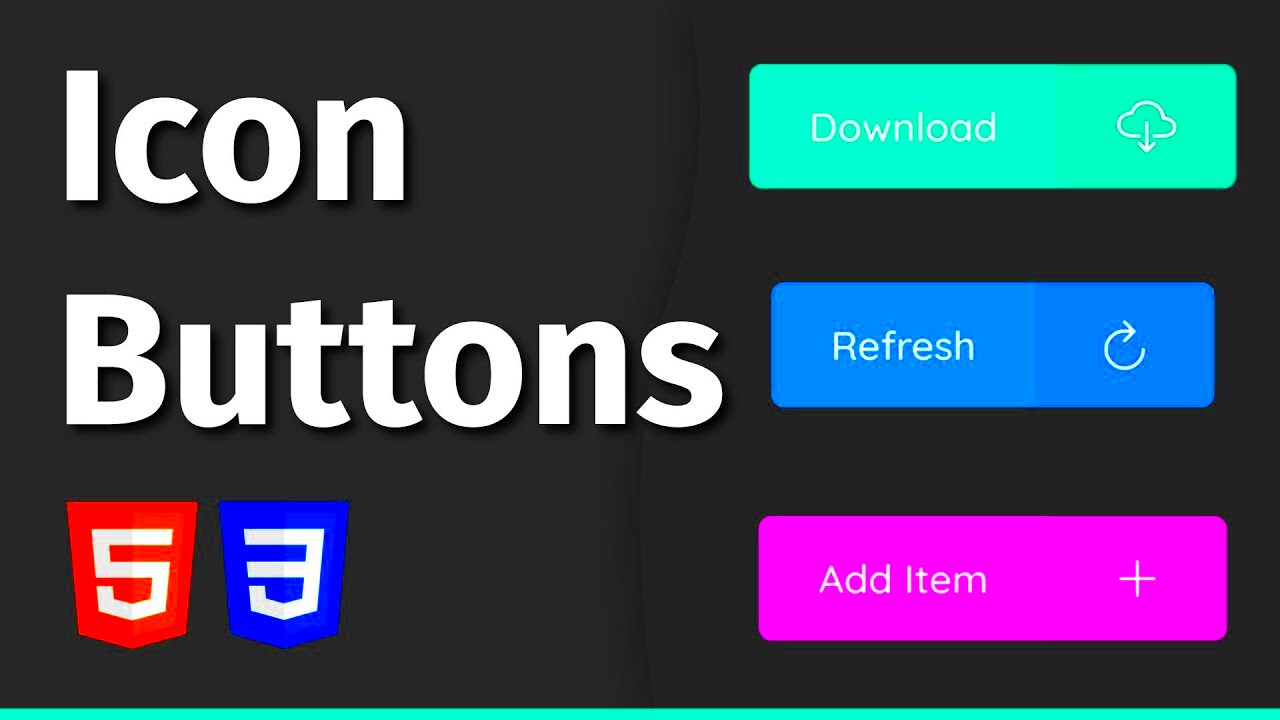
Image buttons are a popular element in web design. They combine the visual appeal of images with the functionality of buttons, making them an effective way to enhance user interaction. Instead of traditional text buttons, image buttons can attract more attention and convey meaning more effectively. This blog post will guide you through creating image buttons in HTML, highlighting their benefits and basic structure.
Benefits of Using Image Buttons
Using image buttons in your web design can offer several advantages. Here are some key benefits:
- Visual Appeal: Image buttons can make your website look more modern and engaging. They can reflect your brand's personality better than text alone.
- Improved User Experience: Users can quickly understand what action to take, as images often convey meaning faster than words.
- Better Click-Through Rates: Attractive image buttons can lead to higher conversion rates, as they catch the user's eye and encourage interaction.
- Customization: You can easily customize image buttons to fit your site's theme by changing colors, styles, and images.
- Mobile Friendliness: Image buttons often work better on touch devices, as they are easier to tap than small text links.
Basic Structure of an Image Button
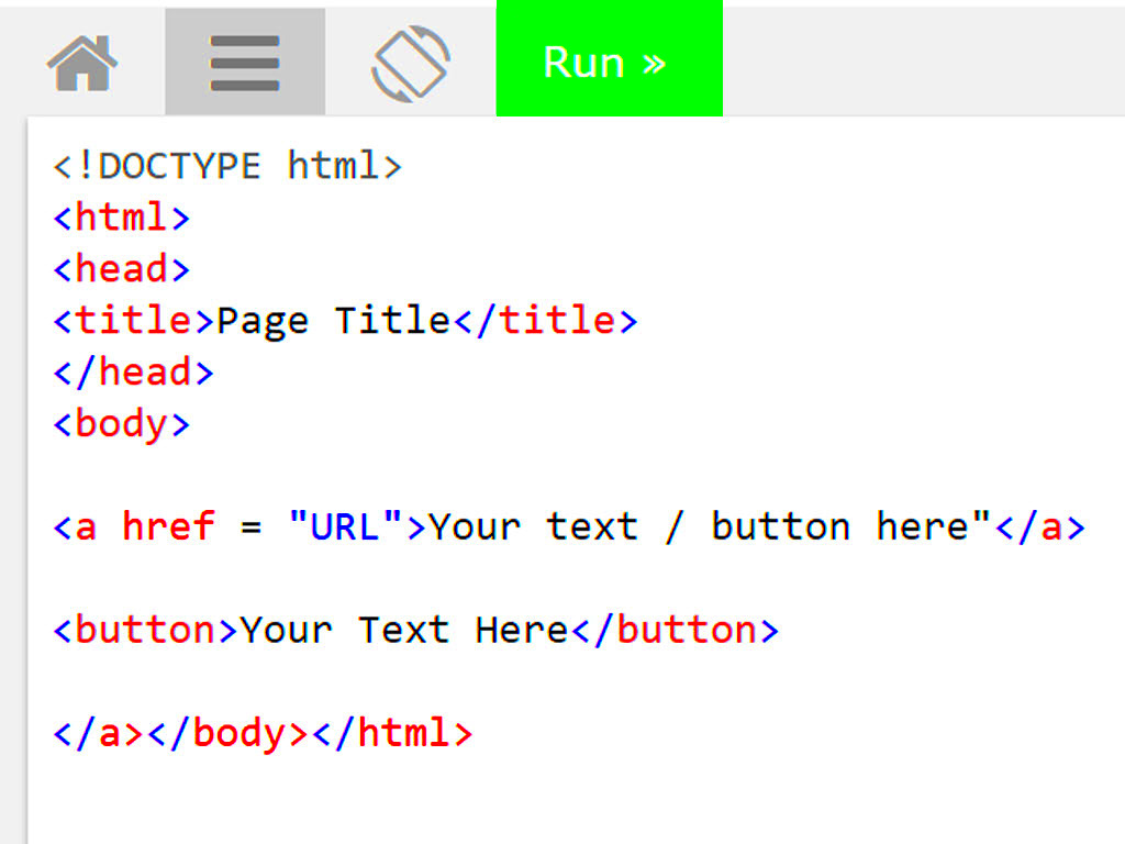
Creating an image button in HTML is straightforward. Below is the basic structure you need to follow:
| Element | Description |
|---|---|
| <button> | The main button element. |
| <img> | The image that will be displayed as the button. |
Here’s a simple example of how to set up an image button:
<button type="button">
    <img src="button-image.jpg" alt="Click Me">
</button>
This structure uses the <button> tag with an <img> tag inside. You can replace the src attribute with the path to your desired image and the alt text for better accessibility. This is the foundation for your image button, and you can further customize it with CSS for styling.
Adding Image to Button
Now that you understand the basic structure of an image button, let's talk about how to add an image to it. Adding an image is easy and enhances the button's visual appeal. Here’s how you can do it:
- Select Your Image: Choose an image that is clear and relevant to the button’s action. For example, a shopping cart icon for a purchase button.
- Use the Correct File Format: Common formats include PNG, JPEG, and GIF. Make sure to optimize the image for fast loading.
- Set Image Dimensions: Ensure the image fits well within the button without distortion. You can use CSS to adjust the width and height.
Here's an example of adding an image to a button:
<button type="button">
    <img src="cart-icon.png" alt="Add to Cart" width="50" height="50">
    Add to Cart
</button>
In this example, the image is combined with text for clarity. Users can click the image or the text to perform the action. This combination often leads to better user engagement.
Styling the Image Button with CSS
Styling your image button with CSS is where you can truly make it stand out. CSS allows you to change colors, add borders, and adjust layouts, giving your button a unique look. Here are some tips for styling:
- Set Button Size: Use padding and margin properties to create space around the button. This helps with user interaction.
- Add Borders: Consider using borders to make your button visually distinct. You can round the corners using the border-radius property.
- Change Background Color: Use the background-color property to enhance visibility.
- Add Hover Effects: Use the :hover selector to create effects like changing color or scaling up the button when a user hovers over it.
Here’s a simple CSS example:
button {
    background-color: #4CAF50;
    border: none;
    border-radius: 5px;
    padding: 10px;
    cursor: pointer;
}

button:hover {
    background-color: #45a049;
}
By incorporating these styles, your image button will not only look appealing but will also provide a better user experience.
Using Image Buttons in Forms
Image buttons can play a vital role in forms, making them more interactive and user-friendly. You can use them for submitting forms or triggering specific actions. Here’s how to effectively implement image buttons in forms:
- Submit Button: You can replace the traditional submit button with an image button. This can enhance the visual layout of your form.
- Image Selection: Use image buttons for selecting options, like choosing a profile picture. This gives users a clear visual cue.
- Feedback Mechanism: Use image buttons to provide immediate feedback or to direct users to other actions.
Here's an example of an image button used in a form:
<form action="/submit" method="post">
    <input type="text" name="username" placeholder="Enter your username">
    <button type="submit">
        <img src="submit-icon.png" alt="Submit">
    </button>
</form>
In this example, the image button submits the form. Using image buttons in forms makes the interaction enjoyable and can lead to higher submission rates.
Accessibility Considerations for Image Buttons
When designing image buttons, it's important to keep accessibility in mind. Making sure that all users, including those with disabilities, can interact with your buttons is essential. Here are some key considerations to enhance accessibility:
- Use Alt Text: Always include descriptive alt text for your images. This helps screen readers convey the button's function to visually impaired users.
- Keyboard Navigation: Ensure that users can navigate to and activate the image button using a keyboard. This is vital for those who cannot use a mouse.
- Contrast Ratio: Check that there is sufficient contrast between the button image and its background. This makes it easier for users with low vision to see the button.
- Size and Clickable Area: Make sure your image button is large enough to be easily clicked or tapped, especially on mobile devices.
- Provide Visual Indicators: Consider adding visual feedback, like color changes or outlines, to indicate when the button is focused or hovered over.
By incorporating these accessibility practices, you ensure that everyone can use your website effectively. Remember, inclusive design not only benefits users with disabilities but also improves the overall experience for all users.
FAQ
Let’s address some common questions about image buttons:
- What is an image button? An image button is a button that uses an image instead of text to perform an action, making it visually appealing and easy to understand.
- How do I add a link to an image button? You can wrap the image button in an anchor tag (
<a>) to link it to another page or resource. - Can I use animations with image buttons? Yes! You can use CSS animations to create engaging effects when users hover over or click the image button.
- What formats are best for button images? PNG and JPEG are popular formats. PNG is ideal for images with transparency, while JPEG is better for photos.
- How can I test accessibility for my image buttons? Use accessibility tools like screen readers to ensure that all users can interact with your buttons effectively.
Conclusion
Image buttons are a powerful addition to your web design toolkit. They enhance visual appeal and improve user engagement. By understanding how to add images, style buttons with CSS, and use them effectively in forms, you can create a more interactive experience for your visitors. Always remember to consider accessibility, ensuring that everyone can use your image buttons without difficulty. With these tips, you can create image buttons that not only look great but also function seamlessly for all users. Happy coding!
 admin
admin