Creating a website that mimics the clean and creative layout of a Behance portfolio can elevate your online presence. Behance is known for its visually appealing presentation, allowing artists and designers to showcase their work beautifully. In this post, we’ll explore how you can incorporate similar design elements into your website, making it not only functional but also stunning. Whether you’re a graphic designer, photographer, or illustrator, these tips will help you attract the right audience and display your work effectively!
Understanding the Key Features of Behance Portfolios
To design a website that reflects the essence of a Behance portfolio, you need to understand the key features that make Behance stand out. Here are some of the most important elements:
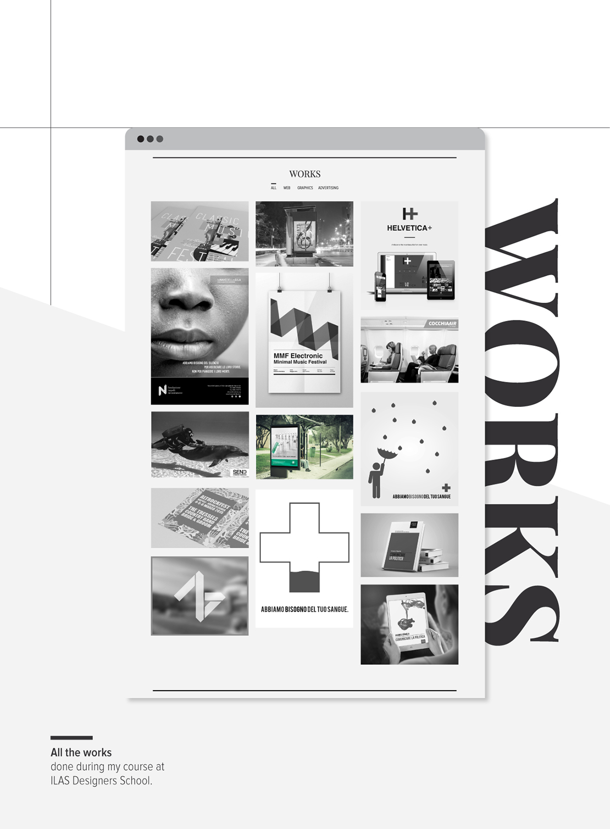
- Visual Hierarchy: Behance uses a strong visual hierarchy to guide visitors through the content. This means showcasing your most impressive work first. Consider using a grid layout where larger images represent featured projects, drawing the eye to the most important pieces.
- High-Quality Images: Quality matters! Ensure that your images are high-resolution and optimized for web use. This not only enhances the viewing experience but also showcases the details of your work. Use formats like JPEG or PNG for images and consider using WebP for faster loading times.
- Project Descriptions: Each project on Behance includes a concise description that provides context. This is your chance to tell a story. Share your inspiration, the challenges you faced, and the solutions you implemented. Don’t be afraid to get personal; storytelling can create a connection with your audience.
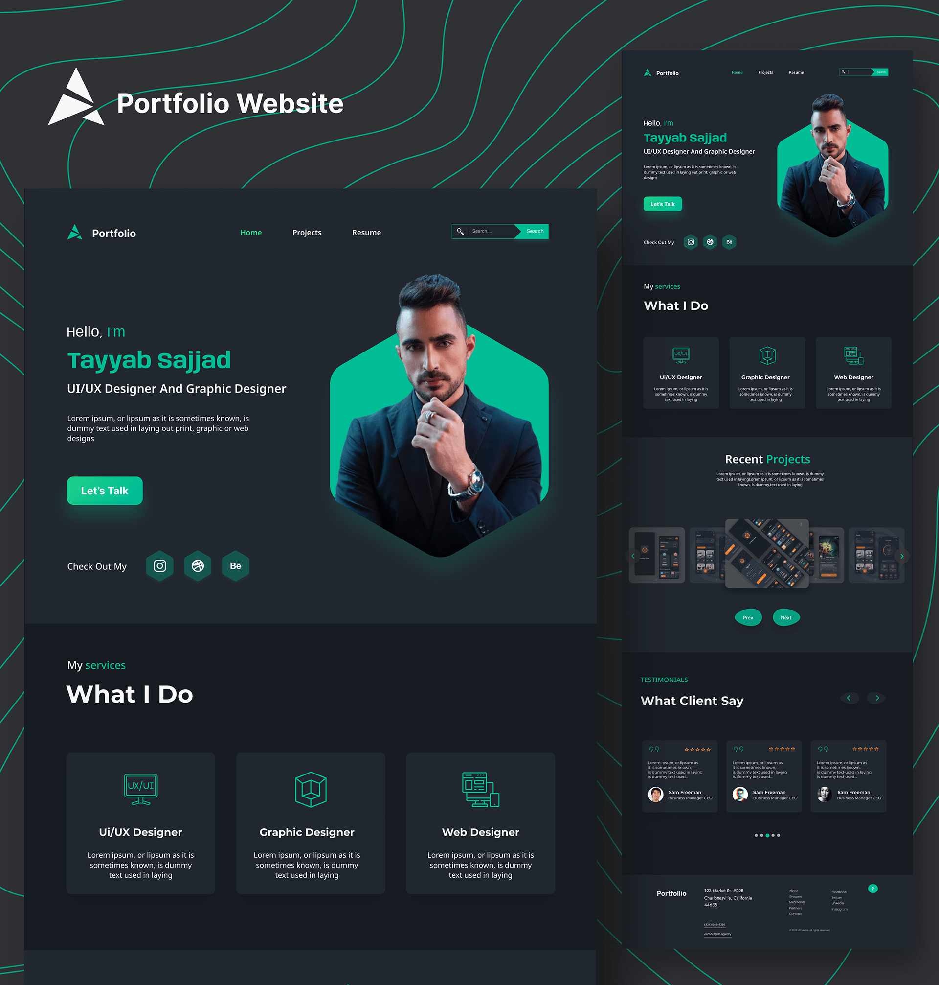
- Responsive Design: With more people browsing on mobile devices, your portfolio should look great on all screen sizes. Behance portfolios are responsive, ensuring that the layout adapts seamlessly. Use flexible grids and media queries in your CSS to create a mobile-friendly design.
- Interactive Elements: Behance often includes interactive elements like videos or animated GIFs. These can engage your audience and keep them on your site longer. Consider integrating videos that showcase your work process or behind-the-scenes footage.
- Clean Navigation: A cluttered website can drive visitors away. Behance portfolios have simple, intuitive navigation. Keep your menu organized, and use categories such as “Illustration,” “Photography,” or “Graphic Design” to help visitors find what they’re looking for quickly.
By incorporating these features into your website, you can create a portfolio that not only mimics the aesthetic of Behance but also enhances user experience. The goal is to make your work shine while keeping potential clients or employers engaged. So, let’s dive deeper into each of these elements in the following sections!
Also Read This: How to Add a Portfolio to Behance and Showcase Your Creative Work
3. Choosing the Right Color Palette and Typography
When it comes to designing a website that mimics a Behance portfolio layout, one of the most crucial aspects is selecting the right color palette and typography. These elements set the mood and character of your site, influencing how visitors perceive your work. So, let’s dive into how to make effective choices!
First off, think about the emotions you want your audience to feel. Colors evoke feelings—blue can convey trust and professionalism, while red can generate excitement. Here’s a simple approach to help you choose:
- Identify Your Brand Personality: Are you modern and sleek, or vibrant and playful? This will guide your color selection.
- Use a Color Wheel: Pick a primary color that represents your brand, then find complementary or analogous colors to create a harmonious palette.
- Limit Your Palette: Stick to 3-5 main colors to keep your design cohesive. Too many colors can overwhelm visitors.
For typography, choose fonts that are easy to read and reflect your style. A well-chosen font can enhance your website’s aesthetics significantly. Here’s how to select effective typography:
- Choose Readable Fonts: Sans-serif fonts like Arial or Helvetica are often great for body text, while serif fonts like Times New Roman can add a touch of elegance for headings.
- Limit Font Variations: Use no more than two or three different fonts. A good combination might be one for headings and another for body text.
- Pay Attention to Font Size: Ensure your text is legible across different devices by using responsive typography.
By harmonizing your color palette with thoughtful typography, you create a visual identity that not only attracts attention but also keeps visitors engaged with your content. Remember, the ultimate goal is to showcase your work effectively, so let your colors and fonts reflect your unique style!
Also Read This: Best Practices for Uploading Your Projects on Behance
4. Utilizing Grid Layouts for Visual Appeal
Grid layouts are an essential design tool that can help you achieve a clean, organized, and visually appealing website, especially when mimicking the style of a Behance portfolio. Grids allow you to structure your content, making it easier for visitors to navigate your work and appreciate each piece. Here’s why you should consider using grid layouts:
First, they create a sense of symmetry and balance. A well-structured grid can guide the viewer’s eye across the page, making it easier to digest information. Here are a few tips for implementing grid layouts effectively:
- Choose the Right Grid System: Whether it’s a 12-column grid or a simple two or three-column layout, select a grid system that aligns with the complexity of your content.
- Consider the Aspect Ratio: Maintain consistent image sizes within your grid to create uniformity. For example, if you’re showcasing photography, using a square aspect ratio can work wonders.
- Incorporate Whitespace: Don’t overcrowd your grid. Allow for adequate spacing between elements to enhance readability and overall aesthetics.
Additionally, grids can adapt to different screen sizes, which is vital for mobile responsiveness. A flexible grid layout will ensure that your site looks great on desktops, tablets, and smartphones alike. Here’s a simple example of how you might structure your grid:
| Device | Column Layout |
|---|---|
| Desktop | 12 columns |
| Tablet | 6 columns |
| Mobile | 2 columns |
By utilizing grid layouts, you not only enhance the visual appeal of your website but also improve the user experience. Remember, the goal is to allow your work to shine while keeping your design clean and organized. So, embrace grids, and watch how they transform your online portfolio!
Also Read This: How to Make a Behance Portfolio Private and Control Who Sees Your Creative Work
5. Incorporating High-Quality Images and Projects
When it comes to mimicking a Behance portfolio layout, the heart of your site is undeniably the visuals. High-quality images can make or break your portfolio, so let’s dive into why this is crucial and how to get it right.
First off, think about your projects. Each piece you showcase should reflect your best work. This means:
- Resolution Matters: Always use images that are at least 1920 pixels wide for landscape images. This ensures clarity on both desktops and mobile devices.
- Consistent Style: Maintain a cohesive aesthetic across your images. You might consider using a specific color palette or style guide to keep things visually unified.
- Contextual Examples: Include images that show your work in context. If you designed a logo, show it in use on a business card or a mock-up of a storefront. This adds depth and helps potential clients visualize the application of your skills.
Moreover, don’t forget about the importance of image optimization. Large, unoptimized images can slow down your website, leading to a poor user experience. Tools like TinyPNG or ImageOptim can help compress your images without sacrificing quality.
Lastly, consider using a gallery or grid layout. This allows your visitors to scan through your work quickly, much like they would on Behance. A masonry layout can create visual interest, providing a dynamic feel to your portfolio. If you’re using a platform like WordPress, templates like Elementor or WPBakery offer intuitive ways to create stunning galleries.
Also Read This: How to Export from Photoshop to Behance and Share Your Designs with the World
6. Adding Interactive Elements to Enhance Engagement
Now that you have gorgeous images showcasing your projects, let’s take it a step further by adding interactive elements. These features can significantly enhance user engagement and make your portfolio more memorable.
Consider the following interactive elements:
- Hover Effects: Simple hover effects on images can create a modern touch. For example, when users hover over a project image, it could slightly enlarge or overlay additional information about the project, like the title or a brief description.
- Sliders and Carousels: If you have multiple images for a single project, a slider can allow visitors to browse through them without leaving the page. This keeps the experience fluid and engaging.
- Video Backgrounds: A subtle video background on your homepage can captivate visitors right away. Just make sure it doesn’t distract from your content. A looped video showing snippets of your design process can be particularly effective.
Moreover, consider integrating parallax scrolling. This technique creates a 3D effect as users scroll down your site, adding depth and making the browsing experience more immersive. Tools like ScrollMagic can help you implement this without too much coding knowledge.
Lastly, don’t overlook the power of call-to-action buttons. Encourage visitors to reach out, whether it’s for collaboration or simply to learn more about a project. Clear, enticing buttons can guide users to your contact page or social media profiles, driving engagement further.
In conclusion, incorporating high-quality images and interactive elements can transform your website from a simple portfolio into a captivating experience, much like those found on Behance. Remember, the goal is to showcase your talent while making it easy and enjoyable for visitors to explore what you have to offer!
Also Read This: How to Download Mockups from Behance Accessing Free and Paid Mockups
7. Optimizing for Mobile Responsiveness
In today’s digital landscape, ensuring that your website is mobile-responsive is not just a suggestion; it’s a necessity. With more than half of web traffic coming from mobile devices, you want your portfolio to shine on every screen size. Here are some practical tips to achieve that:
- Use a Responsive Framework: Consider employing frameworks like Bootstrap or Foundation. These tools automatically adjust your layout based on the user’s screen size, making it easier to create a consistent experience across devices.
- Fluid Grids: Instead of fixed-width layouts, use fluid grids that allow elements to resize proportionally. This ensures that your portfolio images and text maintain their integrity, regardless of screen size.
- Media Queries: Leverage CSS media queries to apply different styles based on the device’s characteristics. For instance, you might want larger images on desktops and smaller, more optimized versions on mobile.
- Touch-Friendly Navigation: Ensure that buttons and links are easy to tap on mobile devices. A good rule of thumb is to make them at least 44px by 44px for better usability.
- Optimize Images: Large images can slow down loading times on mobile devices. Use tools like TinyPNG or ImageOptim to compress your images without sacrificing quality.
By following these strategies, you’ll create a seamless experience for users visiting your portfolio on mobile devices. Remember, a user-friendly mobile site not only impresses visitors but also increases the chances of them exploring more of your work!
8. SEO Strategies for Your Portfolio Website
Now that you’ve crafted a stunning portfolio, it’s time to ensure people can find it! Search Engine Optimization (SEO) is crucial for increasing your visibility online. Here are some tailored strategies to optimize your portfolio website:
- Keyword Research: Identify relevant keywords that potential clients might use to find your work. Tools like Google Keyword Planner or Ubersuggest can help you discover low-competition keywords to target.
- Optimize Page Titles and Descriptions: Each page should have a unique title and meta description that includes your chosen keywords. This not only helps with SEO but also improves click-through rates from search results.
- Alt Text for Images: Since your portfolio is visual, ensure all images have descriptive alt text. This not only helps with accessibility but also gives search engines context about your images.
- Quality Content: Regularly update your blog or portfolio with fresh content. Consider writing case studies about your projects or tips related to your field. This can help improve your search rankings and engage visitors.
- Backlink Building: Aim to get backlinks from reputable sites in your industry. Collaborate with other creatives, guest post on blogs, or participate in online forums to build your online presence.
Implementing these SEO strategies will help your portfolio website attract more visitors, ultimately leading to more opportunities. Remember, SEO is an ongoing process, so keep testing and refining your approach!
 admin
admin