Inserting images into a canvas is a key skill for anyone involved in graphic design. Whether you're working on a simple project or a complex one, the canvas serves as the perfect workspace to bring your ideas to life. The ability to insert images correctly can make a huge difference in the quality and impact of your design. This technique is widely used across various design platforms and software tools.
Canvas provides a flexible environment where you can arrange, resize, and manipulate your images freely. Knowing how to insert images properly ensures that your design stays organized and visually appealing. Let’s dive into why using canvas for this task is so important, and how to get started!
Why Using Canvas for Image Insertion is Essential

Canvas is a powerful tool that offers numerous advantages when inserting images into your design projects. Here’s why it’s essential:
- Flexibility: You can place and adjust images anywhere on the canvas without restrictions. This flexibility allows for precise placement and creativity in your designs.
- Resolution Control: Canvas allows you to maintain high image quality and resolution, ensuring your visuals look sharp and professional.
- Layering: When working with multiple images, canvas supports layering. You can easily stack images and adjust their order, creating a clean, organized design.
- Scalability: Canvas is scalable, meaning it can handle large projects with multiple images and elements without slowing down your workflow.
- Non-destructive Editing: Since most canvas-based tools work with layers, you can edit and adjust images without permanently altering the original.
These features make the canvas an ideal environment for working with images, whether you're designing web pages, digital art, or even print materials.
Also Read This: How to Effectively Invite Friends to Like Your Facebook Page
Steps to Insert an Image into Canvas

Inserting an image into a canvas is a straightforward process, but it’s important to follow the right steps to ensure your design looks its best. Here’s a step-by-step guide:
- Open Your Canvas Tool: Whether you’re using software like Photoshop, Illustrator, or an online tool, the first step is to open the canvas where you’ll be working.
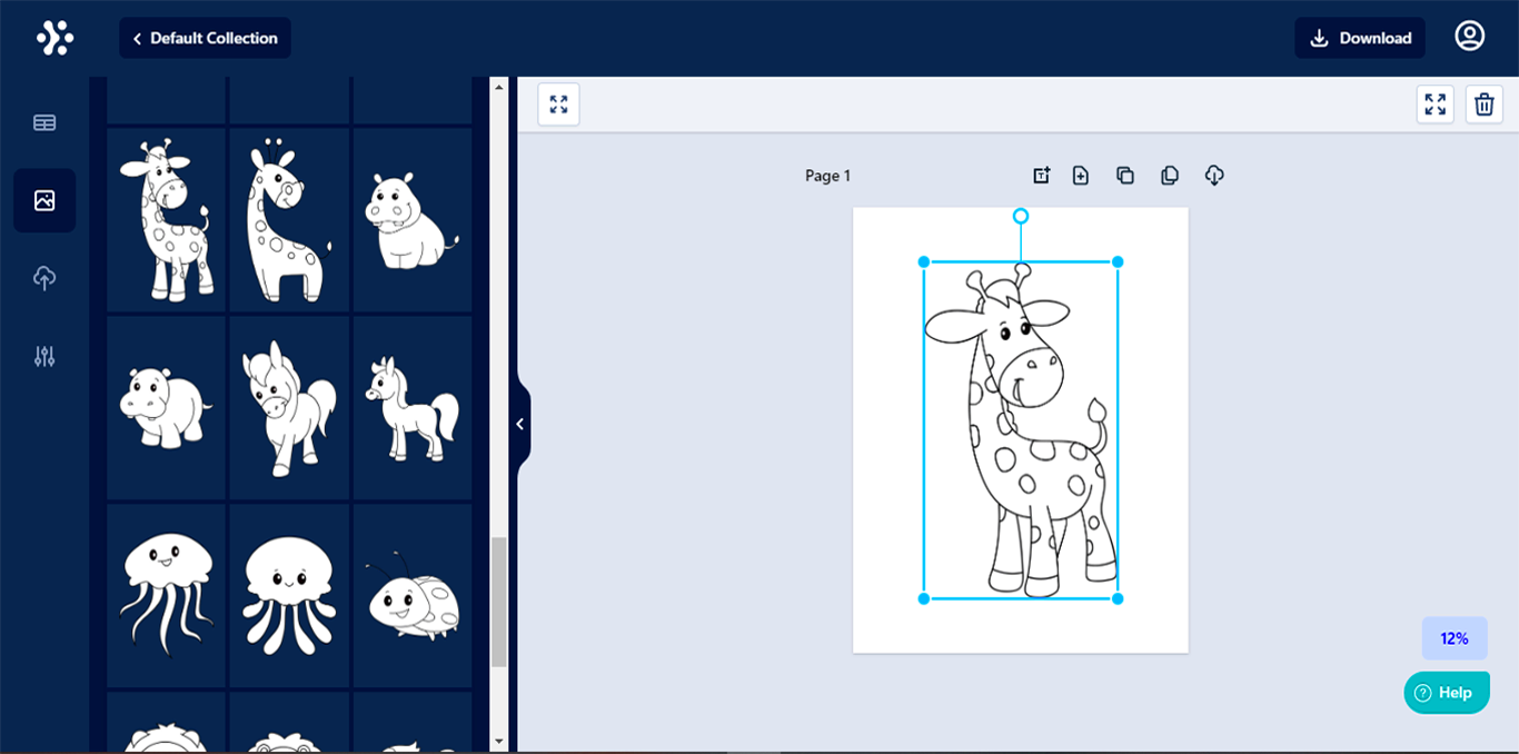
- Select the Image: Choose the image you want to insert. You can either drag and drop the file or use the import feature of your tool to select the image from your device.
- Position the Image: Once the image is on the canvas, you’ll need to position it. You can move it by simply clicking and dragging it to the desired location. If your tool supports it, you can also use alignment guides to help you place it precisely.
- Resize the Image: You may need to resize the image to fit your design. Most canvas tools offer handles around the image that allow you to resize it proportionally or adjust the width and height independently.
- Adjust the Layer Order: If you have multiple images or elements, you may need to adjust the layering. You can bring an image to the front or send it to the back depending on your design needs.
- Apply Effects (Optional): After inserting the image, you can apply various effects like filters, shadows, or transparency to enhance your design.
- Save Your Work: Don’t forget to save your design. Make sure to save it in a format that preserves the quality and layers of your image, such as PNG or PSD.
By following these steps, you’ll be able to insert images into your canvas quickly and efficiently. It’s all about positioning, resizing, and making sure your images are well integrated into the overall design.
Also Read This: How to Embed a PDF for Behance Projects
How to Choose the Right Image for Your Canvas
Choosing the right image for your canvas is essential to creating a visually appealing design. The image you select should complement your overall theme, color scheme, and layout. It’s important to take your time and consider how the
Here are a few tips to help you choose the right image:
- Consider Image Quality: Always opt for high-resolution images. Low-quality images can appear pixelated or blurry when scaled, affecting the overall look of your design.
- Fit the Theme: Choose images that match the mood or message you want to convey. For instance, a calm, serene image works better for a spa website, while a bold and colorful image fits an event poster.
- Maintain Consistency: If you're using multiple images, ensure they have a consistent style, tone, and color palette. This consistency creates a cohesive and professional design.
- Image Composition: Pay attention to the composition of the image. Elements like focal points, negative space, and lighting can drastically change how the image works with your canvas.
- Check the Licensing: Always make sure the image you use is properly licensed. Avoid using copyrighted images unless you have permission or have purchased the rights.
By selecting the right image, you’ll ensure that it enhances your design, not distracts from it. Take the time to pick an image that aligns with your design goals and resonates with your audience.
Also Read This: Saving an Image from Cricut to Your Computer
Adjusting and Resizing Images on Canvas
After inserting an image into your canvas, you may need to adjust or resize it to ensure it fits your design perfectly. Thankfully, most canvas tools offer easy ways to modify the size and positioning of your images without compromising quality.
Here’s how to adjust and resize images on the canvas:
- Resizing: Select the image and use the corner handles to resize it. Hold down the Shift key while resizing to maintain the aspect ratio (width and height proportionally). If you don’t need to maintain the ratio, you can freely resize it to your desired dimensions.
- Cropping: If your image has unwanted edges or needs to be focused on a specific area, use the cropping tool. Some canvas tools allow you to drag and adjust a crop box around the part of the image you want to keep.
- Rotating: If you need to adjust the orientation, most tools allow you to rotate the image. Click and drag the rotation handle, or enter a specific angle for a precise adjustment.
- Positioning: You can move the image around on the canvas. Simply click and drag it to the desired location. You may also use alignment tools to center or align it to other elements on the canvas.
- Opacity Adjustment: If you want the image to blend better with other design elements, adjust its opacity. Lowering the opacity creates a subtle effect that works well for backgrounds or layered images.
- Adding Effects: Apply effects like shadows, borders, or filters to enhance the image and make it more visually engaging. These small adjustments can go a long way in improving the overall design.
Once you’re satisfied with the adjustments, you can move forward with the rest of your design. Proper resizing and adjusting are crucial for creating a balanced and professional-looking final product.
Also Read This: Updating the Talks About Section on Your LinkedIn Profile
Adding Multiple Images to Canvas for Complex Designs
For more complex designs, you may want to work with multiple images at once. The ability to add several images to your canvas allows you to create more dynamic and intricate designs. Whether you're designing a collage, a webpage, or a marketing graphic, working with multiple images on a single canvas is an essential skill.
Here’s how to effectively manage multiple images on your canvas:
- Layering: Use layers to organize your images. By keeping each image on a separate layer, you can adjust, resize, or move them independently without affecting the others. Most canvas tools have a layer panel where you can reorder or hide layers.
- Group Images: If you want to treat multiple images as a single unit, you can group them together. This allows you to move or resize the group as a whole, which saves time when making adjustments.
- Aligning Images: Use alignment guides or grids to keep images in place and ensure they’re evenly spaced. Many tools offer automatic alignment features, which can help you quickly arrange images without manually adjusting them.
- Maintain Visual Balance: When adding multiple images, ensure they don’t overcrowd the canvas. Use the right amount of space between images and be mindful of the balance between negative and positive space.
- Overlapping and Blending: If you want to create an overlapping effect, adjust the opacity or layer order. You can also use blending modes to create seamless transitions between images.
- Consistency: Keep the style of your images consistent. Whether it's through color tones, filters, or effects, maintaining consistency across your images ensures your design doesn’t feel cluttered or disjointed.
By following these tips, you can add and manage multiple images on your canvas with ease. It’s all about keeping things organized and balanced, which will result in a cohesive and striking design.
Also Read This: How to Apply Thick Mascara for Lush Voluminous Lashes on Dailymotion
Best Practices for Optimizing Canvas Design
When working on a canvas design, optimization is key to ensuring that your design is both visually stunning and functional. Optimizing your design allows for a smoother workflow and ensures that your final product looks professional. Below are some best practices you should follow to get the most out of your canvas design:
- Use High-Resolution Images: Always start with high-quality images. Low-resolution images will become pixelated when resized or zoomed in. High-resolution images ensure that your design maintains clarity and sharpness across all devices and print materials.
- Organize Your Layers: When working with multiple images, keep your layers organized. Naming your layers and grouping similar elements together will make it easier to navigate your design and make adjustments later on.
- Maintain a Consistent Color Palette: Stick to a consistent color scheme to create a cohesive look. Using too many colors can make your design look chaotic. Choose a color palette that complements the images you're using and aligns with the overall mood of your design.
- Keep File Sizes Manageable: While high-resolution images are important, be mindful of file sizes. Large files can slow down your design software and make it difficult to work efficiently. Compress images or use vector graphics to keep file sizes manageable without sacrificing quality.
- Utilize Grids and Alignment Tools: Grids and alignment tools help you keep everything in order. Use these features to ensure elements are properly aligned and spaced evenly, making your design look polished and professional.
- Ensure Mobile Responsiveness: If your design is intended for a website or mobile application, make sure it’s responsive. Test how the design looks on different screen sizes and adjust as needed to ensure a good user experience.
By following these best practices, you’ll create optimized, visually appealing, and functional designs. It’s all about balancing quality with efficiency to get the best result.
Also Read This: How Can You Access Canva’s Premium Templates Without a Subscription in 2025?
Common Mistakes to Avoid When Inserting Images
Inserting images into your canvas may seem simple, but there are a few common mistakes that many designers make. Avoiding these mistakes will ensure your design looks professional and runs smoothly. Here are some of the most common errors to watch out for:
- Using Low-Resolution Images: One of the most common mistakes is using low-resolution images that appear blurry or pixelated when resized. Always choose images with high resolution to avoid a poor-quality result.
- Incorrect Image Sizing: Resizing an image improperly can distort it and make it look stretched or compressed. Use the proper tools to resize your images while maintaining their aspect ratio.
- Forgetting About Layer Order: When working with multiple images, layer order is crucial. Forgetting to arrange layers correctly can lead to images being hidden or overlapping in ways that detract from the design.
- Not Considering Image Placement: Placing an image too close to the edges of the canvas or other design elements can make the overall layout feel crowded. Always leave some breathing space between images and elements to avoid a cluttered design.
- Ignoring Licensing and Usage Rights: Using images without proper licensing can lead to legal issues. Always ensure that the images you use are either royalty-free or you have obtained the necessary permissions.
- Overusing Effects: While it’s tempting to apply effects like filters, shadows, or borders to make an image stand out, overusing them can make your design look cluttered. Use these effects sparingly and in moderation to avoid overpowering your design.
By avoiding these mistakes, you can save time and effort while creating polished, professional designs that are sure to impress. Pay attention to the details and always double-check your work before finalizing it.
Also Read This: How to Slice Images on Cricut for Craft Projects
FAQ
Here are some frequently asked questions (FAQs) that can help you better understand the process of inserting images into a canvas and creating effective designs:
- How do I ensure my images look good on all screen sizes?
To ensure your images look good on all screen sizes, consider using scalable vector graphics (SVGs) for logos and icons. Also, test your design on various devices and adjust the layout to fit different screen dimensions. - What file format should I use for images on the canvas?
For images with a lot of detail or transparency, PNG is often the best choice. JPEG works well for photos and high-color images. For vector-based images, SVG is ideal as it doesn’t lose quality when resized. - Can I adjust the image’s opacity on the canvas?
Yes, most canvas tools allow you to adjust the opacity of images. Lowering the opacity can create a subtle, layered effect and help blend images seamlessly with other elements. - How do I resize images without losing quality?
When resizing images, always maintain the aspect ratio to avoid distortion. For larger images, use higher-resolution versions or vector graphics, which can scale without losing quality. - Can I use multiple images in one canvas design?
Absolutely! You can add and manipulate multiple images on your canvas. Organize them in layers and use alignment tools to ensure they are properly spaced and positioned within your design. - What should I do if my design looks cluttered?
If your design feels crowded, try simplifying it by removing unnecessary elements or adjusting the size of your images. Consider using more negative space to give the design a cleaner, more balanced look.
These answers should help clear up any confusion you may have when working with canvas designs. Feel free to revisit this section anytime you need clarification!
Conclusion
Inserting and working with images on a canvas is an essential skill for any designer. From choosing the right image to adjusting its size and positioning, every detail plays a part in creating a visually appealing design. By following the best practices outlined, such as using high-resolution images, organizing layers, and optimizing your canvas for mobile responsiveness, you can ensure your designs are both effective and professional. Additionally, avoiding common mistakes like using low-resolution images or neglecting proper image placement can save you time and frustration. With the right techniques and a keen eye for detail, your canvas designs will stand out and deliver the impact you intend.


