Filling text with an image is a fun and creative way to add visual interest to your designs. Whether you’re working on a social media post, a presentation slide, or a personal project, this technique allows you to combine beautiful imagery with bold typography. It’s easy to do and can make your content stand out in a crowd.
By blending images and text, you can create a professional look that grabs attention while telling a story. Let’s dive into the details and learn how this works and why it’s so effective.
What is Creative Typography
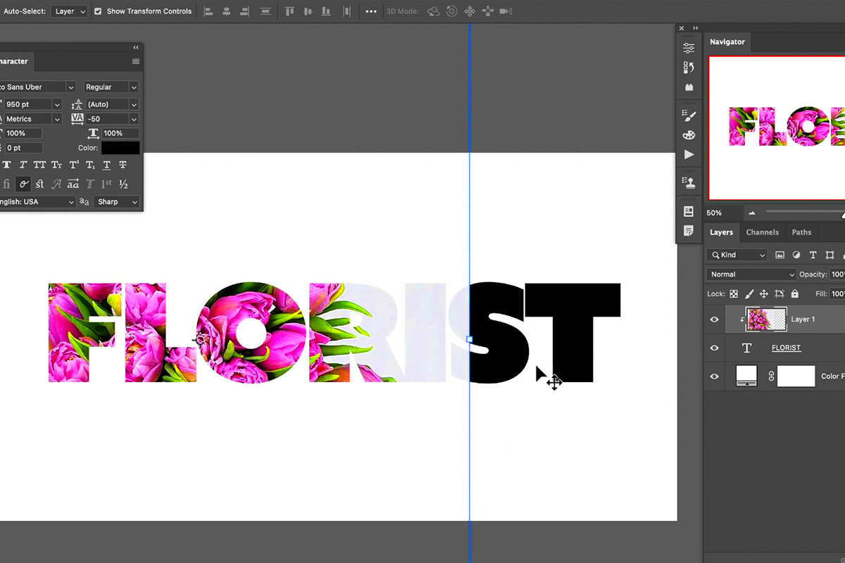
Creative typography is the art of designing text to look visually appealing while conveying a message. It goes beyond basic fonts and colors, involving innovative layouts, textures, and effects that make your text pop. This style is often used in marketing materials, posters, and digital graphics to create eye-catching designs.
When you combine creative typography with images, you take it a step further by using pictures to fill the letters, giving them texture and depth. Here are a few examples of where creative typography can shine:
- Brand logos: Custom text designs that reflect the brand's identity.
- Social media graphics: Posts with unique text effects to grab attention.
- Event posters: Titles and headings that stand out with artistic text treatments.
Creative typography is all about experimenting with shapes, sizes, and effects to make your text more engaging.
Also Read This: Making an Image a Clickable Link in Webflow
Why Using an Image in Text Makes a Difference
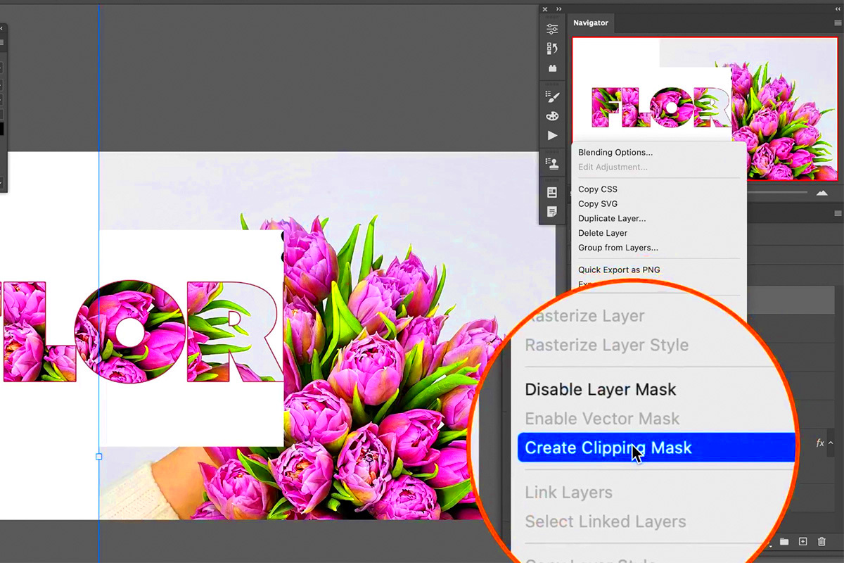
Filling text with an image transforms ordinary text into a visual masterpiece. It’s not just about aesthetics—it’s about storytelling. Images have the power to evoke emotions, and when combined with text, they make your message even more impactful.
Here’s why it’s a game-changer:
- Grabs attention: Eye-catching designs can stop scrolling and draw viewers in.
- Enhances readability: With the right image, text becomes visually engaging without losing its clarity.
- Creates a theme: Using images within text can help reinforce a design’s theme or mood.
For example, imagine the word "summer" filled with a beach image. It immediately conveys a sense of relaxation and fun. This simple technique can elevate your design and make it unforgettable.
Also Read This: How to Integrate Adobe Stock into Adobe XD
Step-by-Step Guide to Fill Text with an Image in Canva
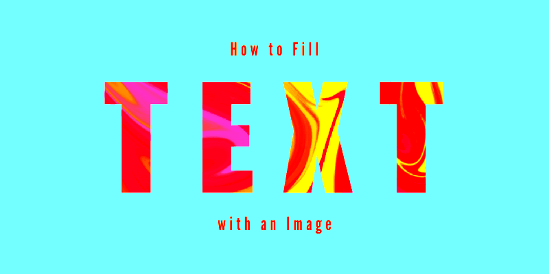
Filling text with an image in Canva is straightforward, even for beginners. This step-by-step guide will walk you through the process so you can create eye-catching designs with ease.
- Create a new design: Open Canva and start a new project. Choose the dimensions that suit your needs, such as a social media post or a poster.
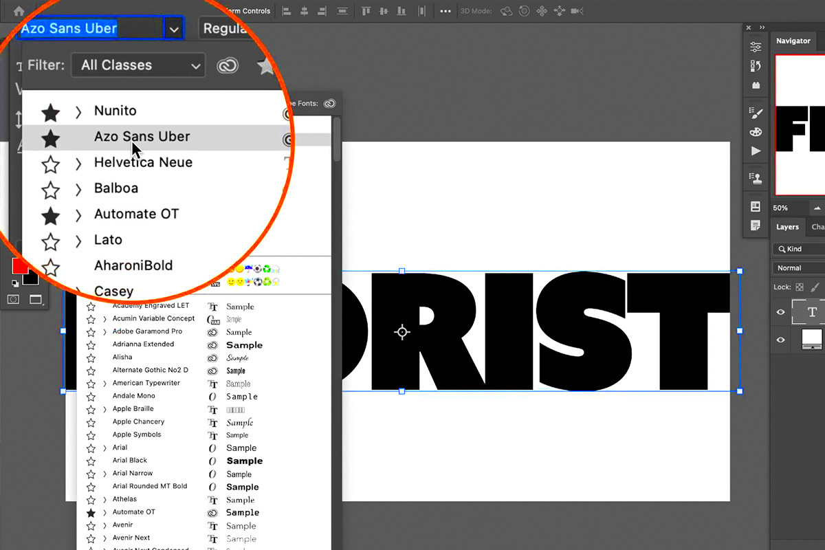
- Add text: Use the text tool to insert the word or phrase you want to work with. Choose a bold or thick font, as these work best for this effect.
- Upload an image: Click on the "Uploads" tab to upload your desired image or choose one from Canva’s library.
- Mask the image: Place the image over the text. Select both the text and the image, right-click, and use the "Set as Frame" or "Mask" feature to fit the image into the text.
- Adjust and align: Resize and reposition the text to ensure the image is displayed properly within each letter.
- Enhance the design: Add a background, shadows, or additional elements to complement your text-image combination.
That’s it! With a few clicks, you can create visually striking designs that stand out.
Also Read This: A Guide to Posting and Selling Images on Adobe Stock
Best Practices for Creative Typography
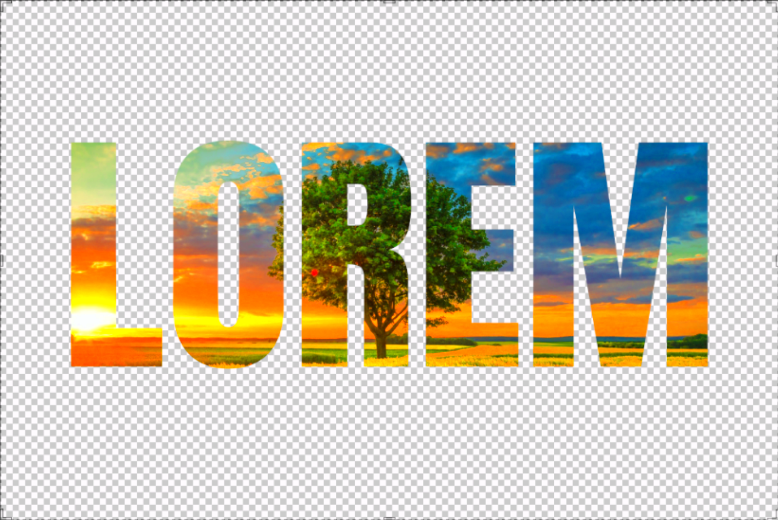
Creative typography can transform your designs, but following some best practices ensures your work looks polished and professional. Here are key tips to keep in mind:
- Choose the right font: Bold fonts with clean edges work best for filling with images. Avoid thin or script fonts for this technique.
- Pick high-quality images: Use sharp and vibrant images to ensure your text looks crisp and clear.
- Maintain readability: Ensure the text remains legible by selecting images with distinct patterns or contrasting colors.
- Align the design: Balance the placement of your text and additional elements to create a cohesive look.
- Experiment with layers: Try using effects like shadows or outlines to enhance the visual impact of your typography.
These practices will help you create designs that are both visually appealing and functional.
Also Read This: how to use adobe stock with multiple illustrations in photoshop
Common Mistakes to Avoid When Filling Text with Images
While filling text with images can create stunning results, certain mistakes can detract from the final design. Here’s a list of common pitfalls and how to avoid them:
- Using overly detailed images: Busy images can make the text unreadable. Stick to simple patterns or focal points.
- Neglecting font choice: Thin fonts don’t hold images well, making the effect less impactful.
- Ignoring contrast: Low contrast between the image and text background can make your design hard to read.
- Overcrowding the design: Adding too many elements around the text can make the design feel cluttered.
- Skipping alignment checks: Misaligned text or images can appear unprofessional.
By being mindful of these mistakes, you can ensure your designs always look polished and eye-catching.
Also Read This: how to share adobe stock livravry with clinet
Frequently Asked Questions
Here are answers to some common questions about filling text with images and creative typography:
- Can I fill text with an image on free Canva accounts?
Yes, Canva’s free version allows you to fill text with images. However, certain features, like premium fonts or advanced masking tools, may require a Pro subscription. - Which fonts work best for filling text with images?
Bold and thick fonts, such as Impact or Montserrat Black, are ideal. They provide enough surface area for the image details to be visible. - How do I ensure my text remains readable?
Choose images with simple patterns or areas of solid color. You can also add outlines or shadows to the text for better contrast against the background. - What types of images are suitable for this effect?
High-resolution images with distinct shapes or textures work best. Avoid overly busy or pixelated images, as they can reduce the quality of the effect. - Can I edit the image within the text after masking?
Yes, Canva allows you to adjust the position, scale, and rotation of the image within the text frame even after masking.
If you have more questions, feel free to experiment in Canva or check out additional tutorials for advanced tips.
Conclusion
Filling text with an image is a creative technique that adds depth and personality to your designs. By following the steps and tips outlined here, you can easily create stunning visuals that stand out. Remember to practice and experiment to find the perfect combination of fonts, images, and effects for your unique projects.
 admin
admin