Choosing the right card stock for your projects can make a significant difference in the quality and presentation of your printed materials. Whether you’re creating invitations, business cards, or other printed products, understanding the options available in Adobe Reader can help you make informed decisions. In this post, we’ll dive into how to select card stock effectively and explore the various types available, ensuring that your prints look professional and polished.
Understanding Different Types of Card Stock
When you’re in the market for card stock, it’s essential to understand the different types available to choose the best one for your needs. Each variety serves a specific purpose and can affect the overall look and feel of your printed materials. Let’s explore the most common types of card stock:
- Cover Stock: This is a popular choice for business cards and postcards. It typically comes in thicker weights, ranging from 80lb to 130lb. Cover stock has a nice finish that lends a professional touch.
- Text Weight: Text weight card stock is usually lighter and thinner compared to cover stock. This type is ideal for flyers and brochures and generally ranges from 50lb to 80lb. It’s great for projects that require a more delicate touch.
- Matte vs. Glossy: Card stock comes in different finishes. A matte finish is perfect for a subtle look and doesn’t reflect light, making it an excellent choice for writing on. On the other hand, glossy finish card stock provides vibrant colors and a sleek surface, making images pop.
- Recycled Card Stock: If you’re environmentally conscious, recycled card stock is a fantastic choice. It’s made from post-consumer waste and comes in various colors and finishes, allowing you to maintain quality while being eco-friendly.
- Specialty Card Stock: This category includes textured, metallic, or even translucent options. Specialty card stock can add a unique touch to invitations, greeting cards, or any project where you want to stand out.
When selecting card stock, consider the following factors:
| Factor | Considerations |
|---|---|
| Weight | Heavier card stock provides a sturdier feel; lighter stocks are better for foldable items. |
| Finish | Decide between matte and glossy based on the desired aesthetic and functionality. |
| Color | Choose colors that align with your branding or project theme. |
| Texture | Think about how the texture will affect the readability and overall feel of your printed materials. |
| Environmental Impact | Consider recycled options if eco-friendliness is a priority for your project. |
By understanding the distinctions among the types of card stock and thinking about the factors that matter most for your project, you can confidently select the best card stock, enhancing your printed materials’ overall impact. Once you have your card stock chosen, using Adobe Reader will help you further customize and print your designs to perfection!
Also Read This: Ultimate Guide to Saving JPGs for Adobe Stock
3. How to Use Adobe Reader for Card Stock Selection
Using Adobe Reader to select the right card stock for your project is a straightforward process that can ensure your designs look their best when printed. Here’s a step-by-step guide to help you navigate through the selection process:
- Open Your Document: Start by opening your design file in Adobe Reader. If you’ve created a PDF with design ideas or specifications, this is where you’ll want to begin.
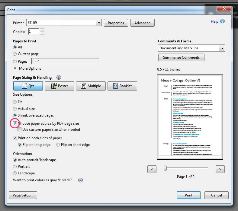
- Check Your Print Preview: Use the print preview feature to see how your document will look on the desired card stock. Go to File > Print and check the preview. This will help you visualize the result before printing.
- Select Printer Settings: In the print dialog, choose the printer you’ll be using. Make sure you select the correct printer settings that match the type of card stock you are considering. This includes options like paper size and orientation.
- Set Paper Type: In the printer properties, look for options that specify the type of paper. Select a setting that best matches your card stock, such as “Heavyweight” or “Card Stock.” This can affect the print quality significantly.
- Adjust Print Quality: For card stock, opt for a higher print quality. Look for settings like “Best” or “High Quality” to make sure your designs come out crisp and vibrant.
- Test Print: Before committing to a large batch, do a test print on a piece of the card stock you’ve selected. This will give you a feel for how the colors render and whether the weight of the stock feels right for your project.
- Evaluate the Result: Once you have your test print, take a close look at it. Check for color accuracy, saturation, and texture. If it meets your expectations, you’re good to go! If not, you may want to adjust your settings or even consider trying a different card stock.
Adobe Reader is a valuable tool in the card stock selection process, allowing you to visualize your designs before committing to material. The key is to experiment and be willing to adjust based on your results. Happy printing!
Also Read This: Mastering VectorStock for Professional Event Posters and Invitations
4. Factors to Consider When Choosing Card Stock
Choosing the right card stock can make all the difference in your project’s success. Here are some essential factors to consider:
- Weight: Card stock is generally measured in pounds or grams per square meter (gsm). A typical card stock weight ranges from 50lb to 130lb (around 210gsm to 350gsm). Heavier card stock feels more substantial, while lighter stock may be better for simple projects like brochures.
- Texture: The texture of card stock can significantly impact the visual and tactile experience. Options range from smooth to textured, linen, or laid finishes. Think about what will best complement your design.
- Color: The color of card stock can affect the overall look of your printed materials. While white is the most versatile, exploring colored card stocks can add a unique touch. Just ensure the colors match your design theme.
- Finish: Card stock comes in various finishes, such as gloss, matte, or uncoated. A glossy finish can amplify colors and give a sleek look, while matte offers more subtlety and elegance. Consider what works best for your project.
- Print Compatibility: not all card stocks are created equal for printing. Some are designed specifically for inkjet or laser printers, so ensure that the card stock you select is compatible with your printing equipment.
- Purpose: Consider the purpose of your project. Are you making invitations, business cards, or greeting cards? Each project type may benefit from different characteristics in card stock. For example, a wedding invitation may demand a heavier, elegant stock compared to a flyer.
Taking the time to carefully consider these factors will help you choose card stock that not only enhances your design but also meets your practical needs. Happy crafting!
Also Read This: How to Embed a PDF in Behance for Easy Document Sharing
5. Tips for Printing on Card Stock with Adobe Reader
Printing on card stock can seem a bit tricky, especially if you’re not familiar with the settings and options available in Adobe Reader. But fear not! With a few helpful tips, you’ll be able to print your projects like a pro. Here are some recommendations to keep in mind when you're ready to hit that print button:
- Check your printer capabilities: Not all printers can handle card stock. Make sure your printer can accommodate the thickness of the card stock you’re using. It’s often wise to do a test print with the card stock you intend to use.
- Adjust your print settings: Before printing, go to the Print menu in Adobe Reader. Select the correct printer and access the printer properties. Set the paper type to match your card stock and choose the highest quality print settings for a sharp finish.
- Use the right size: Ensure that the document size matches your card stock size. For instance, if you're using 5x7 card stock, your document should also be set up at that size. This greatly reduces any issues with misalignment.
- Use a test print: Always try printing on regular paper first. This allows you to spot any issues related to color, layout, or size without wasting your card stock.
- Consider manual feed: If your printer has a manual feed option, use it for better control when printing on thicker paper. Feeding the card stock manually can help prevent jams and ensure smooth printing.
Additionally, don't forget to allow sufficient drying time before handling your printed cards, especially if you’re using inkjet printers. The ink can take longer to dry on thicker paper, so be patient to avoid smudging!
6. Conclusion and Final Thoughts
Choosing and printing on card stock with Adobe Reader doesn’t have to be a daunting task. By taking the proper steps and following our tips, you can create beautiful projects that stand out. Card stock can elevate everything from invitations and greeting cards to brochures and business cards—it's all about making the right choices.
Here’s a quick wrap-up of what we discussed:
- Understand the different types of card stock and select one that fits your project needs.
- Utilize Adobe Reader to check your designs, ensuring everything looks just right.
- Always test print on standard paper before using your more expensive card stock.
- Adjust settings in Adobe Reader for optimal print quality based on your specific card stock.
Remember, the more you practice, the more comfortable you’ll become with the process, and the better your printed results will be. Don’t hesitate to explore more about Adobe Reader’s capabilities and experiment with different weights and textures of card stock. Happy printing!
 admin
admin