Header images play a vital role in web design. They not only provide visual appeal but also help convey the message of a website. A well-placed header image can capture attention and set the tone for the entire page. In HTML, header images are typically placed within the <header> tag or as the first element in the <body>. By properly using header images, you can enhance user experience and improve the overall look of your site.
Importance of Centering Header Images
One of the benefits of centering header images is it can definitely make the look of your site better.
- Visual Balance: A centered header image creates symmetry, making the page look more organized and professional.
- Focus: Centering draws the visitor's attention directly to the image, making it the focal point of the header.
- Responsive Design: Centered images often adapt better to different screen sizes, ensuring a consistent look across devices.
By neatly aligning your header image, it will better the viewers’ experience while making your site look more welcoming.
Also Read This: How to Add a Link to an Image for Interactive Content
Using CSS to Center Header Images
The task of centering header pictures with the use of CSS is not complicated and can be accomplished within a short time. Below are some techniques:
1. Using Text Alignment
If your header image is within a block-level element, you can center it by using the text-align property.
header {
    text-align: center;
}
2. Using Margin Auto
Ergo, for the picture that exhibits as block elements, autography left and right margin are established.
img {
    display: block;
    margin: 0 auto;
}
3. Flexbox Method
In simple terms, with flexbox, you can effortlessly centre any element on your page.
header {
    display: flex;
    justify-content: center;
    align-items: center;
}
These CSS methods allow you to center your header effectively and build an attractive design. Keep in mind that a header image set precisely at the center would have a great impact on how users look at your website.
Also Read This: Creative DIY Room Decoration Ideas from Dailymotion
Steps to Center a Header Image with Inline Styles
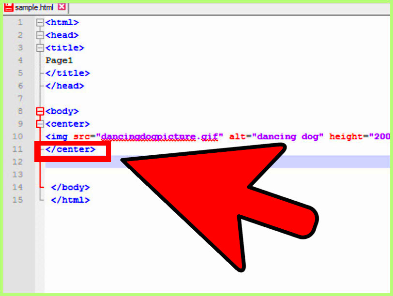
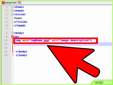
One of the easiest ways to center a header image directly within your HTML is to use inline styles, which allow you to apply styles to an element without affecting others on the web page. Here is how:
- Identify the Header Image: Locate the image you want to center in your HTML.
- Use the
<img>Tag: Ensure your image is included with the appropriate attributes, likesrcfor the image path. - Add Inline Styles: Use the
styleattribute within the<img>tag. For example:
<img src="image.jpg" style="display: block; margin: 0 auto;">In this example, setting display to block and margins to auto will center the image. Remember, while inline styles are quick and easy, they can make your HTML cluttered if overused. It’s best to reserve them for unique cases.
Also Read This: Creating a Second YouTube Channel on Your Phone for Multiple Projects
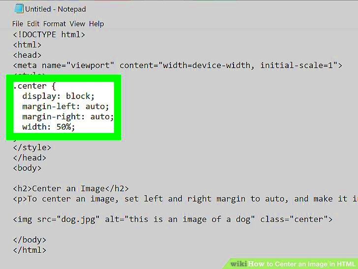
Centering Header Images with CSS Classes
A more structured way of styling header images is through using CSS classes. The approach allows to apply the same styles to various images and maintains cleaner HTML. Below is the guide on how to achieve this:
- Create a CSS Class: In your CSS file or within a
<style>tag, define a class for centering:
.center-image {
    display: block;
    margin: 0 auto;
}- Apply the Class to Your Image: Add the class to the
<img>tag like this:
<img src="image.jpg" class="center-image">A CSS class can be utilized by you so that when necessary, it is possible to change design from one area only. The new approach works very well for websites having numerous header images or at least those that desire to ensure uniformity within their layout as a whole.
Also Read This: how to make image on google slides transparent
Responsive Design Considerations
The header images' centering should be done taking into consideration their presentation on various devices. With responsive design, your images will fit into any screen size while remaining centered. Here are some recommendations:
- Use Percentage Width: Set your image width to a percentage rather than a fixed pixel value to allow for flexibility.
img {
        width: 100%;
        max-width: 800px; /* Maximum width for larger screens */
        height: auto; /* Maintain aspect ratio */
}@media (max-width: 600px) {
img {
width: 90%; /* More width on smaller screens */
}
}Making certain that your centered header images look fantastic regardless of how visitors access your site is another thing to consider when creating a responsive design. This meticulousness has the potential to greatly improve the level of user satisfaction and participation.
Also Read This: How to Add an Outline to an Image in Canva for Emphasis
Troubleshooting Common Issues
No matter how hard you try, centering header images can sometimes be tricky. But don’t fret; there is always a way out! Here are some of the regular challenges encountered and their remedies:
- Image Not Centering: If your image isn’t centering as expected, check if you’re using the right CSS properties. Make sure you’ve set the image’s display to
blockand addedmargin: 0 auto;. - Overflow Issues: Sometimes, images can overflow their container. Ensure that your image width is set appropriately. Using a percentage width or setting a max-width can help keep it in line.
- Responsive Problems: If your image looks good on a desktop but not on mobile, review your media queries. Make sure they’re correctly targeting the right screen sizes.
- Aspect Ratio Distortion: If your image looks stretched or squished, set its height to
auto. This helps maintain the original aspect ratio.
In the event that you experience any problems, take some time and check through your codes. Many times just one little change can lead into big differences. Be sure not to be shy about contacting diverse internet communities for aid; somebody is always available who can help!
Also Read This: How to Upload Video to Canva from YouTube
Frequently Asked Questions
There exist answers. What questions do you have about header images centering? Here are some questions that people ask more often than not just to help elict any common problems:
- Can I use inline styles for centering images?
Yes, inline styles can be effective for quick adjustments, but using CSS classes is generally cleaner and more manageable. - What if my header image is larger than my header?
Adjust the size of your image using CSS. Setting a max-width or a percentage width will help fit it nicely within the header. - How do I make my image responsive?
Use a combination of percentage widths and media queries to ensure your image looks good on all devices. - Is it better to use CSS or inline styles?
CSS is preferred for maintainability and organization, while inline styles can be used for specific cases where necessary.
If there are more inquiries that you have, do not hesitate to browse the internet or visit discussion boards about website designing for extra help!
Conclusion and Final Thoughts
In the beginning, centering a header image in HTML can be seen as daunting but with practice and proper methods you can give your site an appealing and sleek appearance. The following are some tips to keep in mind:
- Understand the purpose and benefits of centering header images.
- Choose the right method for centering based on your needs, whether it's inline styles, CSS classes, or flexbox.
- Consider responsive design to ensure your images look great on all devices.
These advices shall put you in a good position towards coming up with an appealing and interesting website. Continue testing, remain inquisitive, and revel in web designing. Every stage increases competence and realizes aspirations!
 admin
admin