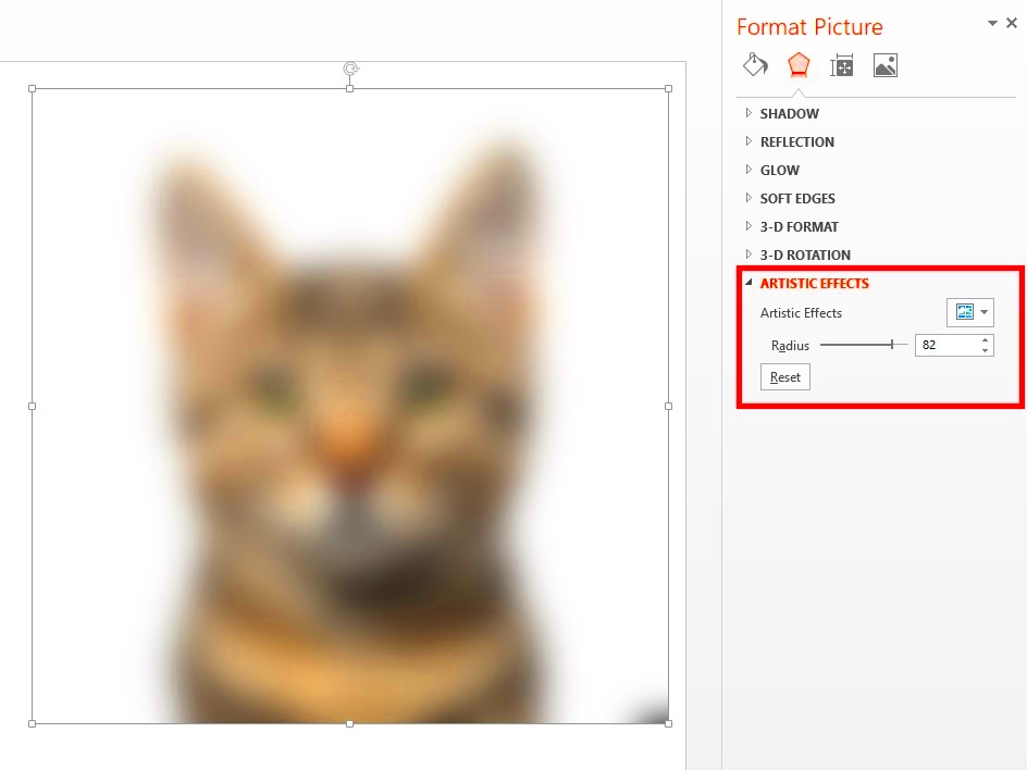
Blurring images can play a crucial role in enhancing your presentations. When you blur an image, it helps to focus the audience's attention on the main content. This technique can also create a sense of depth and professionalism. By using blurred backgrounds, you can prevent distractions and keep your slides looking clean and organized.Here are some reasons why blurring images is important:
- Improved Focus: Blurring helps emphasize key messages in your slides.
- Visual Appeal: A soft background can make your presentation more visually appealing.
- Professionalism: Using blurred images conveys a polished look.
- Emotional Impact: Blurred images can evoke feelings and set the mood for your presentation.
Steps to Blur Images in PowerPoint

Blurring images in PowerPoint is a straightforward process. Follow these simple steps to get started:
- Open PowerPoint: Start by launching Microsoft PowerPoint and opening your presentation.
- Select the Image: Click on the image you want to blur. This will highlight the image.
- Go to Format: Navigate to the “Picture Format” tab in the toolbar.
- Choose Artistic Effects: Click on “Artistic Effects” to reveal various options.
- Apply Blur: Select the “Blur” effect from the list to apply it to your image.
- Adjust as Needed: You can adjust the intensity of the blur using the sliders provided.
Using the Format Options to Achieve Blur
To create a blur effect, you can utilize PowerPoint's format options effectively. Here’s how:
- Right-Click the Image: After selecting your image, right-click on it to access more options.
- Select Format Picture: Choose “Format Picture” from the context menu. This opens a new pane on the right side of the screen.
- Artistic Effects Tab: In the format pane, click on the “Artistic Effects” tab. This tab contains several artistic options.
- Adjust Blur: Look for the “Blur” option. Here, you can control the level of blur applied to your image.
Experimenting with these options allows you to achieve the desired look for your presentation, ensuring your images enhance rather than distract from your message.
Adjusting Transparency for a Softer Look
Adjusting the transparency of your images can add a soft touch that enhances the overall look of your presentation. When you combine blurring with transparency, you create a harmonious visual that allows your content to shine. This technique is particularly useful for backgrounds, as it ensures that the main text and images stand out while still providing context.Here’s how to adjust transparency in PowerPoint:
- Select Your Image: Click on the image you wish to edit.
- Access Format Options: Go to the “Picture Format” tab.
- Click on Transparency: Look for the “Transparency” option in the toolbar.
- Adjust the Slider: Use the transparency slider to increase or decrease the image’s transparency. A setting around 30-50% often works well.
By adjusting the transparency, you can create subtle backgrounds that enhance your slides without overwhelming your audience. Remember, the key is to maintain clarity in your main content while providing a soft visual experience.
Tips for Using Blurred Images Effectively
Using blurred images can be a game-changer for your presentations, but doing it effectively is essential. Here are some tips to keep in mind:
- Choose the Right Image: Select images that have a clear focal point. This will make the blur more effective in emphasizing your content.
- Maintain Consistency: Use similar blur effects across your slides for a cohesive look.
- Balance Text and Images: Ensure that your text remains readable against the blurred background.
- Limit the Use of Blur: While blurring can be powerful, too much can detract from your message. Use it sparingly for maximum impact.
- Test Different Blurs: Experiment with varying levels of blur to see what works best for your specific images and presentation.
By following these tips, you can ensure that your blurred images enhance your presentation rather than distract from it.
Common Mistakes to Avoid When Blurring Images
While blurring images can enhance your presentations, there are some common pitfalls to avoid. Here are a few mistakes to watch out for:
- Over-Blurring: Applying too much blur can make your images unrecognizable and detract from your message.
- Inconsistent Styles: Using different blur effects across slides can create a disjointed look. Aim for a unified style.
- Ignoring Contrast: Blurred images can reduce contrast, making text hard to read. Always ensure your text stands out.
- Neglecting Image Quality: Using low-quality images and blurring them won’t improve their appearance. Start with high-quality visuals.
- Skipping Testing: Failing to preview your slides before presenting can lead to unexpected results. Always check how your slides look in presentation mode.
By avoiding these mistakes, you can use blurring to enhance your presentations effectively and maintain professionalism.
FAQ
1. Why should I blur images in my presentations?
Blurring images helps to focus your audience’s attention on key messages, enhances visual appeal, conveys professionalism, and can evoke emotional responses.2. How do I blur an image in PowerPoint?
To blur an image in PowerPoint, select the image, go to the “Picture Format” tab, click on “Artistic Effects,” and choose the “Blur” effect. You can adjust the intensity using the sliders.3. Can I adjust the transparency of blurred images?
Yes, you can adjust the transparency of blurred images. After selecting your image, access the “Picture Format” tab, click on “Transparency,” and use the slider to achieve the desired effect.4. What are some tips for using blurred images effectively?
Choose images with clear focal points, maintain consistency across slides, balance text with images, limit the use of blur, and test different levels of blur for best results.5. What mistakes should I avoid when blurring images?
Avoid over-blurring images, inconsistent styles, neglecting contrast, using low-quality images, and skipping testing your slides before presenting.Conclusion
Blurring images can significantly enhance your presentations by improving focus, adding visual appeal, and conveying a polished look. By mastering the techniques of blurring and adjusting transparency, you can create captivating slides that support your message without causing distractions. Remember to choose images thoughtfully, maintain consistency, and avoid common pitfalls to maximize the impact of your blurred images. With these strategies, your presentations will be more engaging and effective, leaving a lasting impression on your audience. Blurring images in PowerPoint is a straightforward process. Follow these simple steps to get started:
 admin
admin


