Centering an image on a webpage is one of the simplest yet most effective ways to make your content look more professional. Whether you're designing a blog post, portfolio, or business page, properly aligned images create a balanced and polished appearance. This guide will walk you through easy-to-follow steps on how to center an image, whether you’re working with HTML or CSS.
Aligning an image to the center might seem tricky at first, but with the right tools and techniques, you can achieve the perfect layout in no time. Whether you're a beginner or have some experience with web design, this guide will help you understand how to make images look great in your projects.
Understanding the Basics of Image Alignment
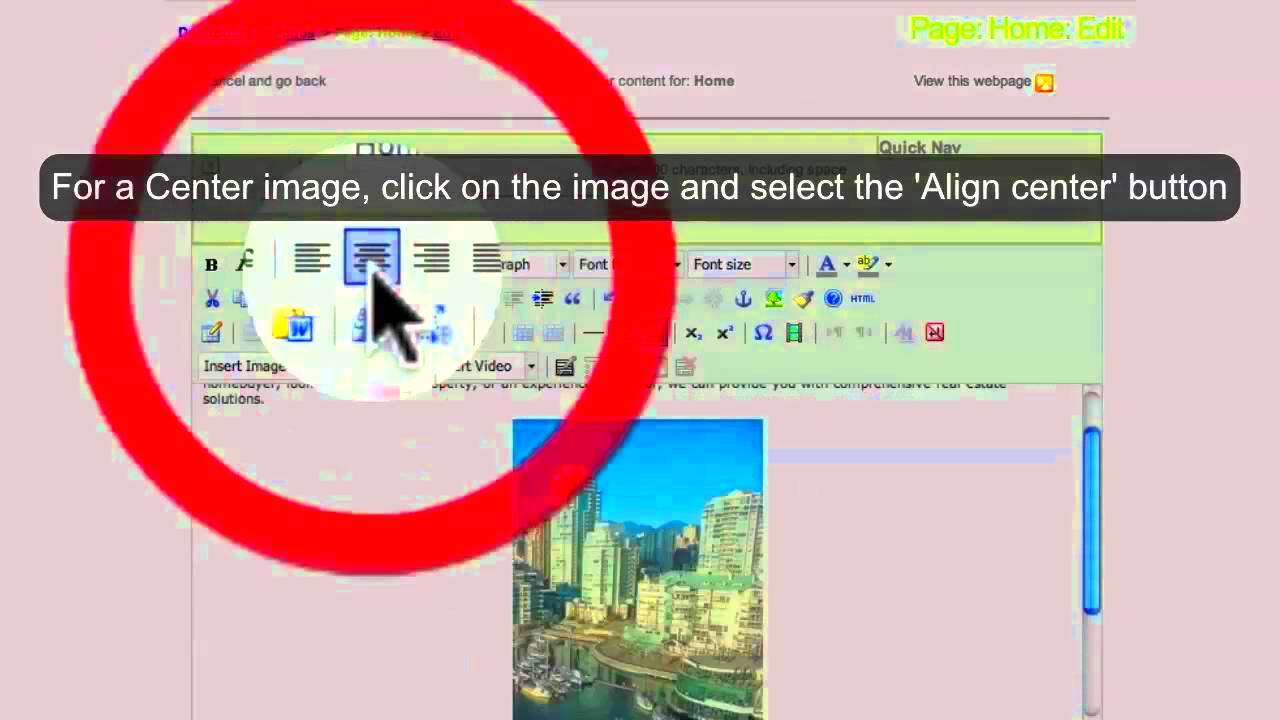
Before diving into the technical steps, it's important to understand what image alignment is and why it's so important. Image alignment refers to positioning an
Here are some key points to keep in mind when aligning images:
- Horizontal alignment: Aligning an image to the left or right pushes it to the side of the page, while centering places it equally on both sides.
- Vertical alignment: This refers to the alignment of the image in relation to other elements above or below it.
- Text wrapping: Images can be aligned with text, allowing the text to wrap around it (left or right) or stand separately.
Having a solid understanding of these concepts will help you use the proper alignment techniques for different design needs.
Step One: Preparing Your Image for Centering
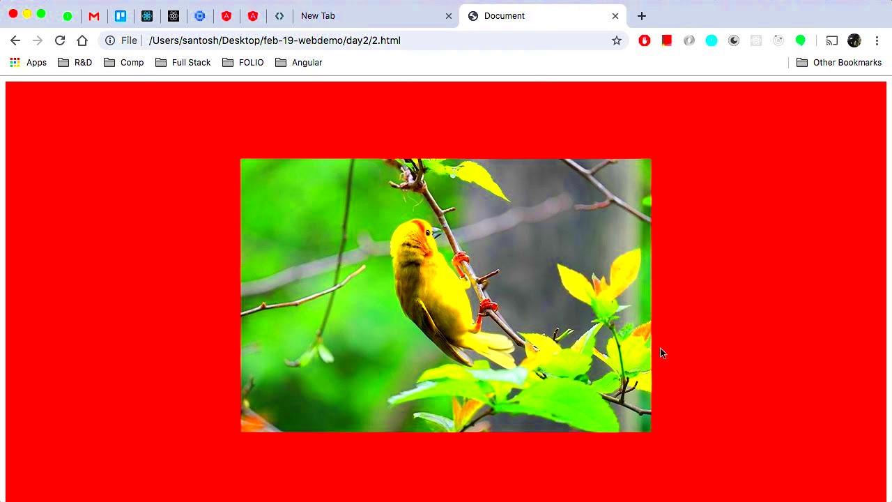
Before you begin aligning your image, it’s crucial to ensure the image itself is ready. This step includes resizing and optimizing your
Here’s how you can prepare your image for centering:
- Resize the image: Ensure your image isn’t too large or too small. For best results, aim for a file size that’s optimized for fast loading times without sacrificing quality. Common image sizes for the web are 1200px to 2000px in width.
- Choose the right format: JPEG, PNG, and WebP are ideal formats for web images. JPEG is best for photos, PNG for images with transparency, and WebP offers the best quality-to-size ratio.
- Optimize for web: Use tools like Photoshop or online image compressors to reduce the file size while maintaining quality. This ensures faster page loading times, which improves user experience and SEO rankings.
Once you’ve resized and optimized your image, it will be easier to position it properly on your webpage without impacting performance or appearance.
Step Two: Using HTML to Align Images
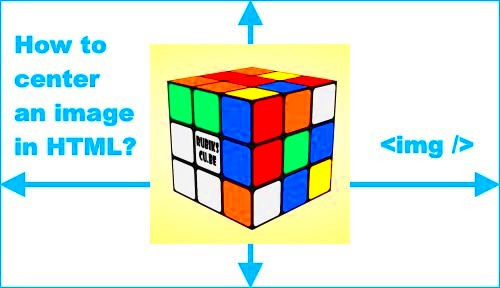
Now that your image is prepared, the next step is to center it using HTML. While modern web design usually relies on CSS for layout adjustments, HTML also offers a simple way to center images. This method is quick and effective for basic designs where you want an image centered within a container or page.
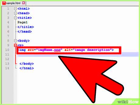
To center an image using HTML, you’ll want to wrap your image tag inside a container element, like a div. The most common HTML tag for centering is the align attribute, although it’s considered outdated in favor of CSS. However, it’s still good to know for compatibility with older websites or quick fixes. Here’s how to do it:
- Using the
alignattribute:<img src="yourimage.jpg" align="center"> - Using a
divcontainer:<div style="text-align:center"><img src="yourimage.jpg"></div>
These methods will center the image horizontally within the container. While the align attribute is deprecated, the text-align style within a div tag is a widely accepted approach for quick centering.
Step Three: Using CSS for Precise Image Centering
For greater control and flexibility, CSS is the preferred method for centering images. Unlike HTML methods, CSS allows you to precisely position images, especially when dealing with responsive designs or complex layouts. In this step, we’ll cover how to use CSS for both horizontal and vertical centering.
Here are the most common CSS techniques for centering images:
- Horizontal centering with
margin: Use this method for centering images horizontally within their parent container:img { display: block; margin-left: auto; margin-right: auto; } - Vertical and horizontal centering with Flexbox:
Flexbox is a powerful layout tool that simplifies both horizontal and vertical centering.
This will center the image both vertically and horizontally within the container..container { display: flex; justify-content: center; align-items: center; } - Using Grid for precise centering:
CSS Grid also offers a straightforward method for centering content.
.container {
            display: grid;
            place-items: center;
        }
CSS offers the most flexibility for responsive web design, allowing images to stay centered even as screen sizes change. This is especially important for mobile-first websites where images need to adjust based on the device's screen width.
Step Four: Troubleshooting Common Image Alignment Issues
Despite your best efforts, sometimes images just won’t align the way you want them to. Fortunately, there are common issues and simple fixes for most alignment problems. In this section, we’ll explore some of the most frequent image alignment issues and how to resolve them.
Here are a few troubleshooting steps to help you fix common alignment problems:
- Images not centering horizontally:
If your image isn’t centering as expected, ensure that it’s inside a block-level container like a
divand that the container has a defined width. If the container is set towidth: auto, the image may not center properly. - Images not centering vertically:
If vertical centering is your issue, check that the container’s height is large enough to accommodate the image. Use
display: flexordisplay: gridfor reliable vertical centering. - Images not resizing with the page:
When your page is resized, images may overflow or appear distorted. To fix this, add the
max-width: 100%CSS property to your image to ensure it scales down within its container without breaking the layout.img { max-width: 100%; height: auto; } - Spacing issues: Sometimes images appear to be off-center because of unwanted margins or padding. Make sure to inspect the margins and padding of both the image and its container. Removing any extra space can help with alignment.
By keeping an eye on these common pitfalls and using the proper techniques, you’ll be able to fix any alignment issues that arise and ensure your images look perfectly positioned on the page.
Benefits of Centering Images Properly
Centering images properly on your website isn’t just about making things look neat – it also offers several practical benefits. Whether you’re designing a personal blog, an e-commerce site, or a professional portfolio, the way you position images can have a significant impact on both the user experience and the overall design of your page.
Here are some key advantages of centering images properly:
- Improved Visual Appeal: A well-centered image creates a balanced and harmonious layout. It draws the viewer’s attention to the image in a controlled, symmetrical way, making the page feel organized and professional.
- Better User Experience: When images are aligned correctly, the content is easier to navigate. It prevents awkward white spaces or misalignments, leading to a smoother user experience. Visitors are more likely to stay longer on a page that looks visually appealing.
- Responsive Design: Centered images work well on different screen sizes. As your website is viewed on phones, tablets, and desktops, properly centered images adjust more easily, making sure your content looks good on all devices.
- Focus on Key Content: When images are centered, they become the focal point of your page, drawing the viewer’s eye exactly where you want it to go. This is especially useful for showcasing product images, featured blog posts, or visual elements that complement the text.
In conclusion, centering images isn’t just an aesthetic choice – it’s a practical one that can improve the overall layout, performance, and user satisfaction of your website.
Alternative Methods to Align Images
While centering images is often the best choice for most designs, there are times when aligning images differently might be more appropriate. Depending on the context and layout of your page, you may want to align images to the left, right, or even have them wrap around text. Let's explore some alternative alignment methods to help you achieve the desired effect.
Here are a few common alternatives to image centering:
- Left Alignment: Aligning an image to the left is often used when you want text to flow next to the image, especially for articles or blog posts. This method is simple and works well for content-heavy pages.
img { float: left; margin-right: 15px; } - Right Alignment: Aligning an image to the right works similarly to left alignment but can create a visually interesting layout where the text flows on the left side of the image.
img { float: right; margin-left: 15px; } - Text Wrap with Image: This method allows your image to be embedded within the text, allowing the text to wrap around it. It’s useful for smaller images or when you want to create a more dynamic layout for articles or blog posts.
img { float: left; margin: 10px; } - Aligning with Flexbox or Grid: If you're using Flexbox or Grid for layout management, these tools allow for more complex image positioning. With Flexbox, for example, you can align images in a row or column with various alignment options.
.container {
            display: flex;
            justify-content: flex-end; /* Aligns image to the right */
        }
Using these alternative methods, you can create layouts that are more flexible and suited to the content and design goals of your website.
Frequently Asked Questions
When it comes to centering and aligning images, there are always a few common questions that pop up. Here, we’ll answer some of the most frequently asked questions to help clarify any confusion you might have about image alignment.
- Why is my image not centering properly? If your image isn’t centering as expected, check the parent container’s width and the image’s display property. Ensure you’re using a block-level element for the container and that the image has appropriate CSS for centering.
- Should I use the
alignattribute for centering images? Thealignattribute is outdated and is not recommended for modern web design. Instead, it’s better to use CSS, as it provides more control over layout and works well with responsive designs. - How do I center an image vertically?
Vertical centering can be tricky. The best method is to use Flexbox or Grid layout systems, as they allow for easy vertical centering in a container:
.container { display: flex; align-items: center; } - What if my image is too large for the container?
If the image is too large, use CSS to make it responsive:
This ensures the image scales down with the container, preventing it from overflowing or distorting.img { max-width: 100%; height: auto; } - Can I center images using JavaScript? While you can use JavaScript to manipulate image alignment, it’s not the most efficient or standard approach. Stick with CSS for layout control unless there’s a specific need for JavaScript interaction.
By addressing these common questions, we hope you now have a clearer understanding of how to work with image alignment and centering in your web projects. If you have any other questions or need further clarification, feel free to ask!
Conclusion and Final Thoughts
Properly centering and aligning images on your website is a crucial step in achieving a clean, professional, and user-friendly design. Whether you choose to use HTML or CSS, each method offers its own set of benefits and ensures that your images are displayed correctly across various devices and screen sizes. By following the steps outlined in this guide, you can ensure your images are not only aligned but also responsive and optimized for performance.
Ultimately, the choice of method depends on your specific needs and design goals. For greater flexibility and control, CSS is the most recommended approach, offering precision for both horizontal and vertical centering. At the same time, HTML methods, though more basic, still serve as a quick solution for simpler designs. No matter which technique you choose, always keep the user experience in mind to ensure your website remains visually appealing and easy to navigate.
