Have you ever stumbled upon a website where images just seem to float perfectly in the middle of the page? It’s not just magic; it’s all about image alignment! Centering images can enhance the aesthetics of your website and create a more professional look. In this post, we’ll dive into the basics of image alignment and explore various methods to center images effectively, so your website can shine!
Understanding Different Methods for Centering Images
Centering an image on your website can be achieved through several methods, and each has its own advantages. Let’s explore some of the most effective techniques:
- Using CSS Flexbox: This modern approach is widely used for layout designs. By applying flexbox properties to the parent container, you can center images both vertically and horizontally. Here’s a simple example:
.container {
    display: flex;
    justify-content: center; / Centers horizontally /
    align-items: center; / Centers vertically /
    height: 100vh; / Full viewport height /
Just wrap your image in a div with the class "container," and voilà! Your image is perfectly centered.
- Using CSS Grid: Another powerful method is CSS Grid, which allows for precise control over layout. Similar to flexbox, you can create a grid container and center your image:
.container {
    display: grid;
    place-items: center; / Centers both horizontally and vertically /
    height: 100vh; / Adjust as needed /
This method is especially useful if you have multiple images or elements to center.
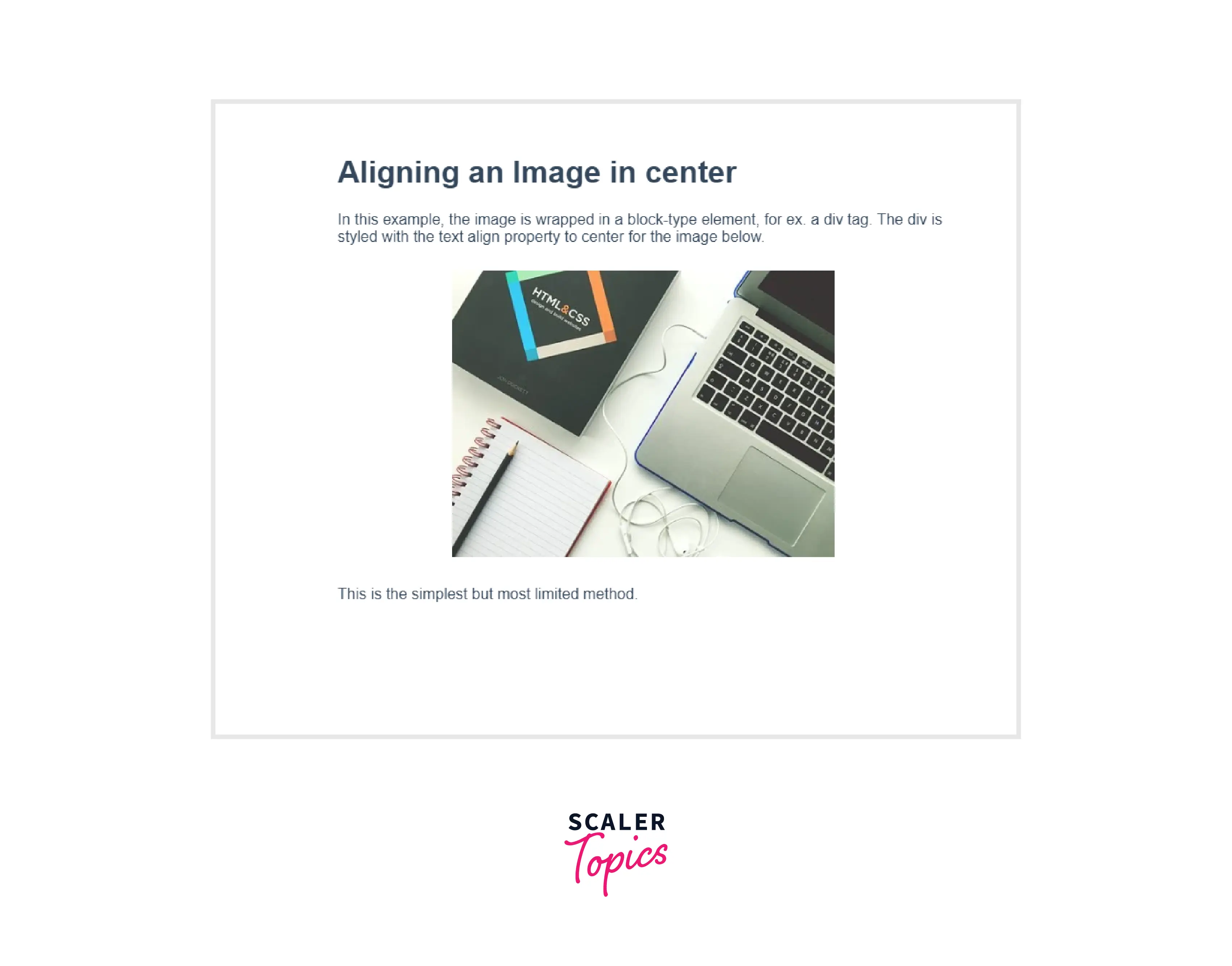
- Traditional Text Align: For simple HTML setups, you can use the text-align property. However, this method primarily works for inline images within block elements:
.center-image {
    text-align: center; / Centers inline images /
By wrapping your image in a block-level element like a div or a paragraph, you can center it easily. Here's how it's done:

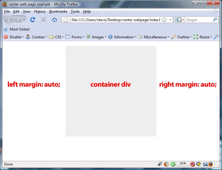
- Using Margin Auto: If your image has a defined width, you can apply margin auto to center it:
img {
    display: block;
    margin: 0 auto; / Automatically adjusts margins for centering /
    width: 50%; / Adjust width as necessary /
This is a classic method and works well for block-level elements.
All these methods have their place, and the best choice depends on your specific layout needs. Experiment with each to see which fits your design vision best!
Also Read This: Making Money through Adobe Stock or Shutterstock
3. Using CSS to Center Images
Centering an image on your website can feel a bit tricky at first, but with CSS, it becomes a breeze. CSS offers several methods to achieve this, and I'll walk you through two of the most popular techniques: flexbox and grid layout. Both are powerful tools that can help you position your images exactly where you want them.
Let's start with the flexbox approach. First, you'll need to make sure your image is placed inside a container. Here’s a simple example:
Now, let’s apply some CSS to center that image:
.image-container {
    display: flex;
    justify-content: center; / Horizontally centers the image /
    align-items: center; / Vertically centers the image /
    height: 100vh; / Full height of the viewport /
With this code, your image will be centered both horizontally and vertically within its container, making it perfect for full-screen hero images or any section where you want the image to be the focal point.
Next, let’s explore how to achieve the same result using the grid layout:
.image-container {
    display: grid;
    place-items: center; / Centers the image in both directions /
    height: 100vh; / Full height of the viewport /
This method is just as effective, and it’s particularly useful when you’re dealing with multiple elements that need to be centered simultaneously.
In conclusion, using CSS for centering images gives you flexibility and control over how your website looks. Whether you choose flexbox or grid, both methods are modern and widely supported across browsers, making them reliable options for web design.
Also Read This: How to Submit Your Photos to Getty Images – A Complete Guide for Aspiring Contributors
4. Centering Images in HTML with Inline Styles
Sometimes, you might need a quick solution without diving deep into external stylesheets. That’s where inline styles come in handy. While not the most efficient method for larger projects, inline styles can be a lifesaver for quick adjustments or small snippets of code.
Let’s take a look at how to center an image using inline styles. Here’s a straightforward example:
In this example, setting display: block changes the image from its default inline state to a block element. This allows us to use margin: 0 auto, which tells the browser to evenly distribute any leftover space on both sides of the image, effectively centering it within its parent container.
While inline styles make it easy to center your images, keep in mind that they can lead to cluttered HTML if overused. It’s a good practice for quick fixes but consider using a stylesheet for more complex layouts.
Another method involves wrapping your image in a div and centering the div itself:
With text-align: center on the div, any inline-level elements inside it (like your image) will be centered without needing to change the display property of the image.
In summary, while using inline styles can be a quick and effective way to center images, they should be used judiciously. Try to keep your HTML clean and consider external stylesheets for more maintainable code in larger projects!
Also Read This: Is LinkedIn Learning Free for Students
5. Using Flexbox to Achieve Perfect Centering
If you’re looking for a modern and flexible way to center your images, Flexbox is the way to go. It’s a layout model that allows you to design complex layouts by distributing space within a container. Here’s how to do it:
- Create a Container: Start by wrapping your image in a
<div>tag. This will be your flex container. - Apply Flexbox Styles: Use CSS to turn the
<div>into a flex container.
Here’s a quick example:
In this example, the image will be perfectly centered both horizontally and vertically, thanks to the justify-content and align-items properties. You can adjust the height of the container as needed, but using 100vh will ensure it takes up the full viewport height.
Advantages of Flexbox:
- Easy to implement and understand.
- Responsive by nature—your layout adjusts smoothly on different screen sizes.
- Great for centering multiple items, not just images!
Also Read This: How to Sell Pictures on Alamy: A Step-by-Step Guide for Beginners
6. Centering Images in Responsive Design
In today’s world, websites are viewed on a multitude of devices—desktops, tablets, and smartphones. So, it’s essential to ensure that your images not only center correctly but also look great on all screen sizes. Here are some tips for responsive image centering:
- Use Percentages: Instead of fixed widths, use percentages for your images. This allows them to scale based on the parent container's size.
- Max Width Property: Combine percentage widths with a
max-widthproperty to prevent your images from becoming too large on wider screens.
For example:
In this snippet, the image will take up the full width of its container but will never exceed 600px. The display: block; and margin: 0 auto; properties ensure that it’s centered within the container.
Media Queries can also be utilized to adjust the image size based on different screen widths:
@media (max-width: 768px) {
    img {
        / Additional styles for mobile /
        width: 90%;
This code ensures that when the viewport is less than 768px, the image width is adjusted to 90%, maintaining a clean layout.
By implementing these techniques, you can ensure that your images are not only centered but also adapt seamlessly to any device. Happy coding!
Also Read This: Inserting Images in Blackboard Discussion Posts
7. Common Mistakes to Avoid When Centering Images
Centering an image on your website might seem straightforward, but there are a few common pitfalls that can trip you up. Here’s a rundown of mistakes to watch out for:
- Not Using the Correct CSS Properties: A frequent error is relying solely on
margin: auto;without considering the display property. Remember, for block elements, you need to setdisplay: block;first. - Forgetting to Specify Width: If you don’t define a width for your image, it might not center properly, especially in a flex container. Always set a specific width or max-width.
- Ignoring Parent Container Styles: The properties of the parent container can affect the image's position. Make sure the parent element has the appropriate CSS properties to allow centering.
- Using Fixed Widths: Avoid hardcoding widths and heights. This can cause the image to become distorted when viewed on different devices. Use relative units like percentages or viewport widths instead.
- Neglecting Responsive Design: A centered image on desktop may not look good on mobile. Always check how your image behaves on various screen sizes.
- Overlooking Browser Compatibility: Not all CSS properties work uniformly across browsers. Make sure to test your design on different browsers for consistent results.
By being aware of these common mistakes, you can ensure that your images are centered correctly and present beautifully on your site. Remember, it’s all about creating a seamless viewing experience for your visitors!
8. Conclusion and Best Practices for Image Alignment
In conclusion, centering images on your website is crucial for both aesthetics and usability. Here are some best practices to keep in mind:
- Use Flexbox or Grid: These modern CSS layout techniques provide powerful ways to center images easily within their containers.
- Responsive Design is Key: Always test your images across various devices and screen sizes. Use media queries to adjust the image size and alignment as needed.
- Optimize Your Images: Before centering, ensure your images are optimized for web use to improve load times and overall site performance.
- Keep Accessibility in Mind: Always include alt text for your images. This not only helps with SEO but also makes your site more accessible to users with disabilities.
- Consistent Styling: Maintain a uniform style across images on your site—consider using similar dimensions, borders, and padding for a cohesive look.
By following these best practices, you’ll ensure that your images not only look great but also enhance the overall user experience on your website. Happy coding!
 admin
admin