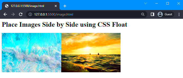
Displaying images side by side can significantly improve the visual appeal of a webpage. This arrangement helps create a clean, organized look and enhances the user experience. Whether you're designing a gallery, showcasing products, or creating a comparison, side-by-side images make your content more engaging and easier to navigate.
Using this layout not only saves space but also allows you to highlight relationships between images. For instance, product comparisons or before-and-after visuals are more effective when placed next to each other. Additionally, it helps maintain a balanced structure on the page, reducing unnecessary scrolling for your visitors.
Here are some key advantages of using side-by-side images:
- Improved readability: Content looks more organized, making it easier for users to follow.
- Better user engagement: Well-placed visuals keep users on the page longer.
- Space efficiency: Reduces vertical scrolling, especially on mobile devices.
Basic HTML Setup for Side-by-Side Images

To arrange images side by side, you need a simple HTML structure. This approach uses basic elements to ensure compatibility across browsers and devices. Here’s how you can start:
Use the following HTML code to place two images side by side:


Key points to remember:
- <div> container: Wrap your images in a container to manage alignment.
- Width: Assign a width (e.g., 45%) to ensure images fit next to each other.
- Display property: Use
inline-blockfor horizontal alignment.
This basic setup works well for simple layouts. However, to add more customization, you can use CSS, which offers greater flexibility.
Using CSS to Create Side-by-Side Image Layouts

CSS allows you to create more advanced side-by-side image layouts with precise control over spacing, alignment, and responsiveness. By combining HTML and CSS, you can achieve a professional look for your web page.
Here’s an example of how to use CSS for side-by-side images:

 .image-container {
display: flex;
justify-content: space-between;
gap: 10px;
}
.image-container img {
width: 45%;
border-radius: 5px;
}
Here’s a breakdown of the CSS used:
- Flexbox: The
display: flex;property ensures images are aligned horizontally. - Spacing:
justify-content: space-between;adds equal spacing between images. - Gap: The
gapproperty adds consistent spacing, even for small screens. - Border radius: Adds rounded corners to your images for a polished look.
This method is highly flexible and works well for modern, responsive designs. You can also combine it with media queries to ensure the layout adjusts beautifully across different screen sizes.
Adding Margins and Padding for Better Spacing

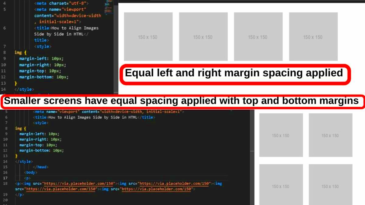
When arranging images side by side, spacing plays a critical role in enhancing readability and visual appeal. Margins and padding are essential CSS properties that help you create balanced spacing between and around images. Without proper spacing, images can look cramped or misaligned, making the layout appear unprofessional.
Here’s how margins and padding work:
- Margin: Adds space outside the element, creating distance between images or other elements.
- Padding: Adds space inside the element, creating a buffer between the image and its container.
Below is an example of adding margins and padding:
.image-container img {
    margin: 10px;
    padding: 5px;
    border: 1px solid #ddd;
    border-radius: 5px;
}


Key tips for better spacing:
- Use consistent margins to avoid uneven gaps.
- Apply padding for a clean, framed look, especially when using borders.
- Test different values to find the right balance for your layout.
Creating Responsive Side-by-Side Image Layouts

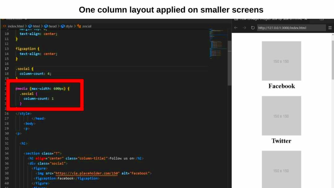
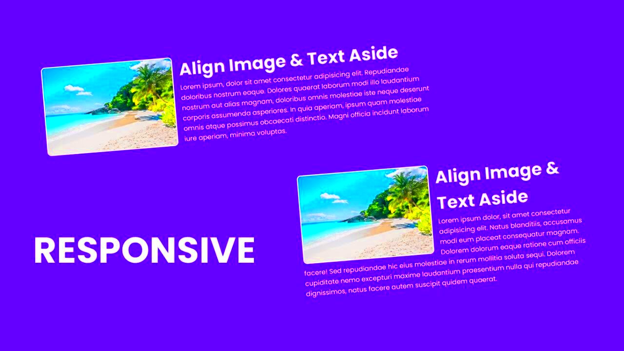
In today’s world, your website must look great on all devices, from desktops to smartphones. Creating responsive side-by-side image layouts ensures your content adjusts seamlessly to different screen sizes. CSS techniques like media queries and flexible layouts make this possible.
Here’s a simple example of a responsive image layout:
.image-container {
    display: flex;
    flex-wrap: wrap;
    gap: 10px;
}

.image-container img {
    width: 45%;
}

@media (max-width: 768px) {
    .image-container img {
        width: 100%;
    }
}


What makes this layout responsive?
- Flex-wrap: Ensures images stack vertically when the screen is too narrow.
- Media queries: Adjust the image width to 100% for smaller screens, ensuring they fit properly.
- Gap: Maintains spacing consistency, even in smaller layouts.
This technique helps you deliver a consistent and visually appealing experience for all users, regardless of their device.
Common Mistakes to Avoid When Adding Images Side by Side
While adding images side by side seems simple, there are several common mistakes that can negatively impact your design. Being aware of these pitfalls will help you create clean and professional layouts.
Here are some mistakes to avoid:
- Overlapping images: Forgetting to set appropriate widths or using improper CSS can cause images to overlap.
- Ignoring spacing: Neglecting margins and padding can make the layout appear cluttered and hard to read.
- Lack of responsiveness: Not using media queries can result in images being cut off or poorly displayed on smaller screens.
- Uneven alignment: Failing to align images consistently creates a disorganized appearance.
To ensure a flawless layout, follow these best practices:
| Issue | Solution |
|---|---|
| Images are too close together | Use margins to create adequate spacing. |
| Images don’t fit on small screens | Use responsive CSS with media queries. |
| Alignment issues | Use Flexbox or Grid for consistent alignment. |
By avoiding these common errors, you can create polished and user-friendly layouts that enhance your website’s appeal.
Frequently Asked Questions About Side-by-Side Image Layouts
Many people have questions about creating side-by-side image layouts, especially when trying to make them responsive and visually appealing. Here are some common queries and their answers:
| Question | Answer |
|---|---|
| Can I create side-by-side images without CSS? | Yes, you can use basic HTML with the table tag or the inline-block style, but CSS provides more flexibility and better design options. |
| How can I make the images responsive? | Use CSS properties like flex-wrap and media queries to ensure the images adapt to different screen sizes. |
| What is the best way to add spacing between images? | CSS properties like margin and gap are ideal for creating consistent spacing. |
| Do side-by-side images affect page loading speed? | If you optimize the image file sizes, side-by-side layouts will not significantly impact loading times. |
| Can I align images vertically as well? | Yes, you can use the Flexbox property align-items to adjust vertical alignment. |
If you have other questions about creating side-by-side image layouts, experimenting with different CSS techniques and exploring online resources can help you find solutions tailored to your needs.
Conclusion for Adding Side-by-Side Images
Arranging images side by side is a powerful technique to enhance your webpage's visual appeal and usability. By combining basic HTML, CSS styling, and responsive design principles, you can create clean and professional layouts that work seamlessly across all devices.


