Canva is an easy-to-use design tool that lets you create beautiful visuals for any project. One of the best ways to make your designs pop is by adding shadows to your images. Shadows can add depth, dimension, and a professional touch to your work. Whether you're designing social media posts, presentations, or marketing materials, shadows help draw attention to key elements in your design.
In this guide, we'll walk you through how to add shadows to your images using Canva, step by step, so you can take your designs to the next level.
Why Adding a Shadow Improves Your Image

Shadows are not just about decoration—they serve a functional purpose in design. When used effectively, they can significantly enhance the look and feel of your images. Here's why adding a shadow to your design can improve its overall appearance:
- Creates Depth: Shadows make elements in your design appear more three-dimensional, adding a sense of space and depth.
- Increases Visual Appeal: A well-placed shadow can make an image look more polished and professional.
- Helps Highlight Key Elements: Shadows draw attention to specific parts of your design, making them stand out more.
- Enhances Legibility: When you apply shadows to text, it can make the words easier to read, especially on complex backgrounds.
- Balances Light and Contrast: Shadows help balance the light in your design, creating a more cohesive and dynamic image.
By understanding the role of shadows in design, you can use them strategically to achieve the desired effect in your Canva creations.
Also Read This: how to superimpose images on android
Step-by-Step Guide to Adding a Shadow in Canva
Now that you know why shadows are important, let's dive into how you can add them to your images in Canva. Follow these simple steps to give your designs a professional look:
- Open Canva: Start by opening Canva and selecting the project you want to work on or create a new design.
- Select Your Image: Choose the image you want to add a shadow to. You can either upload your own or select one from Canva’s library.
- Click on the Image: Once the image is placed in your design, click on it to select it.
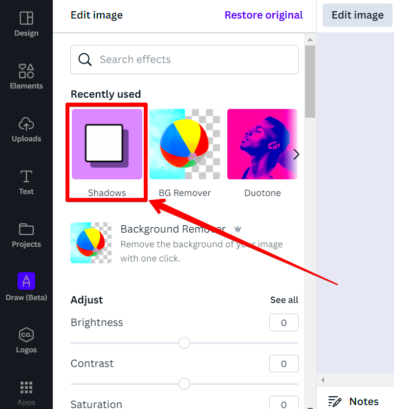
- Apply the Shadow Effect: In the top toolbar, click on the "Effects" button. This will open a menu where you can select "Shadow."
- Choose a Shadow Style: Canva offers different shadow styles, such as "Drop Shadow," "Glow," and "Hard Light." Choose the one that suits your design best.
- Adjust the Shadow Settings: Once you’ve selected a shadow style, you can adjust the intensity, angle, and blur of the shadow. Play around with these settings until you’re happy with how it looks.
- Position the Shadow: You can move the shadow around by dragging it or adjusting the angle so it aligns with the light source in your design.
- Save Your Design: Once you’ve added the shadow and are happy with how it looks, click "Download" to save your image in the desired format.
By following these steps, you can easily add a shadow effect to any image in Canva and give it a professional, polished look.
Also Read This: Creating Unique Wall Hangings at Home Inspired by Dailymotion Videos
Exploring Different Shadow Styles in Canva
Canva offers a variety of shadow styles that can add depth and creativity to your design. Each shadow type has its own unique effect, which can dramatically change the look and feel of your image. Understanding these different styles will allow you to choose the best one for your design's purpose. Here’s a look at the most common shadow styles available in Canva:
- Drop Shadow: This is the most commonly used shadow style. It gives your image a subtle, natural shadow that looks like it’s floating above the background. It's great for adding depth to text and images without making them too bold.
- Glow: The glow effect adds a soft, luminous aura around the object. It’s ideal for creating a soft, ethereal look, and works well with elements like logos or text that need to stand out against a dark background.
- Hard Light: This shadow style creates a more pronounced shadow with sharp edges, making it ideal for designs that need a bold, high-contrast effect. It’s perfect for graphic elements that you want to stand out prominently.
- Angle Shadows: Canva also allows you to create shadows that follow a particular angle, giving your design a more dynamic look. This works great for more complex or layered designs where shadows need to match the lighting of other elements.
Choosing the right shadow style depends on the overall mood you want to create in your design. You can experiment with different options to see which one complements your image best.
Also Read This: How to Upload Your PDF Portfolio on Behance and Showcase Your Work
How to Customize Shadow Settings for the Perfect Look
Customizing shadow settings in Canva allows you to fine-tune the effect to suit your specific needs. From changing the opacity to adjusting the blur, customizing shadows can help you create the perfect look for your design. Here’s how you can adjust the settings:
- Shadow Intensity: Canva lets you control the opacity of the shadow. You can make it light and subtle or dark and dramatic, depending on how much emphasis you want to place on the shadow.
- Blur: The blur effect softens the shadow, making it less harsh. If you want a subtle shadow that blends seamlessly with your design, increase the blur. For a sharper, more defined shadow, decrease the blur.
- Angle: The angle determines the direction from which the shadow appears to be cast. You can rotate the shadow to match the light source in your design, giving it a more realistic or dynamic look.
- Distance: Adjusting the distance changes how far the shadow is cast from the image. A larger distance creates a more dramatic effect, while a smaller distance results in a more grounded, subtle shadow.
- Color: While most shadows are black or grey, you can also customize the color to suit your design. Adding a colored shadow can give your image a unique feel, especially in creative projects or branding designs.
By tweaking these settings, you can control the shadow’s appearance and ensure it enhances your design without overwhelming it. Experimenting with these settings helps you achieve the perfect shadow effect every time.
Also Read This: Removing Black Backgrounds from Images in Photoshop
Tips for Using Shadows Effectively in Your Designs
Shadows are a powerful tool in design, but they need to be used strategically to be truly effective. Too much shadow or the wrong type can detract from your image rather than enhance it. Here are some tips to help you use shadows effectively in your Canva designs:
- Keep It Subtle: Shadows work best when they are subtle and not overpowering. Use them to enhance your design, not overshadow it. A soft drop shadow is often enough to create depth without drawing too much attention.
- Use Shadows to Create Focus: Shadows can help draw attention to specific elements in your design. For example, applying a shadow to your text can make it stand out against a busy background, improving readability.
- Match the Light Source: Shadows should be consistent with the lighting in your design. If your image has a light source coming from the top left, make sure your shadow falls in the opposite direction (bottom right) to maintain realism.
- Don’t Overdo It: Using too many shadows in one design can make it feel cluttered. Choose one or two elements to highlight with shadows, and leave the rest clean and simple for a balanced look.
- Experiment with Color: Sometimes, using a shadow in a color that complements your design can create a unique and eye-catching effect. For instance, using a deep blue or purple shadow can work well with certain creative projects.
- Consider the Background: A shadow works best when there’s enough contrast between the element and the background. If your background is too dark, a shadow might not show up as effectively. Adjust your shadow’s opacity and distance to ensure it remains visible.
By following these tips, you can create designs with shadows that enhance your images, improve legibility, and add a professional touch without overpowering your work.
Also Read This: Discover How to Download Someone’s Facebook Story
Common Mistakes to Avoid When Adding Shadows in Canva
While shadows can elevate your design, they can also have a negative impact if not used correctly. Whether you're new to Canva or have been designing for a while, it's easy to make mistakes that can lessen the effectiveness of your shadows. Let's explore some of the most common errors to avoid when adding shadows in Canva:
- Using Shadows That Are Too Harsh: Shadows that are too dark or bold can make your design look heavy or cluttered. It's important to keep shadows subtle to ensure they enhance, not overwhelm, your image. Always check the opacity settings to keep shadows soft.
- Applying Shadows to Every Element: Not every element in your design needs a shadow. Overusing shadows can create a busy and distracting design. Instead, use shadows strategically on key elements like text or images that need emphasis.
- Ignoring the Light Source: One of the key principles of adding shadows is making sure they align with the light source in your design. If your shadows are inconsistent with the light source, it can create a jarring, unrealistic effect.
- Overusing Glow Effects: While glow shadows can look beautiful in certain designs, overusing them can make your design look unprofessional or too “noisy.” Use the glow effect sparingly, and only when it complements the overall mood of your design.
- Not Adjusting the Shadow Position: Sometimes, shadows look best when they’re shifted slightly to the side or at a different angle. Make sure to experiment with the position and angle of your shadow to match the rest of your design.
- Using Too Many Shadow Styles: Mixing multiple shadow styles in one design can make it feel chaotic. Stick with one shadow style to maintain consistency and cohesion throughout your project.
By avoiding these common mistakes, you can ensure that your shadow effects enhance your design rather than detract from it. Always experiment with subtle adjustments until you get the right balance.
Also Read This: Making Images Transparent on Google Slides
How to Save and Download Your Design with Shadow Effects
Once you've added shadows and fine-tuned your design in Canva, it’s time to save and download your project. Canva makes it easy to export your design with shadow effects intact. Here's a simple guide on how to save and download your design:
- Finish Your Design: Ensure you’re satisfied with the placement, style, and customization of the shadows before saving your design. Double-check all elements to make sure the shadows look natural and balanced.
- Click on the Download Button: When you’re ready to download, click on the "Download" button located in the top-right corner of the screen.
- Choose Your File Type: Canva offers several file formats, such as PNG, JPG, and PDF. For images with shadows, we recommend using PNG for high quality and transparency. If you're working with vector images or need a print-ready design, select PDF.
- Adjust Download Settings: For PNG or JPG files, you can adjust the image quality (higher quality for print or smaller size for web). If you’re downloading a transparent background design, make sure the "Transparent Background" box is checked.
- Download Your File: Once you've made your selections, click the "Download" button, and Canva will generate your file. After the file is ready, it will automatically start downloading to your computer.
Now you have your design saved with all the shadow effects intact, ready for use on social media, in print, or anywhere else you want to showcase your creative work.
Also Read This: How Creative Videos Like A Foolish Stag Teach Life Lessons on Dailymotion
FAQ
1. Can I add shadows to text in Canva?
Yes, you can add shadows to text in Canva to make it stand out against complex backgrounds or improve legibility. Simply select the text, go to the "Effects" tab, and choose your preferred shadow style.
2. How do I remove a shadow from an image or text in Canva?
To remove a shadow, select the element with the shadow, click on "Effects" in the toolbar, and choose the "None" option. This will remove any shadow effect applied to your element.
3. Can I change the color of the shadow in Canva?
Yes, you can change the color of the shadow by selecting the "Color" option within the shadow settings. This is especially useful for creative or branding projects where you want the shadow to match the theme of your design.
4. How do I make the shadow softer in Canva?
To make the shadow softer, increase the blur setting in the shadow customization options. This will create a more subtle and diffused shadow effect that blends better with your design.
5. Are shadow effects available for all elements in Canva?
Yes, shadow effects can be applied to most elements in Canva, including images, text, shapes, and logos. However, some complex elements may not support shadow effects as easily, so it’s best to experiment and see which works best.
Conclusion
Adding shadows to your images in Canva is a simple yet powerful way to enhance your designs and make them appear more professional. By understanding how to use different shadow styles, customizing the settings, and avoiding common mistakes, you can elevate your projects with minimal effort. Whether you're designing for social media, marketing materials, or personal projects, shadows can help add depth, highlight important elements, and create a more polished look. Experiment with different shadow effects to see what works best for your designs, and don't forget to save your work in the right format for the best quality. With these tips, you’re ready to create stunning visuals that stand out!


