Let's face it: in the bustling world of YouTube, first impressions matter. YouTube thumbnails are often the very first thing viewers see before deciding whether to click on your video or scroll past it. A well-designed thumbnail not only captures attention but also accurately represents the content of your video, setting the stage for what’s to come. But how can you make sure your thumbnails stand out in a sea of videos? The magic often lies in choosing the right color mode. Let's dive deeper into the essentials of
Understanding Color Modes
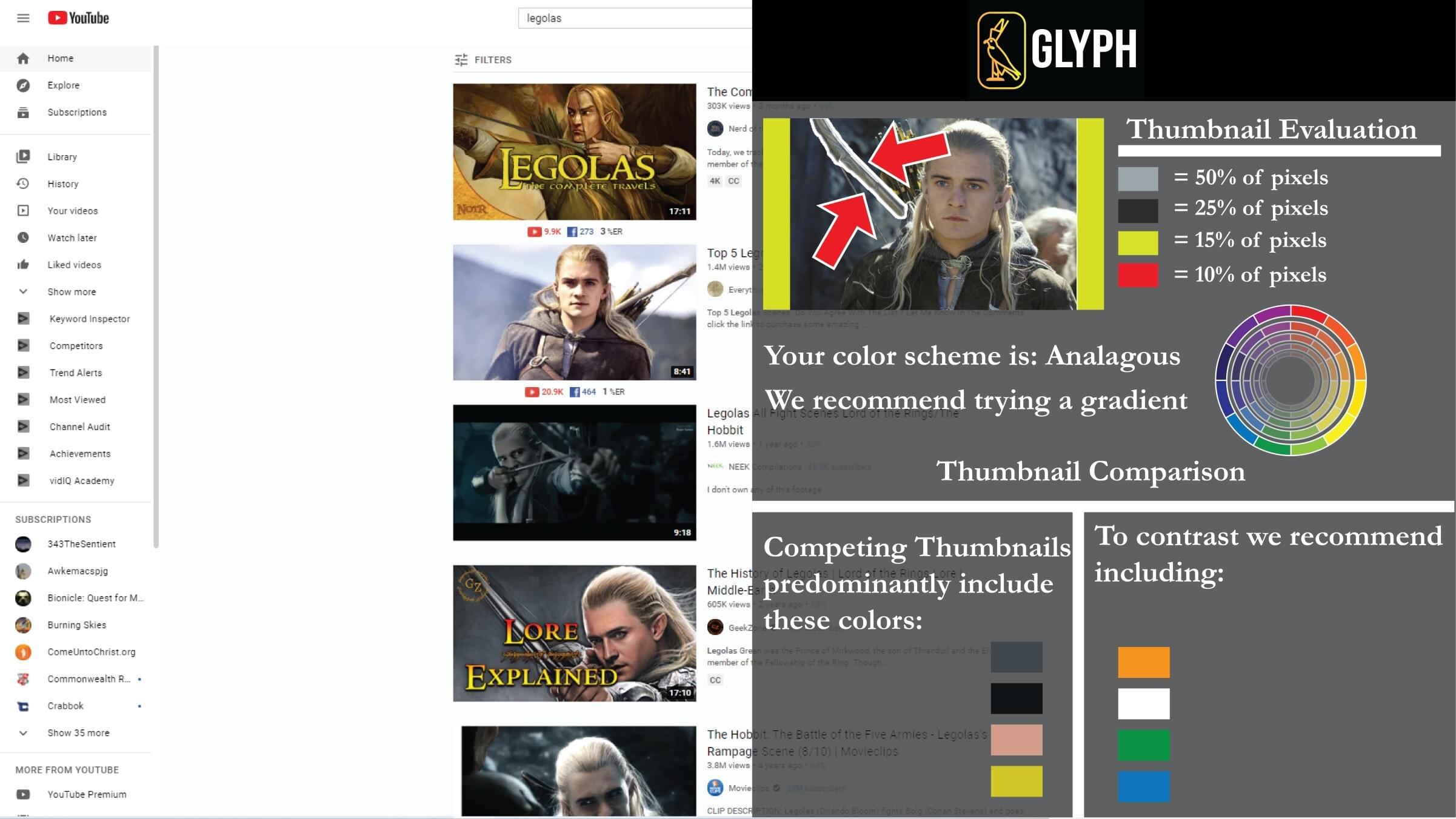
When it comes to creating stunning YouTube thumbnails, the color mode you choose can significantly impact the overall look and feel of your visuals. But what are color modes, and why do they matter? Let's break it down:
- Color Modes Explained: Color modes are the various ways colors are represented in digital media. The most common modes for thumbnails are RGB (Red, Green, Blue) and CMYK (Cyan, Magenta, Yellow, Black).
- RGB Mode: This is the primary color mode for digital screens, including YouTube. It’s based on the additive color model where red, green, and blue light is combined in different ways to create a broad spectrum of colors. RGB is ideal for thumbnails since it allows for vibrant and expansive color ranges that pop on-screen.
- CMYK Mode: This mode is mainly for print media. Since it’s a subtractive color model, it works differently from RGB. When designing a thumbnail, using CMYK can result in dull colors when viewed on a screen. So, it's best avoided for digital projects like YouTube thumbnails.
In short, if you're looking to create eye-catching, engaging thumbnails, stick with RGB. It’s tailor-made for the digital world and will help your videos shine brighter amidst the competition!
The Importance of Color in Thumbnails

When it comes to YouTube thumbnails, color isn't just an aesthetic choice; it's a powerful tool that can significantly impact viewer engagement. Imagine scrolling through a sea of videos, and your eyes land on a thumbnail bursting with vibrant colors. That initial attraction often leads to clicks, and ultimately, views.
Color can evoke emotions and set the tone for your content. For instance:
- Red: This color is often associated with excitement and urgency. It grabs attention and is perfect for action-packed content.
- Blue: Known for its calming and trustworthy vibe, blue works wonders for educational or corporate videos.
- Yellow: Bright and cheerful, yellow can evoke feelings of happiness and positivity, which is great for lifestyle and entertainment channels.
- Green: Often associated with nature and health, green can effectively promote content related to wellness or eco-friendliness.
Using color strategically can help differentiate your brand and make your content instantly recognizable. Consistency in color choices across thumbnails helps build your channel's visual identity, creating a cohesive look that viewers can identify. This also encourages subscriber retention as audiences begin to associate certain colors with your unique style of content.
In short, color in thumbnails can be a game-changer. It not only draws viewers in but also reinforces your brand while communicating your video's message at a glance. So, never underestimate the power of a well-chosen color palette!
Recommended Color Modes for YouTube Thumbnails

Choosing the right color mode for your YouTube thumbnails can enhance how your visuals appear across different devices and platforms. Here are some of the most effective color modes to consider:
| Color Mode | Description | Best For |
|---|---|---|
| RGB | This mode uses Red, Green, and Blue to create colors. It's ideal for digital screens, making it perfect for thumbnails. | All YouTube thumbnails |
| CMYK | This mode uses Cyan, Magenta, Yellow, and Key (Black). While it’s great for print, it’s not suitable for digital platforms. | Not recommended for YouTube thumbnails |
| Indexed Color | This mode limits the color palette, which can be useful for maintaining a particular style but can reduce vibrancy. | Specific themed channels |
The RGB color mode is the clear winner when it comes to YouTube thumbnails. Since screens utilize RGB to detect colors, using this mode ensures your colors appear vibrant and true to life. However, within the RGB color space, consider the saturation and brightness of your colors. Thumbnails with high contrast and saturated colors tend to stand out better.
Experimenting with different combinations and shades will help you find your unique color signature, which can set your channel apart from the crowd. Remember, the goal is not just to draw attention but to foster visual harmony that speaks to the essence of your content. Happy designing!
Tips for Creating Eye-Catching Thumbnails
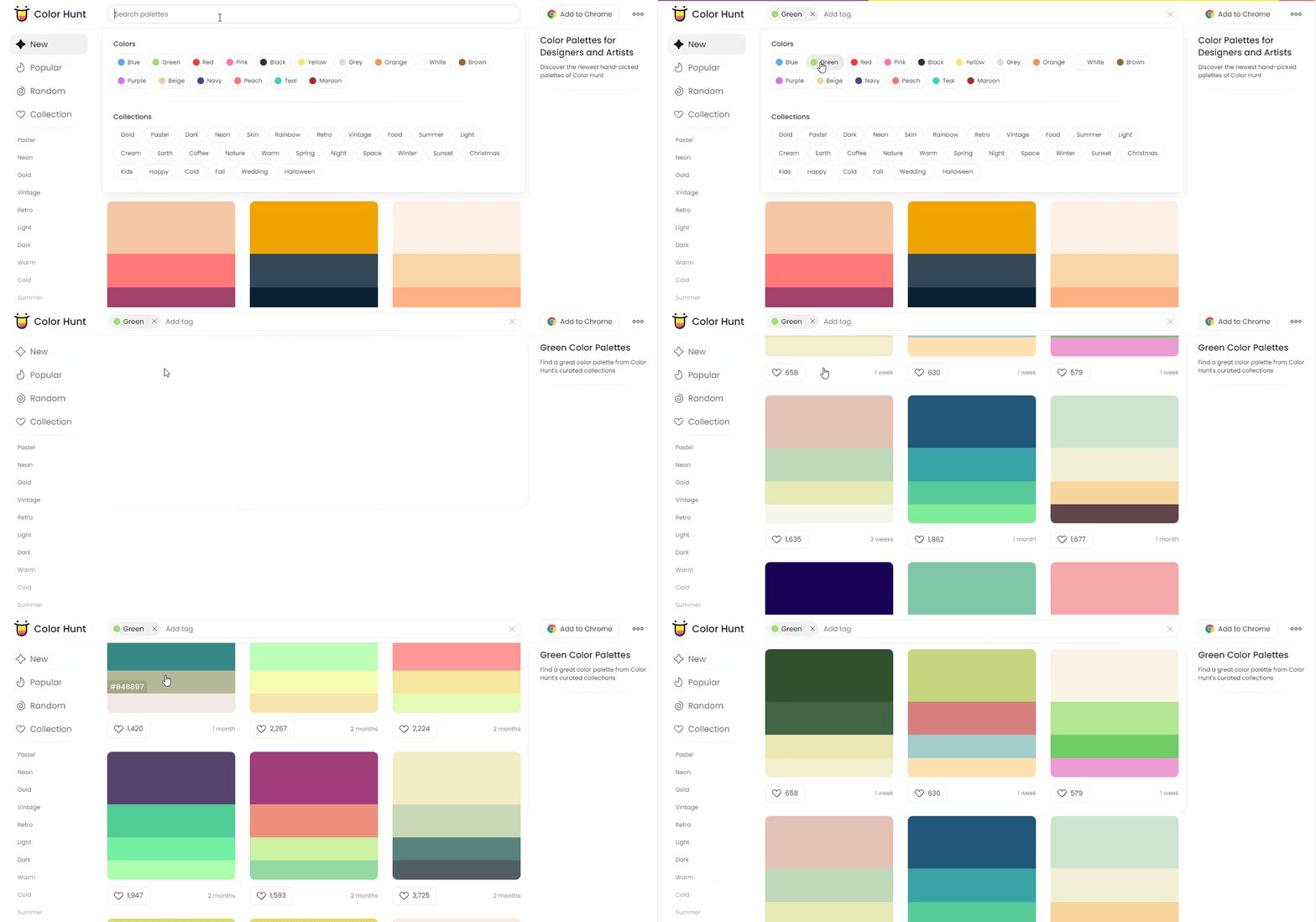
Creating a thumbnail that stands out can make or break your video's click-through rate on YouTube. Here are some practical tips to ensure your thumbnails are eye-catching:
- Use Bold Fonts: Thumbnails are often viewed on small screens, so text needs to be large and legible. Choose bold fonts that can be read easily and use contrasting colors to make them pop.
- Focus on Faces: Thumbnails that feature close-ups of faces tend to draw more attention. Expressions can convey emotions and pique curiosity, enticing viewers to click.
- High-Quality Images: Always use high-definition images. A blurry or pixelated thumbnail gives off an unprofessional vibe and may deter viewers.
- Consistent Branding: Maintain a consistent style across your thumbnails. This could be through color schemes, fonts, or layouts. Your audience should instantly recognize your brand, even from a thumbnail.
- Utilize Color Psychology: Different colors evoke different emotions. For example, red can create a sense of urgency, while blue is viewed as trustworthy. Choose appropriate colors that resonate with your content theme.
- Create a Sense of Mystery: Use graphics or text that suggest there’s something intriguing within the video. This can make viewers curious about your content and encourage them to click.
- Test Different Designs: Don’t be afraid to experiment! Try A/B testing with various thumbnail designs to see which ones perform best with your audience.
Conclusion: Making the Right Choice
Choosing the best color mode and design elements for your YouTube thumbnails is not just an aesthetic decision; it's a strategic one. By understanding your audience and aligning your visual choices with the emotions and responses you want to evoke, you can create thumbnails that not only attract attention but also drive clicks and engagement.
Remember that consistency is key. Whether you opt for a vibrant, colorful palette or a more subdued, monochrome look, make sure it aligns with your brand identity. Your thumbnails should be a reflection of the content within, ensuring that viewers know what to expect when they click on your videos.
So, take these tips to heart, try different approaches, and monitor the outcomes. Over time, you'll find the sweet spot that not only boosts your video's visibility but also creates a strong connection with your audience. Happy thumbnail designing!
 admin
admin


