Image positioning is essential for creating visually appealing web pages. Proper placement of images can enhance the user experience and make your content more engaging. In HTML, you have several options for positioning images, allowing you to control how they appear in relation to other elements on the page. By understanding these options, you can effectively communicate your message and create a layout that meets your design goals.
Exploring Different Image Alignment Options
When working with images in HTML, alignment plays a key role in layout. Here are some common options for aligning images:
- Left Alignment: This places the image to the left of the surrounding text, allowing the text to wrap around it.
- Center Alignment: This centers the image within its containing element, making it stand out.
- Right Alignment: This positions the image on the right side, allowing text to wrap on the left.
To align images, you can use the align attribute in the img tag or apply CSS styles. Here’s a simple example:
| HTML Code | Result |
|---|---|
<img src="image.jpg" align="left"> | Image aligned to the left. |
<img src="image.jpg" align="center"> | Image centered. |
Using CSS to Change Image Position
CSS offers powerful tools to change image positions and enhance layouts. By using CSS, you can achieve more complex positioning than HTML alone. Here are a few methods:
- Margin: Adjust margins to create space around images.
- Padding: Use padding to control the space inside the image's border.
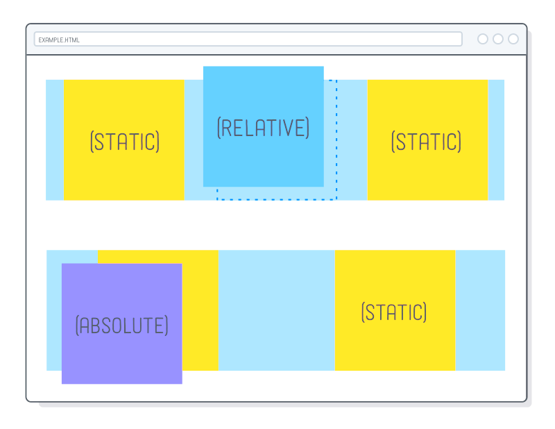
- Position Property: Use properties like
relative,absolute, andfixedto place images precisely.
For example, using CSS to center an image might look like this:
.img-center {

display: block;

margin-left: auto;

margin-right: auto;

}
By applying the img-center class to your image, you can center it easily on the page. Using CSS gives you flexibility and control over your design, making your web pages look professional and polished.
Working with Float and Clear Properties
The float and clear properties in CSS are essential for controlling the layout of images alongside text. By using these properties, you can create a visually pleasing arrangement that allows text to wrap around images, enhancing the overall design of your webpage. Understanding how to work with float and clear properties can make your
When you apply the float property to an image, it shifts the image to one side, allowing text to flow around it. Here’s how it works:
- Float Left: Use
float: left;to position the image to the left of the text. - Float Right: Use
float: right;to place the image on the right side.
However, floated elements can cause issues with container heights. This is where the clear property comes in. It tells an element to stay below any floated elements. Here’s a quick reference:
| CSS Code | Effect |
|---|---|
clear: left; | Move below any left-floated elements. |
clear: right; | Move below any right-floated elements. |
clear: both; | Move below all floated elements. |
By mastering these properties, you can create sophisticated layouts that not only look great but also improve readability.
Positioning Images with Flexbox
Flexbox is a modern CSS layout module that makes positioning images incredibly simple and efficient. It provides a way to arrange elements in a responsive manner, allowing for easy alignment and distribution of space. This is especially useful for creating dynamic and fluid layouts on your web pages.
To use Flexbox for image positioning, you start by defining a container as a flex container. Here’s a basic setup:
.container {

display: flex;

justify-content: center;

align-items: center;

}
Once your container is set up, you can easily control the positioning of your images. Here are some useful properties:
- justify-content: Aligns images horizontally. Options include
flex-start,center, andspace-between. - align-items: Aligns images vertically. You can use
flex-start,center, andflex-end.
This approach makes it effortless to create responsive designs. Images will adjust automatically as the screen size changes, keeping your layout looking great across devices.
Creating Responsive Image Layouts
Creating responsive image layouts is crucial in today’s web design, as it ensures your images look good on all devices, from desktops to smartphones. A responsive layout adapts to different screen sizes, enhancing user experience and accessibility.
To achieve responsive image layouts, consider the following techniques:
- Use Percentage Widths: Set the image width in percentages, such as
width: 100%;. This allows images to resize with their container. - Max-Width Property: Use
max-width: 100%;to ensure images don’t exceed the size of their container, maintaining their aspect ratio. - Media Queries: Implement CSS media queries to adjust image styles based on screen size. For example:
@media (max-width: 600px) {

img {

width: 100%;

}

}
This will make images fill the width of the screen on smaller devices. Additionally, consider using CSS Grid for more complex layouts. This provides even greater control over how images are displayed across different screen sizes.
By following these practices, you can create responsive image layouts that enhance your website’s usability and aesthetic appeal.
Common Issues with Image Positioning
When it comes to positioning images in HTML, there are several common issues that can arise, affecting the overall design of your webpage. Understanding these challenges can help you avoid frustration and create a more polished appearance for your site. Let's explore some of the most frequent problems you might encounter.
- Text Overlap: If images are floated but not cleared properly, text can overlap with images, making content hard to read. Always ensure you use the clear property where necessary.
- Container Collapse: When using float, parent containers can collapse because floated elements are removed from the normal flow. Using the clearfix method can help address this issue.
- Responsive Design Issues: Images might not resize correctly on different devices if not set up with responsive design practices. Always use percentage widths or CSS properties like max-width.
- Alignment Problems: Achieving the desired alignment can be tricky. If using CSS, ensure that the properties applied to the container and images are set correctly for optimal alignment.
By being aware of these issues, you can troubleshoot effectively and create a more seamless user experience. Regular testing across various devices can also help identify and fix these problems early on.
FAQ about Changing Image Position in HTML
Many people have questions about image positioning in HTML. Here are some frequently asked questions that might help clarify common concerns.
- How do I center an image using HTML?
To center an image, you can use CSS. Set the image as a block element and applymargin: auto;to achieve centering. - What is the difference between float and position?
Float removes elements from the normal flow, allowing text to wrap around. Position, on the other hand, allows you to place elements in specific locations on the page. - Can I use CSS Grid for image positioning?
Absolutely! CSS Grid offers great flexibility for laying out images and other elements responsively. - Why do my images look stretched or distorted?
This often happens when you set a fixed width without maintaining the aspect ratio. Usemax-width: 100%;to prevent distortion.
These answers can guide you through some common challenges and help you use image positioning more effectively.
Conclusion on Image Positioning Techniques
In conclusion, mastering image positioning techniques is vital for creating visually appealing and user-friendly web pages. By understanding the various methods available—such as float, clear, Flexbox, and responsive design—you can make your images enhance rather than hinder your layout.
Remember to consider common issues that can arise, and don't hesitate to refer back to FAQs if you find yourself in a bind. Here’s a quick recap of the key points:
- Use float and clear properties effectively to control text flow around images.
- Take advantage of Flexbox for flexible, responsive layouts.
- Implement responsive design techniques to ensure images look great on all devices.
By applying these techniques thoughtfully, you can create a more engaging and visually appealing website. Keep experimenting and refining your skills, and you'll see a significant improvement in your web design projects.
 admin
admin