Centering images accurately on a webpage is crucial for creating visually appealing and well-structured designs. It ensures that your content looks professional and is easy for viewers to engage with. This post explores effective techniques to help you center images precisely, making your website more attractive and user-friendly.
Understanding the Importance of Image Centering
Centering images plays a vital role in web design for several reasons:
- Visual Balance: Properly centered images create a harmonious layout, leading to a more pleasant user experience.
- Focus: When images are centered, they draw attention and help convey your message effectively.
- Professional Appearance: A well-aligned design looks polished, enhancing your brand's credibility.
- Responsive Design: Centering images ensures they adapt well across different devices, providing consistency.
By understanding the importance of image centering, you can significantly improve the aesthetics and functionality of your site.
Different Methods for Centering Images
There are several effective methods to center images in web design, each suited to different situations:
| Method | Description | Best Use Case |
|---|---|---|
| CSS Margin Auto | Set the image's left and right margins to auto. | Block-level images in fixed-width containers. |
| Flexbox | Use display: flex to create a flexible container. | Responsive designs with multiple elements. |
| Grid Layout | Define a grid and place images in the center cell. | Complex layouts needing precise control. |
| Text Alignment | Set text-align: center for inline images. | Images within text blocks. |
Choosing the right method depends on your layout and design goals. By using these techniques, you can achieve perfect image centering and improve your site's overall look.
Using CSS for Precise Image Centering
When it comes to centering images with CSS, there are a few straightforward techniques that can help you achieve precise alignment. The most common method is to set the image as a block-level element and use margins. Here's how you can do it:
- Display Block: First, ensure your image is set to display as a block. This allows it to take up the full width of its container.
- Auto Margins: Next, apply
margin-left: auto;andmargin-right: auto;to the image. This will push the image into the center of its parent container.
Here's a simple CSS snippet:
img {
    display: block;
    margin-left: auto;
    margin-right: auto;
}
Using this method is straightforward and works well in many scenarios. However, it’s essential to consider the context of your layout. This approach is particularly effective when your image is contained within a defined width, ensuring it stays centered regardless of the screen size. Experiment with this technique to find the best results for your design!
Applying Flexbox for Responsive Design
Flexbox is a powerful layout model that makes it easy to center images responsively. It allows you to create flexible and adaptable layouts without much hassle. Here’s how to use Flexbox for centering images:
- Set Display Flex: Apply
display: flex;to the parent container of your image. - Align Items: Use
justify-content: center;to center the image horizontally. - Align Self: If you want to center it vertically as well, use
align-items: center;.
Here’s a CSS example:
.container {
    display: flex;
    justify-content: center;
    align-items: center;
}
Flexbox is great for responsive designs because it adjusts seamlessly to different screen sizes. This method is ideal when you have multiple elements to center, as it keeps everything aligned neatly. Give it a try to see how it can enhance your layout!
Utilizing Grid Layout for Image Alignment
Grid layout is another fantastic way to center images, especially when dealing with more complex designs. It provides greater control over the positioning of your elements. Here’s how to use CSS Grid for centering images:
- Define a Grid: Set the parent container to
display: grid;. You can define rows and columns according to your needs. - Center the Image: Use
grid-template-areasto specify where you want the image to be placed.
Here’s a basic example:
.container {
    display: grid;
    grid-template-columns: 1fr;
    grid-template-rows: 1fr;
    place-items: center;
}
In this setup, the place-items: center; property centers all items within the grid cell, both horizontally and vertically. This method is particularly useful when you want to align multiple images or elements in a grid structure. With CSS Grid, you can create sophisticated layouts while ensuring everything remains well-aligned and centered. It’s a powerful tool in your web design arsenal!
Common Challenges in Centering Images
Centering images may seem simple, but it often comes with its own set of challenges. Understanding these common issues can help you find solutions more easily. Here are some typical challenges you might face:
- Different Image Sizes: Images come in various sizes and aspect ratios, which can make centering tricky, especially in responsive designs.
- Parent Container Width: If the parent container is not wide enough, it may lead to unexpected alignment results, especially on smaller screens.
- Display Types: Using different display properties (like inline vs. block) can affect how images are centered, leading to inconsistent behavior.
- Browser Compatibility: Not all browsers interpret CSS properties the same way, which can result in different appearances across platforms.
To tackle these challenges, it’s essential to test your designs across various devices and browsers. Adjusting CSS properties and using media queries can help you create a more uniform experience. Remember, understanding the limitations and quirks of each method is crucial for achieving the perfect image alignment.
Best Practices for Image Centering
To ensure your images are centered perfectly, consider following these best practices. They will help you maintain a clean and professional look throughout your website:
- Use Consistent Dimensions: Where possible, use images with similar dimensions to maintain uniformity across your layout.
- Optimize Images: Always optimize images for web use. This reduces load times and improves user experience.
- Leverage CSS Techniques: Familiarize yourself with CSS techniques like Flexbox and Grid, as they provide robust solutions for image centering.
- Responsive Design: Use media queries to adjust image size and alignment on different screen sizes, ensuring they always look good.
Following these best practices will not only improve your image centering skills but also enhance the overall visual appeal of your website. A well-structured design encourages user engagement and can lead to better retention.
Frequently Asked Questions
Here are some common questions people have about centering images, along with clear answers to help clarify:
- What is the best way to center an image in CSS?
The best method depends on your layout. Using CSS Flexbox or Grid is recommended for responsive designs, while the margin auto technique is effective for simple cases.
- Why is my image not centering correctly?
Check the display type of your image and its parent container. If the parent isn’t wide enough or the image is set to inline, it may not center as expected.
- How can I center images on mobile devices?
Ensure you use responsive CSS properties like percentages or viewport units, along with media queries, to adjust image sizes and alignments for mobile views.
- Is there a difference between centering block and inline images?
Yes, block images take up the full width of their container, making them easier to center using margin auto, while inline images need different approaches like text-align for centering.
These FAQs cover some of the most common concerns when centering images. If you have further questions, don’t hesitate to explore or ask for help. Understanding these concepts will lead to better web design practices!
Conclusion and Final Thoughts
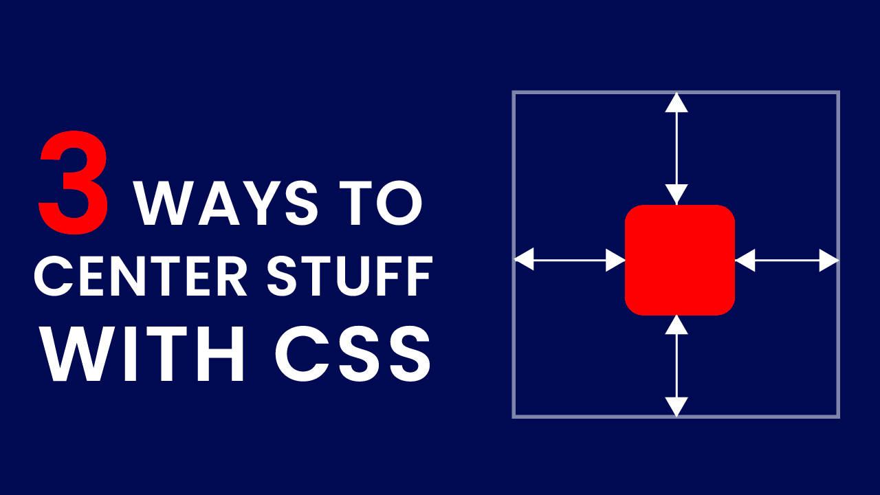
Centering images effectively is a vital skill for anyone involved in web design. By understanding the various methods like CSS, Flexbox, and Grid, you can create visually appealing layouts that enhance user experience. Remember to consider the challenges that come with different image sizes and browser compatibility, and always follow best practices to ensure a polished look. With a bit of practice and experimentation, you can master the art of image centering, making your website not only functional but also aesthetically pleasing. So go ahead, apply these techniques, and watch your designs transform!
 admin
admin