Centering a header image on Blogspot can dramatically improve the visual appeal of your blog. A centered header image gives your blog a clean, balanced, and professional look. If you're looking to make your blog stand out, adjusting the header
Why Centering a Header Image is Important for Blogspot
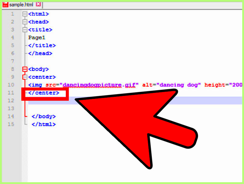
Centering your header image on Blogspot can have a significant impact on your blog's first impression. It creates symmetry, making your blog appear more organized and visually appealing. Here's why it matters:
- Better Design Appeal: A centered image draws attention to the main content, creating a neat and visually balanced layout.
- Improved User Experience: When your header is centered, it feels more professional and welcoming, leading to better engagement from visitors.
- Consistency: Having your header image aligned properly adds to the overall consistency of your design, reinforcing your blog's branding.
- Adaptability: A centered header image works well across different devices and screen sizes, making your blog look great on both desktops and mobile devices.
In essence, centering your header image is a simple change that can go a long way in improving the look and functionality of your Blogspot blog. It also allows for better customization, ensuring that your blog represents you or your brand more effectively.
Steps to Center a Header Image in HTML on Blogspot
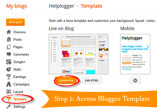
Now that you know why centering your header image is important, let’s dive into the steps you need to follow. It’s actually quite simple and involves just a few changes to your HTML and CSS code. Follow these steps to center your header image:
- Access Your Blogspot Theme: Log in to your Blogspot account and go to the “Theme” section. Here, you’ll find the option to edit your HTML.
- Locate the Header Section: In the HTML editor, search for the
<header>or<div>tag that contains the header image code. - Adjust the Image Alignment: Add the following CSS code to center your header image:
    header img {
      display: block;
      margin-left: auto;
      margin-right: auto;
    }
This code tells the browser to display the image as a block-level element and automatically adjust the margins on the left and right to center it.
- Save and Preview: Once you’ve added the code, save your changes and preview your blog. Your header image should now be centered on the page.
- Publish the Changes: If you’re satisfied with the preview, go ahead and publish the changes to make your new centered header image live.
By following these simple steps, you’ll quickly have a well-centered header image on your Blogspot blog, adding a polished look to your site.
Understanding HTML and CSS Code for Centering Header Images
To center your header image on Blogspot, you’ll need to understand how HTML and CSS work together. HTML defines the structure of your page, while CSS handles the styling and layout. When centering an image, you're primarily using CSS to control how it’s positioned within the header section of your blog. Let’s break it down:
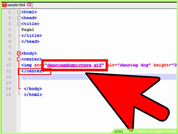
- HTML Structure: In HTML, your header image will be placed within the
<header>tag or a specific<div>container. This is where the image element is defined, like this:
    <header>
      <img src="your-image-url.jpg" alt="Header Image">
    </header>
In this structure, the image tag points to the URL of your header image, and the alt attribute describes the image if it fails to load.
- CSS Styling: To center the image, you'll apply CSS properties to the image tag. Here’s the essential CSS code:
    header img {
      display: block;
      margin-left: auto;
      margin-right: auto;
    }
This code does two things:
- display: block; – It makes the image a block-level element, meaning it behaves like a block of text, taking up the full width of its container.
- margin-left: auto; margin-right: auto; – This centers the image by automatically adjusting the left and right margins.
Understanding this HTML and CSS combination is key to ensuring that your header image is properly centered on your Blogspot blog.
Common Issues When Centering Header Images and How to Fix Them
While centering a header image is usually straightforward, there are some common issues that might crop up. Let’s go through these problems and how you can fix them:
- Image Not Centering Properly: This is often caused by the image being set as an inline element rather than a block element. To fix this, ensure you’ve used
display: block;in your CSS, as shown in the previous section. - Image Overlapping Other Content: Sometimes the header image might overlap text or other elements. This could be because of insufficient padding or margin around the image. You can resolve this by adding padding or margin to the
<header>tag or its container in the CSS:
    header {
      padding: 20px;
    }
- Header Image Not Responding Well on Mobile Devices: Another common issue is the image not resizing correctly on smaller screens. To fix this, use a responsive CSS rule to make the image scale with the screen size:
    header img {
      max-width: 100%;
      height: auto;
    }
This will ensure that your header image adjusts to fit the screen width while maintaining its aspect ratio.
- Fixed or Absolute Positioning Affecting Layout: Sometimes CSS properties like
position: fixed;orposition: absolute;might interfere with centering. If this is the case, try using the standard flow layout withmargin-left: auto;andmargin-right: auto;for centering.
By addressing these common issues, you’ll be able to ensure that your header image looks great across all devices and screen sizes.
Additional Tips for Customizing Header Images in Blogspot
Once you’ve centered your header image, you might want to further customize it to suit your blog's design. Here are some additional tips for enhancing your header image on Blogspot:
- Adjust Image Size: Sometimes, your header image might be too large or too small. You can resize it with CSS to better fit the space. Here’s a simple way to set a maximum width for the header image:
    header img {
      max-width: 100%;
      height: auto;
    }
This ensures the image scales down to fit the container, but doesn’t grow larger than its original size.
- Apply Image Filters: You can make your header image stand out by applying CSS filters like brightness, contrast, or blur. For example:
    header img {
      filter: brightness(80%) contrast(120%);
    }
This will make the image slightly darker and boost the contrast, giving it a unique style.
- Adding Text Overlays: If you want to add text or a logo over your header image, you can use the
position: absolute;property in CSS. For example:
    header {
      position: relative;
    }
    header h1 {
      position: absolute;
      top: 50%;
      left: 50%;
      transform: translate(-50%, -50%);
      color: white;
    }
This places your text exactly in the center of the header image, making it look professional and polished.
- Use a Parallax Effect: To create a dynamic scrolling experience, you can add a parallax effect to your header image. This effect makes the background image move at a different speed than the content as the user scrolls. It can be achieved with a combination of CSS and JavaScript, though it may require advanced coding skills.
By customizing your header image in these ways, you can create a blog that’s visually appealing, unique, and reflective of your personal style or brand.
How to Preview and Publish Changes on Blogspot
After you’ve made changes to your Blogspot theme, such as centering your header image, it’s crucial to preview and publish these changes to make sure everything looks as expected. Here’s a step-by-step guide to help you preview and publish your changes:
- Step 1: Access the Theme Editor – Log into your Blogspot account and go to the “Theme” section from the left-hand menu. Click on the “Customize” button under your current theme.
- Step 2: Edit HTML – Inside the theme editor, click on the “Edit HTML” option. This will open the HTML editor where you can make changes to the theme code, such as centering the header image.
- Step 3: Save Changes – After making adjustments to the HTML or CSS (like centering your header image), save your changes by clicking the “Save” button at the top right of the editor.
- Step 4: Preview Your Blog – Before publishing, click on the “Preview” button to see how the changes appear on your blog. This allows you to check the layout and make sure everything is aligned properly.
- Step 5: Publish Your Changes – If you’re happy with how the centered header image looks, click the “Apply to Blog” or “Publish” button to make your changes live for your audience.
By following these steps, you can confidently preview and publish your Blogspot changes, ensuring your centered header image looks perfect on your live blog.
FAQ about Centering a Header Image in HTML on Blogspot
Here are some frequently asked questions about centering a header image in HTML on Blogspot, along with helpful answers to guide you through the process:
- Q: What is the easiest way to center a header image on Blogspot?
A: The simplest way is to add the following CSS code:header img { display: block; margin-left: auto; margin-right: auto; }. This will center the image horizontally within the header section. - Q: My image isn’t centering properly. What should I do?
A: Make sure you’re usingdisplay: block;andmargin-left: auto; margin-right: auto;in your CSS. If the problem persists, check if there are any conflicting styles or container settings that might affect the layout. - Q: How can I make the header image responsive on mobile devices?
A: To make your header image responsive, add the following CSS:header img { max-width: 100%; height: auto; }. This ensures that the image scales to fit the screen size on mobile devices. - Q: Can I add text over my header image?
A: Yes! You can use CSS positioning to add text over your header image. For example:header h1 { position: absolute; top: 50%; left: 50%; transform: translate(-50%, -50%); }. This will center your text in the middle of the image. - Q: How do I remove the space above or below my header image?
A: You can remove extra space by adjusting the padding or margin values around the header image in your CSS. For example:header { margin: 0; padding: 0; }.
These FAQs should help clear up any confusion and guide you through common issues when centering a header image in Blogspot.
Conclusion: Final Thoughts on Centering a Header Image
Centering a header image on Blogspot is a simple yet effective way to enhance the design and user experience of your blog. With just a few tweaks to your HTML and CSS, you can achieve a professional, balanced look that works well across devices. By following the steps outlined in this guide, you’ll be able to create a visually appealing blog that draws attention and showcases your content effectively.
Remember, the key to success is ensuring that your header image is not only centered but also responsive, so it looks great on all screen sizes. If you encounter any issues, refer back to the troubleshooting tips or FAQs to resolve them quickly. Overall, a well-centered header image can make a world of difference in how your blog is perceived by visitors, helping you create a lasting impression.
So, go ahead and give your Blogspot blog a fresh look by centering your header image. It’s a small change that can have a big impact!
 admin
admin