Web architecture has a crucial part played by image positioning which enable you to guide what appears where on your site thus affecting the general design and interactivity with it. When you place images properly there is always an increase in aesthetic appeal hence enhancing content arrangements. In this segment we will examine image positioning fundamentals in terms of HTML/CSS coding as a prelude for advanced methods that come after.
Using Basic HTML to Position Images
To start positioning images, you need to know the basic HTML tags used to insert images into your web pages. The <img> tag is your primary tool here. Here's how you can use it:
- Source Attribute: The
srcattribute specifies the path to your image file. For example:<img src="image.jpg">. - Alt Attribute: Always include the
altattribute for accessibility. This provides a text alternative for users who cannot see the image. - Width and Height: You can set the size of the image using the
widthandheightattributes, like so:<img src="image.jpg" width="300" height="200">.
While the <img> tag handles the basics, it’s often not enough for precise positioning. That’s where CSS comes into play!
Exploring CSS for Image Alignment
Images on web pages can be easily controlled for layout and alignment using CSS, which is a potent instrument. Techniques that are often used in CSS to align images can be found below:
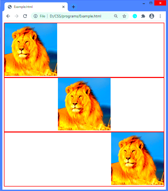
- Text Alignment: You can align images within a block of text using the
text-alignproperty. For instance:div { text-align: center; } - Margin: Use margins to create space around images. For example, to center an image:
img { display: block; margin: 0 auto; } - Float: The
floatproperty allows you to wrap text around images. For instance:img { float: left; margin-right: 10px; }
Using style sheets will give you a professional appearance and your photos will mesh together with the other things you’ve got written. In the following paragraphs we will explore how to make adaptable frameworks and more intricate approaches.
Creating Responsive Image Layouts
Creating responsive image layouts is essential in the current era of web designing. Given the range of devices used by people accessing internet settings, it is important for all your images to look alright in every screen size. In order for images to fit well into various resolutions without compromising on their quality or breaking the overall layout of a website, it needs a responsive structure. We can achieve that with CSS methods.
Creating image layouts that adapt to different screen sizes can be tricky but there are some tricks you might want to try on your own:
- Use CSS max-width: Set the
max-widthproperty to 100%. This way, your image will scale down to fit smaller screens while maintaining its original aspect ratio. For example:img { max-width: 100%; height: auto; } - Implement the
srcsetattribute: This allows you to provide multiple image sources for different screen resolutions. For example:<img src="small.jpg" srcset="medium.jpg 600w, large.jpg 1200w" alt="Responsive Image">
- Utilize CSS Grid or Flexbox: These modern layout systems can help you create fluid, responsive designs. They allow you to easily adjust the size and positioning of images based on the screen size.
If you have got proper details concerning how to do this, your images will not only attract but will also serve to make your website better.
Centering Images on Web Pages
One of the best things you can do to improve the appearance of your web pages is to center images. There are different straightforward ways one can use CSS to centre an image either at the middle of a text block or as a major feature for a specific section. Here is how such methods can be used; let us cover some of them below.
The following are some uncomplicated approaches:
- Using Text Align: If your image is within a block-level element, you can easily center it with:
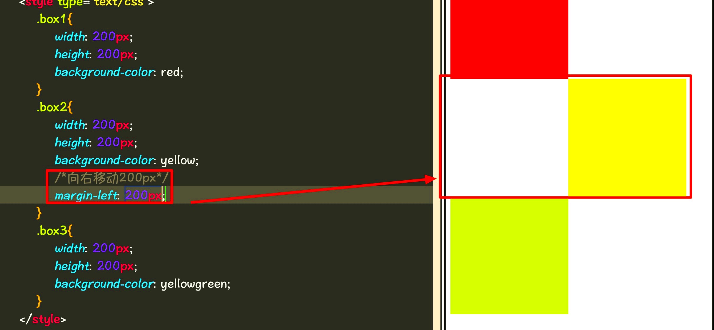
div { text-align: center; } - Margin Auto: To center block elements like images, set their margins to auto. This works well when the image has a defined width:
img { display: block; width: 300px; margin: 0 auto; } - Flexbox Method: This modern approach allows for easy centering. Just apply
display: flex;to the parent container:div { display: flex; justify-content: center; }
Employing this technique will give your images a sleek and planned appearance thus improving the website’s general layout.
Working with Floating Images
Within a layout, the application of floating images provides dynamicism which allows for text wrapping around them. The technique can create a visual flow most appealing in any content. However, it is critical to understand that floats have their own set of rules and this guarantees your layout is intact. In order to know how floating images should be handled properly, let’s go deeper into it.
Points essential here are:
- Using the Float Property: To float an image to the left or right, you can use the
floatproperty. For example:img { float: left; margin-right: 10px; } - Clearing Floats: If you have a container that should wrap around floated elements, use the
clearproperty on the following element. For instance:div { clear: both; } - Responsive Considerations: When using floats, remember to ensure that your images are responsive. Combine float techniques with max-width for best results.
The use of floating images can help you construct a more appealing format that captures the reader’s attention to important particulars while making it possible for them to read the text.
Using Flexbox and Grid for Image Positioning
Two very efficient CSS layout systems that make it easier to position images in web pages are Flex box and Grid. Those systems help manage the arrangement of different elements like images hence achieving an easier and effective responsive design. Understanding those layout models is important if you want your pictures to be well aligned and appear attractive too.
The following describes how you can use Flexbox and Grid to place the images:
- Flexbox for Image Alignment: Flexbox is great for one-dimensional layouts. You can center images both horizontally and vertically by applying flex properties to the container. Here’s an example:
div { display: flex; justify-content: center; /* Aligns items horizontally */ align-items: center; /* Aligns items vertically */ } - Grid for Complex Layouts: CSS Grid is perfect for two-dimensional layouts, allowing you to create complex arrangements. For example, to place images in a grid, you can use:
div { display: grid; grid-template-columns: repeat(3, 1fr); /* Creates three equal columns */ gap: 10px; /* Adds space between items */ } - Responsive Adjustments: Both Flexbox and Grid make it easy to create responsive designs. You can use media queries to adjust the layout based on screen size, ensuring that your images look great on all devices.
Using Flexbox and Grid, one may find it easy to form eye-catching and organized designs that enhance the beauty of their pictures.
Frequently Asked Questions about Image Positioning
Positioning images often sparks many questions, primarily for novices in web design. This article addresses frequent inquiries to shed light on typical ambiguities.
- What is the best way to center an image? The best method depends on your layout. Using
margin: autofor block images ortext-align: centerfor inline images are both effective methods. - How do I make images responsive? Use CSS properties like
max-width: 100%andheight: autoto ensure images resize correctly on different screens. - What are the advantages of using Flexbox and Grid? Flexbox is ideal for single-dimensional layouts, while Grid is excellent for complex, two-dimensional arrangements. Both help create responsive designs easily.
- Why should I use the
altattribute for images? Thealtattribute provides a text description of images, improving accessibility for visually impaired users and enhancing SEO. - What should I do if images are overlapping? Check your CSS properties. You may need to clear floats, adjust margins, or reconsider your layout strategy to avoid overlap.
Using this FAQ section, you can have a more concrete understanding of the placement of images and how to solve some challenges.
Final Thoughts on Positioning Images in HTML and CSS
Proper positioning of images is important for creating visually appealing and user centric web designs in HTML and CSS. With the use of basic HTML tags, CSS properties or even more advanced techniques like Flexbox and Grid, understanding how to manipulate images can improve your site layout considerably.
Here are some pointers that you must bear in mind:
- Utilize Responsive Design: Always aim for responsive images that look good on all devices.
- Choose the Right Method: Depending on your layout needs, decide whether to use Flexbox, Grid, or traditional CSS methods.
- Test Across Devices: Regularly test your images on various screen sizes to ensure they are positioned correctly and maintain their quality.
- Prioritize Accessibility: Don’t forget the importance of the
altattribute for enhancing accessibility and SEO.
Whenever you adhere to these directives, it becomes easier for you to position images on your website thus making your content more captivating for the audience using it. Enjoy programming!
 admin
admin