When browsing through
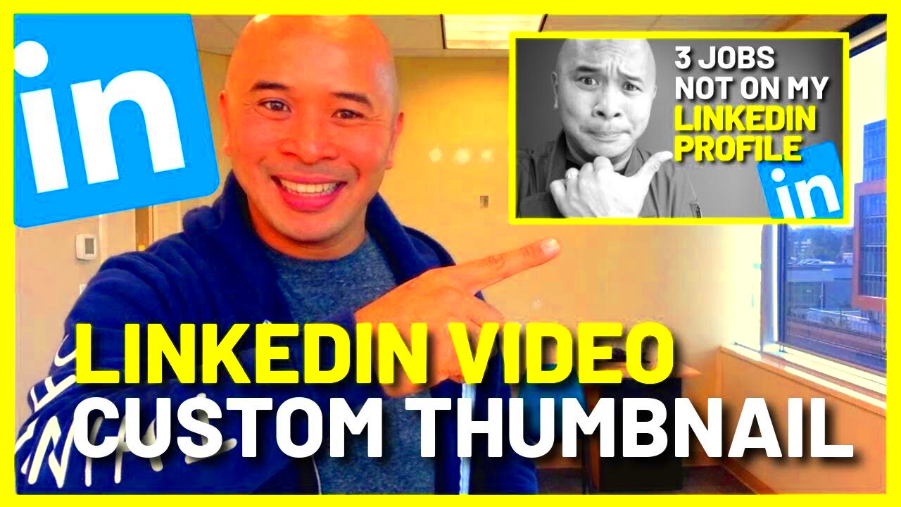
LinkedIn what catches your eye and prompts you to click on a video? More often than not it's the thumbnail. Similar to how a cover piques your interest a captivating thumbnail draws attention and boosts engagement. I recall when I began posting videos on
LinkedIn I didn't fully grasp the impact of an enticing thumbnail. My early thumbnails were rather unremarkable and the view count was unimpressive. It wasn't until I revamped my thumbnails that I witnessed a notable surge in audience interaction.A carefully selected thumbnail serves as a sneak peek that gives viewers a glimpse of what to expect in the video. Its an opportunity to leave a lasting impact. When your thumbnail grabs attention and aligns with the theme of your video it can distinguish your content from others. Consider it a small advertisement for your work that stands out amidst a flood of social media posts.
To make the most of your thumbnail:
- Ensure clarity: The image should be sharp and clear.
- Convey value: It should hint at what viewers will gain from watching.
- Stand out: Use vibrant colors and high contrast to catch the eye.
In short putting effort into designing a thumbnail can greatly influence how far your video spreads and how successful it is on
LinkedIn.
Choosing the Right Image for Your Thumbnail
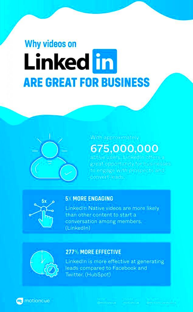
Picking an image for your
LinkedIn video thumbnail is similar to picking an outfit for a special event. You want it to show your personality and leave a lasting impact. I’ve had my ups and downs when it comes to thumbnails at first I went with stock photos but they didn’t connect with my viewers. Through some testing I discovered that using tailored and context specific images made a difference.
Here are some suggestions to help you pick the image.
- Relevance: The image should directly relate to the video content. Avoid misleading visuals.
- Emotion: Choose images that evoke the right emotions. For instance, a thumbnail showing excitement can attract more viewers if your video is about a lively topic.
- Consistency: Use images that align with your personal or brand style to maintain a cohesive look across your posts.
Think about trying out various visuals to determine which one yields the best results. Your thumbnail isn’t merely an image; it plays a vital role in conveying the narrative and attractiveness of your video.
Consider the Visual Appeal and Branding
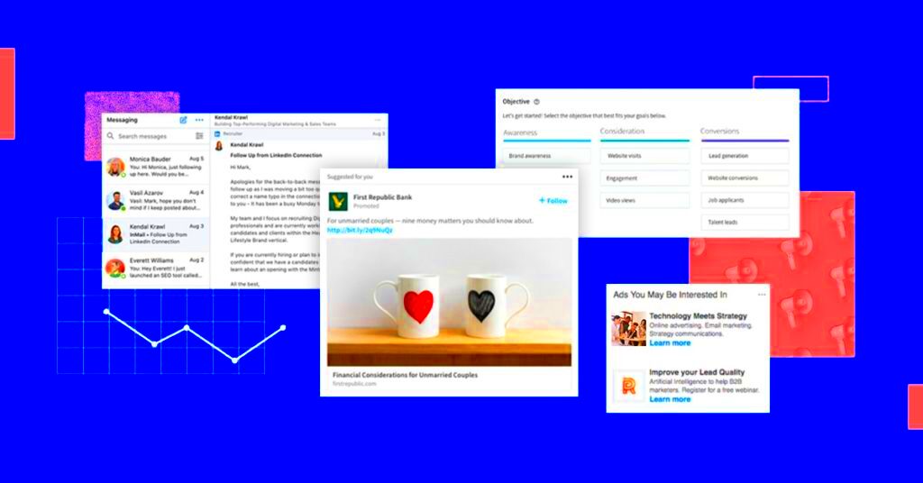
When choosing a thumbnail its important to consider its look and how it represents your brand. Your thumbnail serves as an element of your brands visual identity. I learned this lesson when I used a thumbnail that didn't match my brands colors. As a result the engagement on my video took a hit because the thumbnail seemed mismatched. Since that experience I've made it a point to ensure that every thumbnail I create reflects my brands visual style.
To enhance visual appeal and branding:
- Brand Colors: Incorporate your brand’s colors into the thumbnail to strengthen brand recognition.
- Fonts and Logos: Use consistent fonts and include your logo if applicable. This not only reinforces your brand but also helps in maintaining a professional look.
- Design Simplicity: Avoid clutter. A clean, focused design tends to be more visually appealing and easier to comprehend at a glance.
Dont forget that your thumbnail should not only be visually appealing but also reflect the essence and principles of your brand. When you focus on these aspects you enhance the overall experience for your audience making it more unified and captivating.
How to Use Text and Graphics Effectively
Adding text and visuals to your
LinkedIn video thumbnail is similar to seasoning an American dish—finding the balance can truly elevate the overall taste. I recall trying out various font styles and design components for my thumbnails. At first, I went overboard with too many elements, resulting in a messy look. However, through some experimentation I realized that keeping it simple while using text and graphics strategically yielded the best results.
Here are some suggestions for making good use of visuals and text in your work.
- Keep it Simple: Too much text or too many graphics can overwhelm viewers. Stick to a concise message or a single graphic that complements your video.
- Highlight Key Information: Use text to convey important details like the video topic or main benefit. Ensure the font is readable even in smaller sizes.
- Choose Contrasting Colors: Make sure the text contrasts well with the background. This enhances readability and grabs attention.
- Use Graphics Sparingly: Graphics should support your message, not distract from it. Use them to emphasize key points or add visual interest.
By strategically incorporating text and visuals in your thumbnails, you can enhance their appeal and convey information effectively. This not only captures the attention of potential viewers but also provides them with a glimpse of what your video has to offer.
Optimizing Your Thumbnail for LinkedIn
Getting your thumbnail ready for
LinkedIn is like cooking a meal for an event you want it all to be perfect. I made the mistake of sharing a video with a thumbnail and the outcome was underwhelming. Since that experience I’ve come to realize how crucial it is to customize your thumbnail according to
LinkedIn’s guidelines and the preferences of its audience.
Here are some tips to enhance your thumbnail.
- Size and Resolution: LinkedIn recommends a thumbnail size of 1200 x 675 pixels. Ensure your image is high resolution to avoid blurriness.
- Aspect Ratio: Stick to a 16:9 aspect ratio for a well-fitted thumbnail on LinkedIn. This helps your thumbnail appear correctly across different devices.
- File Format: Use JPEG or PNG formats for the best quality. Avoid using formats that may reduce the clarity of your image.
- Test Visibility: Preview your thumbnail on different devices to ensure it looks good everywhere. A thumbnail that’s clear and appealing on mobile can make a big difference.
If you focus on these aspects, you can enhance the performance of your thumbnail on LinkedIn, drawing more views and interaction for your video.
Tools and Resources for Creating Thumbnails
Designing thumbnails can be a walk in the park if you have the tools. I’ve dedicated a lot of time searching through different tools and materials to discover what suits my needs. Whether it's intuitive design websites or stock photo collections there are plenty of choices available to assist you in creating an eye catching thumbnail.
I suggest checking out these tools and resources.
- Canva: A versatile design tool that offers easy-to-use templates and customization options for creating professional-looking thumbnails.
- Adobe Spark: Ideal for creating visually appealing thumbnails with its range of templates and design elements.
- Unsplash and Pexels: Great resources for high-quality, royalty-free images that can serve as the basis for your thumbnail.
- Figma: If you’re looking for more advanced design capabilities, Figma provides robust features for detailed customization.
Leveraging these resources can simplify the way you create thumbnails and assist you in achieving a sleek and refined appearance. Keep in mind that choosing the tool can greatly impact the overall quality of your finished picture.
Testing and Analyzing Your Thumbnail's Performance
Evaluating how well your thumbnail performs is similar to perfecting a dish. It’s essential to figure out what resonates with the audience and tweak things as needed. I remember posting a video featuring a thumbnail I believed was spot on only to find the engagement levels falling short of my expectations. Upon reflection I understood that experimenting with thumbnails might have enabled me to make better choices based on insights.
Here’s a smart way to assess and evaluate how well your thumbnail is doing.
- Track Metrics: Use LinkedIn's analytics tools to monitor metrics like click-through rate (CTR) and engagement. These insights will help you gauge how well your thumbnail is performing.
- A/B Testing: Experiment with different thumbnails for the same video to see which one gets better results. This can be done by changing only one element at a time to pinpoint what works best.
- Gather Feedback: Ask your audience for feedback. Sometimes, direct input from viewers can provide valuable insights that data alone might not reveal.
- Adjust Based on Findings: Use the data and feedback you gather to make informed changes. Continuously refining your approach will help you improve your thumbnails over time.
Examining how well your thumbnail performs gives you insights into what grabs your viewers interest and how you can enhance your material to boost engagement.
Tips for Updating Your Thumbnails Regularly
Changing your thumbnails from time to time is similar to giving your closet a makeover it keeps things fresh and attractive. There was a time when I had a bunch of videos with old thumbnails that made my content seem dull. Refreshing them not enhanced the appearance but also greatly increased viewer engagement.
Here are a few suggestions to keep your thumbs looking new and appealing.
- Stay Current: Update thumbnails to reflect any changes in your content or branding. Keeping them relevant ensures they resonate with your audience.
- Seasonal Updates: Refresh thumbnails to align with seasonal trends or special events. For example, updating for festivals or major events can catch more attention.
- Monitor Trends: Keep an eye on trends and design styles that are popular. Updating thumbnails to reflect these trends can make your content more appealing.
- Review Performance: Regularly review the performance of your thumbnails. If a particular style isn’t performing well, don’t hesitate to try something new.
By regularly refreshing your thumbnails you can keep them interesting and up to date making your content more vibrant and appealing to your viewers.
Frequently Asked Questions
1. What size should my LinkedIn video thumbnail be?
The recommended size for a LinkedIn video thumbnail is 1200 x 675 pixels. This size ensures your thumbnail is displayed correctly across different devices.
2. How can I make my thumbnail stand out?
Use vibrant colors, clear text, and compelling graphics to make your thumbnail stand out. Ensure it is visually appealing and relevant to the video content.
3. How often should I update my thumbnails?
It’s a good practice to update your thumbnails regularly, especially if there are significant changes in your content or branding. Consider seasonal updates and keeping an eye on design trends.
4. Can I use stock images for thumbnails?
Yes, stock images can be a great resource for creating thumbnails. Just make sure they are relevant to your video content and fit well with your branding.
5. How do I test which thumbnail works best?
Perform A/B testing by using different thumbnails for the same video and compare the performance metrics. Track click-through rates and engagement to determine which one is more effective.
Conclusion
Selecting a thumbnail for your LinkedIn videos is akin to preparing for a show it needs to be captivating and engaging. Based on my own experiences I’ve witnessed the impact of a well designed thumbnail on video performance. Whether it’s through visuals compelling text or simply keeping things fresh every aspect contributes significantly, in grabbing the attention of your audience.By implementing these suggestions and consistently honing your strategy you can improve your videos attractiveness and expand its visibility on LinkedIn. So invest effort, into perfecting your thumbnails and observe how your engagement levels rise.
 Picking an image for your LinkedIn video thumbnail is similar to picking an outfit for a special event. You want it to show your personality and leave a lasting impact. I’ve had my ups and downs when it comes to thumbnails at first I went with stock photos but they didn’t connect with my viewers. Through some testing I discovered that using tailored and context specific images made a difference.
 When choosing a thumbnail its important to consider its look and how it represents your brand. Your thumbnail serves as an element of your brands visual identity. I learned this lesson when I used a thumbnail that didn't match my brands colors. As a result the engagement on my video took a hit because the thumbnail seemed mismatched. Since that experience I've made it a point to ensure that every thumbnail I create reflects my brands visual style.
 admin
admin


