Creating a stunning Behance portfolio is essential for showcasing your creativity and attracting potential clients. A seamless layout not only highlights your work but also provides a pleasant viewing experience. In this post, we’ll dive into some effective tips to enhance your portfolio layout, ensuring your projects stand out in the crowded creative space.
Understanding the Importance of Layout on Behance
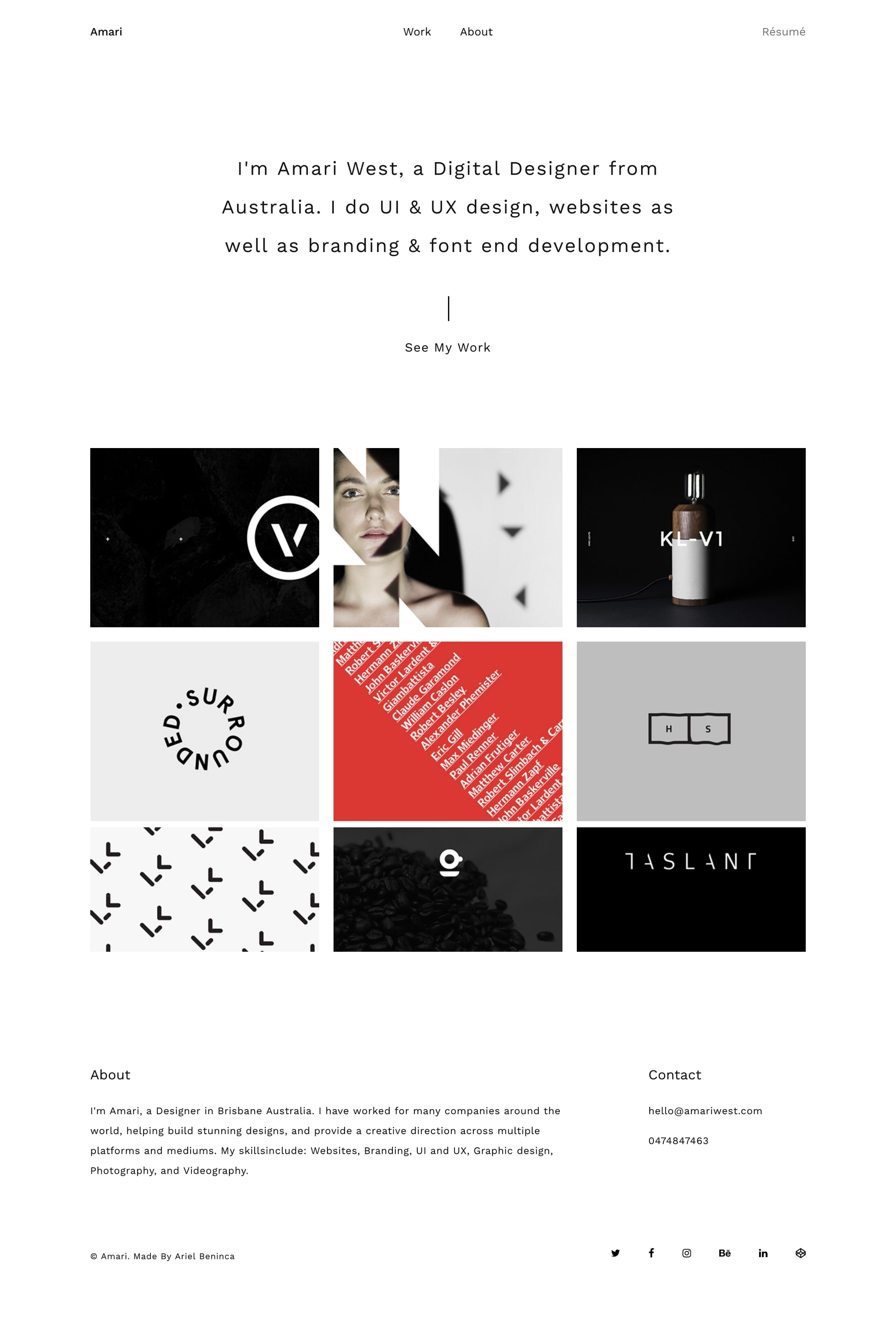
Your layout on Behance serves as the foundation for how your work is perceived. Think of it as the frame for a painting; without a good frame, even the most beautiful artwork can be overlooked. Here’s why layout matters:
- First Impressions: Visitors often decide within seconds whether to stay or move on. A well-structured layout draws them in and keeps them engaged.
- Storytelling: Each project tells a story. An effective layout guides the viewer through this narrative, making it easier for them to understand your creative process and the concepts behind your work.
- Professionalism: A polished layout reflects professionalism. It shows you care about your presentation, which can make a significant difference when potential clients or employers review your portfolio.
- Enhanced Usability: A clean, intuitive layout improves user experience. It allows viewers to navigate effortlessly, finding what they’re interested in without any hassle.
To illustrate the significance further, consider the following points:
| Aspect | Good Layout | Poor Layout |
|---|---|---|
| Engagement | High viewer retention and interaction | Quickly dismissed by viewers |
| Clarity | Easy to understand the project’s objectives | Confusion and misinterpretation |
| Visual Appeal | Attractive and memorable | Distracting or overwhelming |
In conclusion, a thoughtful layout is not just about aesthetics; it plays a crucial role in how your work is perceived and appreciated. By prioritizing layout, you set the stage for your creative talents to shine and make a lasting impact on your audience.
Also Read This: How to Download Images from Behance Saving Your Favorite Graphics and Photos
3. Common Breaks in Behance Layouts

When you're showcasing your work on Behance, it's crucial to understand the common layout breaks that can occur. These breaks can disrupt the flow of your portfolio and detract from the overall impact of your projects. Here are some frequent culprits to watch out for:
- Inconsistent Image Sizes: Using images of varying dimensions can create awkward gaps and misalignments. For example, if one image is a tall portrait and another is a wide landscape, they might not sit well together, leading to a jagged appearance.
- Text Overflow: Every designer loves a good narrative, but when text blocks overflow their designated area, it can cause chaos. Make sure your text fits within its boundaries to keep things tidy.
- Color Mismatches: If your project’s color scheme is inconsistent, it can break the visual harmony. For instance, a vibrant project might clash with muted background colors, which can confuse viewers.
- Improper Margins and Paddings: Oversized margins can push elements too far apart, while tiny paddings can make everything feel cramped. Finding the right balance is key.
To avoid these common breaks, regularly preview your portfolio. Take a moment to zoom out and view your layout as a whole. This can help you identify any inconsistencies that might disrupt the seamless experience you’re aiming for.
Also Read This: Download Bilibili Video Without Any Hassle
4. Tip 1: Choose the Right Image Sizes
One of the most significant aspects of a polished Behance portfolio is the quality and size of your images. Choosing the right image sizes not only enhances the visual appeal of your projects but also ensures a smooth browsing experience for your viewers. Here’s how to get it right:
Understand Behance's Requirements: Behance recommends using images that are at least 1400 pixels wide for optimal display. This size ensures that your images are sharp and clear, even on larger screens. For instance, if you upload a 600-pixel wide image, it might appear pixelated on high-resolution displays.
Utilize Aspect Ratios: Stick to common aspect ratios, such as 16:9 or 4:3. This helps in maintaining consistency across your project. A project that features images with similar aspect ratios will look more cohesive. Imagine a project where all your images are 16:9, it creates a pleasant viewing rhythm.
Optimize for Loading Time: While it's essential to have high-quality images, oversized files can slow down your portfolio. Use tools like TinyPNG or ImageCompressor to reduce file sizes without sacrificing quality. This way, your viewers won’t have to wait too long to see your work!
Test on Multiple Devices: Before finalizing your portfolio, check how your images appear on various devices. An image that looks great on a desktop might not translate well on a mobile screen. Use tools like BrowserStack to preview your layout on different devices.
Remember, the first impression is everything! By choosing the right image sizes, you not only enhance the aesthetic appeal of your portfolio but also create an enjoyable experience for your audience. A well-curated gallery keeps viewers engaged and makes them want to explore more of your work.
Also Read This: How to Download PSD from Behance: Accessing Photoshop Files Shared on Behance
5. Tip 2: Utilize Grids for Consistency
When it comes to creating a visually appealing Behance portfolio, grids are your best friend. Think of grids as the framework that holds your design together. They help maintain consistency across your projects, ensuring that everything looks cohesive and professional. But how do you effectively utilize grids? Here are a few tips:
- Choose the right grid system: There are various grid systems you can use, such as the 12-column grid or the modular grid. Decide based on your content types. For example, if you're showcasing multiple projects, the 12-column grid can help align your elements neatly.
- Keep it flexible: While consistency is key, don’t be afraid to break the grid occasionally for impact. This creates a dynamic visual flow that keeps viewers engaged. For instance, using a full-width image occasionally can draw attention to a specific project.
- Spacing matters: Ensure that the spacing between elements is uniform. A good rule of thumb is to maintain a consistent margin around your content. This not only improves readability but also enhances overall aesthetics.
Imagine browsing a portfolio where every project is laid out in a consistent manner, with images and text aligned perfectly. It feels organized, right? On the flip side, a portfolio that lacks a grid can feel chaotic and overwhelming. So, take advantage of grids to create that seamless flow throughout your work. Use tools like Adobe XD or Figma to create your grids digitally before implementing them on your Behance page.
Also Read This: How to Organize Your Behance Profile and Projects for Better Presentation
6. Tip 3: Optimize Text and Image Alignment
Once you have your grid in place, the next step is to ensure that your text and images are aligned perfectly. This adds to the professionalism of your portfolio and makes your projects easier to digest. Here are some alignment strategies to consider:
- Use a visual hierarchy: Establish a clear hierarchy in your text. This means using different font sizes and weights to guide the viewer’s eye. For example, use larger headings for project titles and smaller text for descriptions.
- Align images with text: When placing images next to text, make sure they align. Left-aligning images with left-aligned text creates a clean, streamlined look. Conversely, centering can work well in specific contexts, so experiment to see what feels right.
- Pay attention to aspect ratios: Keeping your images within the same aspect ratio not only looks professional but also maintains consistency. If you’re displaying several images, this creates a rhythm that is visually appealing.
Let’s say you're showcasing a series of illustrations. Make sure they are the same size and align with the text consistently. This not only keeps the viewer's focus on the content but also enhances the overall readability. Think of alignment as the invisible glue that holds your portfolio together.
In conclusion, optimizing text and image alignment is crucial for a polished Behance portfolio. Embrace the power of grids and alignment to create a seamless visual experience that showcases your creative talents effectively. Happy designing!
Also Read This: Maximizing Sales on Shutterstock: Strategies for Optimizing Your Portfolio Performance
7. Tip 4: Test Your Portfolio on Multiple Devices
Creating a stunning Behance portfolio is just the first step. To ensure your hard work shines through, it’s essential to test your portfolio on multiple devices. Why? Because your audience might be viewing your work on a variety of screens, from sleek smartphones to large desktop monitors. Here’s how to go about it:
- Desktop: View your portfolio on different screen sizes. A layout that looks great on a 15-inch laptop might appear cluttered on a larger display. Make adjustments to ensure it’s visually appealing across the board.
- Tablets: Tablets often have unique resolutions that fall in between mobile and desktop. Check how your images and text scale. Ensure that touch targets are easy to interact with for a smooth user experience.
- Smartphones: The majority of users might access your portfolio on mobile. Test it on both iOS and Android devices. Look for any awkward cropping or layout shifts. Tools like Google’s Mobile-Friendly Test can help you assess how mobile-friendly your portfolio is.
When testing, pay close attention to:
- Image Quality: Ensure your images load properly and maintain high quality on all devices.
- Navigation: Is it easy for users to navigate through your projects? Simple menu layouts often work best.
- Loading Speed: A slow-loading portfolio can turn potential clients away. Use tools like GTmetrix to check your site's performance and optimize accordingly.
- Consistency: Ensure that colors, fonts, and overall design language remain consistent across devices. This builds a strong brand identity.
Lastly, consider asking friends or colleagues to view your portfolio on their devices. Fresh eyes can catch things you might miss. The goal is to create a seamless experience that encourages visitors to explore your work, regardless of how they access it.
8. Conclusion
Creating a seamless layout for your Behance portfolio is more than just an aesthetic choice; it’s about crafting an experience that showcases your creativity and skills effectively. By implementing the tips discussed, especially testing your portfolio across multiple devices, you can enhance your chances of leaving a lasting impression on potential clients and collaborators.
Remember:
- Stay consistent: Make sure your branding remains strong throughout.
- Prioritize user experience: Make navigation intuitive and engaging.
- Test, test, test: Don’t hesitate to reach out for feedback.
As you refine your portfolio, always keep your audience in mind. What do they want to see? What resonates with them? A well-organized, aesthetically pleasing portfolio can speak volumes about your professionalism and attention to detail.
So, roll up your sleeves, dive into your Behance portfolio, and start implementing these tips. Your future projects and clients await!
 admin
admin