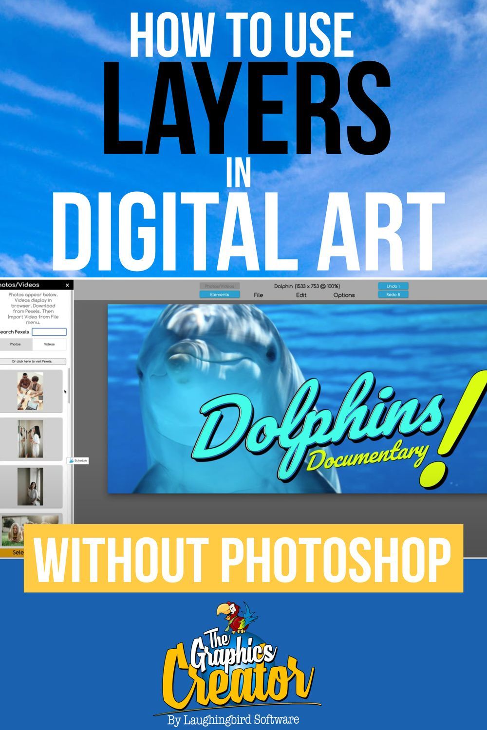
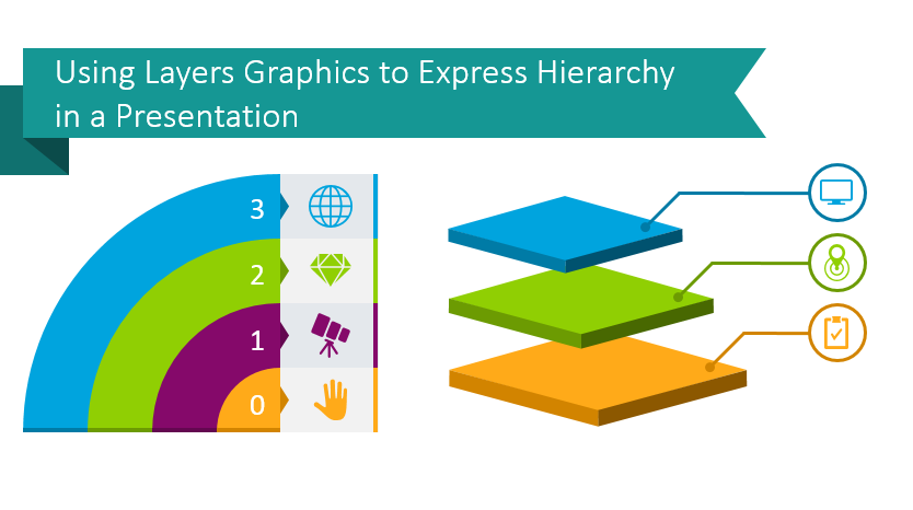
Layering graphics is a powerful technique in design that allows creators to combine multiple elements in a cohesive and visually appealing manner. By stacking images, shapes, and textures, designers can create depth and dimension in their artwork. This approach not only enhances the overall aesthetic but also provides a structured way to manage complex designs.
Imagine building a cake layer by layer, adding flavors and decorations to create something truly unique. In graphic design, each layer can represent a different element, such as text, illustrations, or backgrounds, allowing for endless creativity. With tools available on platforms like VectorStock, designers can easily access high-quality graphics to incorporate into their layered creations.
We'll explore how to effectively use layering graphics to elevate your designs, sharing tips on organization, blending, and the right tools to make the most out of your design projects. Ready to dive in?
Understanding Vector Graphics

Vector graphics are a cornerstone of modern design, characterized by their use of mathematical equations to create images. Unlike raster images, which are made up of pixels, vector graphics remain crisp and clear regardless of size. This makes them ideal for both small and large projects, from logos to billboards.
- Scalability: One of the biggest advantages of vector graphics is their ability to be resized without losing quality. Whether you need an image for a business card or a large poster, vector graphics will maintain their sharpness and clarity.
- Editability: Vector files are often easier to edit than raster images. You can manipulate shapes, colors, and other elements without worrying about degrading the image quality.
- File Size: Generally, vector files are smaller than their raster counterparts, which can be a huge advantage when working with large design projects or sharing files over the internet.
Common file types for vector graphics include AI (Adobe Illustrator), SVG (Scalable Vector Graphics), and EPS (Encapsulated PostScript). These formats allow for flexibility and compatibility across various design software.
When using VectorStock for your design projects, you'll find a wealth of vector graphics to choose from. Incorporating these resources and understanding their benefits will undoubtedly enhance your ability to create stunning layered designs that truly stand out.
Also Read This: How to Record Xbox One Gameplay for YouTube
Exploring VectorStock and Its Offerings

VectorStock is a treasure trove for designers looking to elevate their work with high-quality vector graphics. With millions of options at your fingertips, it’s no wonder why so many creatives turn to this platform. Whether you are crafting a digital project, designing a stunning print layout, or putting together marketing materials, VectorStock has something for everyone.
So, what can you expect from VectorStock? Let’s break down some of its key offerings:
- Diverse Collection: You’ll find an expansive library, featuring everything from illustrations and icons to intricate patterns and backgrounds. No matter what you’re envisioning, there’s likely a graphic that fits the bill.
- Flexible Licensing: VectorStock offers different licensing options, ensuring you have the right to use graphics in various projects, whether they’re personal or commercial.
- Search Functionality: The site boasts a user-friendly search feature that allows you to find graphics quickly. You can filter results by category, style, or even color!
- Vectors vs. Raster Graphics: VectorStock specializes in vector formats, meaning you can scale your designs up or down without losing quality. This feature is particularly useful for logos or designs meant for various applications.
In summary, if you're seeking quality visuals that offer versatility and ease of use, diving into VectorStock’s offerings could be just what your creative projects need.
Also Read This: Image Inversion: Flipping an Image in Microsoft Word
Choosing the Right Graphics for Your Project
Choosing the right graphics for your project might feel overwhelming at first, but with a bit of guidance, it can be an enjoyable part of the design process. Here’s how you can pick graphics that not only resonate with your project but also elevate your overall design.
Start with these steps:
- Define Your Goal: Clearly identify what you want to achieve with the graphic. Is it to inform, evoke emotion, or inspire action? Understanding this will help you narrow your choices.
- Know Your Audience: Consider who will be viewing your design. Tailoring your graphic choices to appeal to your target demographic can make a significant impact.
- Match the Style: Ensure the graphics you choose align with the overall tone and style of your project. For example, if your design is relaxed and friendly, opt for softer illustrations rather than sharp, corporate graphics.
- Keep Your Color Palette in Mind: Graphics should complement your existing color scheme. You can use tools to extract colors from existing designs or take inspiration from color theory to decide which shades work best together.
Finally, don’t hesitate to experiment! Sometimes, the best designs come from trying unexpected combinations of graphics. Take your time and enjoy the process of bringing your vision to life.
Also Read This: Steps to Add an Image to an Audio File for Visual Effect
Techniques for Layering Graphics Effectively
Layering graphics effectively can elevate your designs from ordinary to extraordinary. It's all about how you place and manipulate each element to create a cohesive and visually appealing composition. Here are some techniques that can help you master this crucial aspect of design:
- Understand the Hierarchy: Establish a visual hierarchy by arranging elements based on their importance. Use size, color, and placement to guide the viewer’s eye. For example, larger elements can signify primary information, while smaller elements can support the main visuals.
- Use Transparency: Adjusting the opacity of layers allows underlying graphics to show through. This technique can create depth and interest. Experimenting with different levels of transparency can help you achieve a more nuanced look. Just remember, balance is key!
- Grouping and Organizing: Keep your layers organized by grouping similar elements together. Most design software allows you to label and group layers, making it easier to manage complex compositions. This not only saves time but also helps maintain clarity in your designs.
- Employing Blending Modes: Blending modes can change the way layers interact with each other. Don’t hesitate to play around with these settings; they can lead to unexpected and stunning results. For instance, using a 'multiply' blending mode can add richness to colors.
- Create Contrast: Utilize contrasting colors, sizes, and shapes to make certain elements pop. This not only adds visual interest but also helps convey your message more effectively. Employ contrasting techniques for text to ensure legibility against your graphics.
Also Read This: How to Change Background in Adobe Photoshop 7.0
Step-by-Step Guide to Layering in Design Software
Now that you’re armed with techniques for layering effectively, it’s time to put that knowledge into action. Here’s a handy step-by-step guide tailored for popular design software.
- Open Your Design Software: Launch your favorite software such as Adobe Illustrator, Photoshop, or any other tool you prefer to use.
- Create a New Project: Start a new document. Choose dimensions that suit your design needs—be it for web or print.
- Import Your Graphics: Head to the File menu, select Import, and bring in the graphics from VectorStock that you wish to layer.
- Position Your Layers: Once imported, arrange your graphics by selecting each one and dragging them into place. Use the Transform tool for precise positioning. Don't be afraid to overlap elements for a more dynamic look!
- Adjust Layer Order: Use the layer panel to move your layers up or down, controlling what’s in front and what’s behind. Remember, the top-most layer will be the first one visible to the viewer.
- Apply Effects: Experiment with effects like shadows, glows, and blending modes as discussed. These can enhance your designs dramatically.
- Save Your Work: When satisfied, go to File > Save and choose the appropriate format for your output needs, ensuring that you retain the ability to edit layers if necessary.
And there you have it! With these straightforward steps and techniques, you're well-equipped to create stunning designs using layered graphics from VectorStock. Happy designing!
Also Read This: How to Put an Image on a Shirt: Step-by-Step Guide for Custom Apparel
7. Tips for Creating Eye-Catching Compositions
When it comes to creating stunning designs with layered graphics, composition is key. Here are some tried-and-true tips to help you craft eye-catching visuals:
- Use the Rule of Thirds: Divide your design into a three-by-three grid. Position important elements along these lines or at their intersections for a balanced look.
- Establish a Focal Point: Make sure one element grabs attention more than others. This can be achieved through size, color contrast, or unique graphics.
- Integrate Text Carefully: Text can enhance or overwhelm a design. Ensure that it complements the visual elements and is easy to read. Use contrasting colors for readability.
- Create Depth with Layers: Utilize shadows, highlights, and transparency to give your graphics a 3D effect. This will engage viewers and encourage them to explore your design.
- Stick to a Color Palette: Limit your color options to 3-5 hues. Consistent colors can tie the whole composition together, making it visually appealing and cohesive.
- Add White Space: Don’t overcrowd your design. Allowing for white space helps the viewer's eye to rest and makes important elements stand out.
- Iterate and Experiment: Don’t settle for your first draft. Experiment with layouts and color schemes to see what resonates best. Sometimes the most unexpected combinations yield stunning results.
By incorporating these tips into your design process, you’ll be well on your way to mastering layered graphics that pop!
Also Read This: Bypassing Bing AI Image Restrictions: What You Need to Know
8. Case Studies of Successful Layered Graphic Designs
To really understand the power of layered graphics, let’s explore some standout case studies. These examples showcase how layering techniques can elevate design:
1. Tech Product Launch
A popular tech company recently launched a product, utilizing layered graphics in their promotional materials. Their composition involved:
- Bold Product Imagery: The product was placed at the forefront, layered with a subtle shadow for depth.
- Subtle Background: A gradient background gave a modern look, allowing the product to stand out.
- Minimal Text: Key features were highlighted with simple text, reinforcing the message without cluttering the design.
2. Music Festival Poster
A music festival poster is another great example. The designer employed:
- Vibrant Colors: A limited color palette was combined with eye-catching graphics of musical instruments.
- Layered Illustrations: Various elements, like performers and musical notes, were layered to create a sense of movement.
- Clear Hierarchy: The festival name was prominently displayed, guiding the viewer’s eye through the details of the event.
These successful designs illustrate that thoughtful layering can transform ordinary visuals into captivating and effective graphics. By analyzing compositions like these, you can gather insights to enhance your own creative projects.
Conclusion and Best Practices
Mastering layered graphics from VectorStock is an essential skill for any designer looking to elevate their work and create stunning visual content. By understanding the nuances of layers, leveraging the vast library of vector assets, and applying thoughtful design principles, you can produce eye-catching graphics that stand out in any medium.
Here are some key best practices to keep in mind as you embark on your journey to perfect layered graphics:
- Organize Your Layers: Keep layers named and grouped logically to streamline your workflow. This practice will save time and reduce frustration when making edits.
- Utilize Color Schemes: Stick to a cohesive color palette to enhance visual harmony. Tools like Adobe Color can help you create and maintain consistent color schemes.
- Play with Transparency: Experiment with layer opacity to achieve depth and dimension in your designs. Layering transparent graphics can create interesting interactions between elements.
- Utilize Vector Resolutions: Since vectors can scale without losing quality, ensure that your graphics are appropriately sized for your intended use to maintain clarity and detail.
- Keep It Simple: Avoid overcrowding your design. Sometimes less is more; leave breathing space for the viewer’s eye.
By leveraging these best practices, you will be well on your way to mastering layered graphics from VectorStock, ultimately creating stunning designs that captivate and engage your audience.
 admin
admin


