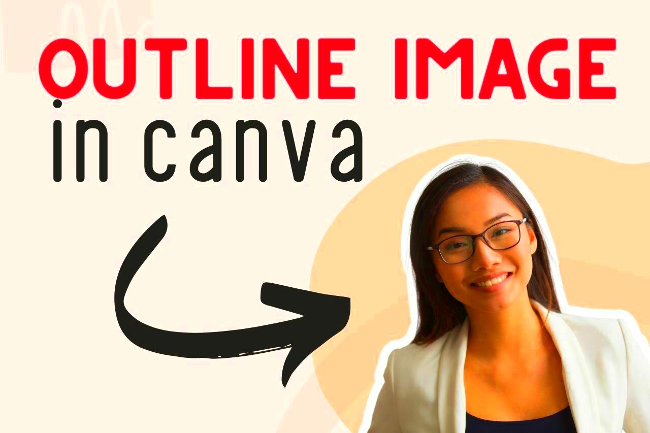
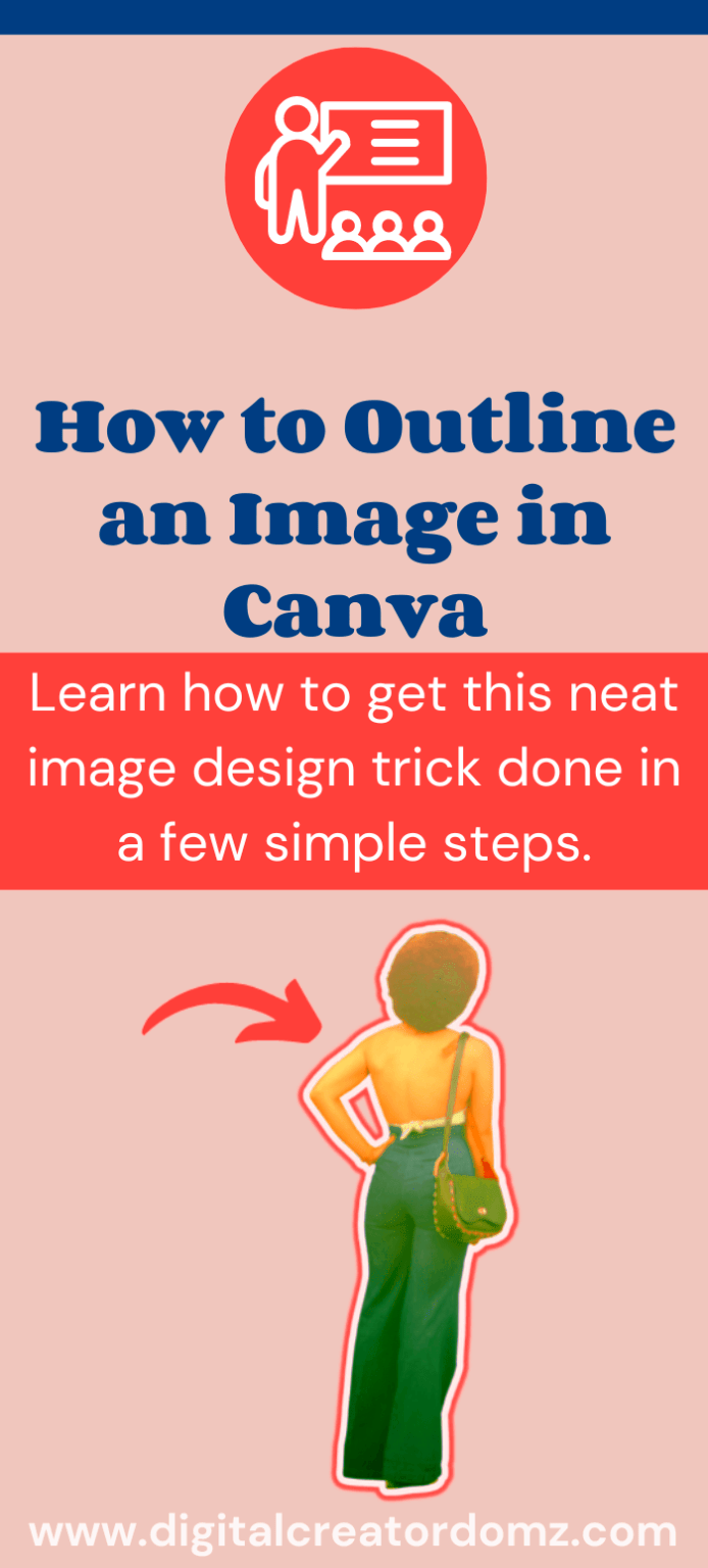
Outlining images in Canva is a great way to make your designs look more polished and professional. Whether you're creating social media posts, marketing materials, or personal projects, adding an outline can give your images that extra touch of style. Outlines help to highlight certain elements in your design, making them stand out and grab attention. In this section, we'll take a quick look at why outlining images is an important step in the design process, especially if you're aiming for high-quality graphics.
Why You Should Outline Images in Canva

Adding an outline around your images in Canva can bring several advantages to your design work. Here are some reasons why you might want to consider outlining your images:
- Improved visibility: A well-designed outline helps images stand out against various backgrounds, ensuring they catch the viewer's eye.
- Professional appearance: Outlines add a sleek, finished look to your images, making your designs appear more polished and high-quality.
- Clear focus: Outlining helps direct attention to the most important parts of your design, such as a product or key message.
- Consistency in design: If you're creating a series of images, adding a consistent outline across all of them can bring unity to your design style.
- Customizable design: With Canva, you have complete control over the thickness, color, and style of the outline, making it easy to match the outline with your overall theme.
As you can see, outlining images is an effective way to enhance your designs, especially when working on professional-looking graphics. In the next section, we’ll walk you through a step-by-step guide to adding outlines to your images in Canva.
Also Read This: Creative Visual Tips for Adding Notebook Images to Your LinkedIn Posts
Step-by-Step Guide to Outlining an Image in Canva

Now that you understand the benefits of outlining images, let's dive into the process. Outlining an image in Canva is easy, and by following these simple steps, you'll be able to add professional-looking outlines in no time.
Step 1: Open Canva and Upload Your Image
Start by opening Canva and creating a new design. Once your design workspace is open, click on the "Uploads" tab on the left sidebar and upload the image you want to outline.
Step 2: Select Your Image
After uploading your image, click on it to add it to your canvas. Make sure the image is selected before you proceed to the next step.
Step 3: Apply a Border Effect
With your image selected, navigate to the "Effects" tab at the top. From there, you’ll find several options, including the “Border” effect. Click on it, and you will see a simple border appear around your image.
Step 4: Customize the Outline
Once the border appears, you can start customizing it. Use the following settings to adjust the outline:
- Thickness: Adjust the thickness of the outline by dragging the slider.
- Color: Click on the color swatch to choose a color for your outline. You can pick from Canva's preset colors or create a custom shade.
- Style: If you want something more unique, you can apply effects like dashed or dotted lines.
Step 5: Fine-tune and Position the Image
You can further adjust the position of your image and outline by clicking and dragging your image on the canvas. If you want the outline to be perfectly centered, use Canva’s alignment tools to guide you.
Step 6: Save and Download Your Design
Once you're happy with the outline and overall look, click on the "Download" button in the top right corner of the screen. Choose the file type that works best for your project and save your design.
With these steps, you can easily add outlines to any image in Canva. It’s a quick process that makes a big difference in the overall appearance of your design.
Also Read This: Wondering What’s the Best Rumble Video Thumbnail Size? Here’s Your Answer
Choosing the Right Image for Outlining
Not all images are ideal for outlining. Choosing the right image to outline is an important step in ensuring your design looks balanced and professional. Some images may have complex details or busy backgrounds that don't work well with an outline, while others are perfect candidates. Here’s how to select the best images for outlining:
- Simple and clear images: Images with a clean background and clear subjects often look the best when outlined. Avoid images with too many small details, as they can be overwhelmed by the outline.
- Contrast with background: Make sure the image contrasts well with the background of your design. If the background is too similar in color, the outline might not stand out.
- Strong focal points: Outlining works best on images where there is a clear focal point. Whether it's a product, person, or logo, outlining helps to highlight the subject of the image.
- Flat images: Images without shadows or complex textures often work better with outlines, as they can appear cleaner and more defined.
When selecting images for outlining, keep in mind how the outline will enhance the overall design. A simple image with a solid subject and clear lines will usually deliver the best results. Avoid images that are too busy or detailed, as they can create visual clutter when outlined.
Also Read This: Making Images Transparent on Google Slides
Customizing Outline Colors and Styles
One of the best features of Canva is the ability to customize the color, thickness, and style of your outlines. This helps you match the outline to your design's theme and make your images stand out in the right way. Here's how to make your outlines truly unique:
1. Choosing the Right Outline Color
Color plays a crucial role in how your outline complements the rest of the design. Here’s what to consider when selecting an outline color:
- Contrast: Choose a color that contrasts well with both the image and the background. A high contrast color will help the outline pop and make the image more noticeable.
- Branding: If you’re creating designs for a business, try using brand colors for your outlines. This ensures a consistent look across all your materials.
- Neutral tones: Sometimes, a neutral color like white, black, or gray works best, especially when you don’t want the outline to distract from the image itself.
2. Adjusting Outline Thickness
The thickness of the outline will also impact how the image is perceived. A thick outline can make the image stand out more, while a thinner outline can create a subtle effect. Use the slider in Canva to adjust the thickness until it looks just right.
3. Experimenting with Outline Styles
Canva gives you the option to choose from different outline styles. You can go for a solid line, dotted line, or dashed line. Each style can add a different feel to your design:
- Solid lines: These are the most common and create a clean, bold look.
- Dotted lines: Dotted lines can give a playful, informal touch to your design.
- Dashed lines: These offer a modern and unique look, adding more character to your design.
By customizing your outline's color, thickness, and style, you can make your design more visually appealing and aligned with your overall aesthetic.
Also Read This: Word Cloud Wonders: Creating a Word Cloud in Microsoft Word
Using Effects to Enhance the Outline
Once you’ve added an outline to your image in Canva, you can take it a step further by applying various effects. These effects can help your outline stand out even more or add an extra layer of creativity to your design. Here’s how to enhance your outlines:
1. Shadow Effects
Shadows can add depth and dimension to your outline, giving your image a more three-dimensional appearance. Canva allows you to add a subtle shadow effect behind your outline, making it pop off the canvas. You can adjust the shadow’s direction, blur, and transparency to suit your design.
2. Glow Effects
A glow effect adds a vibrant, eye-catching look around your outline. This is especially useful if you want your image to stand out against a dark or busy background. Canva allows you to customize the glow’s intensity and color, making it easy to match your design’s mood.
3. Internal Borders
In addition to external outlines, you can also apply an internal border within the image itself. This effect creates a secondary border inside the image, often using a lighter color or a gradient. It’s a great way to give your image a framed look while maintaining the focal point.
4. Applying Blur Effects
Sometimes, applying a soft blur to the outline can create a more artistic or dreamy effect. This effect works well for images that have a more organic or abstract feel, softening the harsh lines and making the outline feel more i
Also Read This: How to Create an Image Button in HTML
Common Mistakes to Avoid When Outlining Images
While outlining images can enhance your design, it’s easy to make some mistakes along the way. These common pitfalls can affect the clarity and overall impact of your design. Here are a few mistakes to watch out for when outlining images in Canva:
- Using Too Thick or Thin Outlines: One of the most common mistakes is selecting an outline that’s too thick or too thin. A thick outline can overpower the image, while a thin one might not be noticeable enough. Aim for a balance that complements your image.
- Choosing a Color That Doesn’t Contrast Well: The outline should stand out from both the image and the background. Avoid using colors that blend in, as this can make your design appear flat and unprofessional. High contrast works best!
- Outlining Busy or Complex Images: Images with lots of intricate details or busy backgrounds don’t always look good with outlines. The outline can get lost or make the image feel cluttered. Keep your image simple to let the outline shine.
- Ignoring Image Placement: Outlining an image that’s poorly aligned or cropped can lead to an awkward design. Ensure your image is properly positioned on the canvas before adding an outline.
- Overuse of Effects: While effects like shadows and glows can enhance your design, too many can overwhelm the image. Use these sparingly, ensuring the outline enhances, not distracts, from the image itself.
By being mindful of these mistakes, you can create more polished and effective designs. Pay attention to the size, color, and style of your outline to ensure your image remains clear and impactful.
Also Read This: Adding Links to Images in Webflow
Tips for Using Outlined Images in Professional Graphics
Outlining images is a great technique, but when you’re using them in professional graphics, there are some best practices you should follow to ensure your designs look top-notch. Here are some tips to help you get the most out of outlined images in your professional projects:
- Maintain Consistency Across Designs: If you’re creating a set of images (such as for a social media campaign or marketing materials), ensure the outlines are consistent across all designs. This creates a cohesive, professional look.
- Match the Outline Style to the Brand: Choose outline styles and colors that align with your brand. A modern, minimal outline might be ideal for a tech brand, while a more playful design might work better for a creative business.
- Balance the Image with the Text: When using outlined images alongside text, ensure there’s a balance. The image should complement the text and not compete with it. Make sure the outline doesn’t distract from your message.
- Use Outlines to Direct Focus: Use outlines strategically to guide the viewer’s eye to the most important elements of the image, like a product or key message. Outlines can help highlight these focal points without making them feel too overpowering.
- Consider Image Resolution: When using outlined images for professional graphics (especially for print), make sure the image is high resolution. A pixelated image can look unprofessional, no matter how well the outline is designed.
These tips can help you take your outlined images to the next level, ensuring they look polished and professional in any project, from digital content to print marketing materials.
Also Read This: Making an Image 300 DPI: A Guide for High Quality
FAQ
1. Can I outline any type of image in Canva?
Yes, you can outline any image in Canva, but it's important to choose an image that will look good with an outline. Simple, clear images work best. Complex or highly detailed images might look cluttered when outlined.
2. How can I change the thickness of an outline in Canva?
After selecting your image, go to the "Effects" tab. From there, you can adjust the thickness of the outline using a slider. Play around with the settings until you find a thickness that works well with your design.
3. Can I use different outline styles in Canva?
Yes! Canva offers different outline styles, including solid, dashed, and dotted lines. You can also change the color and thickness to match the look you're going for. Experiment with different styles to see what works best for your design.
4. Should I always use outlines on my images?
Not necessarily. Outlines are a great way to make certain images pop, but they’re not always appropriate for every design. Consider the complexity of the image, the overall design, and the message you want to convey before adding an outline.
5. Can I use effects like shadows or glow with the outline?
Absolutely! Canva allows you to apply effects like shadows, glow, and more to your outline. These effects can make your image stand out even more, but remember to use them sparingly to avoid overwhelming your design.
Conclusion
Outlining images in Canva is a simple yet effective technique to enhance your designs, making them look more polished and professional. By carefully choosing the right image, customizing your outline’s color and thickness, and using effects to add depth, you can create standout graphics that grab attention. However, it's essential to avoid common mistakes such as using too thick or thin outlines, choosing colors that don't contrast well, or overusing effects. When used correctly, outlines can direct focus, improve visibility, and help your designs look more cohesive and refined. With these tips in mind, you'll be able to create professional-quality images that work for any project, from social media posts to marketing materials and beyond.


