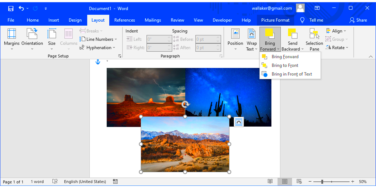
Image overlay in Microsoft Word is a great way to make your documents visually appealing and professional. Whether you're creating a brochure, poster, or report, overlaying images can help emphasize key points or create unique designs. The good news is that Microsoft Word offers several tools to make this process straightforward and enjoyable.
When you overlay images, you layer one image over another or combine them with text and shapes. It’s not just about visuals; it’s about telling a story through creative layouts. Understanding the basics will set the foundation for creating stunning designs without needing advanced software like Photoshop.
Some common scenarios where image overlay is useful include:
- Creating presentations or marketing materials.
- Designing headers for documents or newsletters.
- Enhancing resumes with visual elements.
Once you understand the basics, you can experiment and make your work stand out.
Steps to Insert and Position Images in Word

Inserting and positioning images in Microsoft Word is the first step to creating overlays. Here’s how you can do it effectively:
- Insert an Image:
- Go to the Insert tab.
- Click Pictures and choose This Device or Online Pictures to select your image.
- Resize the Image:
Click and drag the corner handles of the image to resize it proportionally. Avoid stretching it unevenly to maintain its quality.
- Position the Image:
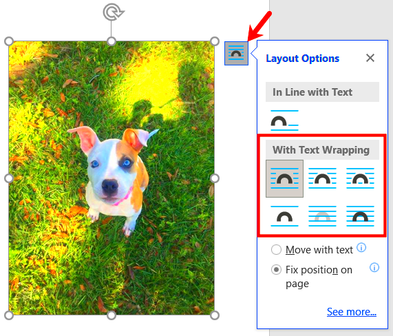
- Select the image and click the Layout Options icon.
- Choose a positioning style, such as In Front of Text or Behind Text, for more control.
These steps ensure your images are ready for layering and creative design. Make sure to experiment with different sizes and placements for the best results.
Also Read This: Achieve a Radiant Glow with Shimmer Application Techniques on Your Face
Using Text Wrapping Options for Image Overlay
Text wrapping options in Microsoft Word are essential for layering images effectively. They help you control how images interact with text and other elements. Here’s how to use these options for overlays:
- Access Text Wrapping:
Right-click the image and select Wrap Text. You’ll see several options like:
- Square: Text wraps around the image in a box shape.
- Tight: Text hugs the edges of the image closely.
- In Front of Text: The image appears over the text.
- Behind Text: The image acts as a background.
- Combine Wrapping Styles:
For overlays, use In Front of Text for the top image and Behind Text for the base image. This layering creates a professional look.
- Fine-Tune Positions:
Drag and drop the images to adjust their placement. Use the arrow keys for precise alignment.
Mastering text wrapping allows you to create eye-catching layouts with layered visuals and ensures your design looks polished.
Also Read This: Creating Unique Wall Hangings at Home Inspired by Dailymotion Videos
Adjusting Transparency and Colors for a Better Effect
One of the key aspects of creating professional and visually appealing image overlays in Microsoft Word is adjusting the transparency and colors of your images. By doing so, you can make sure that the images don’t overpower the text or other elements in your document, and that they blend seamlessly into the layout. This simple adjustment can take your design from good to great!
Here’s how you can adjust transparency and colors:
- Adjust Transparency:
Click on the image, go to the Format tab, and click Color or Set Transparent Color to make parts of the image see-through. This works especially well for logo overlays or images that need to act as subtle background elements.
- Modify Image Colors:
Click on the image, then choose Color under the Format tab. You can change the tone of the image by applying filters such as:
- Grayscale for a black-and-white effect.
- Washout for a lighter, faded look.
- Brightness/Contrast for more vivid or muted images.
- Blend with Text and Shapes:
To further integrate the image with your document design, reduce the opacity (transparency) so that text or shapes can stand out over the image. This technique is particularly useful when using images as background visuals.
Adjusting transparency and colors is a simple yet powerful way to refine your overlays and make sure the images complement the content rather than distract from it. Experiment with these settings to find what works best for your layout.
Also Read This: how to flatten image photoshop
Combining Images with Shapes and Text for Unique Designs
Combining images with shapes and text is an effective way to make your document designs stand out. By layering different elements, you can create unique visual effects that are more dynamic and interesting than just using plain text or images alone. Microsoft Word gives you all the tools you need to experiment and push the boundaries of your creativity.
Here’s how you can combine images with shapes and text:
- Insert Shapes:
Go to the Insert tab, select Shapes, and choose a shape to place over your image. You can use basic shapes like circles, rectangles, or more complex ones like arrows or stars to complement your design.
- Add Text to Shapes:
Once you’ve inserted a shape, right-click on it and choose Add Text. This allows you to place text within the shape, making it part of your visual design. You can adjust font size, style, and color for a custom look.
- Position and Layer:
With shapes and text in place, position them over your image or behind it, depending on the effect you want. Experiment with text wrapping and layer the elements so they create a balanced composition.
- Format and Customize:
Use the Format tab to change the fill color of shapes, add borders, or apply special effects to make your design more eye-catching.
Combining images with shapes and text can give your document a unique and polished look, whether you’re designing a flyer, report, or presentation. Don't be afraid to try different combinations and get creative!
Also Read This: How to Crochet an Image onto Fabric
Common Mistakes to Avoid While Overlaying Images
While overlaying images in Microsoft Word can be a powerful tool for design, it’s easy to make mistakes that could affect the look and functionality of your document. Being aware of these common pitfalls will help you avoid frustration and produce a polished result every time.
Here are some common mistakes to watch out for when overlaying images:
- Overcrowding the Layout:
One of the biggest mistakes is trying to fit too many images into one document. This can make the design look cluttered and distract from the main content. Keep your layout simple and leave enough white space for balance.
- Ignoring Image Resolution:
Using low-resolution images can result in blurry or pixelated visuals. Always use high-quality images, especially for documents that will be printed or shared professionally.
- Not Using Proper Text Wrapping:
Text wrapping helps you control how text flows around images. Avoid using the default setting, which might make your text look disorganized. Try using settings like Square or Tight for cleaner layouts.
- Inconsistent Image Styles:
Ensure that all images in your document have a consistent style. Mixing different filter effects or transparencies can make your design feel disjointed. Stick to a cohesive visual style throughout the document.
- Not Checking Alignment:
Improperly aligned images and text can make the document look unprofessional. Always check that your images are centered or aligned according to your design requirements.
By avoiding these common mistakes, you'll be able to create clean, professional layouts with overlays that enhance your content, not detract from it. Take the time to experiment and refine your technique for the best results.
Also Read This: How to Use ChatGPT API on iOS Devices
FAQs About Image Overlay in Microsoft Word
When it comes to overlaying images in Microsoft Word, many users have questions about the process. Here are some of the most frequently asked questions that can help clarify any confusion and guide you through the process:
- Can I overlay multiple images in Word?
Yes, you can overlay multiple images in Word. Simply insert each image, adjust the transparency or use text wrapping options like In Front of Text or Behind Text to layer them. You can even combine images with text and shapes for more complex designs.
- How do I make an image transparent in Word?
To make an image transparent, click on the image, go to the Format tab, select Color, and choose Set Transparent Color. You can also adjust the image’s transparency using the Picture Format tools for more subtle effects.
- Can I overlay text over an image?
Yes, overlaying text on an image is possible and often used for creating headers or captions. Simply use the Text Box tool or directly add text over the image, then use text wrapping options to position the text correctly on top of the image.
- What’s the best way to align images when overlaying?
For perfect alignment, use the Align tools found in the Format tab. You can align images to the left, center, or right, or even distribute them evenly across your document. Using guides and grids can also help with precision.
- Can I use shapes along with images for overlay effects?
Yes, combining shapes with images is a great way to add depth and interest to your design. You can add a shape like a rectangle or circle over the image and adjust its color, transparency, or text to create unique layouts.
Conclusion
Overlaying images in Microsoft Word is an excellent way to enhance your documents with creative and professional designs. By using text wrapping, adjusting transparency, and combining images with shapes and text, you can create visually appealing layouts that draw attention. Keep experimenting with these tools, and soon you’ll be able to produce polished, impactful designs that stand out.


