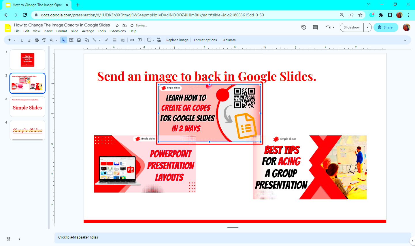
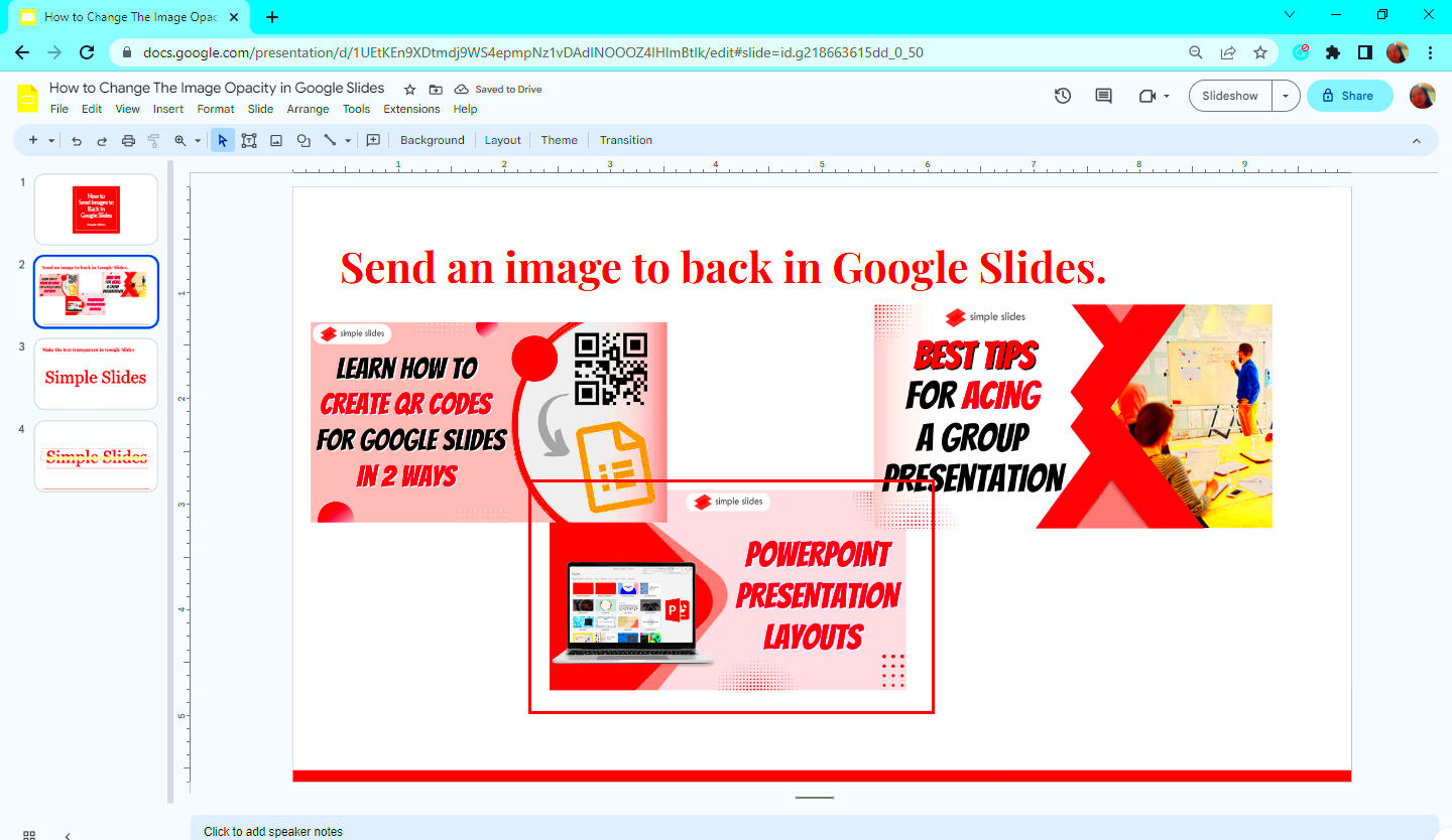
Image layering in Google Slides is an essential tool for creating visually appealing and organized presentations. By using layers, you can control the arrangement of elements on a slide, making it easier to design a polished look. Whether you’re working with text, shapes, or images, layering allows you to adjust the order in which objects appear on the screen.
In this guide, we’ll dive into the basics of image layering, how to send images to the back, and tips for making your slides more dynamic. Let’s explore how simple adjustments to the layering can make a big impact on your presentation’s visual appeal.
Understanding the Basics of Image Layering

Layering images in Google Slides is similar to stacking objects in real life. Each object, whether it's an image, text box, or shape, is treated as a separate layer. The key to mastering layering is knowing how to organize these objects effectively.
Here’s a quick breakdown of the basics:
- Front Layer: The topmost layer is visible and the first thing your audience sees.
- Back Layer: The back layer is hidden behind all other objects on the slide.
- Layer Order: You can move an object forward or backward in the layering stack to control its visibility.
In Google Slides, layering allows you to overlap images, add depth to your slides, and create a more engaging design. By sending certain images to the back or bringing others to the front, you can make specific elements stand out or appear more integrated into your slide design.
Step-by-Step Guide to Sending an Image to the Back

Sending an image to the back in Google Slides is a straightforward process, and it’s a powerful tool for organizing your slide content. Here’s how to do it:
- Step 1: Click on the image you want to send to the back. This will select it.
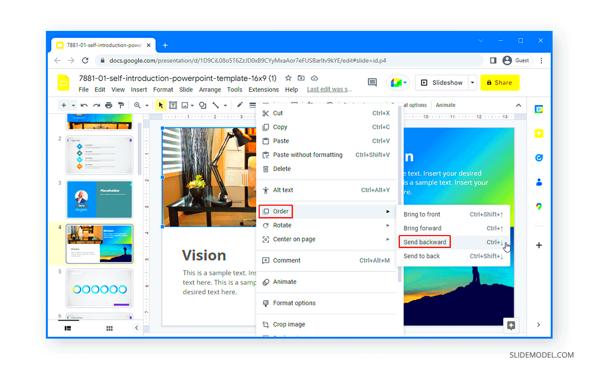
- Step 2: Go to the Arrange menu at the top of the screen.
- Step 3: In the drop-down menu, select Order, and you’ll see several options.
- Step 4: Click on Send to Back. This option will place the image behind all other elements on the slide.
This method can be used to create complex layering effects where the image behind a text box or shape adds context without obstructing important information. If you want to adjust the order later, you can always move the image forward or backward by using the same Order options.
Using the Arrange Menu for Layering Images
The Arrange menu in Google Slides is your go-to tool for managing the order of objects on your slides. When working with multiple images or elements, you may need to adjust which ones appear on top or at the back. The Arrange menu provides simple and effective options to control this layering process.
Here’s how you can use the Arrange menu for layering:
- Step 1: Select the image or object you want to adjust.
- Step 2: Click on the Arrange option in the top toolbar.
- Step 3: Choose from the options available in the dropdown menu:
- Bring to Front: Moves the selected object to the topmost layer.
- Send to Back: Places the object behind all other elements.
- Forward: Moves the object one layer forward in the stack.
- Backward: Moves the object one layer backward in the stack.
These options make it easy to manage the visibility of your images and text boxes. You can layer text over images, add shapes behind pictures, and even create effects where one image appears to "pop" by bringing it to the front. The Arrange menu is crucial for creating a well-organized and dynamic slide design.
Applying Layering Effects for Creative Presentations
Layering effects in Google Slides can add depth and creativity to your presentations. By strategically layering images, shapes, and text, you can guide your audience’s focus and enhance your message visually. Layering is not just about placing objects on top of each other; it's about creating a sense of dimension, movement, and emphasis.
Here are some effective layering techniques to enhance your presentations:
- Overlaying Text on Images: Place text boxes over images to add context or captions, making your slides more informative and engaging.
- Adding Shadows: Add shadows to images or text to create depth, making elements appear as though they are floating.
- Using Transparent Shapes: Create a semi-transparent shape over an image to highlight specific sections while still allowing the background to show through.
- Creating Collages: Layer multiple images to form a collage or artistic visual, perfect for showcasing related content in a creative way.
To apply these effects, simply adjust the transparency of images, move layers to create overlaps, or use the Arrange menu to position elements. These subtle changes can help convey your ideas more clearly and keep your audience visually engaged throughout your presentation.
Tips for Organizing Layers in Google Slides
Organizing layers in Google Slides is key to creating a clean and professional-looking presentation. As you work with more objects, it can be easy to lose track of what’s on top, behind, or overlapping. By keeping your layers organized, you can avoid confusion and make adjustments much faster.
Here are some tips to help you stay organized when working with layers:
- Group Similar Elements: If you have multiple images or text boxes that need to stay together, group them by selecting all elements and clicking Ctrl + G (or Cmd + G on Mac). This way, you can move or adjust them as one unit.
- Label Layers: While Google Slides doesn’t allow you to label layers directly, you can use naming conventions in your file management or include specific colors for certain groups to keep things organized.
- Use the Layers Panel: Although Google Slides doesn’t have a traditional layers panel like design software, you can use the Arrange menu to move items up and down in the stack to control their visibility. Keep a mental note of the order of your layers as you work.
- Keep it Simple: Avoid overloading your slide with too many elements. Keeping your layers to a minimum will help prevent clutter and make your design cleaner and easier to navigate.
By following these tips, you can ensure that your Google Slides presentations remain neat, professional, and easy to edit. Organizing layers properly will also help you maintain consistency across slides, leading to a more cohesive final presentation.
Common Mistakes to Avoid While Layering Images
When it comes to layering images in Google Slides, there are a few common mistakes that can make your presentation look cluttered or unprofessional. Being aware of these pitfalls will help you create cleaner, more effective slides that capture your audience's attention.
Here are some mistakes to avoid while layering images:
- Overlapping Too Many Elements: While layering can create depth, too many overlapping images or shapes can make a slide look crowded and difficult to read. Stick to a clear focal point and avoid excessive clutter.
- Not Using Transparency: If you’re layering images, especially with text, consider using transparency to make sure the content behind is still visible. Otherwise, the text or images can be hard to read or look disconnected from the background.
- Incorrect Layer Order: If you don’t get the order right, your important images or text might get hidden behind other elements. Use the Arrange menu to double-check the layering and ensure that your most important visuals are on top.
- Using Too Many Similar Colors: Layering images with similar or contrasting colors can create confusion. Try to balance colors in a way that the objects stay distinct and don’t clash visually.
- Not Aligning Objects Properly: If your images aren’t aligned properly, they can appear out of place or too disorganized. Always use the alignment tools available in Google Slides to ensure a neat and professional look.
By keeping these mistakes in mind, you can avoid common issues that might make your slides look less polished. Remember, layering is about enhancing your design, not overwhelming it.
Frequently Asked Questions
Layering images in Google Slides can be tricky at first, but with the right guidance, it becomes a powerful tool for creating dynamic presentations. Here are some frequently asked questions to help clear up any confusion:
- Q: How do I move an image behind text?
- Q: Can I layer images with transparent backgrounds?
- Q: How do I make a layer stand out more?
- Q: Can I group multiple images together?
- Q: Can I adjust the transparency of an image?
A: Simply select the image, go to the Arrange menu, and choose Send to Back or Send Backward to move the image behind the text.
A: Yes, you can! Transparent background images are ideal for layering, as they allow you to focus on the objects without interference from solid backgrounds.
A: You can bring a layer forward by selecting it and using the Bring to Front option in the Arrange menu. You can also add shadow effects or adjust the transparency to make layers more prominent.
A: Yes, select all the images you want to group, right-click, and choose Group. This allows you to move them as a single unit, making it easier to manage layers in your presentation.
A: Absolutely! Click on the image, then go to the toolbar and click on the Format Options. Under the Adjustments section, you can modify the image's transparency level to suit your design.
Conclusion: Mastering Layering in Google Slides
Mastering image layering in Google Slides is a key skill that can help you create more dynamic, visually engaging presentations. By using the Arrange menu, experimenting with transparency, and following layering techniques, you can control the visual hierarchy of your slides and highlight important elements.
Remember, layering is all about balancing visibility and making sure your message stands out. By avoiding common mistakes and organizing your layers efficiently, you’ll have more flexibility to create designs that capture your audience’s attention.
Whether you're preparing a business presentation, a school project, or a creative portfolio, mastering layering in Google Slides will make a noticeable difference in the quality and impact of your slides. Keep practicing, and soon you'll be creating visually stunning presentations with ease!


