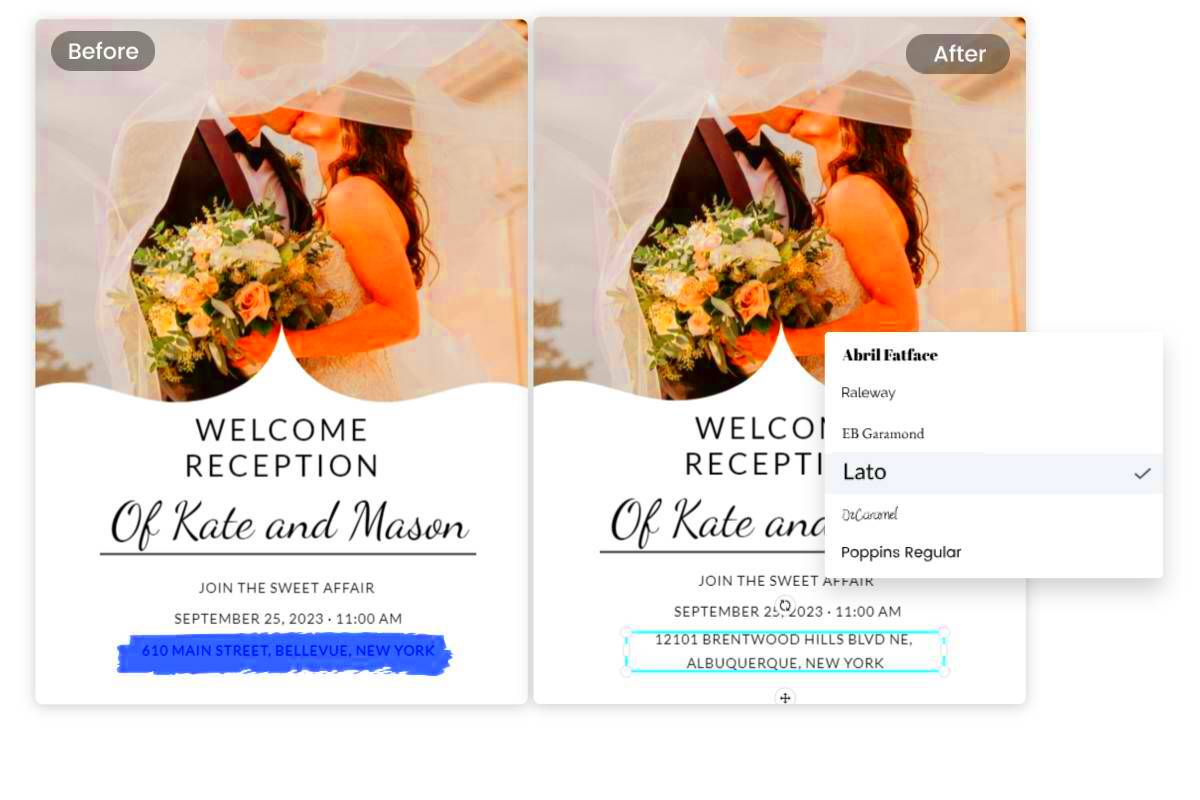
Editing text in an image can be a great way to personalize a design or make important changes to an existing image. Whether you're creating promotional material, editing a graphic, or modifying a social media post, knowing how to edit text while keeping everything looking seamless is key. The most important part of this process is ensuring that the new text matches the original font, size, and style. Otherwise, your design may look inconsistent or unprofessional. This guide will walk you through everything you need to know to get started with editing text in an
Why Matching Fonts Is Important When Editing Text

When you edit text in an image, the font plays a major role in maintaining a consistent visual style. If you don't match the font properly, your image may appear unbalanced, disjointed, or even unprofessional. Here's why font matching matters:
- Consistency: Matching the font ensures that the overall style of your image remains consistent, making it easier for viewers to understand and engage with the content.
- Brand Identity: Fonts are often a key part of a brand's identity. Using the correct font helps to keep your branding strong and recognizable.
- Professionalism: When the text looks like it belongs in the image, it reflects well on your professionalism. A mismatched font can give off the impression of sloppy work.
In short, matching fonts when editing text is crucial for creating clean, professional, and visually appealing images that make a lasting impression.
Also Read This: Essential Strategies for Avoiding Copyright Issues on YouTube
Tools You Can Use to Edit Text in Images
There are many tools available that allow you to edit text in images, and choosing the right one depends on your needs and skill level. Below are some of the most popular and user-friendly tools you can use:
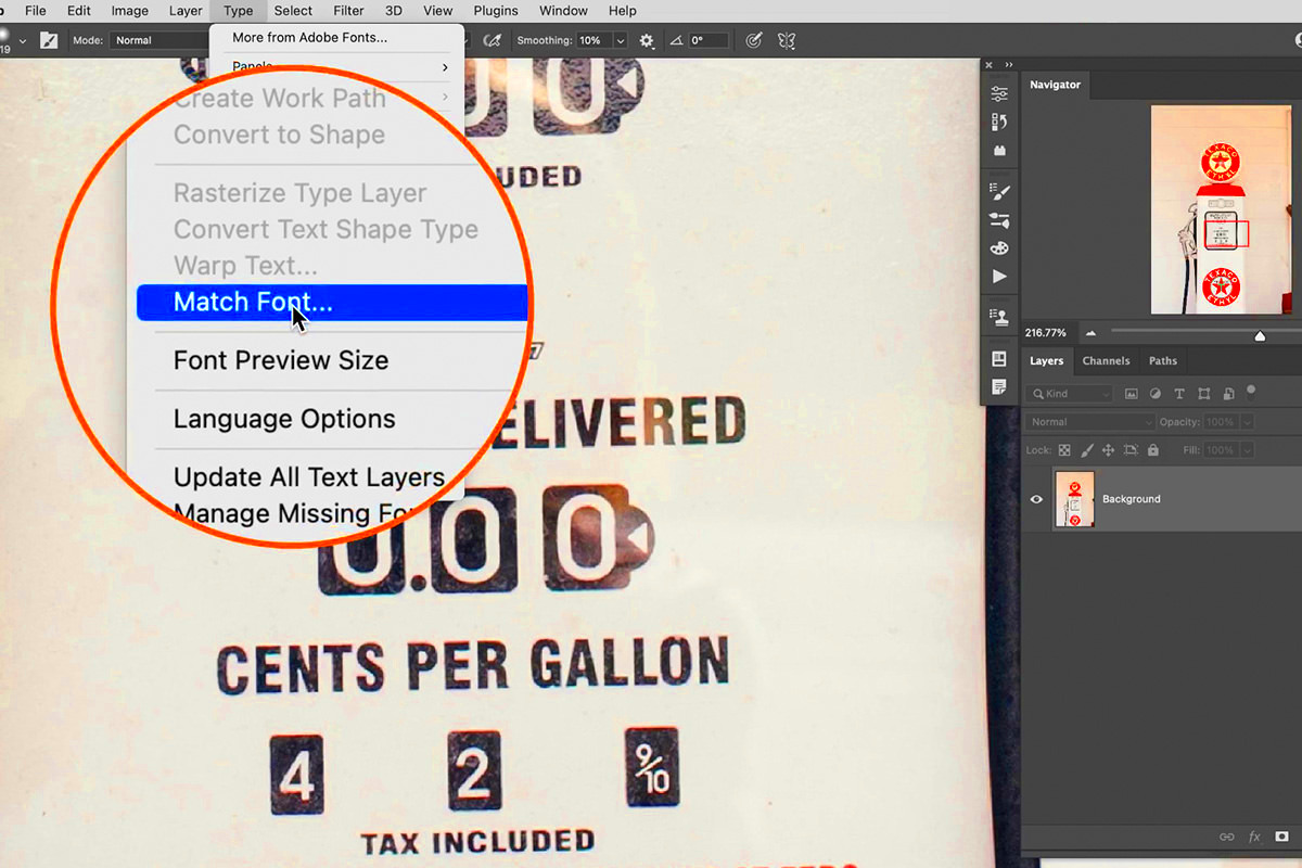
- Adobe Photoshop: A powerful image editing software that provides advanced features for editing text, including font matching, layer styles, and text effects. Ideal for professionals.
- Canva: A beginner-friendly tool that is perfect for quick edits. Canva offers a wide range of fonts and allows you to edit text directly on your image with ease.
- GIMP: A free and open-source alternative to Photoshop, GIMP offers advanced features for font matching and text editing, making it a great option for those on a budget.
- Fotor: A simple online tool that offers easy-to-use text editing features, great for quick image edits.
- PicMonkey: Another beginner-friendly tool that allows for easy font customization and text editing in images, offering templates for social media and marketing purposes.
Each of these tools has unique features that make it suitable for different types of users, from beginners to advanced designers. Explore these options to find the one that best fits your needs and skill level.
Also Read This: How to Share a YouTube Video on Instagram the Complete Guide
How to Identify the Font Used in an Image
One of the biggest challenges when editing text in an image is figuring out which font was used in the original design. Fortunately, there are several ways to identify the font, even if you don’t have access to the original file. Here are a few methods to help you:
- Font Recognition Tools: Tools like WhatTheFont or Font Squirrel’s Matcherator allow you to upload an image and analyze the font used. These tools compare the image to a database of fonts and suggest matches.
- Manual Comparison: If you know the font family (like Arial or Times New Roman), you can manually compare your image to font samples available online. Websites like Google Fonts offer a large collection of fonts that you can browse to find similar ones.
- Ask the Community: If you're still having trouble, try asking online communities, like Reddit’s typography forums. Often, other users can help you identify the font based on their experience.
Once you identify the font, it’s easier to match it when editing text. Keep in mind that some fonts may not be available for free, so you might need to purchase or find an alternative font that closely resembles the original.
Also Read This: How to Stack Images in Deep Sky Stacker
Steps to Edit Text While Matching the Same Font
Editing text in an image while keeping the same font style can be a bit tricky, but with the right approach, it’s easy to achieve. Here’s a simple step-by-step guide to help you through the process:
- Step 1: Choose the Right Tool: Start by opening the image in your chosen editing tool (like Photoshop, GIMP, or Canva).
- Step 2: Identify the Font: Use a font recognition tool or compare the text with known fonts to identify the one used in the image.
- Step 3: Edit the Text: Once the font is identified, use the text tool to delete or replace the existing text with your new content. Make sure you match the font exactly.
- Step 4: Adjust Font Size and Position: Ensure the new text fits perfectly within the design. Adjust the size, line spacing, and alignment to make it look natural.
- Step 5: Final Touches: After editing, check that the new text blends seamlessly with the rest of the image. If necessary, apply effects or adjust colors to make the text look integrated.
Following these steps ensures that your text will match the original font, size, and style, making your edits appear clean and professional.
Also Read This: How to Insert an Image for Better Design
Tips for Getting the Text Size and Style Right
Getting the text size and style right is just as important as matching the font. If the new text doesn’t fit well within the design, it could look awkward or unbalanced. Here are some tips to help you perfect your text size and style:
- Match the Text Size: Make sure the font size of your new text matches the original text in the image. Use the original text as a reference, or adjust the size until it looks right.
- Consider Line Spacing: Pay attention to the line height or leading. If the original text has tight line spacing, your new text should have similar spacing to maintain consistency.
- Use Proper Alignment: Ensure that the text is aligned properly within the image, whether it's left, center, or right-aligned. Misaligned text can make your design look unprofessional.
- Contrast and Color: Make sure the text color matches the style of the original design. The text should stand out from the background but also blend naturally with the image’s overall color scheme.
- Pay Attention to Kerning: Kerning refers to the space between individual letters. Adjust the spacing between letters to ensure that your text is readable and visually balanced.
By following these tips, you can create text that looks like it belongs in the image, with the right balance of size, style, and placement. This will ensure that your final design looks polished and cohesive.
Also Read This: Roblox Rhythms: Playing Roblox with a Soundtrack from Spotify
Common Mistakes to Avoid When Editing Text in Images
When editing text in an image, it's easy to make mistakes that can affect the overall quality and professionalism of the design. To ensure that your edits look polished and seamless, here are some common mistakes you should avoid:
- Using the Wrong Font: One of the most noticeable mistakes is choosing a font that doesn’t match the style of the image. Always try to identify the original font or select one that closely resembles it to maintain visual consistency.
- Incorrect Font Size: Text that’s too large or too small can ruin the balance of the image. Always ensure that the text size is appropriate for the space and the overall design.
- Ignoring Text Alignment: Misaligned text can look sloppy. Make sure the text is properly aligned within the image, whether it’s centered, left-aligned, or right-aligned. Consistent alignment contributes to a clean, organized look.
- Overcrowding the Text: Adding too much text to an image can make it feel cluttered. Be mindful of the space around your text, and avoid cramming too much information into a small area. Simplicity is key.
- Not Matching Text Color: Ensure that your new text color matches or complements the existing design. Colors that contrast too much can make the text stand out in a bad way, while similar colors may make it hard to read.
- Neglecting the Image Context: The style and placement of the text should always consider the context of the image. For example, bold text might not work well with a delicate, minimalistic design.
Avoiding these common mistakes can help you create visually appealing and professional images, ensuring that your text fits seamlessly into the design without distracting from the overall message.
Also Read This: Chromatic Symphony: Changing the Color Theme of Your Spotify App
Frequently Asked Questions (FAQ)
Here are some frequently asked questions about editing text in images and matching fonts:
- How do I find the font used in an image? You can use font recognition tools like WhatTheFont or Font Squirrel’s Matcherator to identify the font. Alternatively, you can manually compare the image to fonts available online.
- Can I use any font for commercial purposes? Not all fonts are free for commercial use. Make sure to check the license for any font you download or use, especially if you're using it for marketing or branding purposes.
- What should I do if I can’t find the exact font? If you can’t find the exact font, look for similar ones. There are many free and paid alternatives that can achieve a similar look, and you can often tweak size and spacing to make them fit better.
- How do I match text size when editing an image? Start by measuring the original text size using your editing tool’s font size feature, then adjust your new text to match it. Pay attention to line spacing and kerning to ensure consistency.
- Are there any free tools to edit text in images? Yes, tools like Canva, GIMP, and Fotor offer free versions that allow you to edit text in images with ease. They come with a variety of fonts and customization options.
If you have more specific questions, don’t hesitate to search for answers in online forums, or consult the help guides of your chosen image editing tools.
Conclusion and Final Thoughts
Editing text in an image while matching the font is a useful skill, whether you’re creating graphics for personal projects, marketing campaigns, or social media posts. By following the steps outlined in this guide, you can achieve professional-looking results and avoid common mistakes. The key to successful text editing lies in attention to detail—matching the font, adjusting the size, and aligning the text properly are all crucial for a polished design. Whether you're using advanced software like Photoshop or a free tool like Canva, the right approach will help you create clean, consistent designs that look great and communicate your message effectively.
Remember to take your time, experiment with different fonts and styles, and always consider the context of your image. With practice, you'll master the art of editing text in images and make your designs look even more professional and polished.


