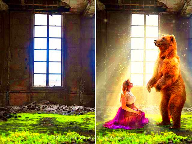
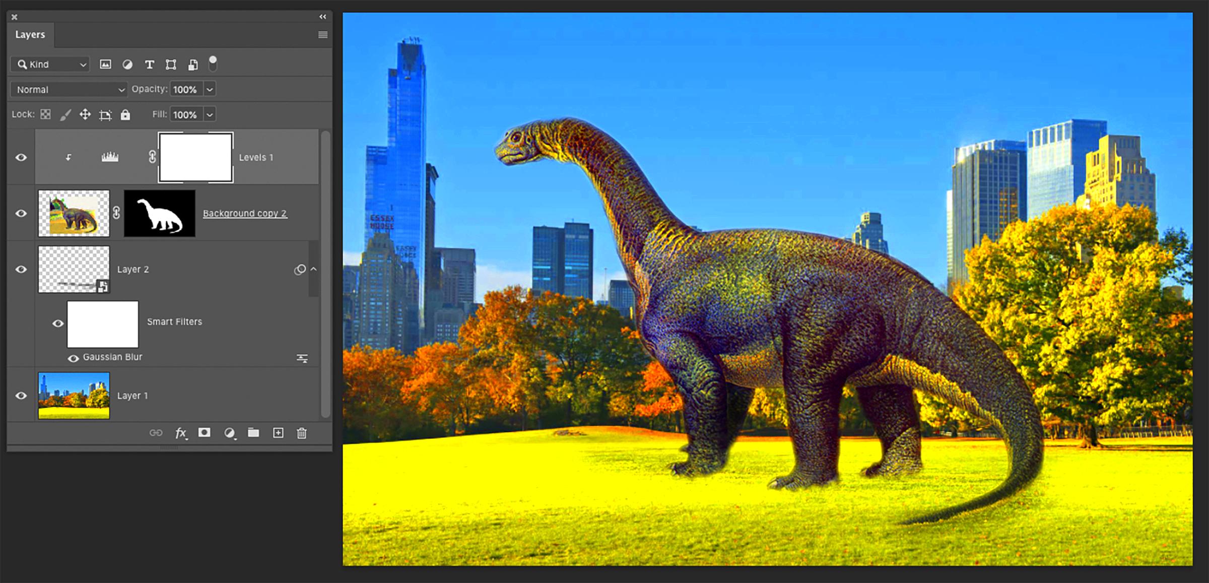
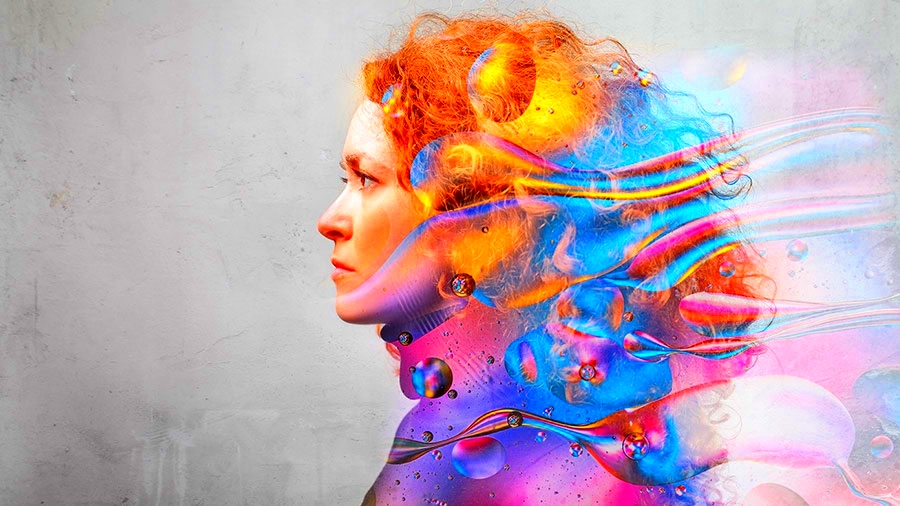
Creating composite images is a fun and creative way to blend different visual elements into one stunning picture. Whether you're a graphic designer, photographer, or someone with a passion for digital art, learning how to make composite images can add a unique touch to your projects. In simple terms, a composite image is a combination of multiple images that are layered together to create a single, cohesive visual. The possibilities are endless – you can combine different photos, textures, and effects to craft something entirely new.
In this guide, we'll walk you through the process of creating composite images from start to finish, share tips on avoiding common mistakes, and introduce useful tools that can help you achieve professional-looking results. So, let’s dive into the world of composite imagery and see how you can transform your designs!
Understanding the Concept of Composite Images

A composite image is essentially a fusion of multiple individual images, combined to form a new, unified piece of art. The process involves blending photos, graphics, textures, or other visual elements to create a seamless final image. Composite images can be used for a variety of purposes, including advertising, artwork, and creative photography. The goal is to make the final product appear as if all the elements naturally belong together, even if they were captured or created separately.
Here’s a quick breakdown of what goes into a composite image:
- Layering: Different images are placed on separate layers. This allows you to control each element independently.
- Masking: You can use masks to hide or reveal parts of an image, ensuring smooth transitions between layers.
- Blending: Blending techniques are used to merge the images so they look seamless. This may involve adjusting opacity, using blending modes, and matching color tones.
- Effects: Adding lighting, shadows, and textures enhances the realism and creativity of the composite.
Composite images are often used in photography to create fantasy or surreal scenes that would be impossible to capture in real life. By carefully combining elements, artists can tell a new story or create a striking visual statement.
Also Read This: Reposting Shorts on YouTube for Beginners
Tools You Need to Create Composite Images

To create a high-quality composite image, having the right tools is essential. Whether you're a beginner or an experienced designer, using the right software can make the process much easier. Here are some of the most popular tools used by professionals to create composite images:
- Adobe Photoshop: The most widely used software for photo manipulation, Photoshop offers powerful tools for creating composites. Features like layers, masks, and blending modes allow you to combine images seamlessly.
- GIMP: A free alternative to Photoshop, GIMP offers similar features like layers, masking, and effects. It's a great option for those just getting started with composite images.
- Affinity Photo: This budget-friendly photo editing software offers many advanced features for creating composites, such as non-destructive editing, advanced masking, and retouching tools.
- Canva: For beginners who want to create simple composites without much complexity, Canva is an easy-to-use option. It offers basic layering and photo editing tools, but it’s more limited compared to professional software.
In addition to photo-editing software, you might also need a few other tools to help enhance your composite:
- Stock Images: Websites like HD Stock Images provide high-quality stock photos that can be used in composite designs.
- Textures and Brushes: Adding textures and custom brushes can give your composite images a more artistic or realistic feel. These can be found online or created yourself.
- Graphics Tablet: A graphics tablet can help you with detailed masking and retouching, offering more precision than a mouse.
With these tools, you’ll be well-equipped to start creating composite images that are both creative and professional-looking!
Also Read This: Can You Download from iStock for Free? Exploring Legal Alternatives
Steps to Create a Composite Image for Unique Visual Effects
Creating a composite image is an exciting process that allows you to blend multiple visual elements into one cohesive piece. Whether you're aiming for a surreal effect or a photorealistic scene, following a step-by-step approach ensures that each element works together seamlessly. Here are the main steps to create your own composite image:
- Step 1: Gather Your Images: Start by collecting all the photos, textures, or graphics you want to include. Think about the overall theme or mood you're trying to achieve and choose elements that fit well together.
- Step 2: Set Up Your Canvas: Open your photo editing software and set up a new project with the appropriate dimensions and resolution for your final image. Make sure the resolution is high enough to maintain quality when working with large files.
- Step 3: Import Your Images: Import the individual elements you want to combine into your canvas. Each image should be placed on its own layer for easier manipulation.
- Step 4: Position and Resize: Use the transform tools to position, resize, and rotate each image element to fit the overall layout. Don’t worry too much about perfection at this stage – focus on getting the right composition.
- Step 5: Masking and Blending: Use layer masks to hide or reveal parts of your images. This helps blend the elements more naturally. You can also use different blending modes to adjust how the layers interact with each other.
- Step 6: Add Shadows and Lighting: To create a realistic effect, add shadows and lighting that match the scene's perspective. This will make the elements look like they belong together.
- Step 7: Fine-Tune Colors: Adjust the colors, contrast, and saturation to ensure the elements look consistent. Use adjustment layers to tweak the color tones and make everything blend smoothly.
- Step 8: Final Touches: Once you're satisfied with the overall look, add any final effects, such as textures, gradients, or filters, to give your composite image the desired visual impact.
By following these steps, you'll be able to create unique and visually striking composite images that capture the viewer's attention.
Also Read This: Should You Premiere or Publish Your YouTube Video? Exploring the Advantages and Disadvantages
Techniques to Enhance Your Composite Images
Once you've mastered the basic process of creating composite images, it’s time to take your work to the next level. There are several techniques that can enhance the realism and impact of your composites, making them stand out even more. Let’s look at some of the most effective techniques:
- Lighting and Shadows: Proper lighting and shadow effects can make a huge difference in the realism of your composite. Ensure the light source in all your images is consistent, and add shadows where necessary to ground the elements in the scene.
- Color Grading: Apply color grading to adjust the overall tone of your composite image. This can help unify different elements and create a more cohesive final image. For instance, you might want to give your entire image a warmer or cooler tone, depending on the mood you're aiming for.
- Use of Depth of Field: Adding depth of field effects can make your composite image appear more professional. Blur the background or foreground slightly to create a sense of depth, similar to how a camera lens focuses on the subject.
- Textures and Overlays: Layering textures like scratches, dust, or grunge effects can add a gritty or aged look to your composite, depending on the style you're going for. These textures help to unify the image elements and can make your composite appear more polished.
- Clipping Masks: Use clipping masks to ensure that one image element only shows through in specific areas of another image. This technique helps create smooth transitions between the images, especially when you need to blend different textures or backgrounds.
- Adjustment Layers: Experiment with different adjustment layers to fine-tune your image’s brightness, contrast, and saturation. These layers can be easily modified without affecting the original image, providing flexibility in your editing process.
By incorporating these techniques, you can transform your composite images into visually engaging and highly professional pieces of art.
Also Read This: Cost of Adobe Stock Photos
Common Mistakes to Avoid While Creating Composite Images
While creating composite images can be a lot of fun, there are a few common mistakes that can ruin the final result. Whether you're a beginner or an experienced designer, avoiding these pitfalls will help ensure your composite images look as polished and professional as possible:
- Inconsistent Lighting: One of the most common mistakes is mismatched lighting. If the light sources in your images don’t align, the final image can look disjointed. Always ensure that all elements are lit from the same direction and at similar intensity.
- Overcrowding the Image: It’s tempting to include as many elements as possible, but too many images can make your composite look cluttered and overwhelming. Keep it simple and focus on the key elements that help tell your story.
- Ignoring Image Resolution: Using low-resolution images for a high-resolution composite can result in pixelated or blurry output. Always work with high-quality images to ensure the best final result.
- Overdoing the Effects: While it’s fun to experiment with different effects, too many can make your image look artificial or overdone. Subtlety is key – use effects like gradients, textures, and lighting carefully to enhance, not overwhelm, the composition.
- Not Matching Color Tones: If your images have different color tones, the composite can look unnatural. Pay attention to the color balance across all layers, and adjust the tones to create a harmonious overall look.
- Neglecting to Use Masks: Layer masks are an essential tool in creating seamless composites. Avoid using hard edges without masks, as they can create noticeable lines between elements and ruin the blend.
- Not Saving Progress Properly: Always save your work in a format that allows you to go back and make changes if needed. Save layers separately and use file types like PSD or TIFF for easy editing later.
By being aware of these common mistakes, you can avoid pitfalls and ensure that your composite images look professional and polished.
Also Read This: how to round image corners in google slides
How to Use Lighting and Shadows in Composite Images
Lighting and shadows are two of the most important elements when creating a composite image. They help to bring depth, realism, and consistency to the different components of your composition. Without proper lighting, the elements in your composite image can appear flat or disjointed, as if they don’t belong in the same scene. Understanding how to use lighting and shadows effectively is key to making your composite image look more natural and polished.
Here are some tips for using lighting and shadows in your composites:
- Match Light Sources: The first step is to ensure that all the light sources in your images are consistent. If one element has a bright light source from the top left, other elements should follow the same lighting direction. This will make the images blend more naturally.
- Use Shadows for Depth: Adding shadows where they should naturally fall will give your composite image depth and help to ground the different elements in the scene. Use soft shadows for a more realistic effect and adjust their opacity depending on the intensity of the light.
- Highlight Focal Points: Use lighting to draw attention to the key areas of your composite. For instance, if your main subject is a person, you can add a light source that highlights their face while the background fades into darkness. This helps to direct the viewer's focus.
- Use Layers to Control Light: In Photoshop or other editing tools, you can use separate layers to adjust lighting effects. Experiment with layers to add subtle highlights, create depth, and control the shadows independently of your main elements.
- Soft vs. Hard Shadows: Experiment with both soft and hard shadows to create different moods. Soft shadows work well for dreamy, ethereal effects, while hard shadows give a sharper, more dramatic look.
By carefully placing light sources and shadows, you can make the different elements of your composite appear as if they are part of the same world, ensuring a more seamless and engaging image.
Also Read This: Enhance Your Website’s Aesthetic with High-Quality Photos from Imago Images
Final Tips for Crafting Stunning Composite Images
After you've mastered the basic steps of creating composite images, the next challenge is to add the finishing touches that will truly make your image stand out. Here are some final tips to help elevate your composite images to the next level:
- Work Non-Destructively: Always use non-destructive editing techniques, such as adjustment layers and layer masks, so you can make changes without affecting the original image data. This allows you to experiment freely without fear of losing your work.
- Pay Attention to Composition: A strong composition is essential for a stunning image. Use the rule of thirds, leading lines, or symmetry to guide the viewer's eye and keep the image balanced.
- Experiment with Textures: Adding subtle textures, like grunge or paper textures, can bring life to your composite image. Just make sure the textures blend well with the overall look of the image to avoid overwhelming it.
- Consider the Atmosphere: Adding atmospheric elements like fog, smoke, or bokeh can help tie the different elements of your composite together. These effects can add a sense of depth and make your image feel more dynamic.
- Don’t Overdo It: It’s easy to get carried away with all the different effects, but sometimes less is more. Subtle adjustments can often yield more impressive results than overloading the image with too many layers or effects.
- Seek Feedback: Sometimes, getting a fresh perspective can make a big difference. Show your work to others and ask for feedback to spot any areas that could be improved.
By applying these final tips and taking your time to polish the details, you’ll be able to craft composite images that leave a lasting impression on your viewers.
Also Read This: How to Do Eye Makeup at Home with a Step-by-Step Tutorial for Gorgeous Eyes
FAQ
What is a composite image?
A composite image is created by combining multiple photos or elements into a single image, allowing you to create a new, cohesive visual. These images are often used in photography, design, and digital art to combine different scenes, objects, or textures.
Which software is best for creating composite images?
The best software for creating composite images includes Adobe Photoshop, GIMP, and Affinity Photo. These tools provide powerful features such as layers, masking, and blending modes to help you combine images effectively. For beginners, GIMP is a great free option, while Photoshop offers advanced capabilities.
Can I create a composite image with free tools?
Yes! There are several free tools like GIMP, Paint.NET, and Canva that can help you create composite images. While they may not have all the advanced features of paid software, they can still provide you with the tools needed to get started and create impressive designs.
How do I make my composite images look realistic?
To make your composite images look more realistic, focus on matching lighting and shadows, using consistent color grading, and ensuring that the elements blend seamlessly. Pay attention to the perspective of each image element and add subtle details like shadows, textures, and depth of field to create a more believable scene.
What are some common mistakes when creating composite images?
Some common mistakes in composite image creation include inconsistent lighting, mismatched color tones, overcrowding the image, and not using masks effectively. By carefully checking each element for consistency and using layers and masks, you can avoid these mistakes and create polished composites.
Conclusion
Creating composite images is a powerful and creative way to push the boundaries of visual storytelling. Whether you're a beginner or an experienced designer, following the right steps, using the appropriate tools, and applying key techniques like proper lighting, shadowing, and color grading can make a significant difference in the quality of your final image. Don’t be afraid to experiment with different elements, but always ensure that your images maintain a sense of consistency and coherence. With practice, patience, and the tips shared in this guide, you’ll be well on your way to crafting stunning composite images that captivate and impress. So, take your skills to the next level, and let your creativity shine through every project you work on!


