Centering an image on a webpage may seem like a simple task, but it plays a crucial role in creating a visually appealing layout. Whether you are designing a website or working on a blog post, properly centered images help to enhance the overall user experience. Images that are centered create a clean, balanced design and ensure that the content looks neat across all screen sizes. In this post, we will walk through the importance of centering images and explore various methods to achieve perfect alignment.
Why Image Centering Matters
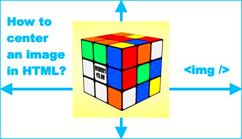
When designing a webpage, how you present your images can significantly impact the user experience. Centering images is more than just a design choice; it can influence the way users perceive the content. Here’s why image centering matters:
- Improved Visual Appeal: A centered image looks clean and balanced, contributing to a harmonious layout.
- Consistent Design: Centered images help create a uniform structure across the page, especially when paired with other content.
- Better User Focus: When an image is in the center, it immediately draws attention, making it easier for users to focus on the key visual.
- Responsive Design: Centering images is crucial for ensuring they look great on both large and small screens, contributing to a seamless mobile and desktop experience.
In summary, centering your images can make your content look more polished and professional while improving the readability of the page. With the right techniques, you can easily ensure that your images are properly aligned.
Different Methods to Center Images
There are several methods for centering an image on a webpage, each offering flexibility depending on your design needs. Let’s take a closer look at the most popular methods:
- Using CSS Flexbox: Flexbox is one of the easiest ways to center an image both horizontally and vertically. By applying flexbox properties to the parent container, you can easily align the image in the center. Here’s an example of how to use Flexbox for centering:
  .container {
    display: flex;
    justify-content: center; /* Horizontally centers the image */
    align-items: center; /* Vertically centers the image */
  }
  .image {
    max-width: 100%;
  }
- Using CSS Grid: CSS Grid is another powerful tool for creating layouts. To center an image using Grid, you can define the container as a grid and place the image in the center.
  .container {
    display: grid;
    place-items: center; /* Centers the image both horizontally and vertically */
  }
  .image {
    max-width: 100%;
  }
- Using Text Align (Horizontal Centering): This method works for centering images horizontally within their container. It’s one of the simplest techniques but does not account for vertical centering.
  .container {
    text-align: center;
  }
- Using Margin Auto (Horizontal Centering): You can also center an image horizontally by applying 'margin: auto' on the left and right sides. This works best with block-level images and a defined width.
  .image {
    display: block;
    margin-left: auto;
    margin-right: auto;
  }
Each of these methods has its own advantages depending on your project. Flexbox and Grid are perfect for more complex layouts, while the margin auto and text-align methods are simple and work well for basic designs. By understanding these options, you can choose the best approach for centering images in any web project.
Using CSS to Center Images Horizontally
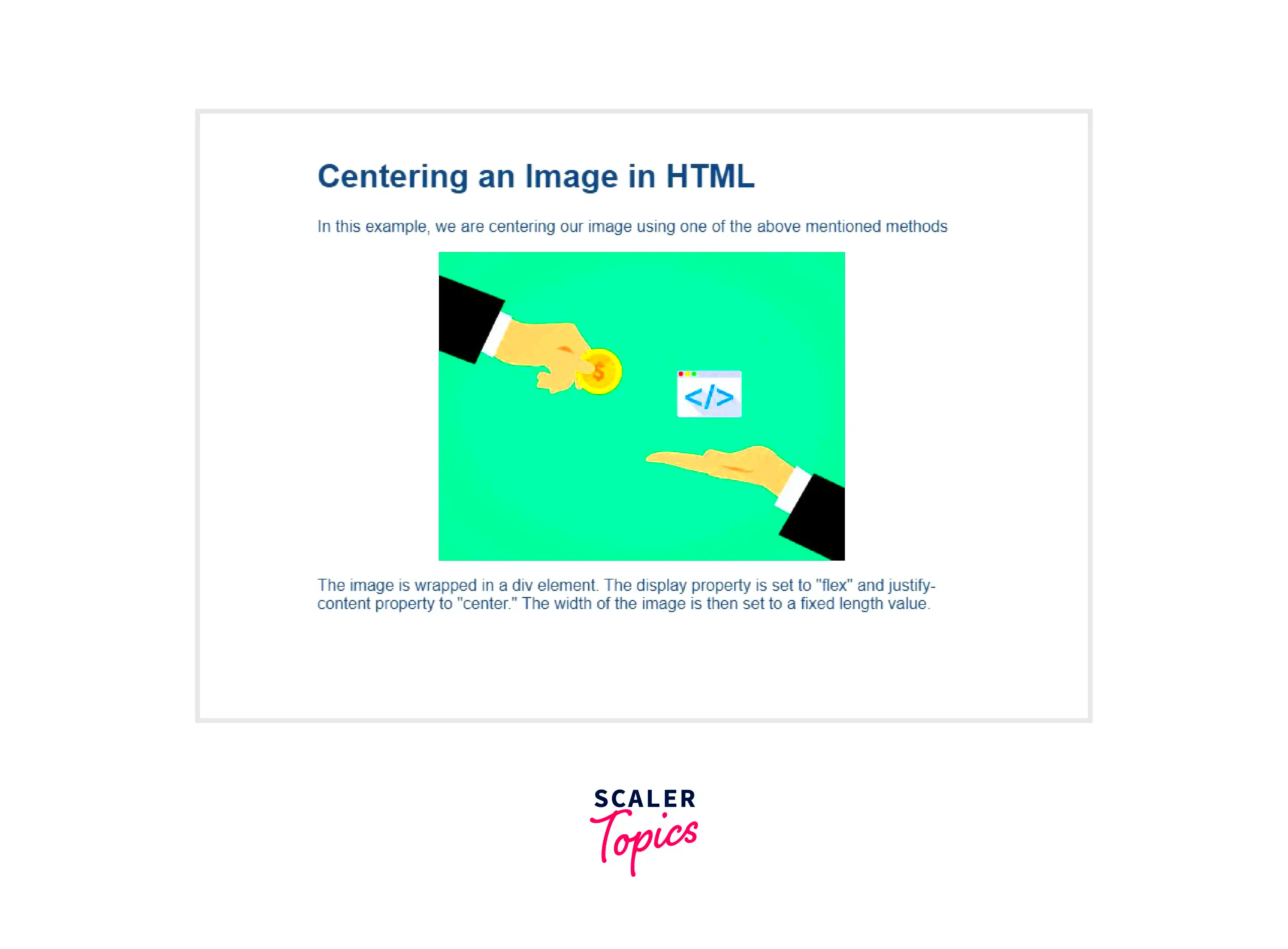
Centering an image horizontally is one of the most common tasks when working with web design. Whether you want an image to sit perfectly in the middle of its container or just need to ensure it aligns correctly with other content, CSS makes it easy. Let’s dive into a few different techniques for horizontally centering an
- Using Margin Auto: This is one of the simplest and most effective ways to center an image. By setting the left and right margins to "auto" and giving the image a specific width, it will automatically center within its parent container.
  .image {
    display: block;  /* Makes the image behave like a block element */
    margin-left: auto;
    margin-right: auto;
    width: 50%;  /* Adjust this as per your image's width */
  }
- Text Align (for inline images): If your image is inline or inline-block, you can use the
text-alignproperty on the parent container to center it horizontally.
  .container {
    text-align: center; /* Centers any inline or inline-block elements */
  }
Both of these methods are simple, effective, and compatible with most web projects. The margin auto technique is more flexible for block-level images, while text-align works well for inline images or when working with mixed content like text and images.
How to Vertically Center an Image
Vertical centering can be tricky, especially if you’re not familiar with CSS positioning. However, with modern CSS techniques, it’s easier than ever to center an image vertically. Let’s explore a few ways to do this:
- Using Flexbox: Flexbox makes both horizontal and vertical centering a breeze. To center an image vertically, simply apply
display: flexto the parent container, then usealign-items: centerto ensure the image is centered vertically.
  .container {
    display: flex;
    justify-content: center; /* Optional: horizontally centers the image */
    align-items: center; /* Vertically centers the image */
    height: 100vh; /* Sets the height of the container to full viewport height */
  }
- Using Grid: CSS Grid is another modern approach that allows you to vertically center images with ease. The
place-itemsproperty will center the image both horizontally and vertically.
  .container {
    display: grid;
    place-items: center; /* Centers the image both horizontally and vertically */
    height: 100vh; /* Sets the height of the container to full viewport height */
  }
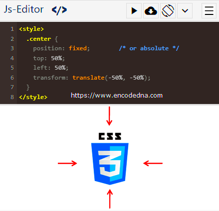
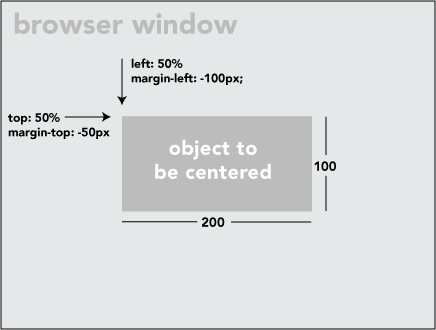
- Using Absolute Positioning: This method involves using position absolute on the image itself and setting the parent container to position relative. You can then use the
topandtransformproperties to vertically center the image.
  .container {
    position: relative;
    height: 100vh;
  }
  .image {
    position: absolute;
    top: 50%;
    left: 50%;
    transform: translate(-50%, -50%);
  }
Each method has its benefits. Flexbox and Grid are the most flexible and easiest to use, while absolute positioning gives you more control over precise positioning. Depending on your layout and needs, you can choose the one that works best for your design.
Centering Images in Responsive Design
In today’s mobile-first world, ensuring your images are properly centered across all screen sizes is a must. Responsive design allows images to adapt to different screen widths, ensuring they maintain their visual balance no matter the device. Let’s look at how to center images in responsive design:
- Using CSS Media Queries: Media queries allow you to apply different CSS rules based on the screen size. This helps you ensure your images stay centered on both small and large screens.
  @media (max-width: 768px) {
    .container {
      display: flex;
      justify-content: center;
      align-items: center;
    }
  }
- Fluid Image Widths: Setting the image width to a percentage (like 100%) ensures that the image will resize according to the width of its container. This makes the image more adaptable to various screen sizes.
  .image {
    width: 100%; /* The image will take up the full width of its parent container */
    height: auto; /* Maintains the aspect ratio */
  }
- Max-Width for Larger Screens: On larger screens, you might not want your image to stretch too wide. Setting a max-width ensures that the image doesn’t exceed a certain size.
  .image {
    width: 100%;
    max-width: 1200px; /* Prevents the image from growing too large */
    height: auto;
  }
By combining media queries, fluid image widths, and max-width properties, you can ensure your images look great and stay centered, no matter what device your users are on. This is crucial for responsive web design, helping maintain a seamless user experience across all screen sizes.
Common Issues When Centering Images
Centering images on a webpage may sound easy, but there are several common issues you might encounter. These challenges can make your design look off or cause functionality problems. Fortunately, most of these issues are easy to fix once you understand them. Let’s take a closer look at some common problems when centering images and how to solve them.
- Images Not Centering Correctly: Sometimes, even when you use the right CSS rules, your image may not appear in the center of the container. This can happen if the parent element’s width is not set correctly, or if other styles are overriding your centering properties. Ensure the parent container has a defined width, and use developer tools to inspect the element and check for conflicts.
- Images Stretching or Distorting: If the width or height of the image is not set properly, it can stretch or distort when centered. To avoid this, always set the width to a percentage (like 100%) and the height to auto. This keeps the image’s aspect ratio intact and ensures it looks good across different screen sizes.
- Vertical Centering Issues: Vertical centering is more challenging than horizontal centering, especially if the container’s height is dynamic. To solve this, use Flexbox or Grid, which are more reliable for centering images vertically. Avoid using outdated methods like setting the top margin or padding.
- Responsive Design Problems: Images that look centered on desktop may appear off-center on mobile devices. This can happen if you’re not using fluid widths or media queries. Make sure your images are set to 100% width with max-width for larger screens, and apply media queries to adjust the layout based on screen size.
By understanding these common issues and how to address them, you can ensure that your images are always perfectly centered, no matter the screen size or layout challenges.
Conclusion: Mastering Image Centering for Web Design
Mastering image centering is an essential skill for any web designer. Whether you're working on a portfolio, blog, or corporate website, ensuring your images are correctly aligned can dramatically improve the visual appeal and professionalism of your site. We’ve explored several techniques, from Flexbox and Grid to traditional methods like margin auto and text-align, and discussed how they can be used to center images both horizontally and vertically.
With these methods in your toolkit, you’re equipped to tackle any image alignment challenge that comes your way. Remember, the key to mastering image centering is understanding the different CSS properties available, knowing when to use each, and ensuring your design is responsive across various screen sizes.
Don’t forget to test your designs on different devices to make sure your images stay perfectly aligned. By applying these best practices, you’ll create clean, user-friendly layouts that look great on any screen.
FAQ
Q: What’s the best method to center an image on a webpage?
A: The best method depends on your specific layout. Flexbox and CSS Grid are the most versatile and reliable methods for centering images both horizontally and vertically. If you need a simpler solution, margin auto works great for horizontal centering with block-level images.
Q: Why isn’t my image centering correctly?
A: This could be due to several reasons, such as incorrect container width, conflicting CSS rules, or the image not having the right display property. Use your browser’s developer tools to inspect the element and ensure there are no issues with the parent container's width or other conflicting styles.
Q: How can I make sure my images are responsive?
A: To make images responsive, set their width to 100% and the height to auto. Use media queries to adjust the layout on different screen sizes, ensuring that images stay centered and look good on both small and large devices.
Q: Can I use text-align for vertical centering?
A: No, text-align only works for horizontal centering. For vertical centering, you’ll need to use Flexbox, Grid, or absolute positioning with a transform property.
Q: What should I do if my image is distorting when centered?
A: If your image is stretching or distorting, make sure the width is set to a percentage (like 100%) and the height is set to auto. This keeps the image’s aspect ratio intact and prevents distortion.
 admin
admin

