If you’ve ever wanted to make your Google Slides presentations more visually appealing, wrapping text around images is a simple yet effective trick. This feature allows you to position text seamlessly around images, giving your slides a more professional look and making your content easier to read. Whether you're creating a presentation for business, school, or personal use, mastering this technique can elevate your designs and make your slides stand out.
In this post, we will walk you through the process of wrapping text around images in Google Slides, why it's important, and how it can enhance the readability and aesthetics of your presentations. Let's dive into how you can make your slides look polished and engaging in just a few easy steps.
Why Wrapping Text Around Images Enhances Presentations
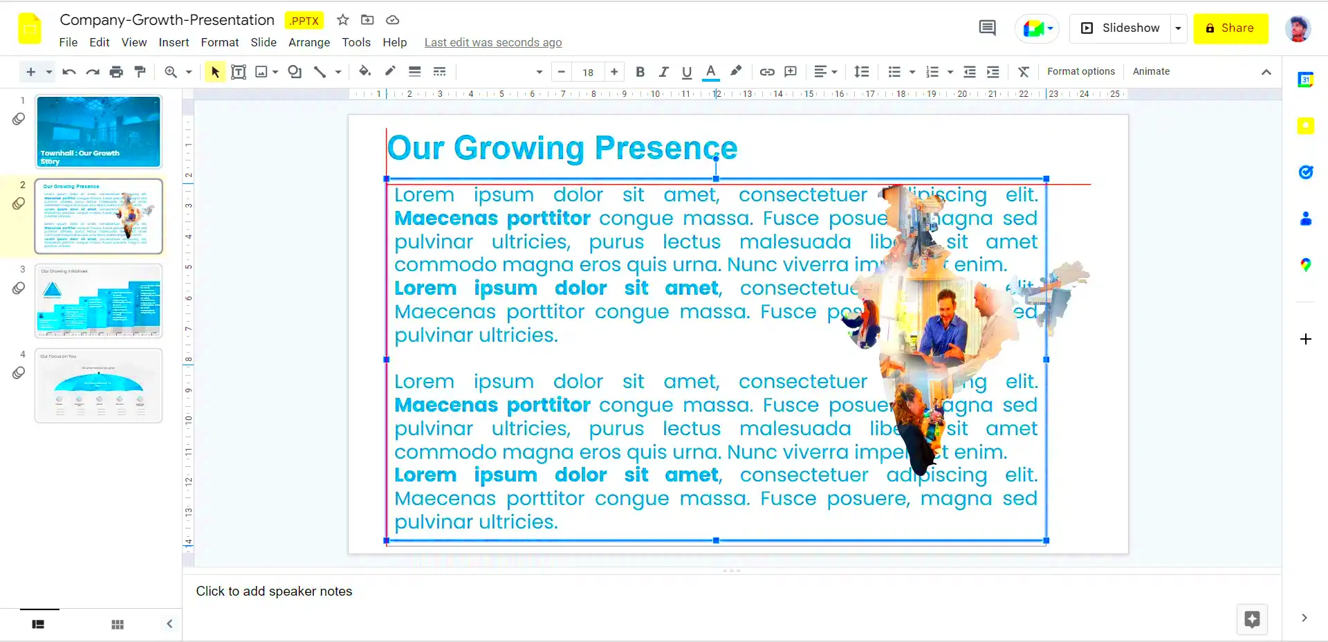
Wrapping text around images adds a layer of finesse to your presentations that can help keep your audience engaged. Here’s why this technique is so useful:
- Improved Visual Appeal: Wrapping text around images creates a cleaner, more professional look, allowing your slides to feel more polished and cohesive.
- Better Use of Space: By wrapping text, you can make the best use of your slide space without cluttering the layout. The text flows naturally, allowing you to fit more information without making the slide look crowded.
- Enhanced Readability: With text wrapped around images, your slides become easier to read and follow. The natural flow of the content can make your ideas more clear and comprehensible.
- Greater Flexibility: This technique gives you more flexibility in how you design your slides, allowing you to experiment with different layouts and image placements.
Overall, wrapping text around images not only makes your slides more visually pleasing but also helps improve the way your audience interacts with your content, making it a valuable skill to master for anyone working with Google Slides.
Step-by-Step Guide to Wrapping Text Around Images
Now that you understand the benefits of wrapping text around images, let’s get into the step-by-step process. Here’s how you can wrap text around an image in Google Slides:
- Insert an Image: Start by adding an image to your slide. To do this, click on “Insert” in the top menu, then select “Image.” You can upload an image from your computer, Google Drive, or even search the web directly.
- Insert a Text Box: After adding your image, create a text box where you want the text to appear. Go to “Insert” again, and select “Text box.” Draw the text box on the slide to the size you need.
- Position the Image: Move the image to where you want it on the slide. For wrapping text to work, the image needs to be positioned within the area where the text will be. You can resize the image as necessary to fit the slide layout.
- Format the Text Box: Click on the text box and start typing your content. To wrap the text around the image, make sure the text box is not covering the image entirely. Adjust the position of the text box as needed, allowing it to flow around the image.
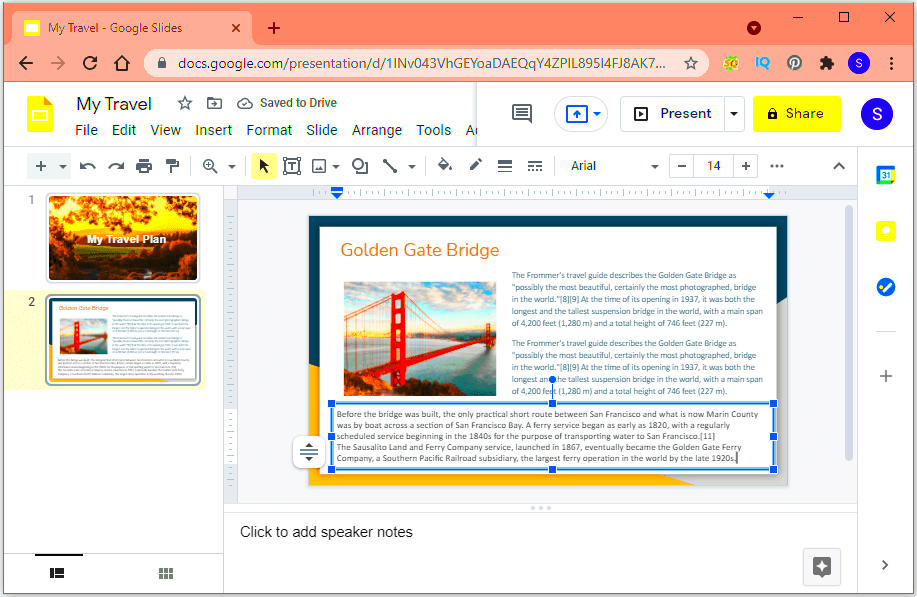
- Adjust the Text Wrap: While Google Slides doesn't have a specific "text wrap" feature like some other tools, you can simulate this by placing text boxes strategically. If you need the text to flow on the left or right side of the image, simply position the image where you want it and let the text automatically flow around it.
- Refine Your Layout: Once you have the text and image in place, fine-tune the alignment and spacing. You can adjust the margins of the text box, or resize the image, to create a balanced layout.
Wrapping text around an image might take a little practice, but once you get the hang of it, you’ll be able to create sleek, professional presentations with ease. Experiment with different placements and text layouts to find what works best for your content.
Using Text Box and Image Options
To successfully wrap text around images in Google Slides, you’ll need to get comfortable with using both text boxes and image options. These tools allow you to control how the text and image interact, creating a clean, organized slide. Let’s break down how to use each tool effectively:
- Text Box Options: A text box is where your content lives. It’s essential to position the text box carefully around the image. When you add a text box, you can adjust its size, move it, and change the alignment of the text inside. Use the toolbar options to adjust font size, color, and style to suit your presentation’s design.
- Image Options: Once the image is placed, you can fine-tune its positioning. Click on the image, and you'll notice options like resizing, cropping, and rotating. To wrap text smoothly, the image should be aligned in a way that allows the text to flow naturally beside it. For instance, try placing the image to the left or right of the text box.
- Layering Text and Images: Sometimes, you might want to layer text over an image. This is useful if you want the text to be directly on the image. To do this, adjust the text box’s transparency and play with the text’s positioning until it sits perfectly over the image. However, always ensure the text is readable against the image background.
Mastering these tools gives you control over your slide’s layout, letting you create dynamic, visually appealing designs. Play around with different combinations of text and image positions to see what works best for your content.
Adjusting the Image Placement for Better Text Flow
One of the keys to a successful text and image layout in Google Slides is adjusting the placement of your images. By carefully positioning the image, you can create a smooth text flow that makes your slides look more polished and easy to read. Here’s how to do it:
- Aligning the Image: When placing the image, make sure it’s aligned with the text box. Use the guidelines that appear when you drag the image. This helps keep the content organized. You can also use the “Align” tool in the toolbar to ensure your image is centered or aligned to the left or right of the text box.
- Using Text Box Resizing: Resizing the text box allows you to create more space for the text to wrap around the image. Make sure the text box is wide enough to allow for smooth flow of text around the image. This gives a balanced feel to the slide and makes it easier for your audience to follow.
- Adjusting Image Size: Adjust the size of your image to fit the layout. If the image is too large, it could crowd the text or make it difficult to read. On the other hand, a small image might not provide enough visual impact. Play around with the size and positioning until it complements the text.
- Overlapping Text and Image: If you want to create a more creative or artistic design, consider overlapping the text slightly with the image. This can create a dynamic look, but be careful that the text doesn’t become hard to read.
With a little experimentation, you can fine-tune the placement of both images and text boxes to create a more effective layout. The goal is to keep the text readable while allowing the image to complement the content without overpowering it.
Common Challenges When Wrapping Text Around Images
While wrapping text around images is a simple technique, there are a few challenges you might face along the way. Knowing how to handle these issues can save you time and effort in the long run. Here are some common problems and their solutions:
- Text Overlapping the Image: This is one of the most common issues. It happens when the text box is too small, and the text starts overlapping the image. To fix this, simply resize the text box or move the image to give the text more space.
- Images Blocking Text: Sometimes, the image may block the text, especially if it’s placed in front of the text box. To solve this, right-click on the image, select “Order,” and then choose “Send to back” to ensure the text remains visible.
- Text Doesn’t Wrap Properly: If your text isn’t wrapping around the image the way you want, it could be because the image is too large or improperly positioned. Try resizing the image or adjusting the text box’s width to help the text flow more naturally around the image.
- Misalignment Between Text and Image: Sometimes, images and text boxes don’t align correctly, which can lead to a disorganized slide. Use the alignment tools in the toolbar to make sure everything lines up neatly.
- Limited Text Formatting Options: Google Slides doesn’t offer the same text wrapping options as more advanced design tools, which can be frustrating. However, by experimenting with text boxes, spacing, and image placements, you can still achieve a professional layout.
By being aware of these challenges and using the tips above, you can troubleshoot and improve your design process. Wrapping text around images is a great way to make your Google Slides more engaging, and with a little practice, you’ll be able to create slides that look fantastic every time.
Tips for Creating Professional Presentations
Creating a professional presentation goes beyond just adding text and images to slides. It’s about making sure your content is engaging, visually appealing, and easy to follow. Here are some tips to help you create polished Google Slides presentations:
- Maintain Consistency: Consistency is key when designing a presentation. Use the same font style, colors, and layout across all your slides. This gives your presentation a cohesive look and makes it feel more organized.
- Use High-Quality Images: Always choose clear, high-quality images that match your content. Blurry or pixelated images can detract from your message and make your presentation look unprofessional.
- Keep Text Minimal: Try not to overcrowd your slides with too much text. Use bullet points to summarize key ideas and keep sentences short. The goal is to communicate your message without overwhelming your audience.
- Use White Space Effectively: Don’t be afraid of empty space! White space helps to create a clean and balanced layout. It allows your content to breathe and makes it easier for the audience to focus on the important elements.
- Use Visuals to Support Your Message: Images, charts, and graphs are powerful tools to complement your text. Use visuals that directly relate to the content you’re discussing and enhance your message.
- Choose Readable Fonts: Always select easy-to-read fonts. Stick to standard fonts like Arial or Calibri, and avoid using more than two different font styles throughout your slides.
- Practice and Refine: The final tip is practice. Review your presentation multiple times, check for spelling or grammatical errors, and make adjustments to improve flow and clarity.
By following these tips, you’ll be able to create presentations that look and feel more professional. Remember, the key to an effective presentation is simplicity and clarity, combined with well-chosen visuals.
FAQs About Wrapping Text Around Images in Google Slides
Wrapping text around images in Google Slides might seem tricky at first, but once you get the hang of it, it becomes a useful design tool. Here are some frequently asked questions about this technique:
- Can I wrap text around an image in Google Slides like I can in Word?
Google Slides doesn’t have a direct text wrap feature like in Word. However, you can manually position the text and image so that the text flows around the image. This can be done by resizing the text box and adjusting the image's position on the slide. - How do I ensure the text looks neat when wrapping around images?
To keep the text neat, make sure your image isn’t too large for the text box. Resize both the image and the text box as needed, and use the “Align” tool to make sure everything is properly spaced and aligned. - Why is my text overlapping the image?
If the text is overlapping the image, it’s likely because the text box is too small or the image is too large. Try resizing both the text box and image to allow for better flow. You can also move the image to a different spot on the slide. - Can I add multiple images with text wrapping in the same slide?
Yes! You can add as many images as you want, just remember to adjust the text box each time to ensure the text flows correctly around each image. Use the resizing and alignment tools to keep things balanced. - How can I make my text more readable over an image?
If your text is hard to read over an image, consider adjusting the image’s transparency or using a semi-transparent background behind the text. You can also change the text color or add a shadow for better visibility.
These FAQs address some of the most common challenges when wrapping text around images in Google Slides. With a bit of practice, you’ll be able to handle these issues and create slides that are both functional and visually appealing.
Conclusion
Wrapping text around images in Google Slides is a simple yet powerful technique that can greatly enhance the look and feel of your presentations. By using this feature strategically, you can create slides that are not only visually appealing but also easier to read and follow. Remember, positioning and adjusting the text and images for better flow is the key to achieving a polished result.
Don’t forget the importance of other presentation tips like using high-quality visuals, keeping text minimal, and maintaining consistency. By applying these strategies, you’ll be able to craft professional presentations that captivate your audience.
Now that you know how to wrap text around images and use other presentation design tips, you’re ready to take your Google Slides presentations to the next level. Happy presenting!
 admin
admin