Rhythm in visual images plays a significant role in guiding the viewer’s eyes through a design. It refers to the repeated elements or patterns that create a sense of movement. Just like in music, rhythm in design involves repeating elements at regular intervals, which provides harmony and flow to the visual composition. Whether you are designing a website, creating art, or curating photographs, understanding how rhythm works can help create a more engaging and dynamic visual experience.
Understanding the Concept of Rhythm in Design
Rhythm in design is a technique used to organize elements in a way that leads the viewer’s eye across the artwork, creating a sense of movement. It can be achieved through repetition, alternation, or progression of visual elements. The rhythm gives the design structure and balance, allowing the viewer to navigate through the piece seamlessly.
There are different types of rhythm in design:
- Regular Rhythm: When elements are repeated at fixed intervals, creating a predictable pattern.
- Flowing Rhythm: A more organic, natural feel where elements appear to move smoothly.
- Random Rhythm: Unpredictable, often with no set pattern, which can evoke spontaneity and surprise.
- Progressive Rhythm: The repetition of elements that gradually change, creating a sense of progression and development.
By understanding these types, designers can choose the right rhythm to express the emotion or movement they want to convey in their visual projects.
Also Read This: A Comprehensive List of Image Processing Companies in the USA
Elements That Create Rhythm in Images
Several key elements in design contribute to creating rhythm in visual images. These elements work together to establish movement, flow, and harmony. Here are some of the most common ones:
- Lines: Lines guide the viewer’s eye in a particular direction. Curved lines offer flowing rhythm, while straight lines provide a more regular, structured rhythm.
- Shapes: Repeating geometric or organic shapes in a composition can generate rhythm. Think of a series of circles or squares arranged in a pattern.
- Colors: Color repetition also creates rhythm. For instance, using the same color in different elements can unify the composition and direct attention.
- Texture: Repeating textures, whether visual or physical, can establish a rhythmic pattern that leads the viewer’s eyes from one part of the image to another.
- Size: Varying the size of elements in a design can create a progressive rhythm. Gradual changes in size can give a sense of movement and depth.
- Spacing: The consistent use of spacing between elements can help form rhythm, either by creating intervals or an illusion of motion.
By carefully considering how to use these elements, you can design images that not only look balanced but also feel dynamic and full of life.
Also Read This: How to Scale Thumbnails in Behance for Optimizing Your Portfolio’s Visuals
How to Use Color to Show Rhythm
Color is a powerful tool in design and can play a major role in creating rhythm. By repeating or alternating colors throughout a design, you can guide the viewer’s eyes and establish a sense of movement. Color rhythm can be used to create harmony, balance, and even to highlight important elements in your design.
Here are some effective ways to use color to show rhythm:
- Consistent Color Use: Repeating the same color across different parts of your design helps create visual rhythm. This can be particularly effective for maintaining a harmonious flow throughout your image.
- Color Gradients: Gradually shifting hues or saturation levels can create a sense of progression and movement. For example, transitioning from dark to light shades of the same color creates a flowing rhythm.
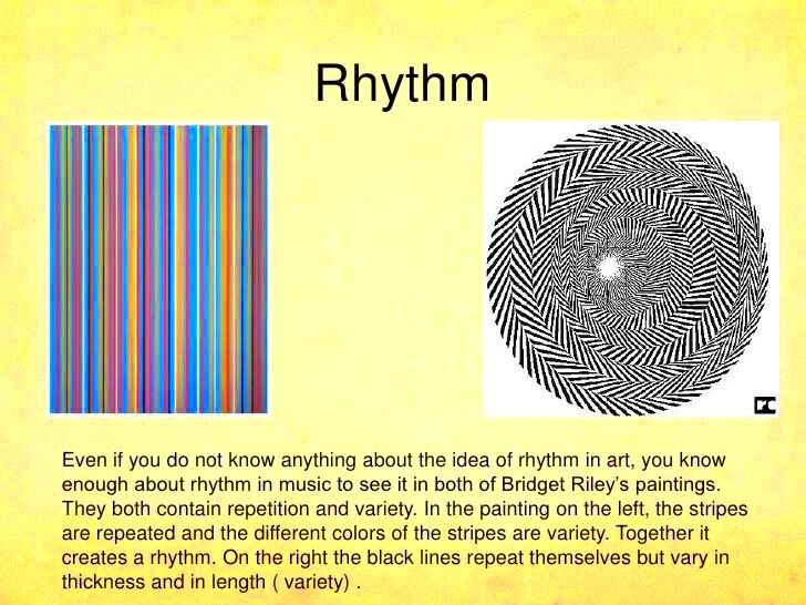
- Color Contrast: Alternating contrasting colors at regular intervals can create a strong visual rhythm. Think of the classic black and white checkerboard pattern — it has an obvious and bold rhythm due to the contrasting colors.
- Color Grouping: Grouping similar colors together and placing them in a repeating pattern can make the design feel cohesive while still maintaining a dynamic rhythm. For example, grouping warm colors together in one area and cool colors in another can create visual balance while offering movement.
By considering how colors interact with one another and how they are placed in your design, you can craft a rhythm that is both visually appealing and purposeful.
Also Read This: Picture-perfect Solution for Your Shutterstock Image Downloader Search
Using Shapes and Patterns to Represent Rhythm
Shapes and patterns are essential for creating rhythm in visual design. By repeating or varying shapes, you create a repetitive flow that guides the viewer’s eye and adds depth to the composition. Patterns can either be regular or irregular, but when used effectively, they provide a structured visual rhythm.
Here’s how you can use shapes and patterns to create rhythm:
- Repeating Shapes: The most straightforward way to show rhythm with shapes is to repeat them at regular intervals. For example, circles, triangles, or squares arranged in rows or grids can create a sense of consistency and order.
- Varying Size of Shapes: By altering the size of the shapes while keeping them in a similar pattern, you can create a progressive rhythm. Larger shapes at the start of a sequence gradually shrinking as they move across the design adds movement and flow.
- Patterned Repetition: Using intricate patterns that repeat, such as stripes, dots, or geometric designs, can establish rhythm across a larger surface. Whether the pattern is symmetrical or asymmetrical, it directs attention and gives a structured rhythm to the composition.
- Combining Shapes: Sometimes, you can combine multiple shapes, such as circles and squares, to create a more complex rhythm. The combination adds visual interest while maintaining a repetitive flow.
Shapes and patterns don’t just fill space—they are essential in guiding how a viewer experiences the rhythm in your design. Be mindful of the spacing, size, and arrangement to create a smooth flow or exciting movement.
Also Read This: The Top Photography Trends to Watch in 2023
Applying Rhythm in Photography and Illustrations
In both photography and illustrations, rhythm helps create a sense of motion and flow. Whether it’s a photo series or a single illustration, rhythm enhances the composition and provides structure. By applying rhythm in these visual mediums, you can lead the viewer’s eye through the image in a specific way, creating a more dynamic and engaging experience.
Here are some ways to incorporate rhythm into your photography and illustrations:
- In Photography:
- Repetitive Elements: Look for repeating patterns, such as rows of windows, trees, or streetlights. These natural repetitions in a scene create rhythm and guide the viewer’s eyes across the image.
- Movement in the Frame: Motion can also be used to create rhythm. A moving subject, like a person walking or a car passing, can establish a sense of motion, especially if captured multiple times or from different angles.
- Leading Lines: Using lines like roads, railways, or architectural elements can guide the viewer’s eye through the photo, creating a natural rhythm that enhances the overall composition.
- In Illustrations:
- Repeating Patterns and Details: In illustrations, you can use repeating motifs or elements to create rhythm. For instance, drawing a series of similar objects or figures at regular intervals can create movement.
- Rhythmic Lines: Curved lines or shapes that follow a path can create rhythm. Think of the spiral in a nautilus shell or the flowing lines of waves in a landscape. These elements can guide the viewer's gaze naturally through the artwork.
- Color and Texture: Repeated use of specific colors or textures in your illustrations can also contribute to the rhythmic flow. For example, a series of soft color gradients or textured brush strokes can create a continuous visual rhythm.
When rhythm is applied thoughtfully in photography or illustrations, it creates a visual harmony that feels organic and engaging. Whether you're working with real-world scenes or imagined worlds, rhythm ensures that the visual journey remains captivating.
Also Read This: Where can I get license free images or pictures
Common Mistakes to Avoid When Creating Rhythm in Visuals
When trying to create rhythm in your visuals, it’s easy to fall into certain traps that can disrupt the flow or balance of your design. While rhythm can greatly enhance your image, making a few common mistakes can lead to a disjointed or overly busy composition. Let’s take a look at some of the mistakes you should avoid:
- Overusing Repetition: While repetition is essential for rhythm, overusing it can make the design feel monotonous. If every element looks the same, the viewer’s eye will not know where to focus, leading to a lack of visual interest.
- Lack of Variation: Using the same elements without any variation can lead to a predictable and boring design. Introducing slight changes in size, color, or placement can create a more dynamic rhythm and keep the viewer engaged.
- Ignoring White Space: White space, or negative space, is just as important as the elements in your design. Overcrowding your composition can disrupt the flow and make it hard for the viewer to focus on the rhythmic patterns you are trying to create.
- Using Too Many Contrasting Elements: While contrasting colors or shapes can create rhythm, too many competing elements can create visual chaos. It’s important to find a balance between contrast and harmony to avoid overwhelming the viewer.
- Inconsistent Spacing: Rhythm relies on the consistent spacing between elements. If the spacing is irregular or inconsistent, the rhythm will feel broken, and the viewer’s eye won’t follow the design smoothly.
By avoiding these common mistakes, you can ensure that your design maintains a cohesive and engaging rhythm that guides the viewer through your visual story.
Also Read This: Making Money through Adobe Stock or Shutterstock
FAQ about Showing Rhythm in Visual Images
Here are some frequently asked questions to help you better understand and apply rhythm in visual images:
- What is rhythm in visual design? Rhythm in visual design refers to the repeated use of elements (like shapes, colors, or patterns) in a way that guides the viewer’s eye through the composition. It creates a sense of movement and flow within the image.
- How can rhythm affect the mood of a design? Rhythm can influence how the viewer perceives the design. For instance, a smooth, flowing rhythm can create a calming effect, while a more irregular rhythm can feel dynamic and energetic.
- Can rhythm be applied to any type of design? Yes, rhythm can be applied in various design fields, including graphic design, photography, illustration, and architecture. Whether you’re designing a website or creating an artwork, rhythm helps organize elements and create visual harmony.
- What is the difference between rhythm and pattern? Rhythm refers to the overall flow and movement in a design, while patterns are the specific repetition of elements. Rhythm is the effect, and patterns are the method used to achieve it.
- How do I know if my design has good rhythm? A well-balanced design with rhythm will feel visually appealing and guide the viewer’s eyes naturally across the composition. It won’t feel chaotic or overly busy, and there should be a clear flow between the elements.
Conclusion on the Importance of Rhythm in Visuals
Rhythm is a key aspect of visual design that can transform a simple image into a captivating one. By repeating elements like shapes, colors, or patterns, you can guide the viewer’s eye, create movement, and add harmony to your design. Whether you’re working on a photograph, an illustration, or any other visual project, rhythm plays an essential role in making the composition feel dynamic and engaging.
Remember, balance is crucial. Too much repetition can become monotonous, while too little can make your design feel disconnected. The goal is to find the right rhythm that complements your message and enhances the viewer's experience.
In the end, rhythm helps you communicate visually in a way that is both structured and fluid. So, embrace it as a powerful tool in your design toolkit, and watch how it can elevate your visuals to a new level.
 admin
admin
