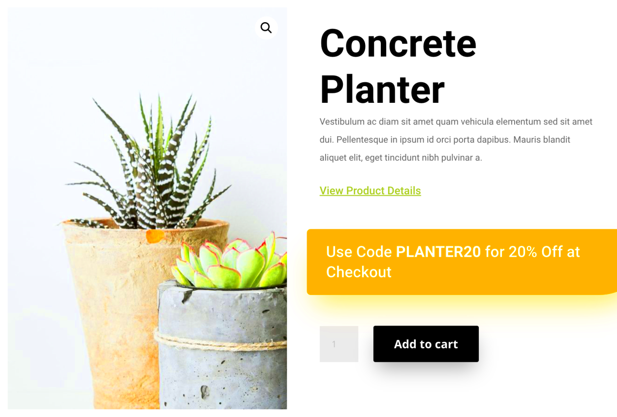
If you're running an online store using WooCommerce and Divi, you know how important it is to create an intuitive shopping experience. One of the most essential elements in any eCommerce store is the "Add to Cart" button. By default, WooCommerce places this button at the bottom of the product page or after product descriptions. However, some users prefer to display it below the product image for better accessibility. In this post, we’ll show you how to make that change in a few easy steps, ensuring that your customers can quickly add items to their cart without scrolling too far down.
Understanding WooCommerce and Divi Integration

WooCommerce and Divi are both powerful tools for creating and managing online stores. WooCommerce is a plugin for WordPress that turns your website into a fully functional eCommerce platform. It allows you to sell products, manage orders, and handle payments seamlessly.
Divi, on the other hand, is a highly flexible WordPress theme and page builder. It comes with a visual editor that makes building custom layouts easy, even for those with limited coding knowledge. When combined, Divi and WooCommerce offer endless possibilities for customizing your store, including tweaking product page layouts to better suit your needs.
By integrating Divi’s design flexibility with WooCommerce’s eCommerce functionality, you can create a store that not only looks great but also works smoothly. This guide will focus on using Divi to modify the placement of the "Add to Cart" button in your WooCommerce product pages, ensuring a better shopping experience for your customers.
Why You Should Add "Add to Cart" Button Below Product Images
Placing the "Add to Cart" button below the product image can improve the user experience in several ways:
- Improved Accessibility: Shoppers can add items to their cart immediately after viewing the product image, without having to scroll down to find the button.
- Better Visual Focus: When the "Add to Cart" button is placed near the product image, it draws attention quickly, leading to more conversions.
- Clean Layout: Moving the button below the image can create a more organized, visually appealing product page.
- Mobile Optimization: On mobile devices, this layout keeps the page compact and user-friendly, making it easier for customers to add items to their cart.
All of these factors can contribute to a smoother shopping experience and potentially increase your sales. Whether you're looking to optimize for mobile users or simply make the button more prominent, positioning the "Add to Cart" button below the product image can be a great choice for your WooCommerce store.
Steps to Modify the Product Page Layout in Divi
Modifying the product page layout in Divi to place the "Add to Cart" button below the product image involves a few simple steps. If you’re familiar with Divi’s visual builder, this process will be fairly straightforward. Let’s break it down step by step:
- Step 1: Open Divi Builder – Navigate to the product page you want to edit in your WooCommerce store. Click on “Edit with Divi” to open the page in the Divi Builder.
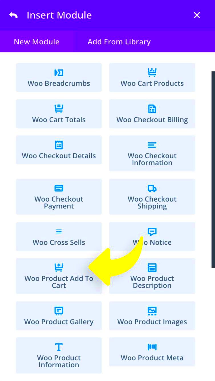
- Step 2: Locate the Product Module – Inside Divi Builder, find the product module or the section containing the product image and details.
- Step 3: Modify the Product Layout – You can modify the structure of the product page by adjusting the module’s settings. You may need to split the row into two columns to separate the product image from the other product details.
- Step 4: Move the "Add to Cart" Button – To move the button below the product image, simply drag the button module and place it in the desired location. Ensure it is positioned just beneath the product image section.
- Step 5: Save and Publish – Once you’re satisfied with the layout, click the “Save” button, and then “Publish” to make the changes live on your website.
With these steps, you’ll be able to customize the product page layout in Divi, positioning the "Add to Cart" button exactly where you want it. This simple adjustment will enhance the user experience and make the shopping process smoother.
Customizing the "Add to Cart" Button Using Divi Builder
Now that you’ve positioned the "Add to Cart" button below the product image, it's time to customize the button to fit your store’s design. Divi Builder offers an easy-to-use interface for making these changes, even for beginners. Let’s go through how to make the button stand out on your page:
- Step 1: Select the "Add to Cart" Button – Inside the Divi Builder, click on the "Add to Cart" button to open its settings.
- Step 2: Style the Button – In the button settings, you’ll see options to change the text, background color, font, size, and more. Customize these elements to match your store’s branding.
- Step 3: Adjust Button Position – You can adjust the button's alignment by choosing left, center, or right alignment under the “Spacing” section. Positioning the button correctly ensures it’s easy for users to spot.
- Step 4: Use Hover Effects – Divi allows you to add hover effects to buttons. This is an excellent way to make the "Add to Cart" button interactive. You can change the button color or add a subtle animation effect when the user hovers over it.
- Step 5: Save Your Changes – After you’ve customized the button to your liking, click “Save” to apply the changes. This will update the appearance of the button on your product page.
By customizing the "Add to Cart" button in Divi, you can ensure that it aligns with your brand’s aesthetics and provides a seamless shopping experience for your customers.
Using CSS for Additional Styling and Positioning
While Divi’s visual builder offers plenty of customization options, you can take your product page to the next level with custom CSS. Using CSS, you can adjust the styling and positioning of the "Add to Cart" button in ways that are not available through the Divi settings alone. Here’s how to add some extra flair:
- Step 1: Access the Page's Customizer – Go to the WordPress dashboard, navigate to “Appearance,” and select “Customize.” From here, you can access the custom CSS section.
- Step 2: Write Your Custom CSS – If you want to change the button's position, you can add a simple CSS rule. For example:
.single-product .product .add_to_cart_button { position: relative; top: 20px; /* Moves the button 20px down */ } - Step 3: Adjust Button Styling – CSS also lets you change the button’s shape, borders, and shadows. For instance, you could make the button rounded with:
.single-product .product .add_to_cart_button { border-radius: 12px; box-shadow: 0 4px 6px rgba(0, 0, 0, 0.1); } - Step 4: Test and Refine – After applying your CSS changes, refresh the page and see how it looks. Test on both desktop and mobile devices to ensure your button looks great across all screen sizes.
- Step 5: Save Your Changes – Once you’re happy with the results, click “Publish” to apply the changes to your website.
CSS gives you total control over how the "Add to Cart" button looks and behaves. From adjusting its size and color to fine-tuning its position, custom CSS can help you create a unique and user-friendly design for your product pages.
Testing the Changes on Your WooCommerce Store
Once you’ve made the necessary changes to your WooCommerce store by customizing the product page layout and the “Add to Cart” button, it’s crucial to test everything before going live. Testing ensures that your changes work as expected and provides a smooth shopping experience for your customers. Here’s how you can test the modifications:
- Step 1: Preview the Product Page – Before publishing, use the preview feature in WordPress to see how the page looks with the new button placement. This allows you to check the layout without affecting the live site.
- Step 2: Check the Button Functionality – Make sure the “Add to Cart” button is working properly. Click on it to ensure that the correct product is added to the cart. If there are any issues, check your theme or plugin settings.
- Step 3: Test on Different Devices – Since a large portion of users browse eCommerce sites on mobile devices, it’s important to test your product page on smartphones and tablets. Ensure that the “Add to Cart” button is still easy to find and that the layout looks good on smaller screens.
- Step 4: Test User Flow – Go through the entire shopping process, from browsing a product to adding it to the cart, checking out, and completing a purchase. This ensures that the button placement doesn’t disrupt the flow of the shopping experience.
- Step 5: Ask for Feedback – If possible, ask a few customers or colleagues to test the page and provide feedback. They might notice things you missed, and their input can help refine the user experience.
Once you’re confident that the changes are working correctly, it’s time to publish them. Regular testing after updates is also a good practice to ensure everything continues to function smoothly.
FAQ
Here are some frequently asked questions about adding the "Add to Cart" button below product images in WooCommerce Divi:
- Q: Can I customize the “Add to Cart” button’s text?
- A: Yes, Divi allows you to change the text of the “Add to Cart” button directly within the module settings. You can customize the button label to match your store’s tone and branding.
- Q: Will my changes affect the mobile version of the site?
- A: Not if you use responsive design practices. Divi automatically adjusts layouts for mobile devices, but you should still test the layout to ensure the button is easily accessible on all screen sizes.
- Q: What if I don’t know how to code?
- A: No problem! Divi’s visual builder makes it easy to customize your page without any coding knowledge. If you do need advanced changes, you can use Divi’s built-in custom CSS editor or hire a developer.
- Q: Can I change the position of other elements on the product page?
- A: Yes, you can easily reposition elements like the product title, description, and price by adjusting the Divi modules on your product page. Simply drag and drop elements to the desired position.
- Q: Is there a way to add additional functionality to the “Add to Cart” button?
- A: Yes, you can add custom functionalities, such as adding a pop-up confirmation or redirecting users to the cart page after adding a product. This can be done through additional Divi settings or custom code.
Conclusion
Incorporating the “Add to Cart” button below product images in WooCommerce Divi is a simple yet effective change that can improve your customers’ shopping experience. By following the steps outlined in this guide, you can easily customize your product page layout, ensuring that the button is both visible and accessible. Whether you’re using Divi’s built-in features or adding custom CSS for more styling options, you have the flexibility to design a product page that suits your store’s branding and functionality needs.
Remember to test all changes thoroughly before making them live. It’s important to ensure the button works as expected and the layout looks good on all devices. By continually improving the user experience, you can increase engagement and boost conversions. So, don’t hesitate to experiment with the layout and design until you find what works best for your store.

 admin
admin


