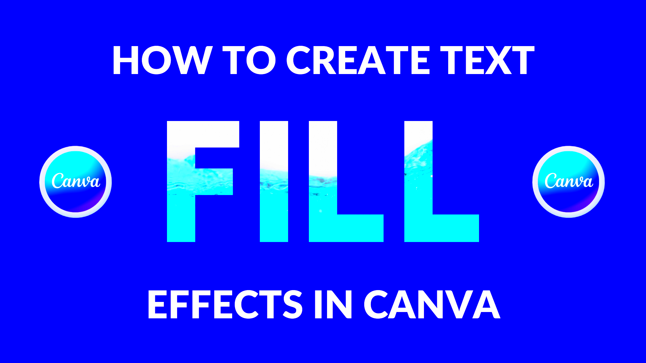
Text-filled images are a creative way to combine visuals with powerful messages. This technique uses words to fill shapes or forms in an image, creating an eye-catching design that can capture attention quickly. Whether for social media posts, marketing materials, or personal projects, text-filled images can convey ideas effectively and aesthetically. In this blog, we'll explore the benefits of using text in
Benefits of Using Text in Images
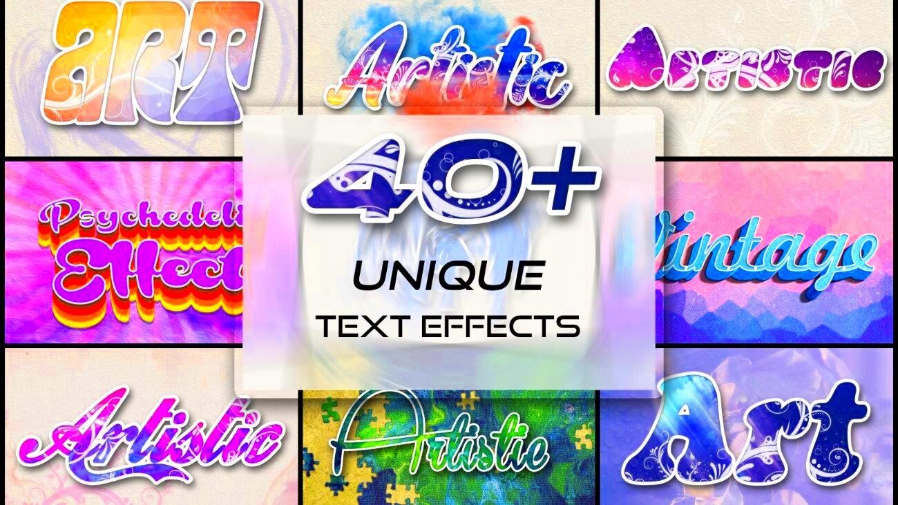
Incorporating text into images offers several advantages that can enhance your communication. Here are some key benefits:
- Visual Appeal: Text-filled images can be visually striking, making them more engaging to viewers.
- Clear Messaging: Combining text and visuals can help convey your message more effectively, ensuring it resonates with your audience.
- Branding Opportunities: Using consistent fonts and styles can strengthen your brand identity.
- Versatility: Text-filled images can be used across various platforms, from websites to social media, enhancing your content's reach.
- Improved Retention: Studies show that people remember information better when it's presented visually, making text-filled images more memorable.
Also Read This: Using SolidWorks to Add Images
Tools and Software for Creating Text-Filled Images
There are many tools available to help you create stunning text-filled images. Here’s a list of some popular options:
| Tool | Description |
|---|---|
| Canva | A user-friendly graphic design platform with templates for text-filled images. |
| Adobe Photoshop | A powerful tool for more advanced users, offering extensive customization options. |
| PicMonkey | An easy-to-use online editor perfect for quick edits and text overlays. |
| GIMP | A free and open-source image editor that rivals Photoshop’s features. |
| Fotor | An online tool with a focus on photo editing and graphic design, suitable for creating text-filled images. |
Each tool has its strengths, so choose one that fits your needs and skill level. With these resources at your fingertips, you can start creating text-filled images that stand out.
Also Read This: Understanding Stock Photo Licensing on Adobe
Step-by-Step Guide to Designing Text-Filled Images
Creating text-filled images might seem daunting, but it's easier than you think. Follow these simple steps to get started:
- Choose Your Image: Start by selecting a high-quality image that complements your message. Make sure it has enough empty space to accommodate the text.
- Decide on Your Text: Think about what you want to convey. Keep it short and impactful. A catchy quote or a powerful statement often works best.
- Select a Design Tool: Pick one of the tools mentioned earlier, like Canva or Photoshop, to begin your design process.
- Fill the Image with Text: Use the text tool in your chosen software. Adjust the font size, style, and color to ensure it blends well with the background.
- Adjust the Layout: Experiment with the text placement. Center it, align it left or right, or even curve it around the image. Play around until it looks just right.
- Save and Share: Once you’re happy with the design, save your image in the appropriate format (like PNG or JPEG). Now you can share it on your chosen platforms!
By following these steps, you can create beautiful text-filled images that grab attention and effectively communicate your message.
Also Read This: Expert Editing Techniques for Flawless Pictures in Photoshop CS6
Best Practices for Text Placement and Readability
Ensuring your text is readable and well-placed is crucial for the effectiveness of your text-filled images. Here are some best practices to consider:
- Contrast is Key: Make sure there is a clear contrast between your text and background. Light text on a dark background or vice versa works best.
- Font Selection: Choose fonts that are easy to read. Sans-serif fonts often look cleaner and more modern.
- Limit the Amount of Text: Keep your text concise. Too much text can overwhelm the viewer and reduce impact.
- Use Text Hierarchy: Highlight important information by varying font sizes or weights. This helps guide the viewer’s eye.
- Leave Space: Avoid clutter by ensuring there is enough space around the text. This enhances readability.
- Test on Multiple Devices: Check how your text-filled image looks on different screens. Adjust sizes and placements as needed.
By following these best practices, you can enhance the visual appeal and effectiveness of your text-filled images, ensuring your audience receives your message loud and clear.
Also Read This: Maximizing Your Earnings with Adobe Stock
Examples of Text-Filled Images in Different Contexts
Text-filled images can be used in various contexts, each serving a unique purpose. Here are some examples to inspire your creativity:
- Social Media Posts: Use quotes or call-to-action phrases over engaging photos to boost engagement on platforms like Instagram and Facebook.
- Marketing Materials: Incorporate text-filled images in brochures or flyers to highlight promotions, events, or services.
- Blog Headers: Create striking header images for your blog posts that reflect the content and invite readers to dive in.
- Presentations: Use text-filled images in slides to emphasize key points and keep your audience engaged during presentations.
- Inspirational Quotes: Design beautiful images featuring motivational quotes to share online, perfect for encouraging others.
These examples show how versatile text-filled images can be. No matter the context, they can enhance your messaging and capture the attention of your audience.
Also Read This: How to Upload Pictures on Getty Images and Start Earning from Your Photography
Common Mistakes to Avoid
While creating text-filled images can be fun, there are some common pitfalls that can affect their effectiveness. Here are a few mistakes to steer clear of:
- Overcrowding the Image: One of the biggest mistakes is cramming too much text into your design. It can confuse viewers and dilute your message. Aim for clarity and focus.
- Poor Contrast: Using colors that are too similar can make your text hard to read. Always ensure there’s enough contrast between the text and the background for better visibility.
- Choosing the Wrong Font: Selecting overly decorative or complex fonts can hinder readability. Stick to clean and simple fonts for a professional look.
- Neglecting Mobile Viewers: Many people will see your images on mobile devices. If the text is too small or poorly placed, it can be hard to read. Test your designs on different screen sizes.
- Ignoring Brand Consistency: If you use various styles, fonts, and colors across different images, it can confuse your audience. Keep a consistent style that aligns with your brand identity.
- Not Testing Different Layouts: Don’t settle for your first design. Experiment with various text placements and formats to see what works best for your image.
Avoiding these mistakes will help you create impactful text-filled images that communicate effectively and resonate with your audience.
Also Read This: Shutterstock Alternatives: Exploring Other Stock Photography Platforms
FAQ
Here are some frequently asked questions about text-filled images that might help clarify any doubts:
- What is a text-filled image? A text-filled image combines visual elements with text to convey messages creatively. The text often fills a shape or space within the image.
- Can I use any font for my text? While you can use various fonts, it's best to choose those that are easy to read and fit your overall design style.
- Are there specific dimensions I should use? The dimensions can vary based on the platform you're using. Always check the recommended sizes for social media or web use to ensure your images look great.
- How do I ensure my image is high quality? Start with high-resolution images, and export your final designs in formats like PNG or JPEG for the best quality.
- Can I use text-filled images for commercial purposes? Yes, but make sure you have the proper rights to use any images and fonts in your designs, especially for commercial use.
Conclusion
Text-filled images are a powerful tool for enhancing your visual communication. By following the steps and best practices outlined in this blog, you can create stunning designs that capture attention and convey your message effectively. Remember to avoid common mistakes, test your designs, and stay true to your brand identity. Whether you're promoting a product, sharing inspiration, or creating content for social media, text-filled images can help you stand out in a crowded digital space. So, grab your favorite design tool and start experimenting with this creative approach today!
 admin
admin