Wrapping text around images in Google Slides can enhance the visual appeal of your presentations. It allows you to create a more engaging layout that directs attention to key content while maintaining a clean and professional look. Whether you're creating a business presentation, an educational slide, or a personal project, knowing how to wrap text effectively can make a significant difference in your audience's experience.
Steps to Insert Images in Google Slides
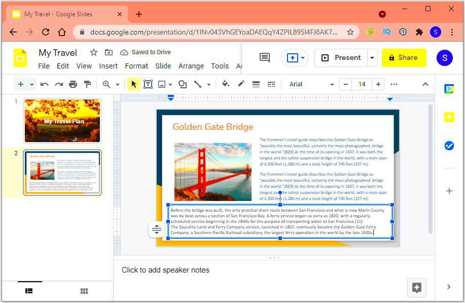
Inserting images into Google Slides is a straightforward process. Follow these simple steps:
- Open your Google Slides presentation.
- Select the slide where you want to add the image.
- Click on the Insert menu in the top toolbar.
- Choose Image from the dropdown.
- Pick the source of your image: upload from your computer, search the web, or choose from your Google Drive.
- Once you select the image, it will appear on your slide. You can click and drag it to position it where you want.
Now that you have your image in place, you can start wrapping text around it for a more polished look.
Methods for Wrapping Text Around Images
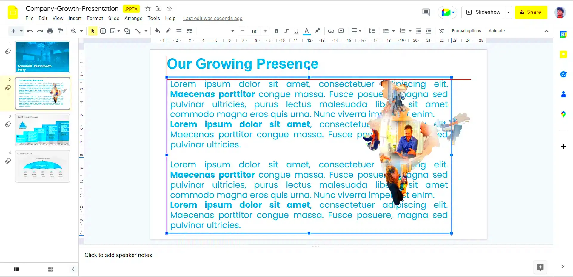
There are a couple of methods to wrap text around images effectively in Google Slides. Here’s how you can do it:
Method 1: Using Text Boxes
1. Insert a text box by clicking on the Insert menu and selecting Text box.
2. Type your text in the box, then position it next to your image. You may need to resize the text box to fit your content.
3. Adjust the alignment of the text box to create the desired wrapping effect.
Method 2: Placing Images with Text Flow
1. Insert the image as described earlier.
2. Click and drag the image to the left or right of the text area. Google Slides does not wrap text automatically, so you’ll need to adjust the text placement manually.
3. Fine-tune the positioning by resizing the image or adjusting the text box until it looks balanced.
By using these methods, you can achieve an attractive layout that keeps your presentation engaging and easy to read.
Adjusting Image Position for Better Text Flow
Adjusting the position of your images in Google Slides is crucial for achieving a harmonious text flow. When your images are placed thoughtfully, they complement your text instead of disrupting it. Here are some tips to help you adjust your image position:
- Drag and Drop: Simply click on the image and drag it to your desired position on the slide. Pay attention to the surrounding text to ensure a balanced look.
- Use Alignment Tools: Click on the image and look for alignment options in the toolbar. Aligning images to the left, right, or center can help create a more cohesive layout.
- Resize Images: Sometimes, resizing the image can improve the flow of text around it. Click on the corners of the image and drag to make it larger or smaller.
- Consider Margins: Leave some space between the text and the image. This helps avoid a cluttered look and ensures the text remains readable.
By adjusting your image position thoughtfully, you can create a more professional presentation that guides your audience's eye smoothly across the content.
Using Text Boxes for Enhanced Layout
Text boxes are a powerful tool for improving the layout of your Google Slides presentation. They allow you to control the placement of text in relation to images, enhancing readability and aesthetics. Here’s how to effectively use text boxes:
- Create a Text Box: Click on the Insert menu and select Text box. Click and drag to draw the box on your slide.
- Type Your Content: Enter the text you want. You can format it by changing the font style, size, and color to match your presentation theme.
- Positioning: Move the text box around the image to find the best fit. You can place it above, below, or alongside the image.
- Adjust the Size: Resize the text box by dragging its corners. Ensure it fits well with the image and doesn’t overlap awkwardly.
Using text boxes gives you flexibility in designing your slides, allowing you to create a layout that captures attention and communicates your message clearly.
Best Practices for Text and Image Alignment
Aligning text and images properly is key to a polished and professional presentation. Following best practices helps maintain visual harmony and clarity. Here are some effective strategies:
- Consistency: Keep the alignment consistent across all slides. If images are left-aligned on one slide, they should be left-aligned on others too.
- Use Grids and Guides: Enable gridlines in Google Slides to help align your text and images. This can make positioning easier and more precise.
- Leave Adequate Space: Avoid overcrowding by leaving sufficient space between images and text. A well-spaced layout is easier to read and looks more appealing.
- Group Elements: If you have multiple elements (like an image and a text box), group them together. This helps in moving them as one unit without disrupting the layout.
By adhering to these best practices, you can create slides that are visually appealing and easy to understand, ensuring your audience stays engaged with your presentation.
Troubleshooting Common Issues
Even with the best tools and techniques, you might encounter some common issues while wrapping text around images in Google Slides. Don't worry; these problems are usually easy to fix. Here are a few troubleshooting tips:
- Text Overlap: If your text overlaps with the image, try resizing the image or moving it to a different position. You can also adjust the text box size to avoid overlap.
- Image Not Aligning: If the image doesn’t align properly, use the alignment tools in the toolbar. Click on the image, and choose the alignment option that suits your layout.
- Text Box Issues: If your text box won’t resize or move as expected, ensure you are selecting the correct box. Click on the border of the text box to adjust its size or position.
- Changing Text Orientation: If the text doesn’t flow well, consider changing its orientation. Right-click the text box, select Format options, and adjust the rotation settings if necessary.
By following these tips, you can quickly resolve most issues and keep your presentation looking sharp and professional.
FAQs
Here are some frequently asked questions about wrapping text around images in Google Slides:
- Can I wrap text around an image in Google Slides?
Yes, you can position the text box next to the image to create the effect of wrapping, though Google Slides doesn’t support automatic text wrapping. - How do I make my text look better next to images?
Use clear fonts, maintain consistent font sizes, and ensure there’s enough space between the text and image for a cleaner look. - What should I do if my image is too large?
Resize the image by clicking and dragging the corners to make it smaller without losing its aspect ratio. - How can I ensure my layout is consistent across slides?
Stick to the same alignment and formatting styles throughout your presentation for a cohesive look.
Conclusion
Wrapping text around images in Google Slides is an effective way to enhance your presentation's visual appeal. By understanding how to insert images, adjust their positions, and use text boxes wisely, you can create engaging layouts that draw attention and communicate your message clearly. Remember to troubleshoot common issues and adhere to best practices for alignment. With these tips in hand, you’ll be able to deliver presentations that captivate your audience and leave a lasting impression.

 admin
admin